查看完整案例


收藏

下载

附件

翻译
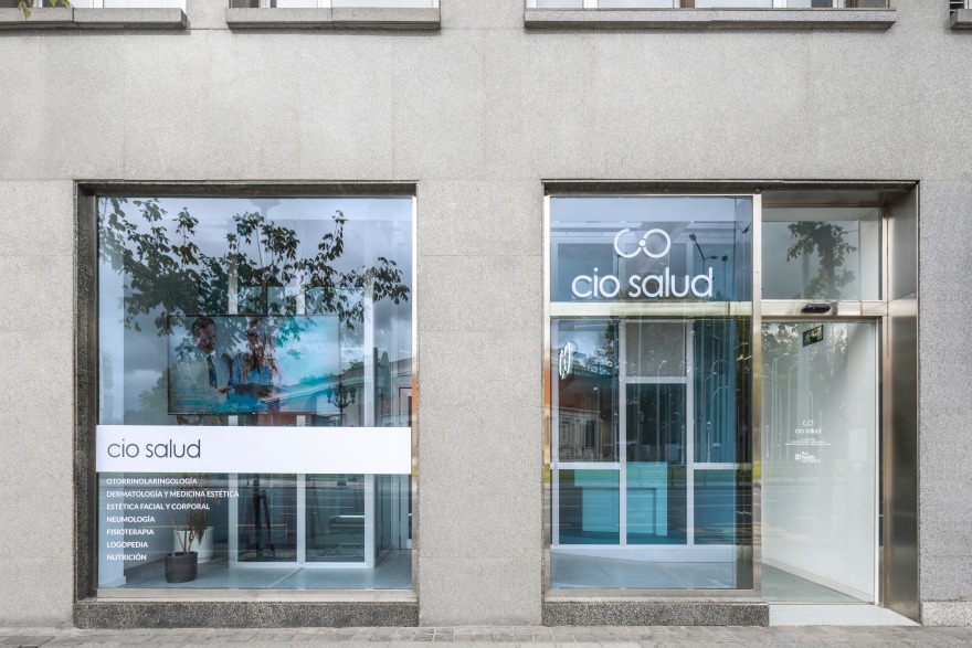
The success of the project resides in the union –both visually and functionally-, of the two floors of the premises, which were previously perceived as totally segregated spaces.
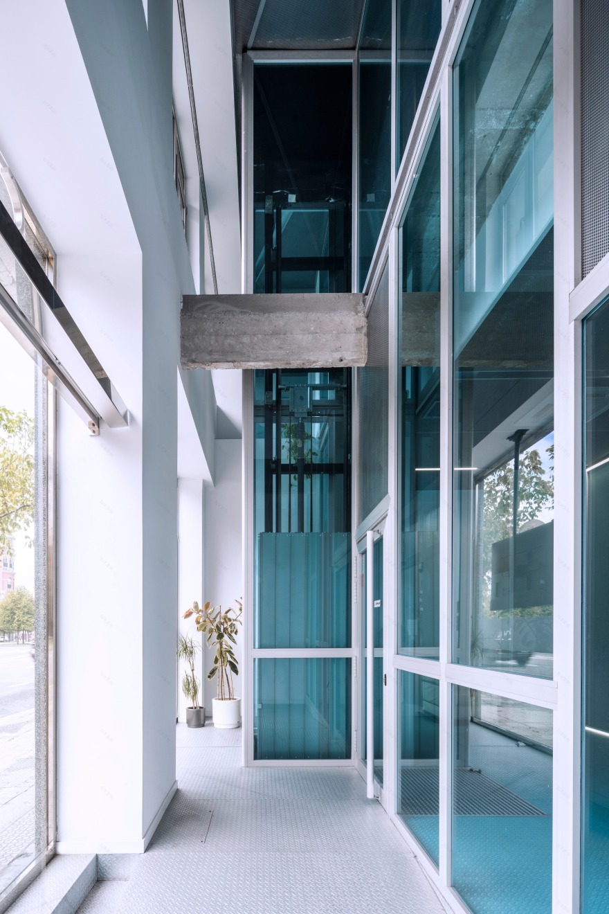
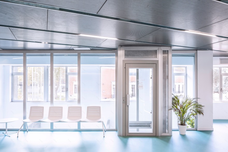
Our strategy has been to bet on joining by emptying. This emptiness becomes materialized in a double height entrance hall, paralleled to the façade, which is generated by breaking the slab of the first floor, and where we also place the new elevator.
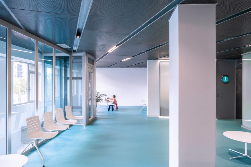
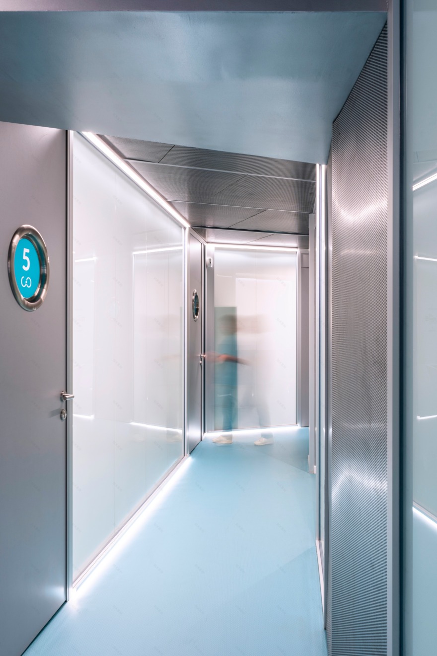
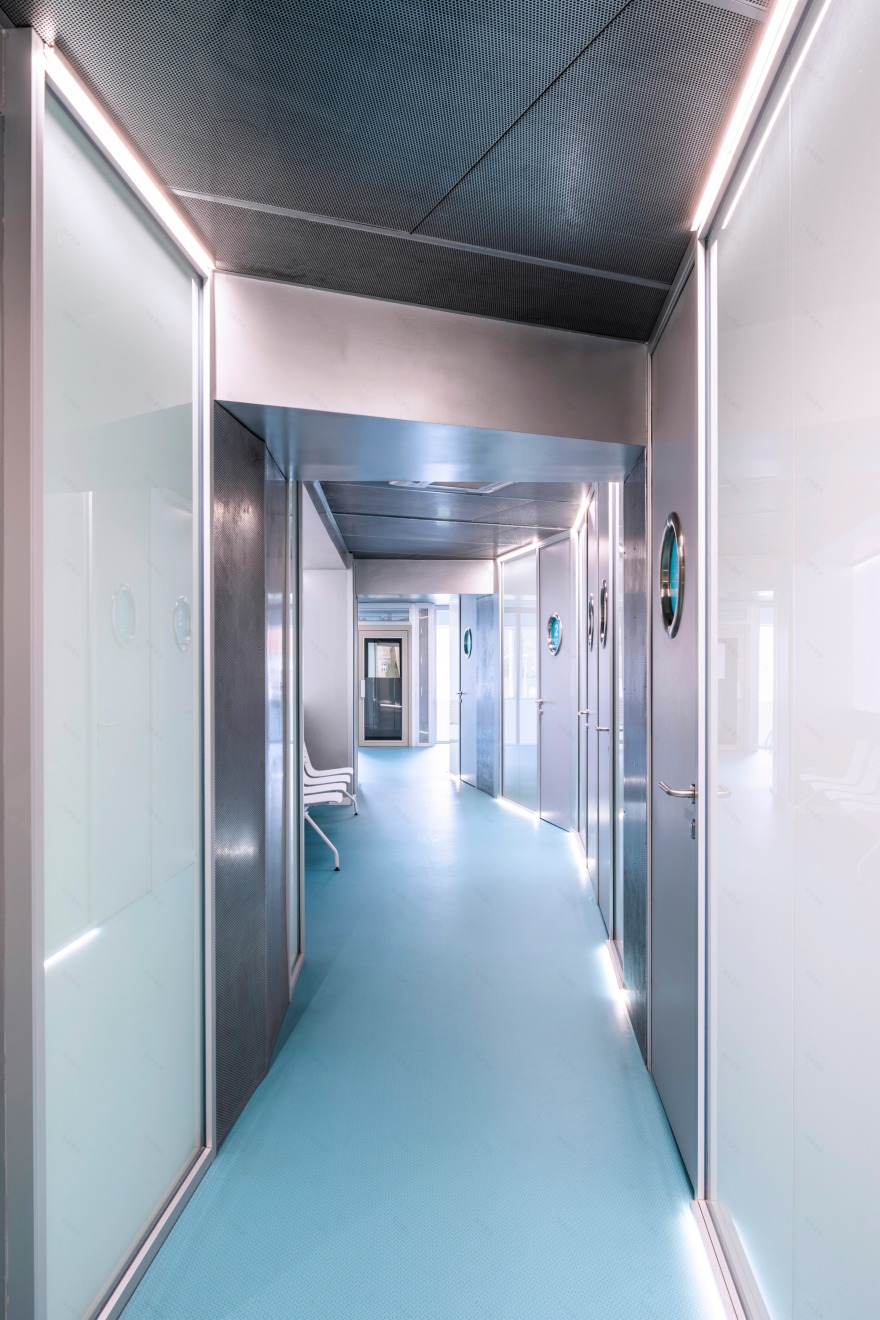
The ground floor welcomes patients. The main medical activity happens on the first floor, which has very short height and is very deep from the street alignment. We have designed a ceiling whose geometry breaks with the linearity of the space, which, added to the uneven arrangement of the partitions that divide the surgeries, blurs the tight corridor feeling.
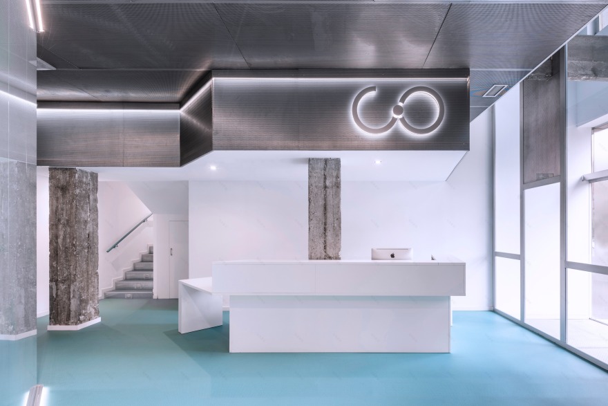
The main materials chosen, such as galvanized steel or glass, have a clean and neutral character, and are reflective and transparent. By being so they optimize the light conditions of the space, and enhance the brand image through the enveloping repetition of the corporate colour of the continuous floor.
客服
消息
收藏
下载
最近


