查看完整案例


收藏

下载
架构师提供的文本描述。为了扩大品牌,客户失败了。
Text description provided by the architects. As an attempt to expand the brand, the client Lost&Found decided to open its latest offline store in Chaoyang Hopson One Shopping Mall. C+ Architects has been entrusted with interior design work.
这家商店位于商场地下二楼,占地面积205平方米。迷失者
This store on the second basement floor of the mall covers an area of 205 square meters. The Lost&Found hopes it can continue its brand philosophy, and to make breakthrough in the multi-format retailing. Therefore, in addition to meeting basic functional needs, the architect also tries to find "past" building materials, hoping to create dialogue with the brand's furniture products through material practices and to awaken the emotion of cherishing good things.
空间的划分和统一,与商场走廊附近的已存在的柱子相结合,建筑师用连续的墙壁包围了一个新的空间,包括商店橱窗、手术室、办公室和仓库等相对封闭的功能区。设计的目的是实现无列展示空间,同时在南面和东侧自然形成两个入口。
The division and unification of space Combined with the pre-existed columns near the corridor of the mall, the architect encloses a new space with continuous walls that includes relatively closed functional zones such as shop window, operation room, office and storage. The design is to realize the column-free display space, while naturally forming two entrances on both south and east sides.
承重墙将商店分成两个空间.里面的部分以迷失为特征。
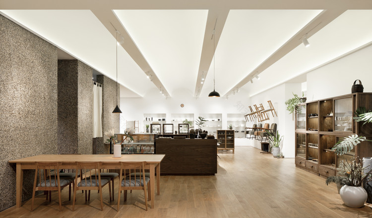
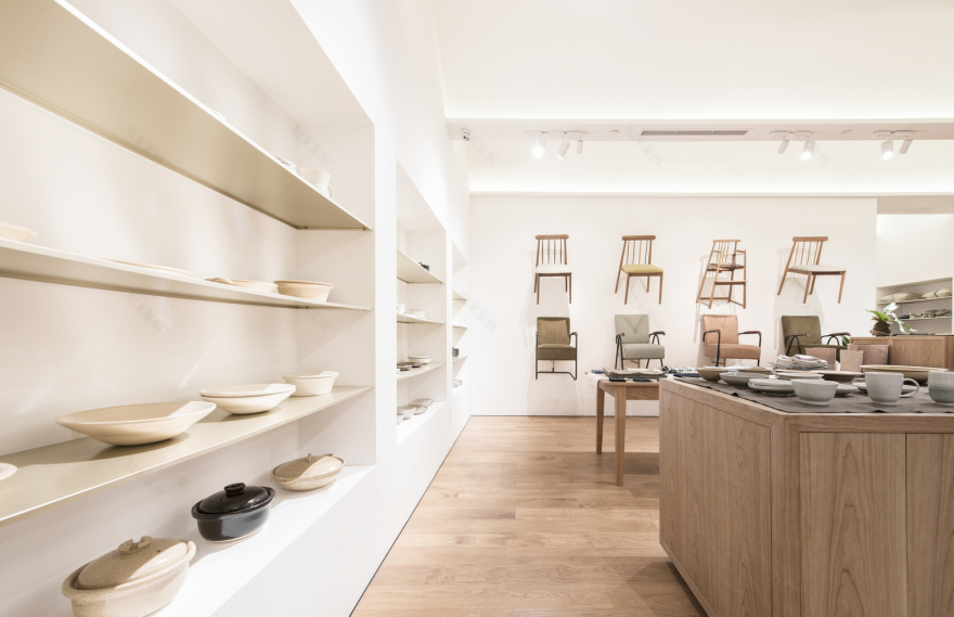
A load-bearing wall divides the store into two spaces. The inside part featured Lost&Found furniture collection, and the outside part sells small pieces like tablewares and lifestyle goods. When customers enter the shop from south side, the open display table with plant decoration, window space and the wall of chairs can be seen at once. The east entrance is adjacent to the café area, to facilitate the diversion of the people with different demands.
在定义了空间之后,两个主要的销售空间通过一排排拱形天花板统一起来。两个拱门的交叉口结合了烟雾探测器、喷水系统、空调通风口和聚光灯,使拱门更加纯净。拱门两侧隐藏的LED用漫射光照亮商店。发光的拱门突出了天花板的秩序感,使整个商店沉浸在柔和的氛围中。
After the space is defined, the two main sales spaces are unified through rows of arched ceilings. The intersection of the two arches combines smoke detectors, sprinkler system, air conditioning vents and spotlights, making the arches purer. Hidden LED on both sides of the arch illuminate the shops with diffuse light. The glowing arches highlight the sense of order of the ceiling and immerse the entire store in the soft atmosphere.
Sectional detail
截面细节
长期使用的质量和舒适性时间与对象交互的美是日常生活的重要组成部分,甚至扩大到建筑的规模。在决定新墙的材料时,遵循品牌倡导的“珍爱”生活方式,建筑师也提到了“时间”的元素。由于商场位于地下室,材料需要满足严格的防火要求,最终采用水洗石材已成为最合适的选择。
Quality and comfort for long-term use The beauty of the interaction between time and objects is an important part of daily life, even the scale is enlarged to architecture. When determining the material of the new walls, following the "cherishing things" lifestyle advocated by the brand, the architect also referred to the element of "time". Because the store is in the basement, the materials needs to meet stringent requirements for fire protection, the practice of washed stone has become the most suitable choice eventually.
© Jing Liu
(3)刘京
如今,熟悉这种老式方法的人越来越少。工人们说,这让他们想起了他们童年时期建造的一座房子的情景。洗过的石墙是自然而独特的,随着环境的变化和时间的痕迹可以清晰地看到它的质感。这种可回收的环保材料也非常适合商店里的木制产品。
Nowadays, people familiar with this old-fashioned approach are getting fewer and fewer. The workers said it reminded them of the scene of a house built in their childhood. The washed stone wall is natural and unique, it appears more textured as the environment changes and traces of time can be clearly seen. This recyclable eco-friendly material also fits quite well with the wooden products in the store.
Concept illustration
概念说明
Concept illustration
概念说明
然而,作为商场中的墙面材料,洗刷石材是很有挑战性的。一般情况下,通常的操作步骤是在墙上嵌入石块,然后用大量的水冲洗。但是这个网站没有这样的水环境。为了达到预期的效果,工人们采用了类似的预制方式。首先,将混合的石头粘在PVC网上,然后用这些碎片覆盖墙壁,然后用水泥填充石头的间隙,最后,把墙壁擦干净。完工后,完工的墙给人一种触碰的感觉。
However, it is very challenging to get washed stone as the wall material in the mall. In general, the normal operation procedure is to embed stones in the wall, and then wash with plenty of water. But the site doesn’t have such water conditions. In order to achieve the desired result, workers adopted a similar prefabricated way. First of all, glue the mixed stones to the PVC mesh, then cover the walls with those pieces and fill the gap of the stones with cement, finally, wipe the walls clean. After the completion, the finished wall gives people a feeling of touching.
建筑师以棕色为主选择暖色砾石。希望,新的墙壁充满了体积感,将使商店脱颖而出的灰色色调环境,并协调内部的家具颜色在同一时间。
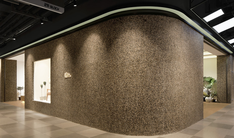
The architects chose warm color gravel mainly based on brown color. Hopefully, the new wall full of sense of volume will make the store stand out from the gray tone environment, and harmonize the color of the furniture inside the store at the same time.
Concept diagram
概念图
此外,招牌是由异形钢板制成,内有暗灯。钢板经过无缝焊接和抛光,最后进行氧化处理。透过过道,细长的钢板看起来像一条丝带围绕着商店。这种金属与洗过的石墙形成鲜明对比,并与品牌家具中的金属部件相呼应。
Moreover, the signboard is made of profiled steel plate with hidden lights inside. The plates are welded and polished seamlessly and oxidized at last. Looking through the aisle, the slender steel plate looks like a ribbon surrounds the shop. The metal contrasts with washed stone walls and echoes the metal components in the furniture of the brand.
客服
消息
收藏
下载
最近


