查看完整案例

收藏

下载
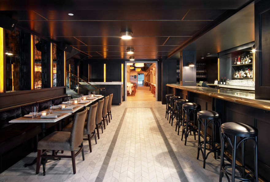
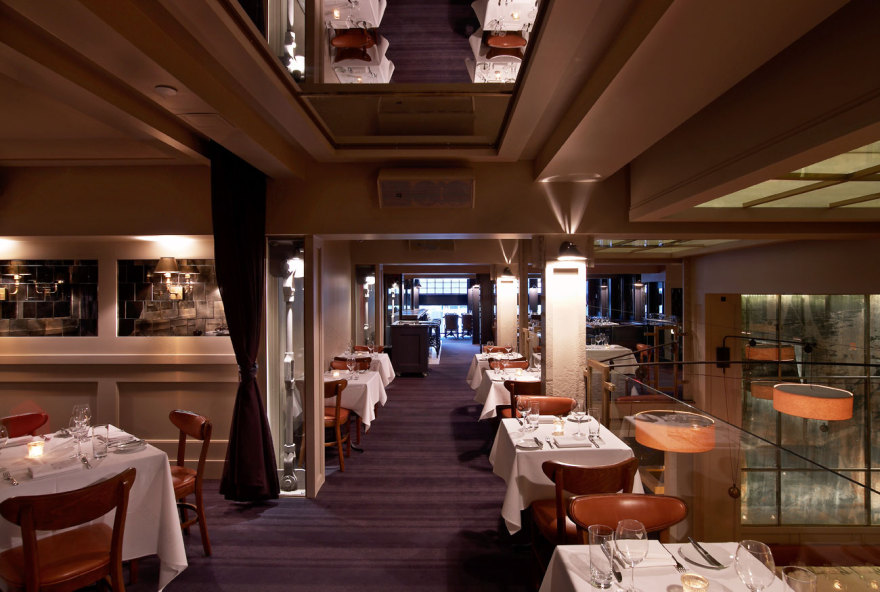
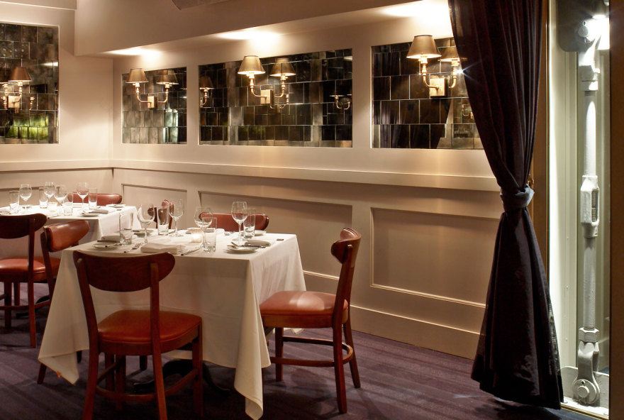
Abe & Arthur’s is a glossy old-school steak house that speaks to the archaeology of the Meatpacking District past and present. To design it, we started with one word: gossamer. We peeled away the fleeting shimmer of the Meatpacking District and brought back its patina; tumbled herringbone marble floors, glossy paint in midnight tones, aged mirrors and a polished zinc bar. The layers of the design (brick + glass + graphic scrims) speak to the layers of influence that make the neighborhood what it is today and bring it to life (its history + its neighbors + its family). Abe & Arthur’s is a great place to be a regular �C you could happily go there three times a week, which is actually saying a lot in a city like New York.
客服
消息
收藏
下载
最近


