查看完整案例


收藏

下载

翻译
Jeffrey Hutchison & Associates (JHA) recently completed an innovative reinvention of DFS’s T Galleria Beauty Hall in the hub of the Four Seasons Hotel – Venetian development in Macau, China.
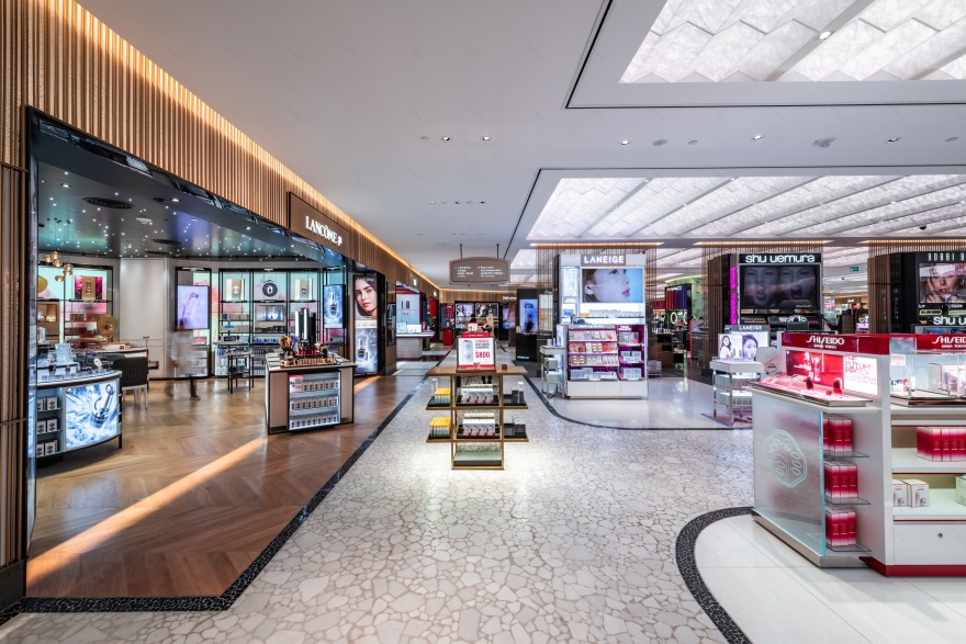
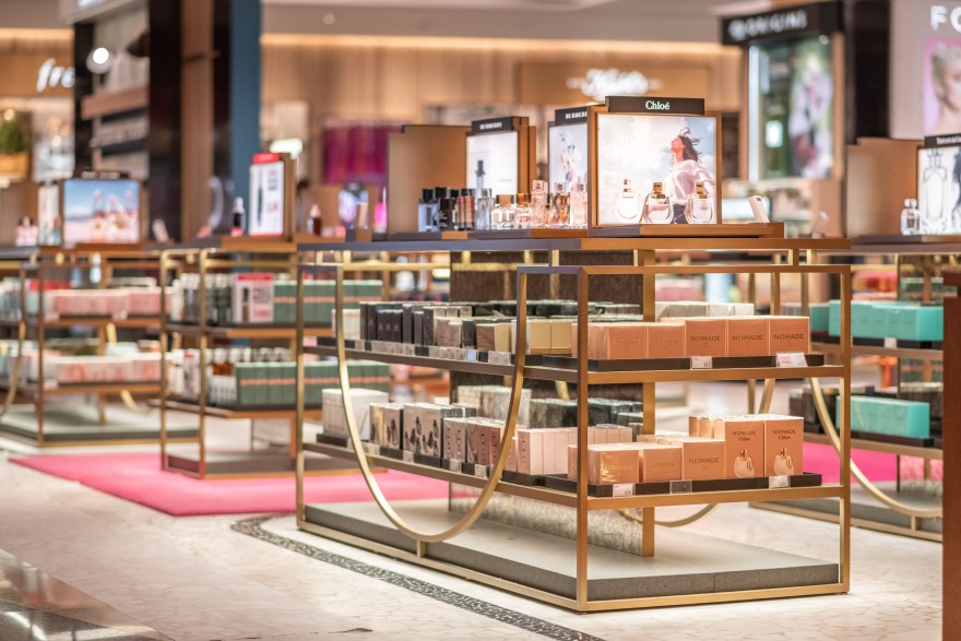
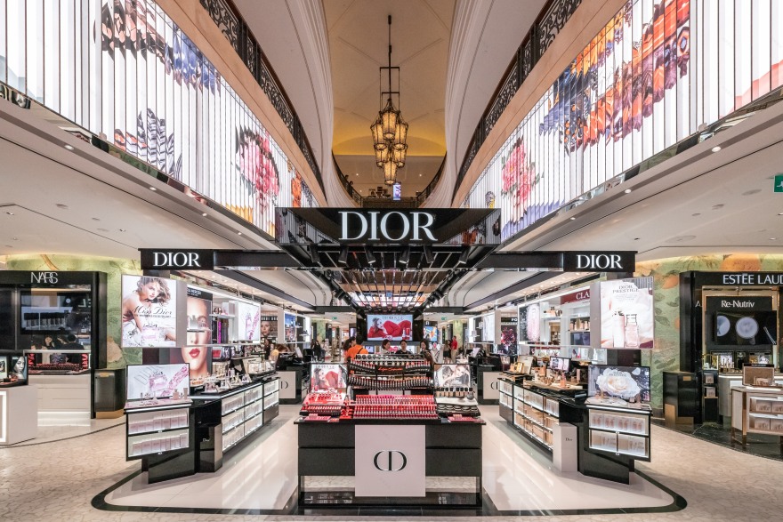
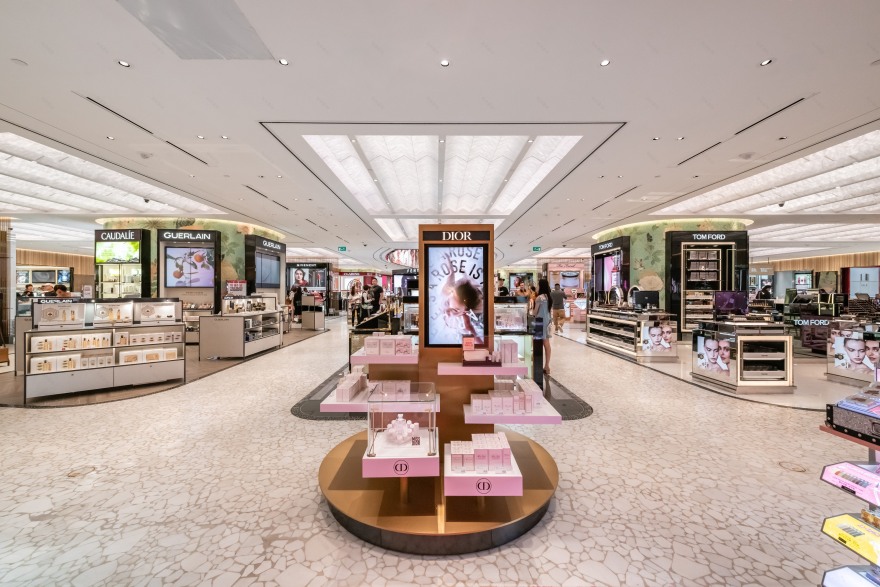
JHA transformed the 40,000 SF Beauty Hall into a luxurious modern “Chinese Garden” with elegant architectural elements that gracefully integrates technology as well as decorative art installations by local artists capturing the spirit of a natural retreat. The Beauty Hall seamlessly accommodates 58 individual brands as well as two multi-brand pads comprised of multiple fragrance brands.
“DFS strongly believes that each T Galleria should create a visual dialog between its space and the local culture. My vision was to pay tribute to the historical significance of the Chinese garden. We saw the need to establish a dialog between the importance of the natural world and its relationship to both beauty and wellness.” stated Jeffrey Hutchison, Founder of Jeffrey Hutchison and Associates. “We wanted to connect emotionally with customers by transporting them into a space of reflection where they feel relaxed to shop for their favorite beauty brands.”
Achieving their vision for the renovation and design of the space, JHA accomplished the following:
Contemporary Envelope: The perimeter of the T Galleria is wrapped by slender brass metal rods in two sizes (10 mm and 15 mm) reminiscent of bamboo, which continues to the strategically placed digital screens for brands to display messages and new products.
Brand Wall: In the center of the store, the brass “bamboo” rods are again used to create sleek and elegant brand wall frames that allow dynamic brands to create a presence while also establishing a strong design vocabulary for the project.
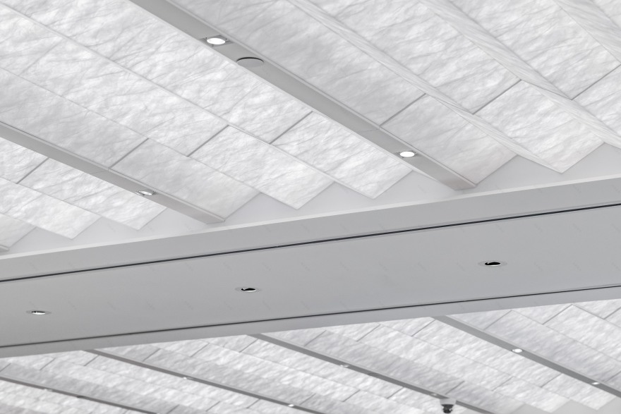
Chinese Garden and Cultural Integration: A polished, white broken mosaic pattern was used on the floor to resemble river stone found at the bottom of a reflecting pool. A backlit ceiling with intricate acrylic folds, inspired by Chinese fans and lanterns, organizes the space highlighting the main circulation.
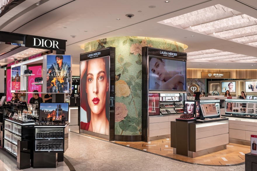
A neutral palette of black, white and brass brings a sense of serenity and richness complemented with the soft jade hue of the custom-made, garden-themed mosaic tile murals that cover the large curved columns throughout the store. The integrated artwork commissioned by a local artist, including the mosaic tile murals and a large installation at the ceiling void, respectfully reinforces the Chinese references.
Technology: Large digital screens around the perimeter bring modernity to the design and act as an accent the brass envelope.
客服
消息
收藏
下载
最近


