查看完整案例


收藏

下载

翻译
Project team: Phuttipan Aswakool, Chotiros Techamongklapiwat, Thanakrit Navanugraha
Location: Bangkok, Thailand
Completion Year: 2020
Area: 300 sq.m.
Type: Interior / Showroom
Photography: Skyground architectural film & photography
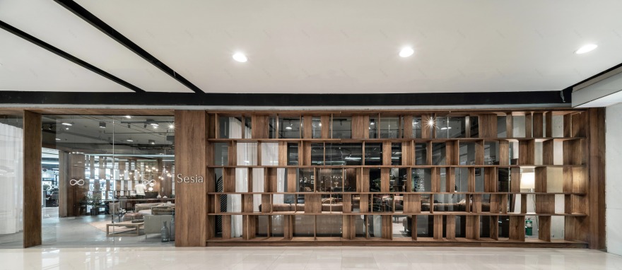
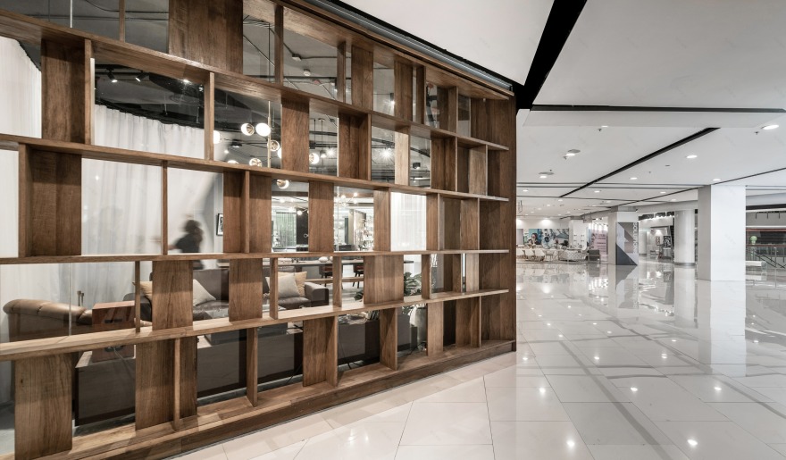
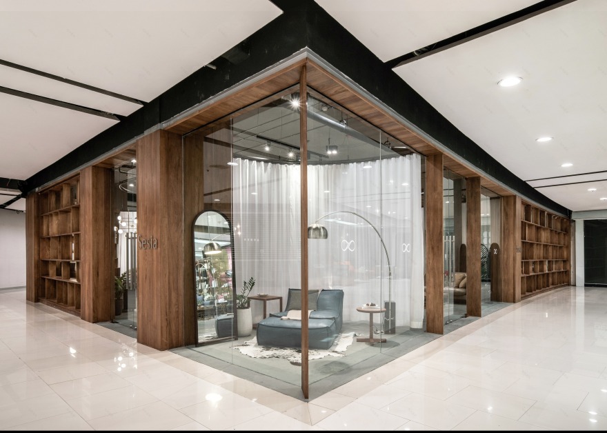
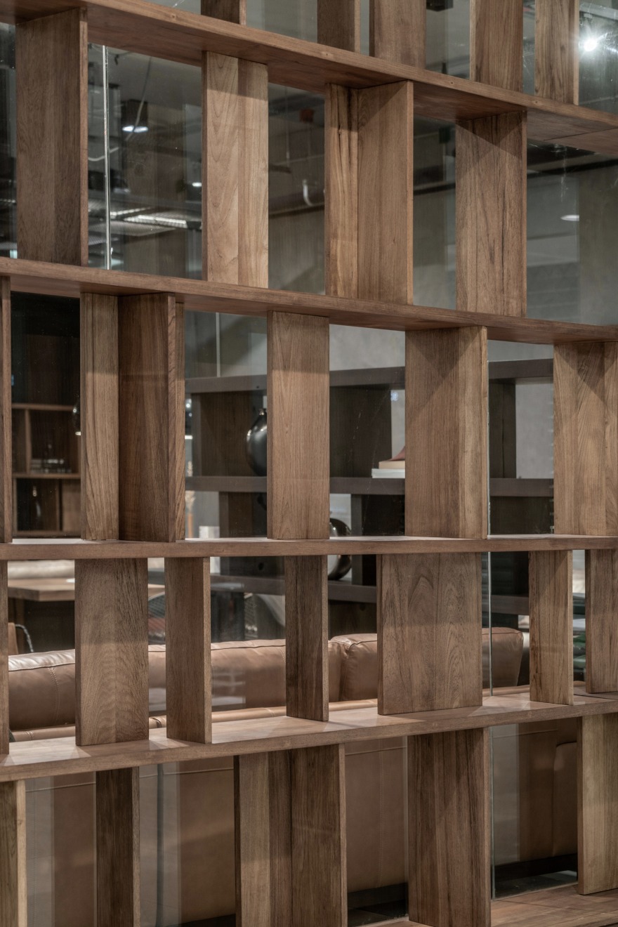
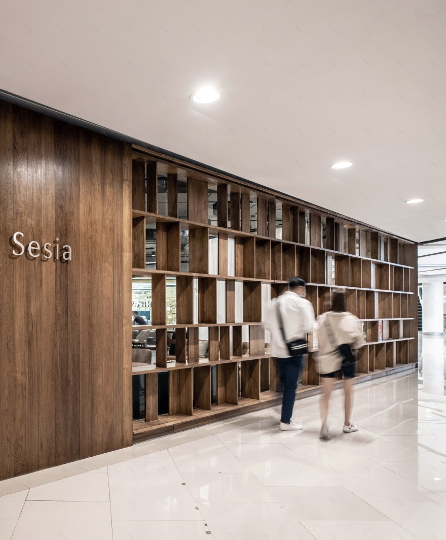
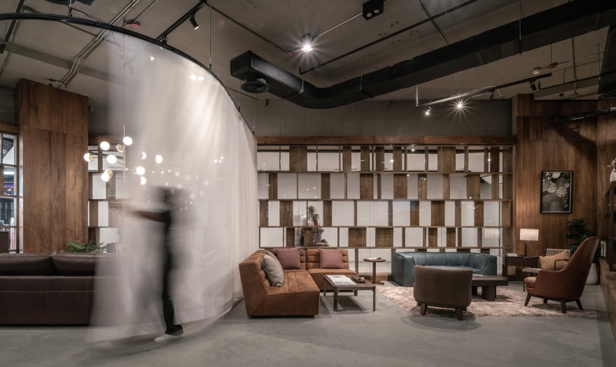
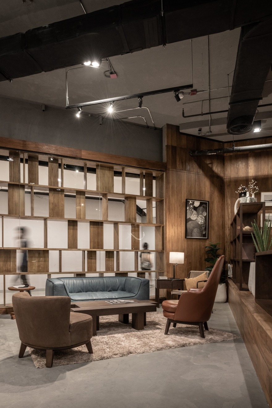
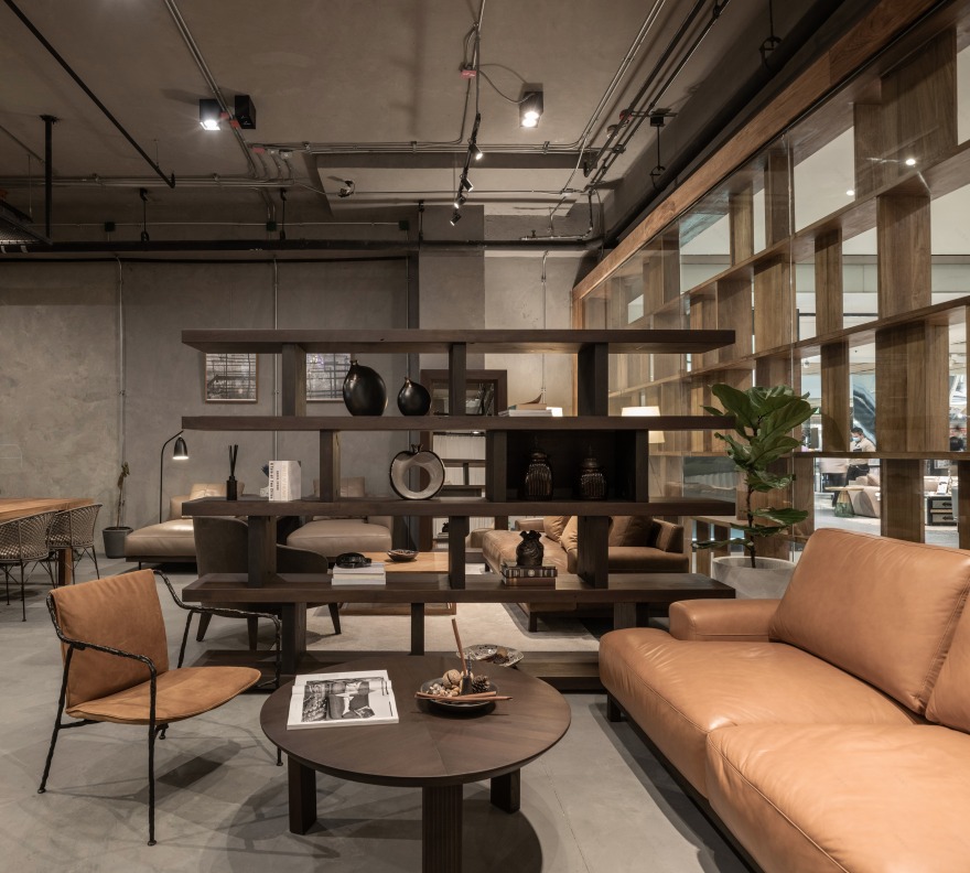
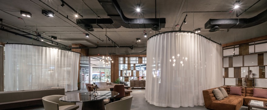
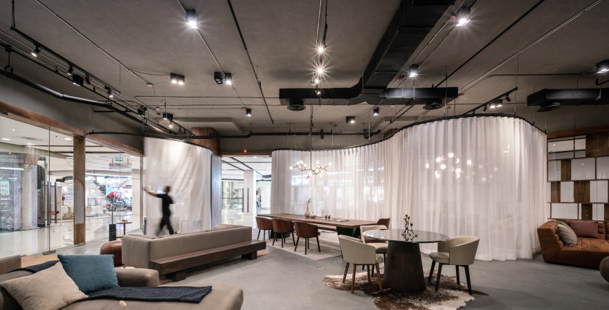
ASWA has designed a new showroom for Sesia, a Thai-furniture brand, inside the shopping mall in the center of Bangkok. The concept of an interior facade inspired by the iconic bookshelf from its brand was applied along the whole length of the showroom tends to grab people’s attention from far away. The impressive technical detail of the book-shelf facade allows the pedestrian to touch and understand the beauty of their product while the view from interior space, the facade works as a backdrop to offer the blur-effect to the traffic outside of pedestrians and allows customers to focus on their products inside the showroom.
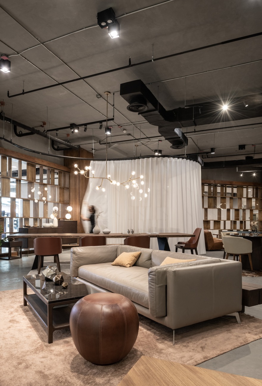
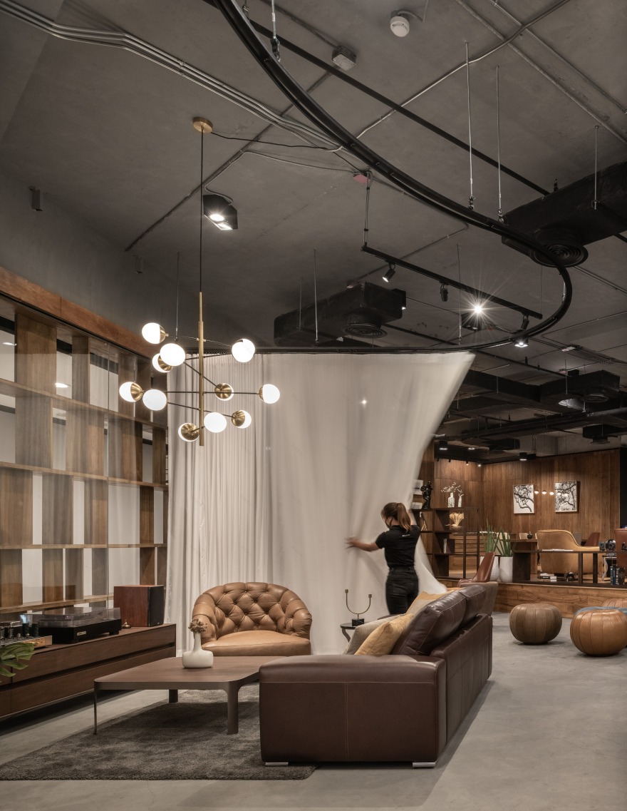
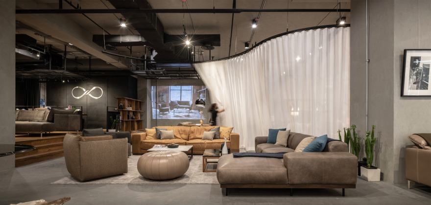
Another essential element of the showroom is curved-rail curtains that separate the space and work well with the interior facade to create a living-like home space. These off-white semi-transparent curtains allow its staff and customers to reform an exhibition space by themselves. It is a gallery of passion for design and craftsmanship, and intend to exhibit arts by projection mapping in the future on the curtains’ surface as a canvas like a gallery space.
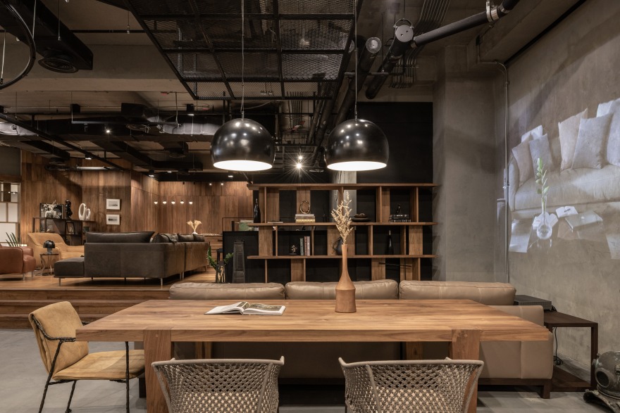
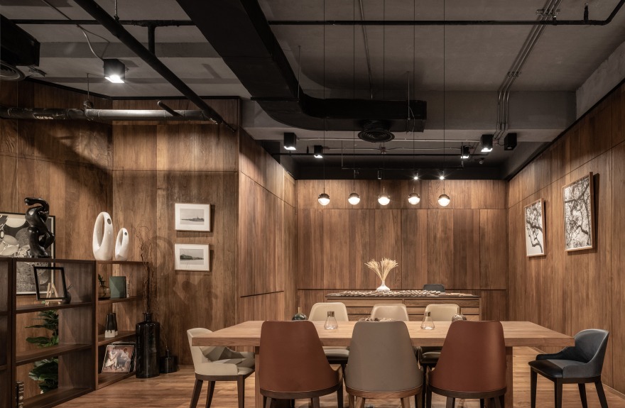
The office of the showroom was raised from the showroom around 50 centimeters, together with a semi-formal business meeting area with the island for a material showcase for customers to review where the studio decided to provide a clear view towards the entrance.
As the material compatibility of this showroom is wood, polished concrete, and steel along with an off-white curtain as the materials’ truth to magnify the furniture inside the showroom. This project is a translation of the brand identity into an architectural language to identify brand identity over and over.
客服
消息
收藏
下载
最近


