查看完整案例


收藏

下载

翻译
LOCATION: KRASNOPROLETARSKAYA ST 16, MOSCOW PROJECT: 01-05.2019 SIZE: 170 M2 CLIENT: VICTOR ILLARIONOV ARCHITECTS: EVGENIY SHCHETINKIN, LEEZA SEMIONOVA, POLINA NIKOLAEVA V12 ARCHITECTS PHOTOS: DMITRY CHEBANENKO TEXT TRANSLATION: EKATERINA PETKOVA
V12 Architects have just finished a new project in the centre of Moscow in the former Soviet printing house “Red Proletarian”, redeveloped now into a large business centre.
As the name suggests, SoupMaker Café make and serve a variety of seasonal soups, but the menu goes well beyond them. The team has already worked on the premises: the very first big restaurant designed by their project is located almost next door.
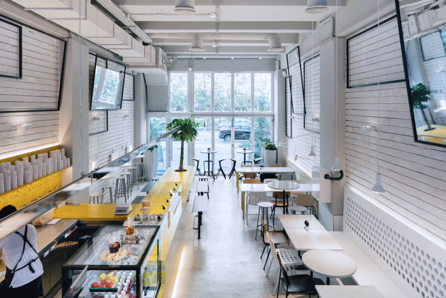
This time they have happened to work with a space, very long and narrow in plan, with 5-metre high ceilings and large floor-to-ceiling glazing on the main facade.
Due to this, the kitchen, lavatories and storage rooms have been squeezed into a two-storeyed box at the very back. The space left is tiled with metal profiles and the niches are accomplished by neon signs tipping off the rooms’ functions. The manager’s office on the second floor is masked by spy mirror film.
The ceilings and ventilation have been painted in neutral gray. The original wall cladding is partly restored and fixed with translucent lacquer. The floor surface and tables are coated with microcement.
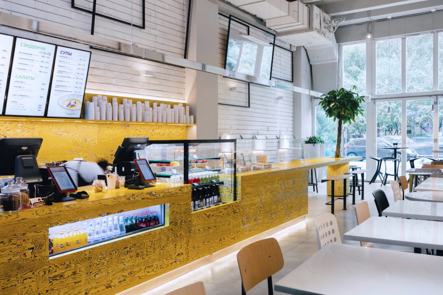
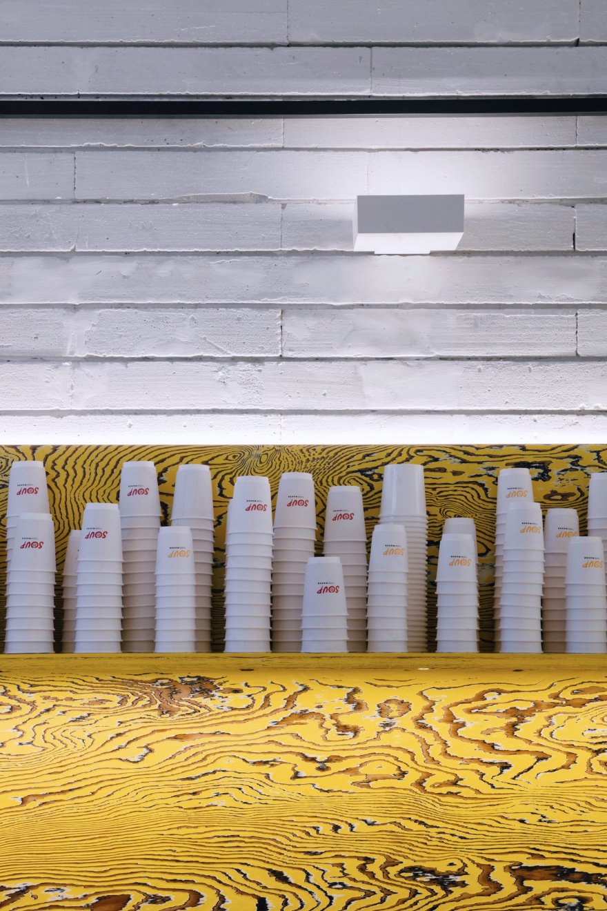
The interior concept represents a combination of the laconic industrial building shell and the bright yellow-painted plywood bar counter, finished in the old Japanese wood technique. The counter is an important zoning element of the entire space and serves several purposes: it is aproduct display, a service area, a cash desk and a communal table with a plant pot in it at the same time.
The Cafe has got two entrances, from the outside and from the inside, for visitors from the business centre. The seats and tables are arranged along the pass between the two. This provides a bunch of opportunities for visitors: long tables for big companies, small tables for couples, and bar stools at the counter for singles.
Lighting design is an integral part of V12 projects. This time Pantrac uplights (wall mounted luminaries) by ERCO have become the solution for the ceiling. This professional optics minimizes shadows and floods the space with soft reflected light. The tables are lit with custom-made small wall sconces combinations and Par pendants by Zerolight. The plywood counter is lit with a long chrome track light, also individually manufactured for the project. Neon signs enliven the space and attract visitors from the street in the evening. Extra zing is Campbell’s lights (Canned light) by Ingo Maurer in the bathrooms.
Except for some pendant lights, most pieces of decoration are custom-made according to the architects’ drawings. Another exception is chairs. Osaka chairs and Koi Booki by Pedrali introduce additional Asian references. A Result chair, a legendary Dutch chair originally produced by Ahrend for educational institutions in the 60-70s, has also fitted in the interior well. It is amazingly lightweight and very comfortable and has been back in production by HAY since 2017.
客服
消息
收藏
下载
最近


