查看完整案例


收藏

下载

翻译
Evoke International Design Inc. was tasked with completing Published on Main with a design centered around traditional finishes to age with the space over the years to come.
Inspired by traditional English coffee houses from the 18th century, which acted as the primary center for communication of news in local community at the time, these public houses were spaces where publications could be distributed, communicating with the masses.
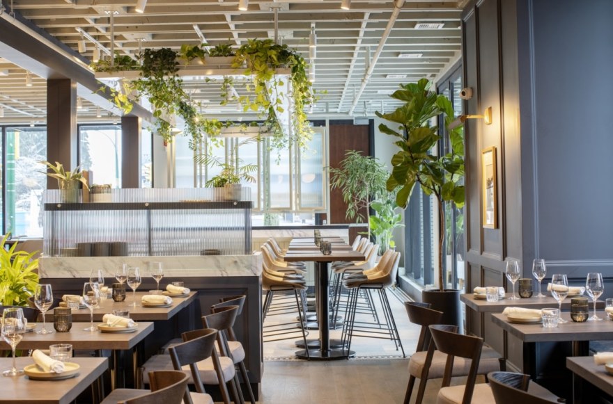
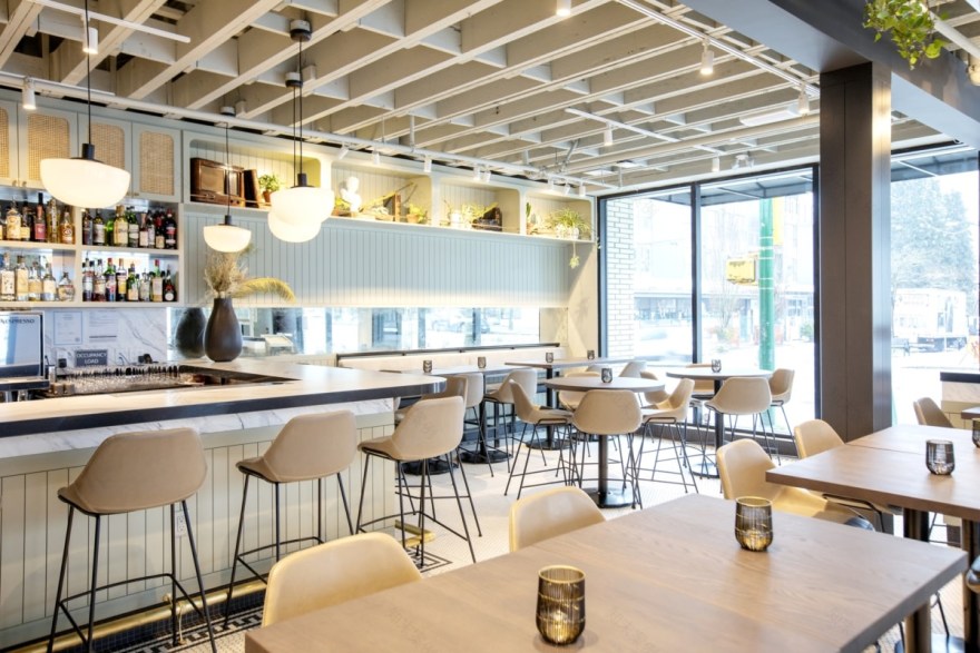
The restaurant was divided into two separate areas. The front, a solarium, where pale green tones and natural cane were used to create a light, more natural aesthetic. Counter height seating allows for a less formal approach as this was integral for a casual and welcoming atmosphere. A suspended plant canopy allows for vines to grow and creep at will. In the rear dining room, traditional panelling was used as a feature. Dark tones to the walls and ceiling over the garde manger bar create a more intimate space for evening service.
Both areas were tonally linked to create a subtle transition from one space to the other, reflecting the considered, locally sourced menu that changes with seasons.
Design: Evoke International Design Inc.
Architect: AMU Architects
Photography: Janis Nicolay
7 Images | expand images for additional detail
客服
消息
收藏
下载
最近


