查看完整案例


收藏

下载

翻译
in-between architects created a durable design for AKVO Hotel without compromising style or comfort, a timeless space for those traveling to Hong Kong.
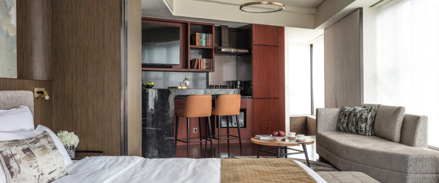
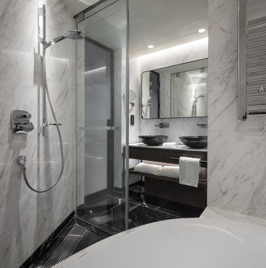
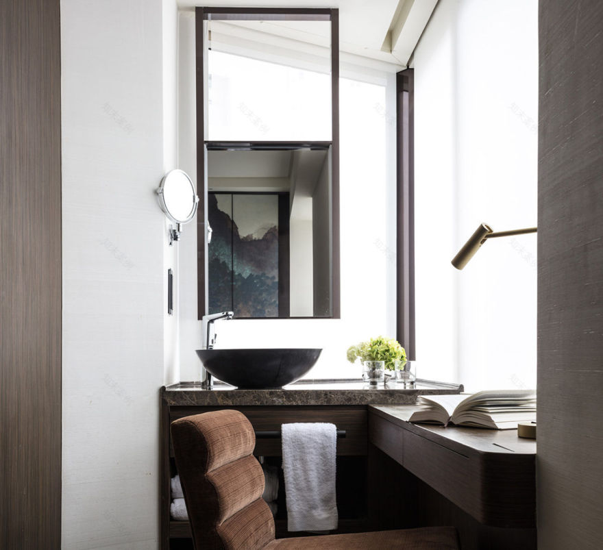
The client gave us considerable design freedom but the brief called for us to be mindful of the property’s function as a commercial hotel. Although we wanted to make it feel like a luxurious, elegant and comfortable home, having form without function was not an option and would not have been economically viable in the long term. The consideration of practicality was, therefore, an essential part of the design process. Everything had to be durable without compromising style or comfort and the interior scheme needed to be timeless to avoid the need for an update after a relatively short period of time.
We also wanted the AKVO to be a platform for Chinese art. The client personally painted all of the abstract artwork, which was inspired by traditional Chinese ink paintings but has been made relevant for a modern interior. The paintings feature on wall panels and wallpaper, depicting elements in nature including mountains, cloud forms, water and cherry blossom.
Particularly clever is the incorporation of the artwork into versatile sliding screens that divide the living area from the bedroom in place of solid walls. The desired image has been printed onto silk and sandwiched between panes of glass with a metal trim. The translucent screens’ benefits are multiple: they allow a degree of natural light to pass through them; they offer guests the option of privacy while in the bedroom; and, whether open or closed, they transform what could have been a nondescript room element into a striking feature.
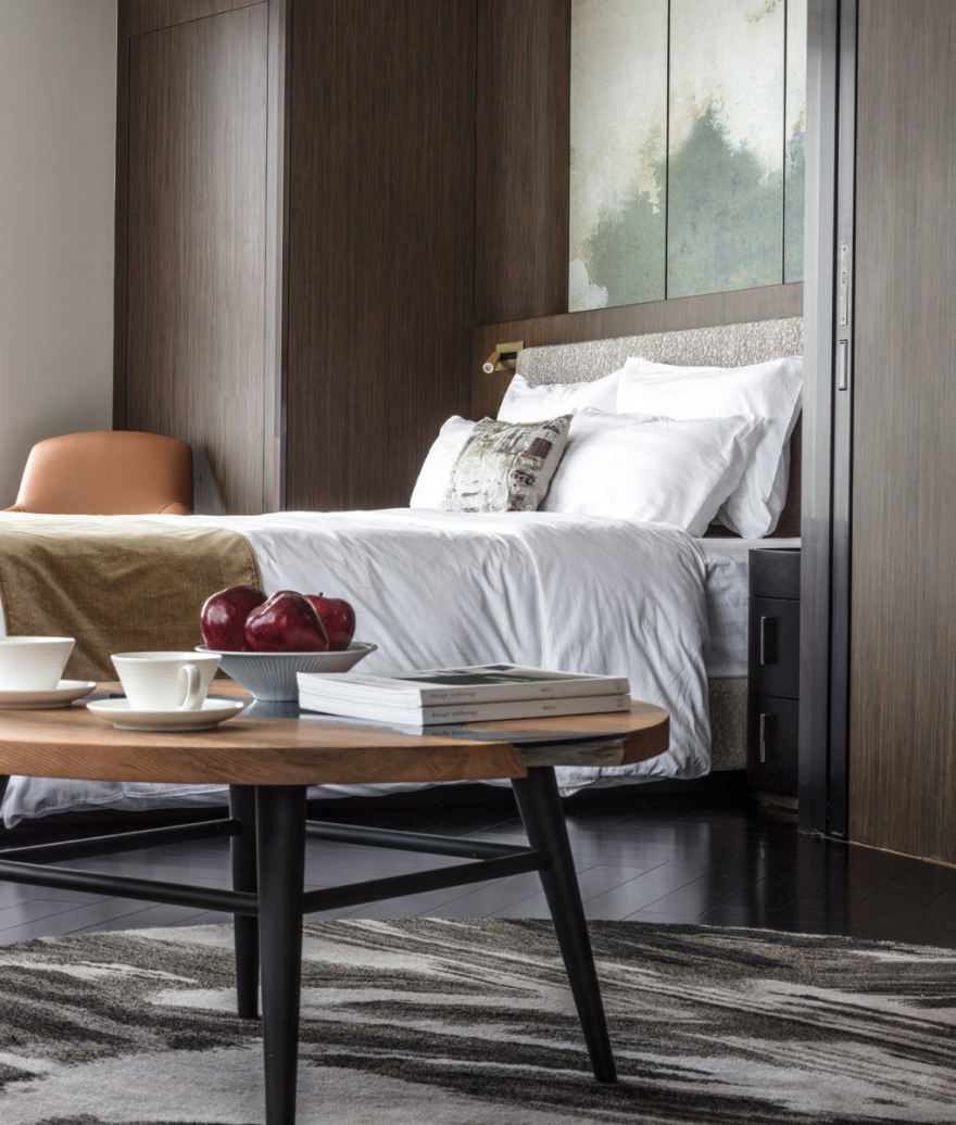
The artwork differs from one room to another in colour and treatment, and sets the tone of the soft furnishings. Materials are used boldly but with a fine articulation to avoid disturbing the tranquil ambience with an overload of pattern or colour. Similarly, floor rugs throughout the hotel have been custom woven to echo the shades and patterns of each artwork they sit with.
The hotel’s architecture also had a bearing on what went on inside. As it is located on a corner site, it has an angular, somewhat masculine exterior. To balance and soften this, we incorporated gently curving furniture and patterns, which also suggest the calm fluidity of water, into the design. Symmetry is achieved through subtle layers of curves. A circular rug is positioned near a round dining table, which is illuminated by a curvilinear light; elsewhere, globular or ring-shaped ceiling lights float above spherical coffee tables.
Flooring materials have been selected for their sturdiness and delineate different areas within the open-planned space. Hardwearing ebony, for example, has been laid in a herringbone pattern, which also gives the expanse of dark wood added visual interest, while contrasting stone tiles are used in areas of high traffic and tick practicality boxes.
Thanks to its unique artwork that varies from room to room but remains true to the overall theme, the AKVO avoids the homogenous look of some hotels, yet simultaneously retains a sense of style cohesion and character.
Design: in-between architects Design Team: Ivan Wong, Carmen Lee, Vincent Chau Photography: Edmon Leong
10 Images | expand images for additional detail
客服
消息
收藏
下载
最近


