查看完整案例


收藏

下载
全屋定制品牌索菲亚(SUOFEIYA)的全新概念店选址于广州天河核心商圈人流量最大的正佳广场,立品设计受邀为品牌打造创新零售空间,希望能在已趋成熟的定制家居行业模式中做出突破。
The new concept store of the full-house furniture customization brand SUOFEIYA is situated at one of the most popular shopping-malls with largest number of visitors in Tianhe CBD, the commercial center of Guangzhou, China. Designed by LEAPING CREATIVE, the innovative retail space aims to explore a new mode of experience in the ever-maturing furniture customization industry.
目前市面上的家居零售店普遍采用以样板间展示产品的展厅模式,此店 200 平方米的面积显然无法容纳大量样板间;而基于设计团队对定制行业的洞察,其核心优势并不局限于单独的家居产品,而是从定制设计到产品生产再到物流和安装的完整服务体系。
Currently, most furniture retail stores in China display products in various sample rooms which normally requires a large scale of showroom space, which is infeasible for this project since the site only occupies an area of 200 square meters. However, with great insight, the design team think that the core competitive advantage of a furniture customization brand does not merely lie in individual products, but more importantly in a comprehensive service system that integrates products design, manufacturing, home delivery and installation.
因此,如何在有限的空间中,向消费者传达服务优势、提供有趣体验并留下深刻印象是设计的首要思考点;设计团队从概念、视觉、空间、互动装置、营销推广等各方面进行梳理及统筹,为品牌的终端店面提出“WORKSHOP”主题概念。
So the key is to figure out how to innovatively convey the brand’s service advantages, and to create impressing customer experience in the limited space. Coordinating store concept, visual identity, floor planning, interactive installations, and marketing strategy, LEAPING CREATIVE came up with the theme of “WORKSHOP” to guide the project.
WORKSHOP:亲身体验、共同参与的工作坊
Workshop: first-hand experience and joint participation
“WORKSHOP”即“工作坊”,命名取其“多人共同参与、亲身体验、相互激发灵感”的核心理念,品牌将通过 WORKSHOP 店面为消费者带来优质生活方式提案。
The "WORKSHOP" concept is based on its core idea of "experiencing first-hand, participating together and inspiring mutually", which is considered an innovative retail mode to provide customers with quality lifestyle proposals.
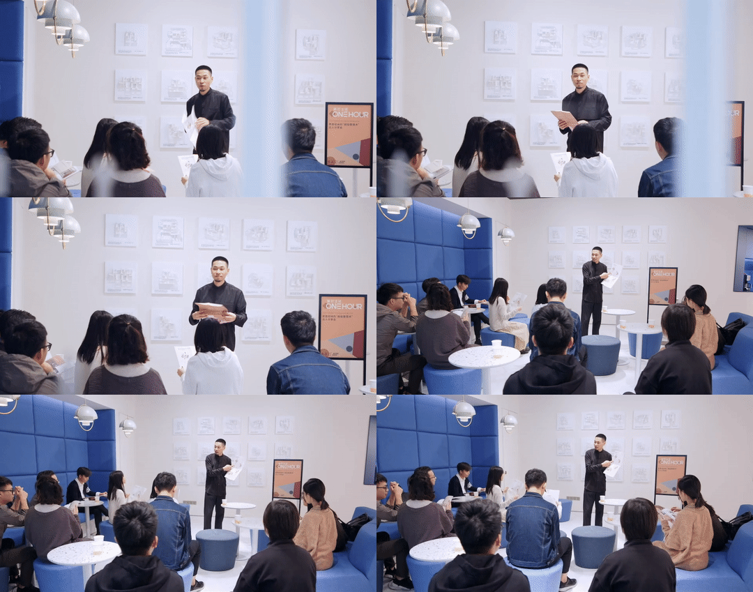
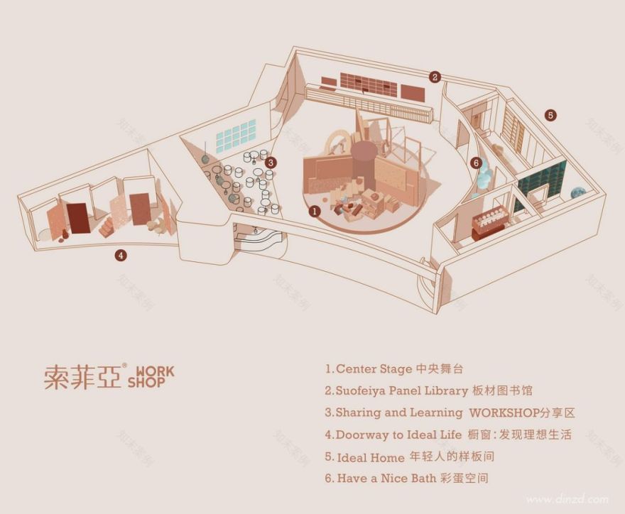
在为这家店做空间规划时,除了展现服务优势的部分,设计师还加入“板材图书馆”与“WORKSHOP 分享区”板块。前者运用多媒体展示帮助访客亲身眼见和触摸材料样板,从而更易想象它们用在家中的样子;而后者为生活达人的日常分享会活动提供专属空间,使得 WORKSHOP 真正成为共同参与、以交流启发灵感的“灵感供给站”。
As planning the layout, the designers added a "Panel Library" area and a "Sharing and Learning" section in the space, in addition to the main area for displaying the brand’s advantages of services. The "Panel Library" uses multimedia to help visualizing how those materials can be utilized in their homes, and the "Sharing and Learning" area is a dedicated space for lifestyle advisers to share their experience, which makes the WORKSHOP an "inspiration station" that allows a group of people to participate in sharing activities together and thereby spark inspirations through communication and interaction.
用装置设计手法讲述故事
Storytelling installations
WORKSHOP 店的一个重要任务,是帮助面对装修无从下手的消费者了解家居装修定制服务优势;区别于行业传统依靠店员口述的方式,设计师选择让空间中的装置来讲述故事。
One of the major goals of the WORKSHOP is to acquaint customers who have no idea of home decoration and furnishings with the brand’s advantages in terms of furniture customization. As opposed to the conventional practice of introducing services by salespersons, the designers tried to let installations in the space to tell the stories.
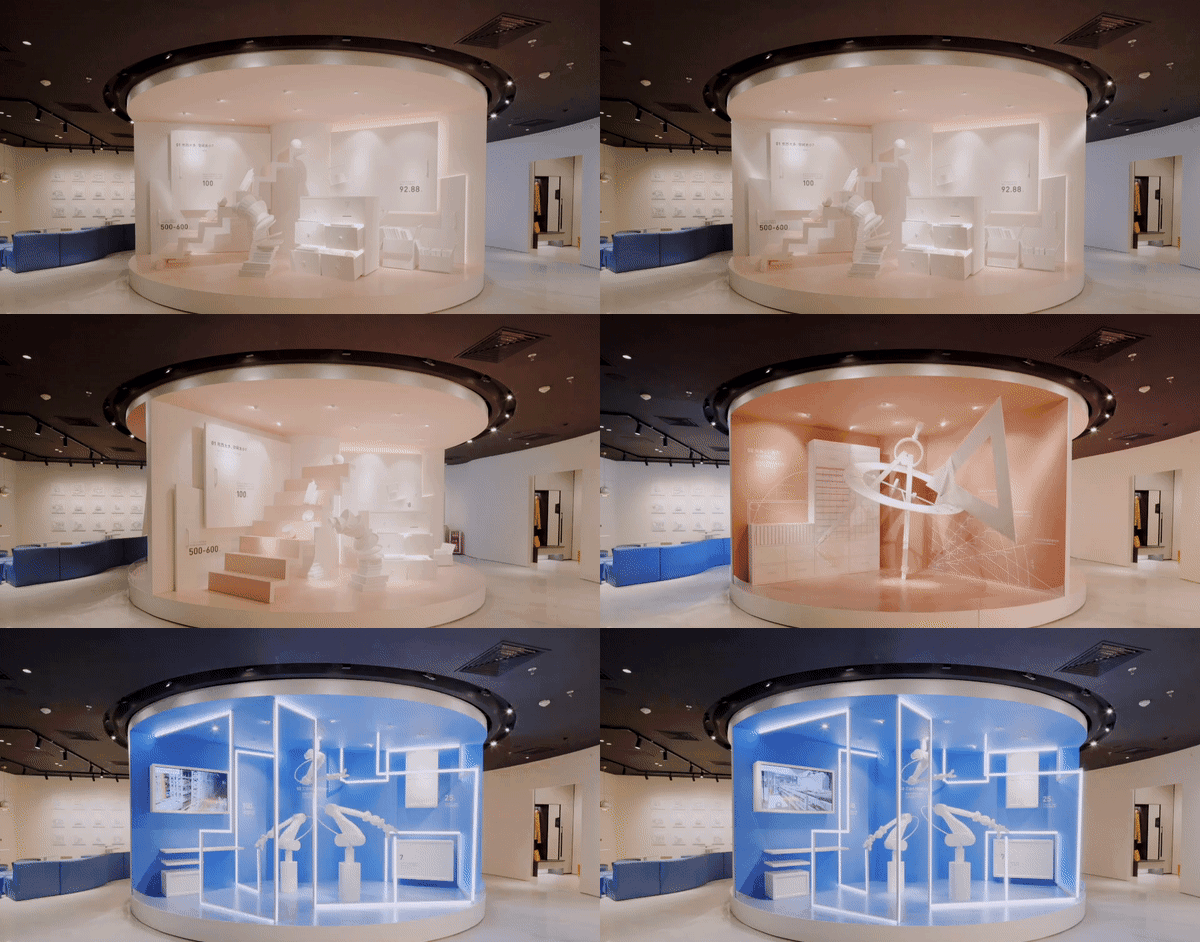
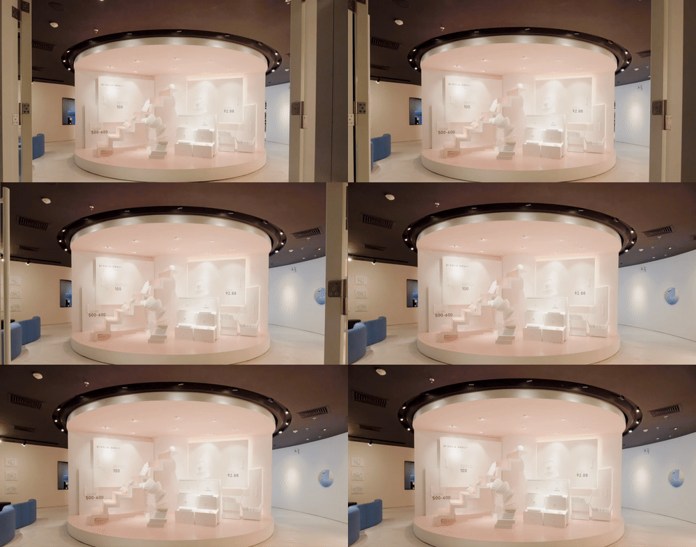
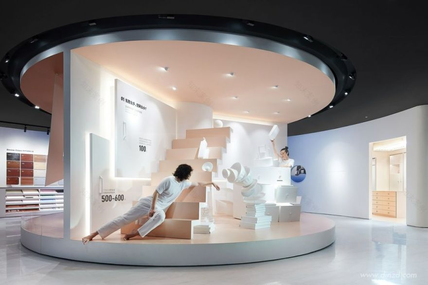
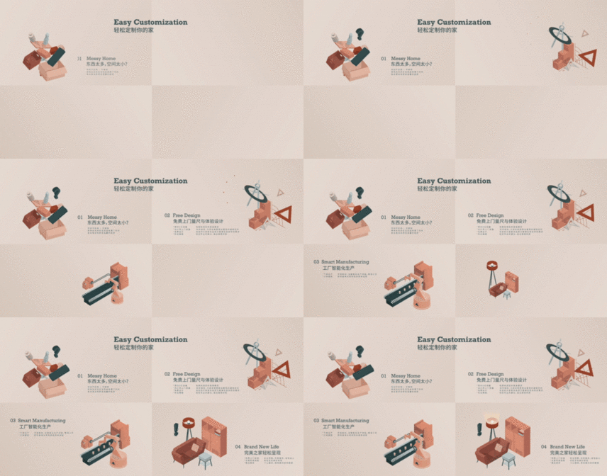
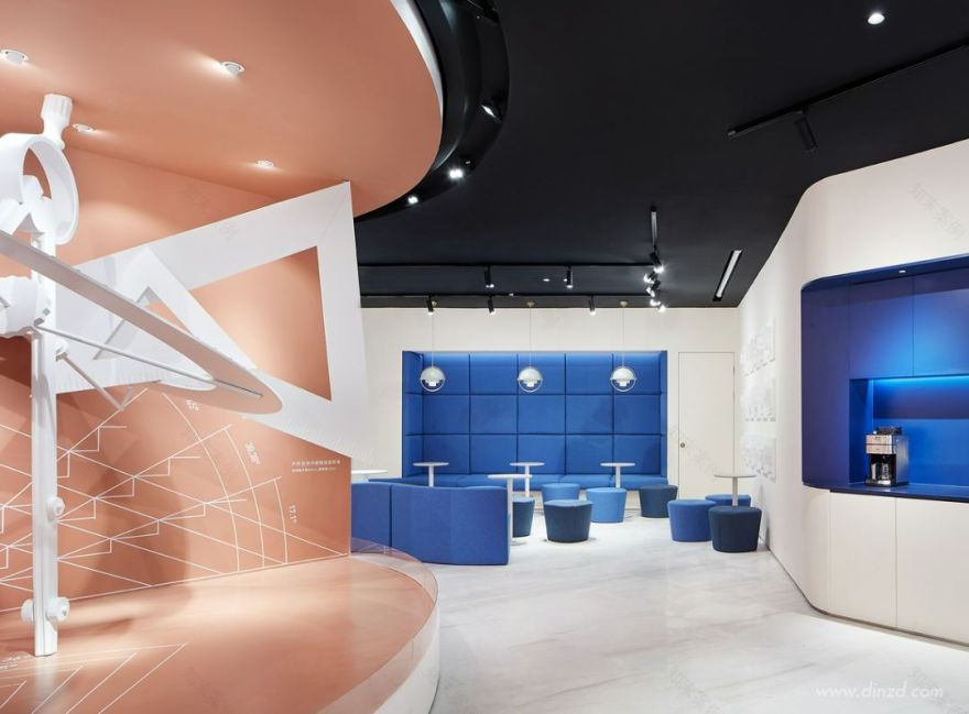
为此,设计师利用铺位原有建筑结构——立于店面中心位置正对入口的大柱子,转化空间布局难点,环绕柱子设置了一个不停缓慢转动的圆形舞台;利用装置设计手法,通过充满戏剧张力的表达方式,用舞台上的三个部分分别展现服务过程中的三个体验环节。其中的第一部分就从日用品杂乱堆叠的夸张场景开始,着力表现人们家中“东西太多、空间太少”而二次装修无从下手的普遍生活困境,希望与刚刚步入店内的顾客产生共鸣。
To that end, they ingeniously made use of the large column at the center area of the original space that faces the entrance, and created a rotating circular stage around it. Featuring installation design approach and dramatic expressions, the stage consists of three sections that respectively present the three steps in the service process. The first section starts with an exaggerated scene where household items are stacked disorderly, which focuses on embodying a common dilemma in people’s daily life, especially in large cities — too many articles in the limited living space yet redesign and redecoration is far from easy, thereby aiming to strike a chord with customers as they stepping into the WORKSHOP.
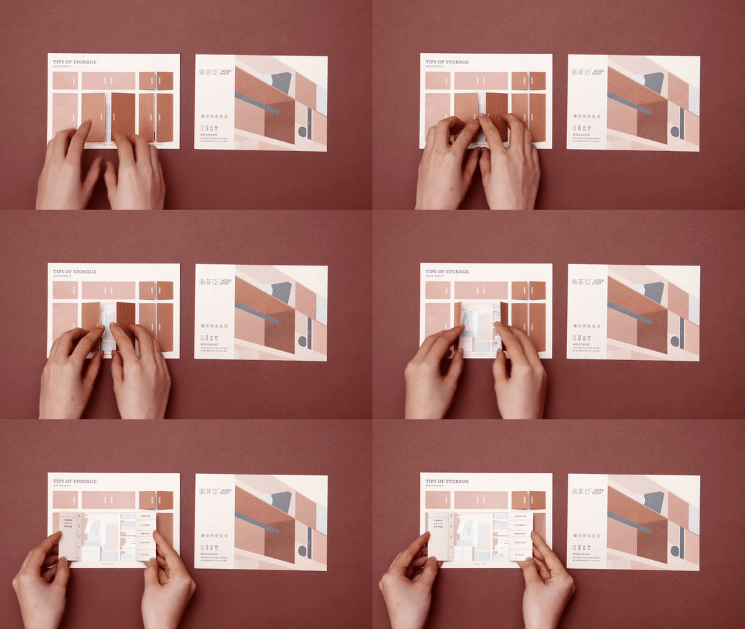
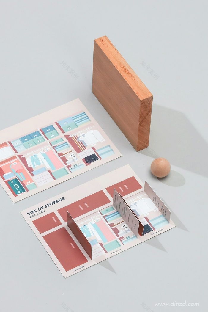
舞台上还藏有互动小惊喜,按下储物柜的抽屉把手便会吐出“收纳 tips”卡片,卡片设计模仿衣柜柜门的打开形式,顾客动手撕开上层即可翻看背面的实用收纳窍门。
There are some surprising interactive details on the stage. When pushing the handles of cabinet drawers, cards with storage tips would come out. The double-layer cards mimic the form of closet, so that the customers can get practical information by flipping the upper layer cards like opening a closet door.
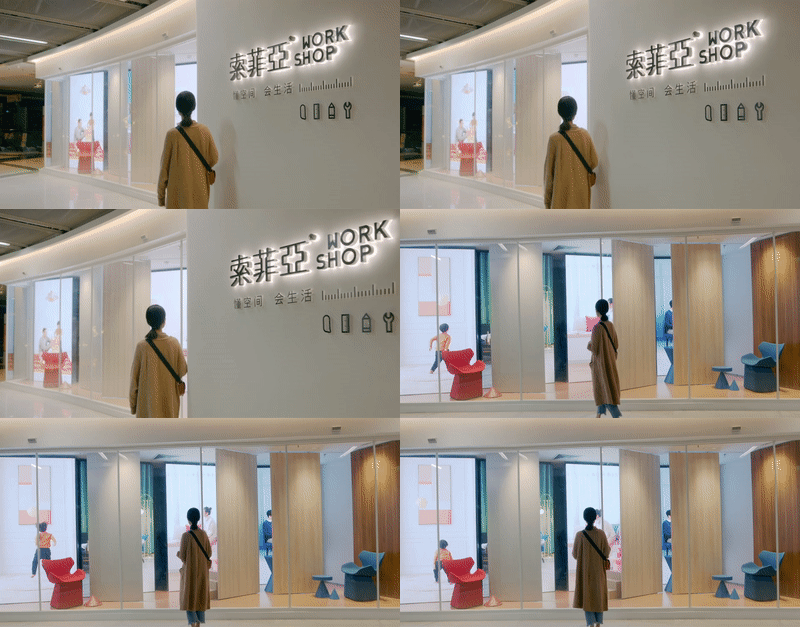
而外立面的橱窗装置则采用动态机械与视频画面结合的方式:竖立在前的柜门板像舞台幕布一样来回移动,随机露出屏幕画面;而画面中分别轮播着单身、年轻伴侣、及三口之家等不同类型家庭的生活画面。设计师希望以此表达打开柜门获得更多优质生活的概念,对产品卖点进行趣味性表达。
On the other hand, the store window display installation also refers to the door-opening motion. The cabinet door panels in the front keep moving back and forth to reveal the video screens randomly. The videos keep playing the life scenes of singles, young couples, families of three and other family types in turn. Through such design, the designers hope to convey the connection between quality lifestyle and the products both provided by the brand.
更贴合都市年轻人生活方式的故事样板间
Showrooms that well fit into urban young people’s lifestyle
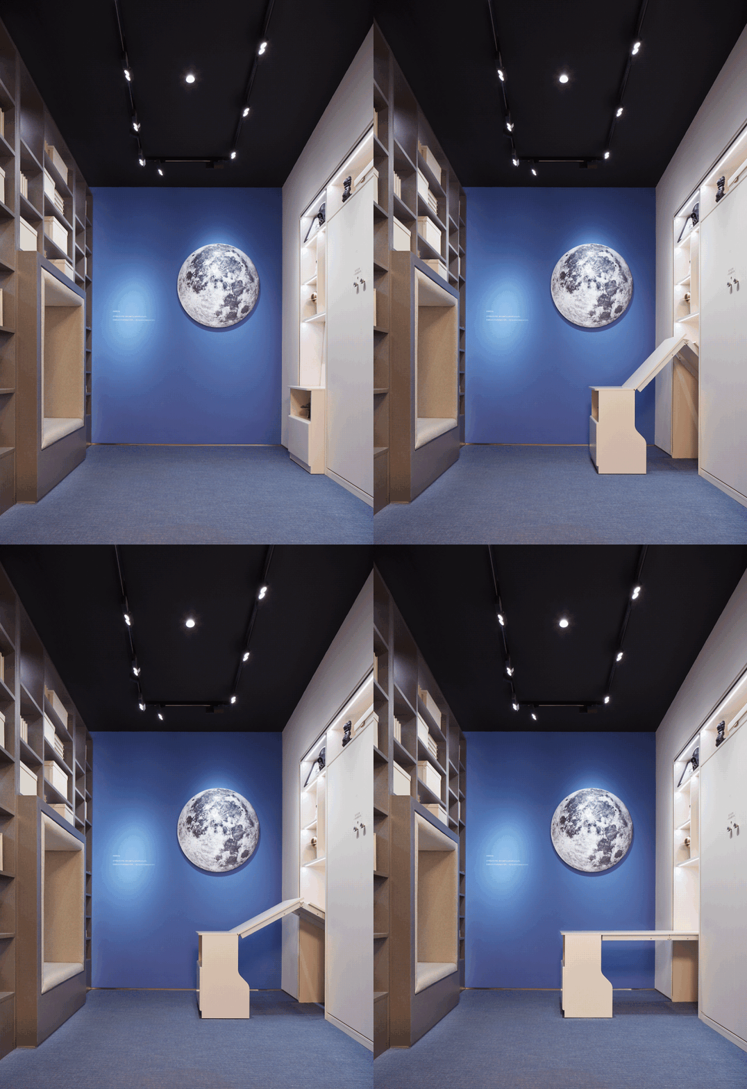
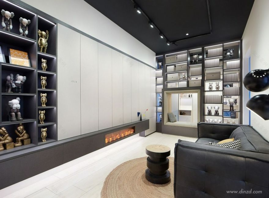
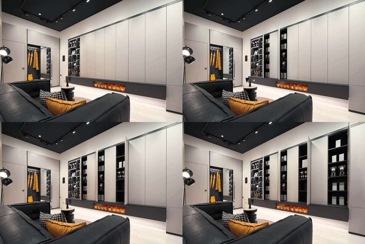
与传统样板间不同,WORKSHOP 店内参照都市常见生活场景构建了三个故事样板间,分别是喜欢买买买的女生的衣帽间、文化青年的书房兼卧室、以及热衷收集潮品的家庭的客厅。
The WORKSHOP has three special storytelling sample rooms that were designed based on common scenes of urban life, including a walk-in closet for girls who are enthusiastic about shopping, a study & bedroom for literature-loving young males and a living room for families keen on stylish items collection.
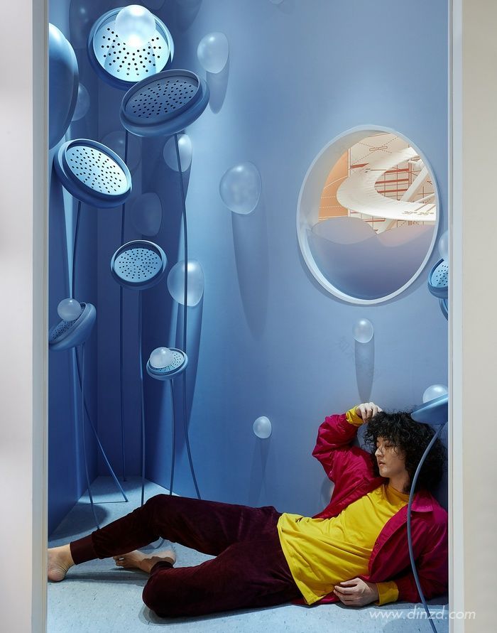
三个样板间夹角之间的三角区域设置了充满泡泡的蓝色角落,结合香薰及音响效果,形成彩蛋空间;而正面弧墙及圆形窗口,则与外窗外的圆形舞台形成呼应。
The intersection angle of the three showrooms forms a triangular area, which features a blue corner with bubbles, pleasant fragrance and audio effects, making it a bonus space. Its arc-shaped wall and the round window echo the circular center stage outside it.
统一视觉调性塑造全方位的完整体验
Full-range and unique experience created through unifying visual effects
由 WORKSHOP 概念出发,从品牌 LOGO 及辅助图标,到店内的物料也均由立品设计团队操刀,以保证完整统一的品牌形象。通过在店内设置的可供取阅的《探店攻略》,顾客的整个逛店过程成为了更具仪式感的新奇体验;而礼品纸袋和作为延伸品的绒布面托特袋,则帮助这种独特体验走出空间,传递给更多的受众。
In order to build a unified brand image, the brand logo and icons as well as the supportive materials in the WORKSHOP were all designed by LEAPING CREATIVE. Exploration Guidebook is accessible to customers, making the experience of exploring the space more novel and giving it a ceremonial sense. Besides, the paper gift bags and velvet tote bags are helpful to bring the unique experience out of the store and communicate to more target customers.
物料图片
项目地点|| 广州市
Location| Guangzhou, China
空间面积
200 m2Area|200 m2
设计公司
Design firm| LEAPING CREATIVE
设计总监|| 郑铮
Design director| Zen ZHENG
项目经理|| 陈常
Project manager| CC CHEN
品牌策划及视觉|| 陈常、黄绮琳、肖文婷、陈策御
Brand planning & visual identity
CC Chen, Qilin Huang, Wenting Xiao, Evan Chen
店面空间|| 梁纪颖、刘瑞学、姚丁凌、陈瑜
Spatial design| Jiying LIANG, Ruixue LIU, Dingling YAO, Yu CHEN
互动装置|| 黄绮琳、兰颖、黄敏聪
Interactive installation design
Qilin HUANG, Ying LAN, Mincong HUANG
营销设计|| 陈常、洪加路、黄绮琳
Marketing design | CC Chen, Jialu Hong, Qilin Huang
撰文 | 洪加路
Text | Jialu HONG
视频摄制 | 赞制作
Video production | Jank Production
空间摄影 | 黄早慧、20Animagis
Photos of interior spaces | Zaohui HUANG, 20Animagis
平面摄影 |
Photos of graphic designs | Anson
模特造型 | Zoey
Model stylist |ZoeyLEAPING CREATIVE
索菲亚
创新零售概念店
图纸呈现
平面图
LEAPING CREATIVE
索菲亚
创新零售概念店
公司介绍
立品设计创始人、设计总监 /郑铮
Leaping Creative 立品设计是一家品牌体验设计咨询公司,为不同行业的品牌提供形象策略和体验设计服务。团队由来自商业调研分析、品牌视觉传达、空间体验塑造、互动装置及材料研究等各个领域的优秀设计师构成,擅长运用跨界设计思维与跨领域设计手段,基于品牌商业策略,为消费者打造独特体验。
Leaping Creative is a branding design consultancy. Our team is formed with designers from various background including business research, retail space design, visual design, interactive installation and material study, together to help our clients build unique customer experience.
郑铮毕业于英国伦敦艺术大学中央圣马丁学院,获产品设计荣誉学士学位,曾获英国皇家特许设计师协会 (CSD) 全英大学生设计大赛产品设计类金奖。毕业后曾于伦敦从事产品设计、品牌设计、市场推广等不同职能的工作,多元的工作经历给予郑铮多维的视角,使他相信多元设计思维与品牌商业策略的有机结合将为品牌创造最大价值。回国后于 2010 年创立 Leaping Creative 立品设计,商业设计作品获多项国内外知名大奖,2017 年获评“40under40 中国设计杰出青年”。
Graduated with a degree of BA (Hons) Product Design from Central Saint Martin College of Art and Design, University of the Arts London, Zen Zheng has worked in London in different fields including product design and branding sector. His mixed working experience gave him a multi-dimensional perspective on design, and the belief that a good design should be both creative and problem solving. Zen founded Leaping Creative in 2010, and was awarded ’40 Under 40 Chinese excellent designer’ in 2017.
供稿 / Leaping Creative 立品设计
客服
消息
收藏
下载
最近


