查看完整案例


收藏

下载
当日地陷东南,这东南一隅有处曰姑苏,有城曰阊门者,最是红尘中一二等富贵风流之地。
Long ago the earth dipped downwards in the southeast,And in that southeast part was a city named Gusu;And the quarter around Changmen Gate of GusuWas one of the most fashionable centres of wealth and nobility in the world of men.
01 背景 BACKGROUND
位于苏州市姑苏区的文化创意产业园内,占据着整个建筑体,是一个超级摄影工作室--MU 慕婚纱摄影。
“慕”来源于法语 Amour,意为爱。
A super photography studio, Located in the Cultural and Creative Industry Park in Gusu District, Suzhou City, Occupying the entire building. The name “MU”()comes from the French word Amour, which means love.
品牌主打故事感、情绪感、仪式感系列婚纱照,巧妙运用创意园旧工业风建筑,在人文气息浓郁安静的环境中创作。
The studio focuses on shooting wedding photos with a sense of story, emotion, and ceremony. Cleverly use the old industrial-style buildings in the Creative Park. Create in a quiet and culturally rich environment.
材质 MATERIAL
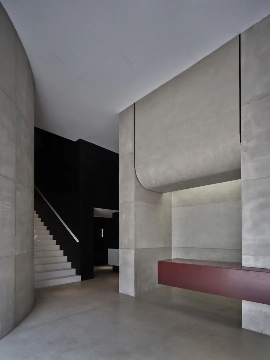
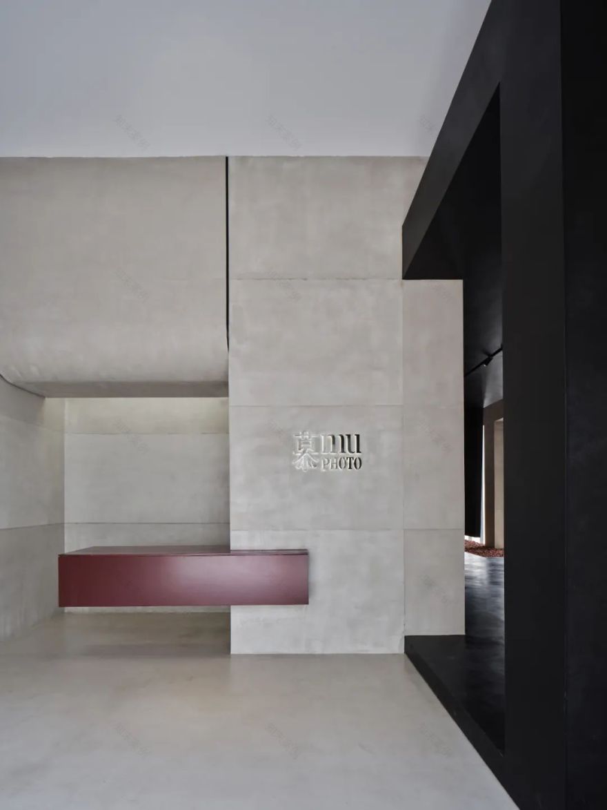
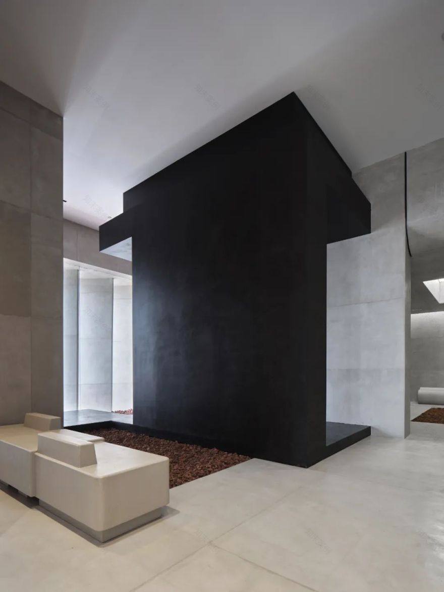
灰色的艺术水泥作为墙面和地面的主要材料,为简洁的空间赋予神秘而原始的质感。
Grey artistic cement is used as the main material for walls and floors, giving the people standing in this concise space a mysterious and primitive feeling.
搭配黑色艺术涂料与灰色系艺术水泥形成视觉反差,小部分的辰砂红成为空间的唯一色彩。室内与周围的建筑,在视觉上形成了对比。
Black art paint and grey art cement form a visual contrast. A small part of cinnabar red becomes the only color in the space. There is a visual contrast between the interior and the surrounding buildings.
03 色系灵感 INSPIRATION OF COLORS
色彩灵感来源于苏州建筑,采用经典的「白墙黛瓦」的配色。五行中金为白色,水为黑色,火为红色,代表中国古代传统的色系,在空间里以现代的形式演绎。
The colors are inspired by Suzhou architecture, which uses the classic "white wall and black tiles" color scheme. In the theory of five elements, the color of metal is white, water is black, and fire is red. These color systems representing ancient Chinese traditions, are interpreted in a modern form in the space.
灰 GRAY
灰是“白”经过岁月的洗礼,加上粗糙化的哑面纹理,赋予体块最原始的材质。
Gray is "white" fading over years. The gray color and rough matte texture reflect the most primitive material of the block.
黑 BLACK
黑为“哑黑”。与青黑对比,饱和度更高的色彩,或与灰同处一个空间内,或单独处之,给人一种高级感。
Black is "matt black". In contrast to blue black, this kind of color with higher saturation, whether used with gray or alone, will give people a sense of high-level.
红 RED
此处的红,称之“辰砂”,是指中国传统色彩名称。据五行之说,南方属火,故又以赤为南方之色。让人联想到:太阳、火焰、热情,运用此色以示醒目。
The red here, called "Cinnabar", refers to the traditional Chinese color name; according to the theory of five elements, the south is fire, so red is the color of the south. It is very eye-catching and reminiscent of the sun, flames, and passion.
04 空间塑造
SPACE SHAPING
外立面的其中一角,墙体以斜切的方式,将人们的视觉中心引入到室内;整齐排列的竖向体块,平添一种端庄的秩序感与节奏感。
In one corner of the facade, the wall is obliquely cut to introduce people’s visual center into the room; the neatly arranged vertical blocks add a dignified sense of order and rhythm.
我们把江南园林的廊道注入室内空间中。入门沿着视线往右看,是一条直廊,用于原创作品展示,以黑色的顶、地包裹着。靠近窗的两面片墙不完全落地,人们径直行走移步异景,室内外之间似乎可进行对话。
In designing the indoor space, we adopted the corridors of Jiangnan gardens. Looking to the right along the line of sight, the entrance is a straight corridor for the display of original works. The whole corridor is wrapped with a black roof and floor, and the two walls near the window are not completely floored. When people walk straight inward, they will see different sceneries, and there seem to be conversations between indoors and outdoors.
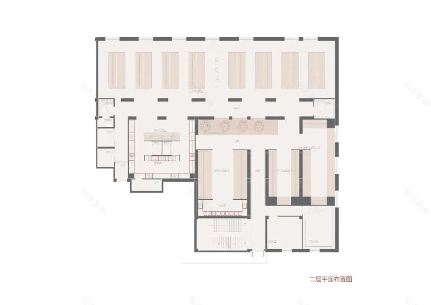
二层礼服区过道,模仿江南园林中的复廊。两廊之间隔着一道墙,两条过道都可以通行,透过墙上的漏窗或门洞,可观看对面的景致。
The aisles in the formal dress area on the second floor mimic the complex corridor in Jiangnan gardens. There is a wall between the two corridors, and both aisles are passable. People can watch the scenery on the opposite side through the leaky window or door opening on the wall.
在采光面单一的空间中,我们想创造出更多的自然光线,便利用墙顶之间的缝隙,布置一条条灯带,看上去仿若由天棚外洒下来的光。
In such a space with a single lighting surface, in order to create more natural light, we make use of the gaps between the tops of the walls to lay light strips, which looks like the light spilled from the ceiling.
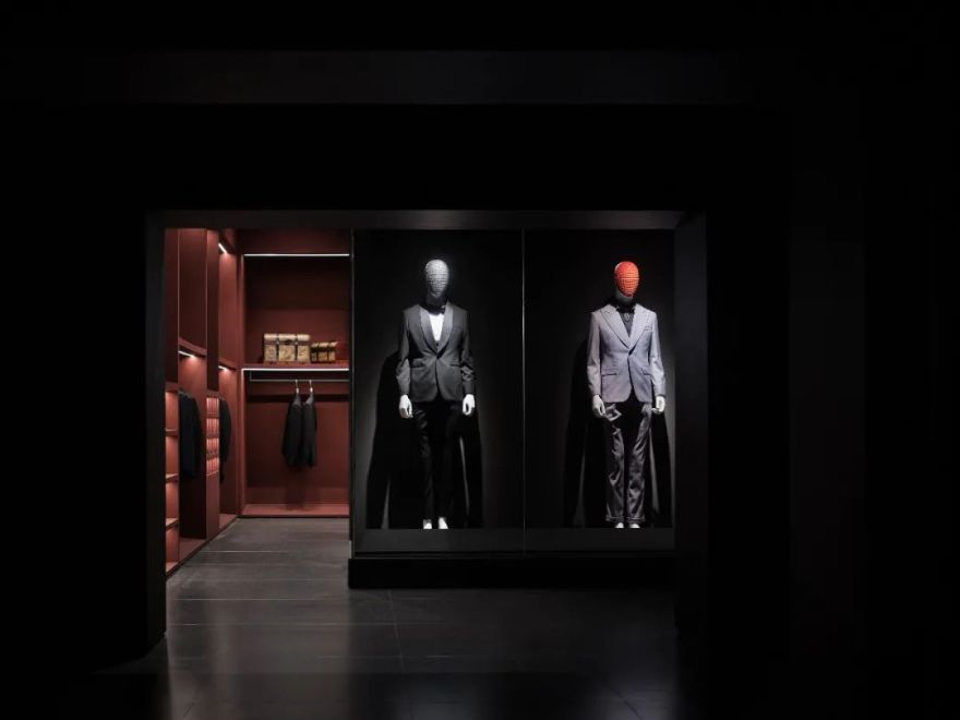
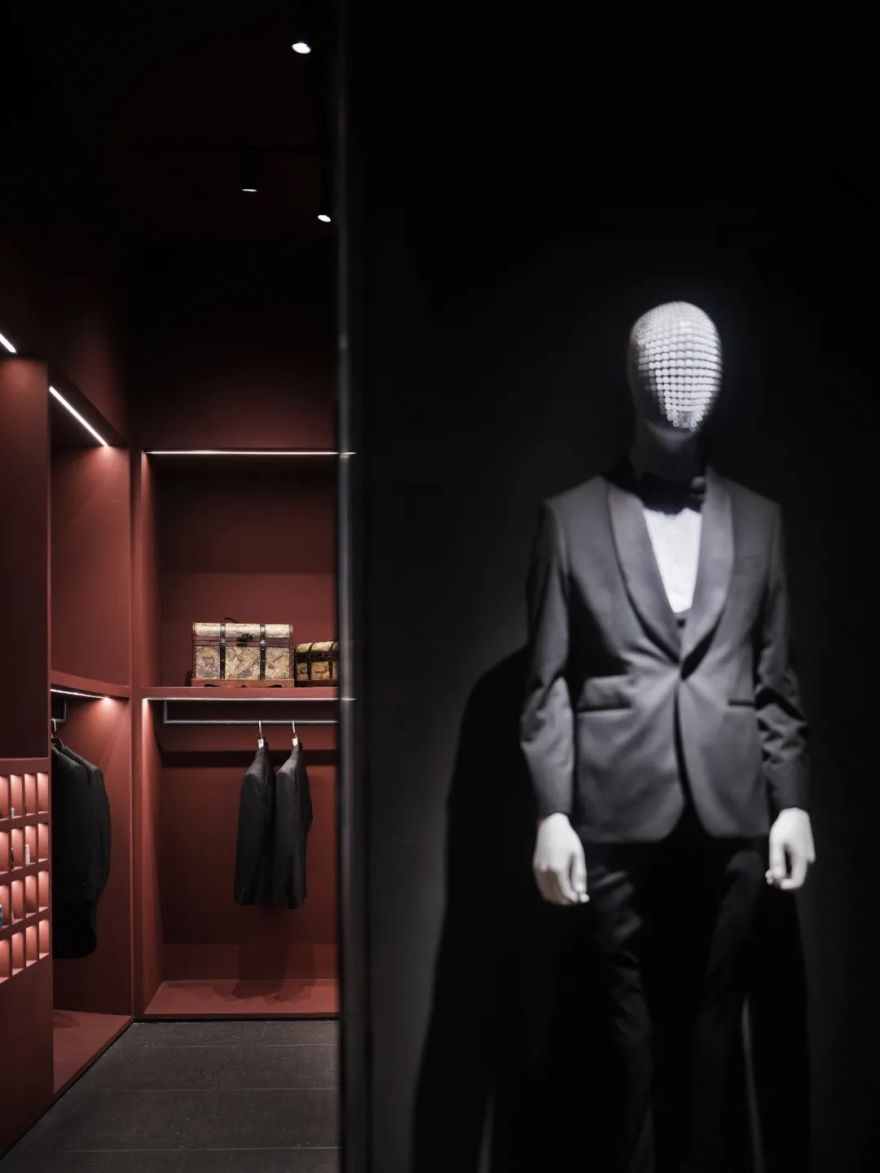
二层礼服区的“高级黑”,是衬托婚纱的色系。非黑,无以显其白;非白,无以利其黑。整体空间用方体来进行阐述,顶面与墙连成一道红色弧形,打破空间的平静感。
The "premium black" in the formal dress area on the second floor is the color to set off the wedding dresses. If it is not black, there is no way to show its white; if it is not white, there is no way to benefit its black. The overall space is illustrated with cubes. The top surface and the wall form a red arc, breaking the calmness of the space.
空间镜头的镜面世界让人犹如置身于虚幻的门洞之间,沉浸在无限序列的空间中。
The mirror-like world in the space lens makes people feel as if they are in an illusory doorway and immersed in an infinite sequence of space.
05 几何 GEOMETRY
序列 Sequence
选片区和礼服区都应用片状的墙面,竖立于空间中,充满秩序感与体块感的隔断作为空间的分隔。展示区采用回字形的艺术吊灯,光线均匀散落在展台上,为原本冷静的结构,增添不少氛围。
Both the selection area and the formal dress area use sheet-shaped walls, which are erected in the space, and the orderly block partitions are used as the separation of the space. The exhibition area adopts the art chandelier in the shape of a back shape, and the light is evenly scattered on the booth, adding a warm atmosphere to the original calm structure.
穿插 Insertion
前台与展示台都在原本的几何空间中,插入横向的方体结构。这种相互穿插的形式,离地横向生长,如同浮木漂浮在水面。
In the original geometric space, both the front desk and the display stand are inserted into a horizontal cuboid structure. This inserting form grows horizontally off the ground, like driftwood floating on the water.
体块 Block 空间的规划是以体块相互之间的关系,形成各自独立的区域。
Space planning is based on the relationship between the blocks to form separate areas.
06 融合 MIX
灰、黑、红三种材料之间的碰撞与平衡,以几何的室内造型,构建空间的视觉感官冲击。
Collision and balance among gray, black and red materials, Constructing the visual sensory impact of the space, with geometric interior modeling.
在这座人文气息浓郁的城市一隅,以一种新的姿态生长着
In a corner of this culturally rich city, it is growing with a new attitude
室内设计:品界设计
Interior Design: Scope Design
主创设计师:梁剑峰/翁德
Chief Designer: Liang Jianfeng/Weng De
项目地址:江苏-- 苏州
Project Address: Suzhou, Jiangsu
空间类别:商业空间
Space Category: Commercial Space
设计风格:现代主义
Design Style: Modernism
灯光设计:有束光
Lighting design: Delicht
材质研究:比直涂装
Material Study: Bizhi coating
项目面积:3000 m2
Project Area: 3,000 m2
2014 年,翁德与梁剑峰在福建闽南的漳州共同创立品界设计。公司名称源起用心对待每个设计案例,把每一次的设计都作为一个细心品味的过程,让设计无界……翁德&梁剑峰作为公司主创设计师,每个项目都与团队共同交流完成,同时凭着敏锐的设计直觉,完成了一个个大中小型项目,多年来荣获行业内多项大奖:德国 IF/意大利 A Design Award/美国 IDA/亚太区室内设计大奖等。
翁德、梁剑峰
创始人兼主创设计师
客服
消息
收藏
下载
最近


