查看完整案例


收藏

下载
又一家由Atelier A为Fine品牌设计的店铺在上海乌鲁木齐路开业,这家迷你的西洋果子店面积仅20多平方米,店面宽不到3米,给空间设计提出了极大的挑战。为最大程度利用空间,满足陈设西洋果子、制作茶水饮料和提供堂食的需求,顾客与店员活动区域由一排柜台隔开,分别从两扇门进出,笔直的动线方便活动,双方互不干扰。
▼门店外观,exterior view ©田炳珉
A new Fine store designed by Atelier A has opened on Wulumuqi Road in downtown Shanghai. This mini-sized yougashi store occupies an area of just over twenty square meters, with a width of less than three meters. How to display exquisite yougashi desserts and at the same time provide drinks and eat-in service in this small shop poses huge challenge for space design. Maximum usage of the space is achieved by straight circulation routes. Areas for staff and customers are divided by a counter with separate entrances so that they do not get in each other’s way.
▼顾客与店员活动区域由一排柜台隔开 staff and customer areas divided by the counter ©Atelier A
▼室内概览,interior view ©田炳珉
临街的店门是又一处巧妙的设计,由于乌鲁木齐路地处繁忙地段,如朝外开门会影响过往行人,而朝内开则会损失很大一部分店铺面积。设计师于是将两扇店门构成向内三角形,朝外开门,解决了上述难题,又为等外卖或抽烟的顾客留出空间。三角形虽面积不大,却是从外到内的重要过渡空间,沿袭了Fine品牌一贯注重店铺内外空间交流的特点。
▼设计草图,sketch ©Atelier A
The façade is another innovative design. Outswing doors might obstruct passengers on the busy street. However, inswing doors would waste a large proportion of the small shop area. The solution to the dilemma is an inward triangle made by two outswing doors. Meanwhile, this triangle creates space for customers to smoke or wait for takeaways. It is also an important liminal space from the exterior to the interior, as the outdoor/indoor interaction is a feature of all Fine stores.
▼巧妙设计的三角形店门 liminal triangular space by two outswing doors ©田炳珉
店铺门面使用故意做旧的材料,与周围老城区风貌协调,同时呈现有趣的对比。两扇店门一边用雅致的深色榄仁木,与店铺招牌相同,另一边用褪漆的淡绿色铁皮门框,照映Fine的品牌颜色。顾客走进店堂会发现,这组精巧与粗糙的对比延伸至内部装饰。
The two doors are deliberately made old to match the surrounding old town area, but using different materials—one made of stylish dark wood, the same as the signboard, the other faded light green iron, Fine’s brand color. When entering the store, customers will find that the interesting contrast of refined vs. crude extends to the inside.
▼从室内望向淡绿色铁皮门 view to the green iron door from internal space ©田炳珉
▼展示区细部,cake display area ©田炳珉
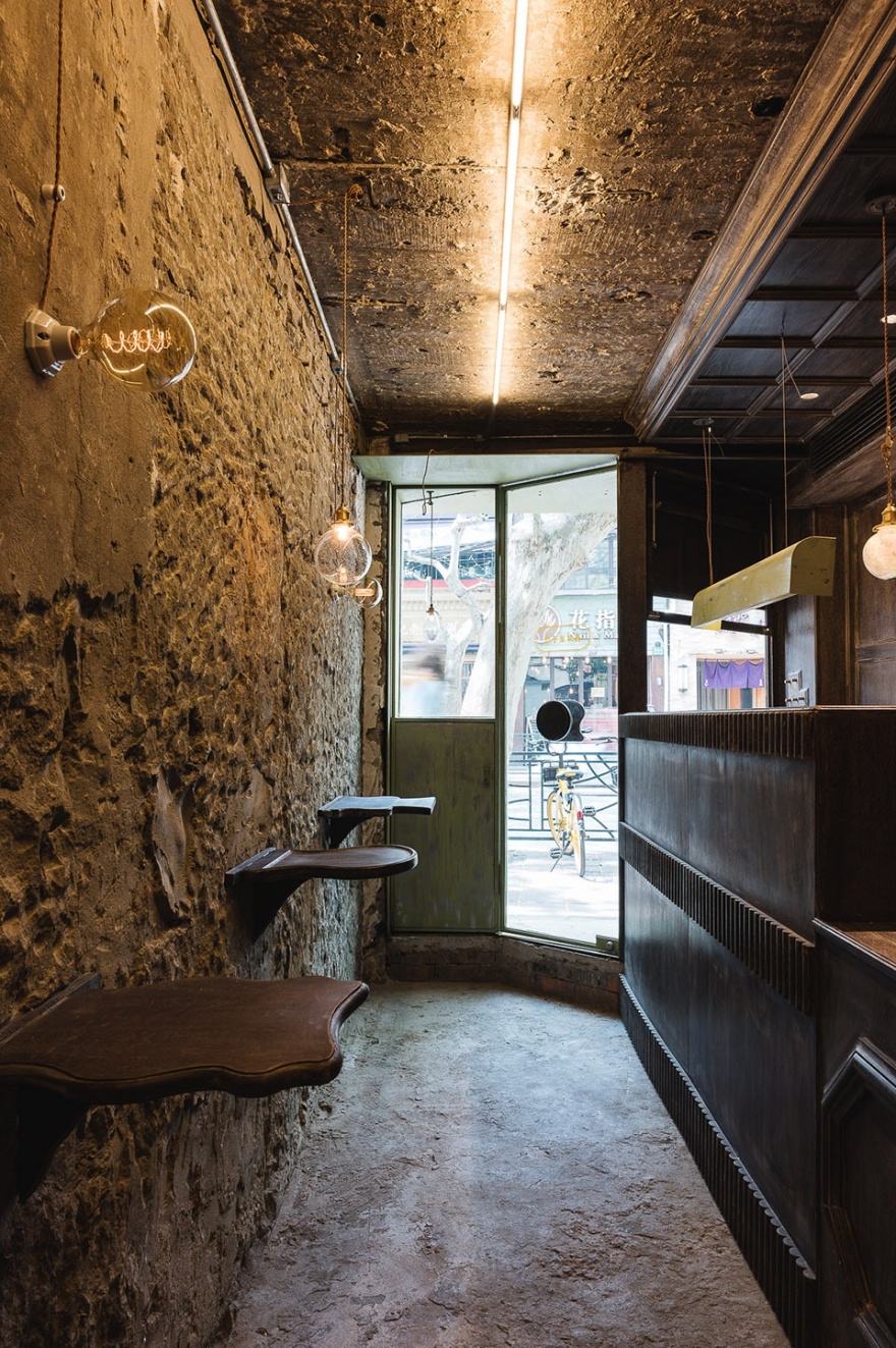
店员活动区域的墙面、天花、排风口和柜台全部采用榄仁木,并以柔和的花线勾勒,好似日本大正风古董店;而就餐区内铲除了原有的地砖,以及墙面的涂层和装饰物,露出老建筑原始的青砖和水泥,保留随机的手工铲凿痕迹,且布线均走明线。
The staff area half looks like a Japanese Taisho antique shop. The walls, ceiling, air vent grills and the counter are all made of the same dark wood, decorated with mouldings. Whereas the other half is removed of all previous decorations, including previous floor tiles and wall paints. Instead, grey tiles and cement of the old building are exposed, so are all the cables and random hand-made chiselling marks.
▼店员活动区和就餐区在材料上形成对比 the staff area contrasts with the dining area in its material ©田炳珉
▼店员活动区域用榄仁木装饰,仿日本大正风 staff area decorated with dark wood in Japanese Taisho style ©田炳珉
▼就餐区墙面露出原始建筑的青砖和水泥墙面,保留手工铲凿痕迹 decorations chiselled to expose original tiles and cements in dinning area ©田炳珉
▼天花板灯具细部,ceiling light detail ©田炳珉
Firm: Atelier A
Location: Wulumuqi Road, Shanghai, China
Category: Restaurant
Project Architect: Yanwen (Lily) Zhu
Area: 20 m2
Project Year: 2020
Photographs: Byungmin Jeon
客服
消息
收藏
下载
最近


