查看完整案例


收藏

下载
来自
上海有寻建筑设计事务所
Appreciation towards
Circle Studio Shanghai
for providing the following description:
这是一次奇妙的设计之旅,主题‘31度灰’时尚艺术馆的确定,其实是一个自然生长的过程:所有基础信息透过设计师的大脑,像神奇造物机一样倾然而出。
This is a fantastic design tour. We begin this journey from the first face-to-face communication, task design to basic information acquisition. The design theme determination of “‘31 shades of grey’ fashion art gallery” is actually a natural growth process. All basic information powers out through the designer’s mind like magical creation machinery.
▼门店外观,exterior view
TAG是一个多品牌的融合空间,售卖男、女装及配饰;风格上既有正式礼服,又有街头风潮衣;既有走秀需求,又有咖啡吧。头脑风暴中我们找到一种“比拟”的空间修辞,通过它,TAG的设计雏形便清晰可见。在我们眼中,TAG所陈列的时尚商品都可以被看作艺术品,而业主也正是用一种艺术化的品味在经营这个品牌。与业主的第一次交流便明确了设计方向:我们要用“艺术馆”(Gallery)的方式来设计时尚买手店。
TAG is a fusion space of multiple brands and contents. Men’s wear, women’s wear and accessories are in the space to be sold. In terms of style, there are formal dresses and street-style clothes; there are not only fancy catwalk-show but also cafe bar inside. During brainstorming we find out the “analogy” between space of Gallery and collection store.In this “analogy” we get the prototype of TAG design. In a general way the fashion collection exhibited in TAG can be seen as artworks. The Owner also wants TAG Boutique keep a kind of artistic taste.When we as designers communicate with the owner and discuss about the concept for the first time, we chime in easily and soon confirm the direction of the design to develop . We are determined to design a “fashion art gallery”, so we need to develop the design of a fashion boutique like doing a gallery design.
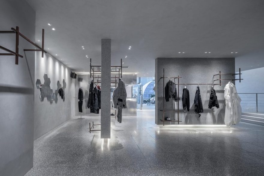
▼灰色作为空间的主调为各种风格的服饰提供了背景,full grey hue was used as the space keynote to show clothes of different styles
▼设计师以“艺术馆”的形式来呈现时尚买手店,the designer develop the fashion boutique like doing a gallery design
▼收银台及接待区域,cash & reception area
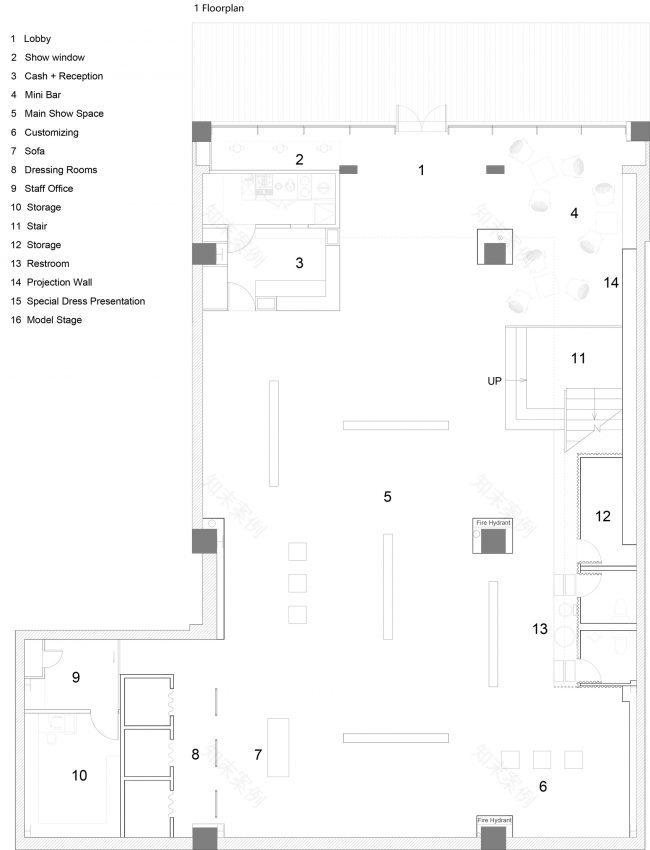
在这一主题的引领下,我们借鉴”艺术馆“的空间组织方式,在方形的平面上穿插布置展墙,用以陈列服装;并通过展墙错落的布置,让空间流动起来。在展墙之间,点缀立方体展柜来陈列配饰。楼梯的设计同样也借鉴了”艺术馆“的思路,使其成为空间的焦点。宽敞的楼梯空间一侧,是一面连续的超大展墙,博物馆级别的洗墙灯营造出“艺术馆”的氛围,空间将艺术和时尚紧密链接。
Guided by this idea, we begin to organize the space. The exhibition walls are alternately arranged on square planes for presentation of clothes. Referencing the classical flow pattern in early Morden, the arrangement of exhibition walls lead customers into a flowing and unstopping space. Cubic showcases are interspersed between exhibition walls to display accessories. The design of stairs is designed to be more than a functional element but also a showing space as in a gallery, and finally becoming the focus inside the whole space. The atmosphere created by the professional wall washer light, along with mega-size exhibition wall on one side of capacious stair space highlight the theme of “art gallery”, linking art and fashion closely.
▼宽敞的楼梯空间一侧,是一面连续的超大展墙,along with mega-size exhibition wall on one side of capacious stair space highlight the theme of “art gallery”
▼休息区域,seating area
▼交通空间,circulation
▼二层展览空间,display area on the second floor
“艺术馆”的主题使我们终于有机会尝试纯灰色空间,不同灰色系材料呈现出丰富的层次和质感。在材质组合搭配上,通过不同材质间的对比则形成一种有张力的戏剧化效果,使得空间的质感丰富且细腻。毛毡、水磨石、花纹铝板、波纹铝板、清水混凝土、艺术涂料、木材和大理石等材料,在空间里交错组合,共同营造了一个微妙的“灰”空间。在自然光和人工照明的配合下,这个灰色的空间透出淡雅宁静的气质,犹如莫兰迪的画,静谧而迷人。同时灰色“艺术馆”空间所具有的仪式感和神秘感,使得陈列其中的商品获得了艺术化的升华,增强了设计师服装的品质感,有效的提升了人们的购物体验。
The purpose of art gallery is to display art exhibits. Our fashion boutique borrows the idea, taking full grey hue as the space keynote to show clothes of different styles. Grey around 30 shades have various choices and texture possibilities, obtaining abundant gradations and bringing exquisite feelings to space. In the view of texture combination, we hope to form a kind of tension through comparison between different textures, bringing dramatic effects and making space texture rich and changeable. Felt, terrazzo, calico aluminum plates, bare concretes, artistic cement paint, corrugated aluminum plates and marble appear alternately in space, jointly fostering a delicate “grey” space. In line with natural light and artificial illumination, the grey space reflects elegant and peaceful temperament, which is as quiet and attractive as Morandi’s paintings. Meanwhile, the sense of ceremony and mystery brought by grey “art gallery” makes the exhibited goods obtain artistic sublimation, promoting the quality sense of people’s shopping experience.
▼不同材质间的对比使得空间的质感丰富且细腻,the comparison between different textures brings changeable texture with dramatic effects
▼试衣间区域,fitting room area
“比拟”的空间修辞,“艺术馆”的设计手法,使时尚买手店最终获得超乎寻常的表现维度。而这次设计也使作为设计师的我们收获了非凡的体验。
The applications of “analogy” space rhetoric and design method of art gallery make it accessible for fashion boutiques to obtain extraordinary performance dimensions. This design also enables us to gain remarkable experience.
▼首层平面图,1st floor plan
▼二层平面图,2nd floor plan
▼室内立面图,interior elevations
项目名称:贵阳TAG时尚店
设计公司:上海有寻建筑设计事务所/CIRCLE STUDIO SHANGHAI
设计主创:汪琳,王丹
业主:TAG时尚
项目位置:贵阳市云岩区未来方舟
项目规模:512平方米
完成时间:2017 年
摄影师:吴清山
Project name: TAG Boutique of Guiyang
Architect’ Firm: CIRCLE STUDIO SHANGHAI
Architects: Wang Lin, Wang Dan
Project location: Guiyang, Guizhou Province , China
Year: 2017
Gross Built Area (square meters or square foot): 512 Square Meter
Photo credits: Qingshan Wu
客服
消息
收藏
下载
最近


