查看完整案例


收藏

下载

附件

翻译
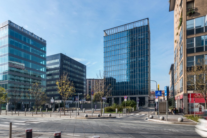
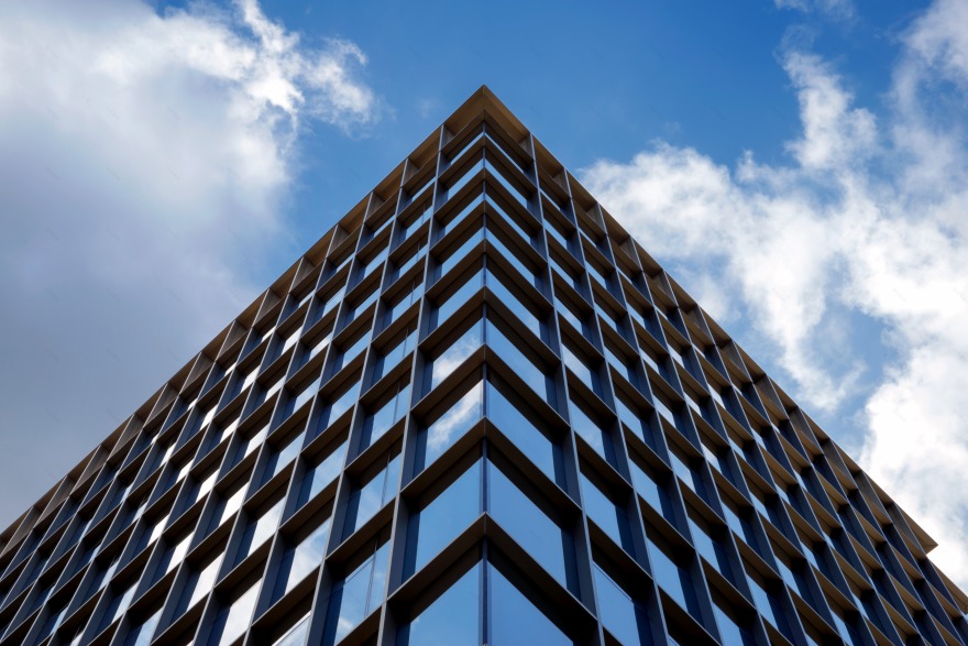
The tower is located in the Porta Nuova district and can be accessed across a pedestrian square in front of new Palazzo Lombardia along viale Restelli in the downtown area extending from the Isola district east towards a recently developed area culminating in the building accommodating the Regional Council. This area has recently become a sort of “new city centre” for Milan, both a commercial and residential hub. L22’s design approach is based around a very cutting-edge vision in which maximising the efficiency and flexibility of this future office space is combined with an innovative facade design, smoothly flowing spaces, and views from the inside towards the outside and vice-versa. Built in 1990-1992 based on a structural design by the engineers Franco Morini and Emilio Pereira from the Morini Progetti associate engineering firm, the building - completely renovated by L22 Urban & Building - has a glass curtain facade featuring an overlapping pattern of slender horizontal and vertical elements designed to focus on both the layout of different levels and the facade’s structural grid. The redevelopment project is focused on emphasising the building’s presence in the square out in front, maximising its height to enhance a sense of verticality. The construction floats above an all-glass double-height entrance. The project was designed along the lines of elegance and timelessness. Sassetti Tower has a powerful identity that is a far cry from fleeting trends. Change keeps on generating change in the dynamic Porta Garibaldi area.
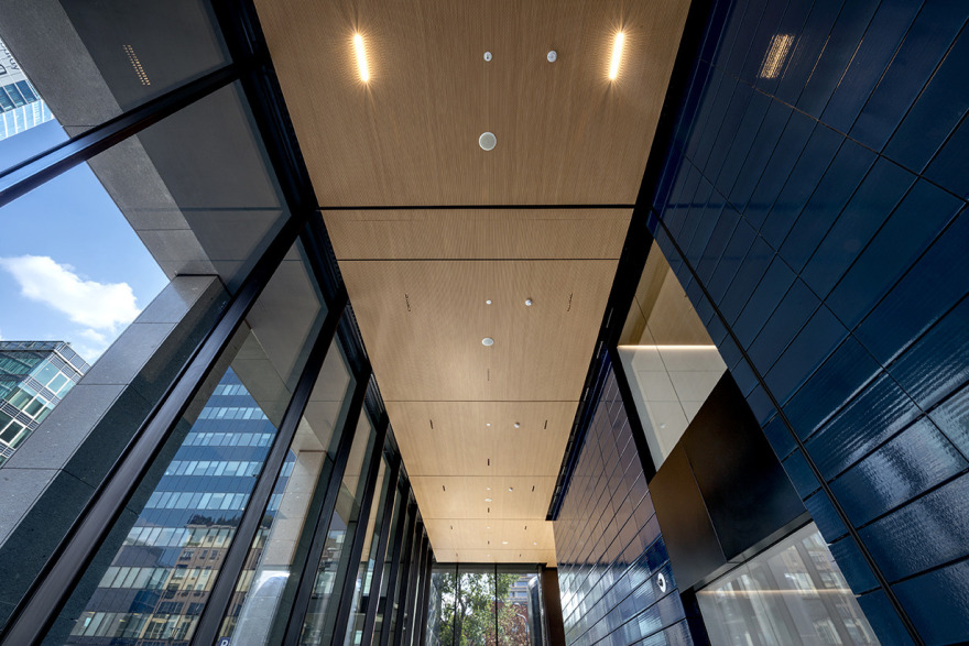
The facade grid has been extended beyond the terrace to emphasise the vertical nature of the tower, while Santafiore Lavagrigia stone cladding in the form of columns and architraves has been added on at ground-floor level. The imposing row of columns covered with Santafiore Lavagrigia stone emphasises the base’s solidity and makes the upper section look more elegant.
The building has been reconnected to the city: the entrance gates facing the square have been completely removed to open up the first floor to create visual continuity and make full use of the available spaces. The interior layout has also been completely revamped. On the outside, there is a row of doubleheight columns since a mezzanine level only takes up a small central part of the building’s base: the double-height hall announces change right from the entrance.
On the inside it is both a reception area and a functionally dynamic rest area for congregating and organising work meetings. The first and second underground levels hold the archives, parking facilities and systems, which had been moved there from the 12th floor that is now used for offices again. These floors will also incorporate amenities for people using the tower, such as locker rooms and a small gym. The 3rd-5th underground levels are used for parking.
The office levels have been totally renovated to focus on enhancing the workplace’s efficiency and flexibility. Each of them has been given its own loggia located at the rear, so as not to interfere with the structural unity along the main front.
Two stairwells interact directly with the area outside the ground floor. An outside service lift, which also acts as a fire escape if needed, provides access to every floor of the tower right up to the new 13th-floor terrace. Shifting some of the GFS – gross floor area - from the terraces, communal mezzanine, and landings around the lifts, has freed up space for a new 13th level and for converting the 12th floor to offices, which previously only accommodated technical rooms. The attic level stands out for its spacious terrace (approximately 270 square metres) landscaped with trees and pot plants, its 360° view across the city, and an events room incorporating in closed and ancillary spaces.
客服
消息
收藏
下载
最近


