查看完整案例


收藏

下载

翻译
P 06 studio completed the CUF Hospitals & Clinics using colors and straightforward design in Lisbon, Portugal.
CUF is a growing network of private healthcare (owned by Grupo José de Mello Saúde), formed by 18 hospital and clinical units in Portugal. However, despite providing a similar service throughout the group, until now each unit had its own particular environment.
The challenge of this project was to create a strong and unique identity to be felt across the entire network.
This was a long and complex project spanning over 4 years, which involved two teams from P 06 studio — one responsible for the interior design and the other for the creation of an efficient wayfinding system.
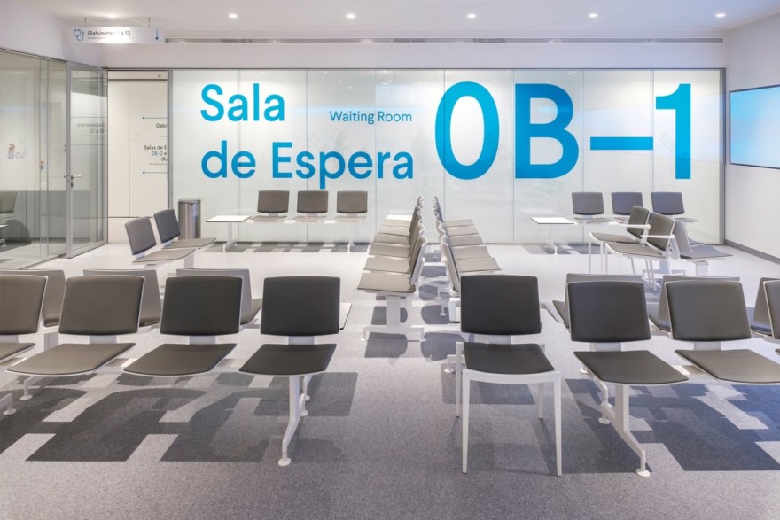
The first creative decision was to define a hospital-like feel, opposed to the luxury and cosiness of a hotel. We wanted a calm and comfortable environment, but at the same time clean, straightforward and representative of affordable healthcare. To this end, we strayed from the fake wood aesthetic — predominantly used in CUF’s former units and by competing groups — and created an aseptic environment, mostly in shades of white and grey, like an open canvas to be painted.
The second step was to define a colour code that would both help identify the different clinical zones as well as filling the rooms with splashes of colour, giving more character to the site.
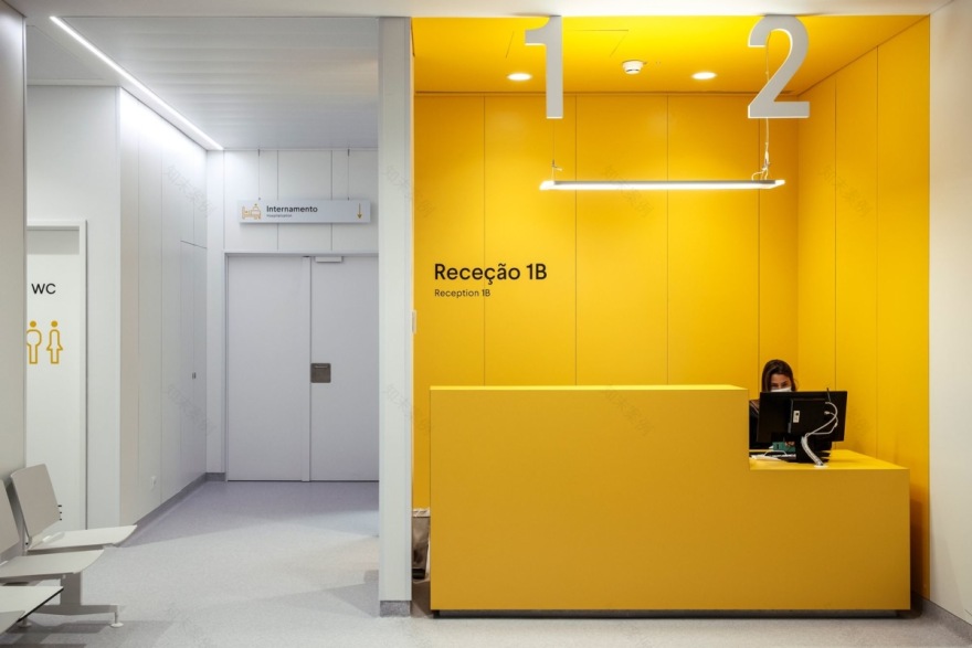
Blue is the brand colour for CUF, therefore used as the default colour, associated with a generic wide range of medical and non-medical services. Orange was used for the emergency department. Yellow for hospitalization and all services that could require some permanence from the patient such as observation, recovery and operating rooms. Green was the colour defined for the oncology zone.
The majority of the materials and furniture are sturdy, locally-sourced products built to last. We consulted Portuguese product designers to help us in defining a contemporary furniture collection, with simple lines and neutral tones, including some bespoke pieces.
The patient was always at the heart of our project. For that reason we developed a large scale wayfinding system that allows the patient to be self sufficient and not require any help from staff at any step of the process.
To achieve this, we designed a clean graphic language with good legibility — using generous scale graphics and typography — with good integration on the existing architecture and interior design mood.
To match the clean and elegant feel of the chosen typeface we designed a full custom pictogram set that helps convey a clear message on the signage.
The signage system uses the same colour code that was defined on the interior design mood in order to create a visual coherence between specific zones/services and the associated signage.
Given the vast size and growth of the CUF network, we developed two style guides that represented the principles defined by the interior design and wayfinding projects, with enough scalability and flexibility to be easily adapted to each hospital’s specific architecture and operational needs.
Design: P 06 studio Design Team: Nuno Gusmão, Vanda Mota, Frederico Gonçalves, Marta Vaz, Jacinta Fialho, Miguel Ferreira Signage Design: Mário Videira, Frederico Gonçalves, Sebastião Soares Photography: José Vicente, FG+SG
Design: P 06 studio
Design Team: Nuno Gusmão, Vanda Mota, Frederico Gonçalves, Marta Vaz, Jacinta Fialho, Miguel Ferreira
Signage Design: Mário Videira, Frederico Gonçalves, Sebastião Soares
Photography: José Vicente, FG+SG
7 Images | expand images for additional detail
客服
消息
收藏
下载
最近


