查看完整案例


收藏

下载
COMMON ZHANG 店铺位于广州市荔湾区的 ARAapM 服装城,周边聚集各类服装相关商场,是中国历史较悠久的服装批发集散地之一。业主找到我们的时候,因服装城状态老化严重,整体空间都在设计升级。服装城中其他店铺的设计受当下流行趋势的影响,室内设计风格趋于统一,识别度较低。业主的设计诉求便是想要 COMMON ZHANG 从众多同类化的店铺中跳脱出来,呈现出一种反传统商场化的、不盲目追求当下流行趋势的、又有点神秘且有趣的服装展示与售卖空间。
COMMON ZHANG retail store is located in ARAapM Clothing Plaza, Liwan District, Guangzhou, surrounded by various clothing-related plazas. It is one of the earliest clothing wholesale distribution centers in China. When the client first came to us, the entire plaza was undergoing renovation due to its serious aging over the year. The current design trend significantly influences all the other stores’ designs; most are identical and lack recognition. In the design brief, the client’s objective is to create a unique store that stands out from all the surrounding stores and is mysterious and exciting to explore simultaneously.
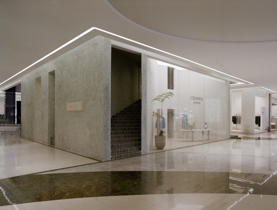
▼改造后的 Common Zhang,Common Zhang after renovation
着手分析场地优劣势,线索有三:1. 场地空间十分方正,正对着大楼的两个主入口,处于视觉焦点;2. 可用层高为 5.4 米;3. 场地中央竖立着一根 1.2×0.8 米的巨型承重柱,打破了原本开敞的空间。紧跟这三条线索,我们想在场地创造一个小型建筑,让人不管从大楼的哪个入口进来都能被其吸引,同时建筑内部的动线生动有趣,激发人们探索的欲望。
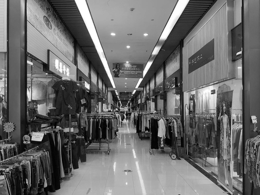
▼改造前的 ARAapm 服装城,ARAapM before renovation
We started with a comprehensive site analysis of the advantages and disadvantages; there are three clues: 1. the site is considerably squarish, and it is directly facing the two main entrances of the building, which sits in a visual focus; 2. the usable ceiling height of 5.4 meters; 3. there is a giant 1.2×0.8 meters load-bearing column in the center, breaking up the original open space. According to these three clues, our design strategy is to create a small interior architecture on the site so that the unconventional structure will attract whoever enters the building. At the same time, the dynamic internal circulation will urge people to explore the space.
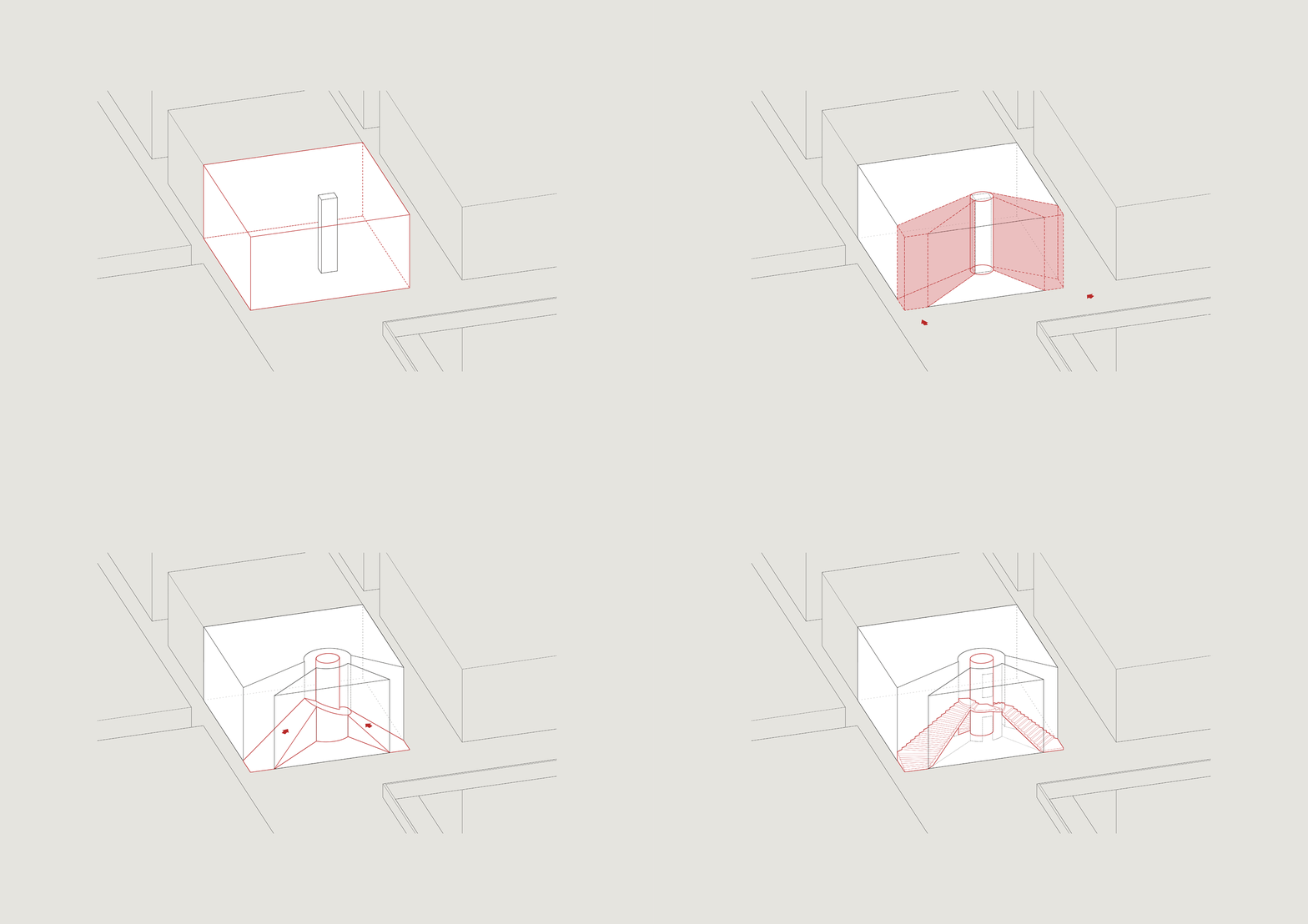
▼概念轴测图 gif, Concept axonometric diagram
我们将场地用户外常用建筑材料-绿色水洗石夯实地包裹起来,形成形体方正但非常具有体量感的小型建筑,随之挖出正对着商场主入口的两个角作为进入店铺的两个主入口。场地中央的巨型承重柱则变身为建筑中的核心筒,连接着两个主入口,不管你从商场的哪个入口进来,都能先被这个夯实的小型建筑所吸引,然后再被两个主入口内的神秘楼梯引导进店铺内。
Considering the site to be a solid squarish architecture block, the façade is wrapped with green exposed aggregated stone, which is commonly used for outdoor. We intentionally carved out the two corners facing the main entrances of the plaza as the two main entrances for the store. We fully exploit the giant column in the center, transforming it into the core of the architecture, connecting the two main entrances by a series of stairs. No matter which access you come in from the plaza, you will first be drawn to the unconventional solid architecture block and guided into the store by the two mysterious stairs.
▼外立面,Side facade
▼COMMON ZHANG 展示橱窗,Front facade
你从任一楼梯进入,顺着台阶往上慢慢汇集到核心筒的旋转楼梯平台,再循序渐进地慢慢步入服装区域。逛完豁然开朗的展示橱窗,踱步至琳琅满目的服装售卖区挑选自己中意的服装,最后从侧出口离开。至此,你在这个“流动空间”中,完成了一次美妙的旅程。
Ascending from either stair, you will slowly converge at the spiral stairs and step into the window display. Fold back to the dazzling merchandise area to pick your favourite pieces, and leave through the side exit. Till this moment, you have completed an incredible journey with this rhythmic meander.
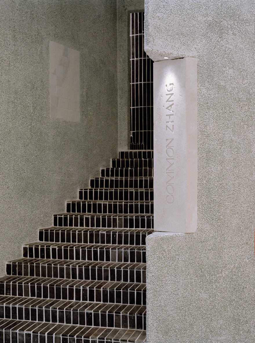
▼外立面一侧的主入口楼梯
Main entrance on one side of the facade
▼Logo 细节,Logo detail
▼外立面一侧的主入口楼梯
Main entrance on one side of the facade
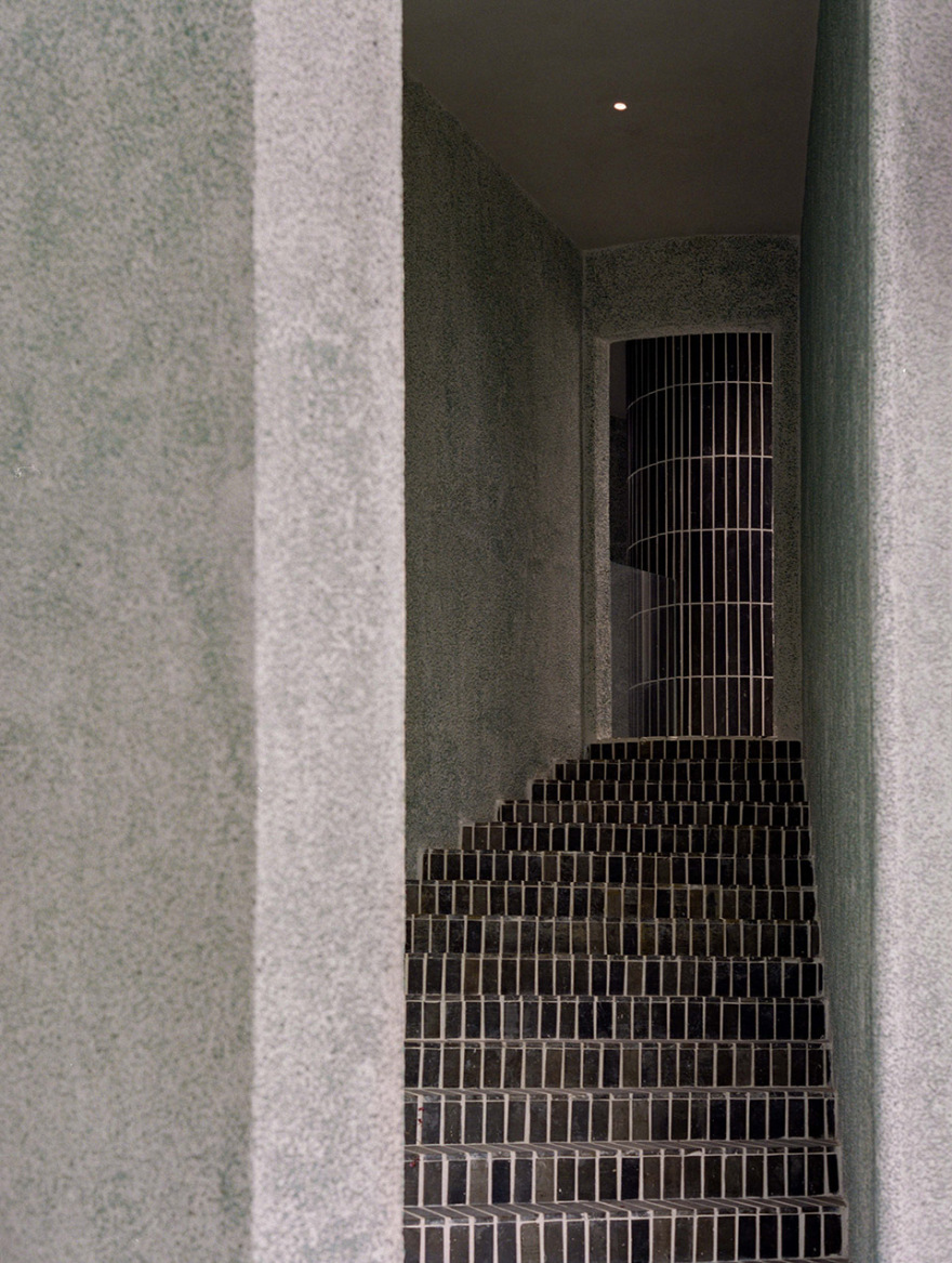
▼从两个主入口内的神秘楼梯汇集到核心筒楼梯, From two main entrance stairs converges at the core stairs
▼核心筒楼梯细部,Dentails of the core stairs
金砖作为核心筒与楼梯的主要材质,顺着台阶的方向,师傅们用一片片手工切割的长条金砖细心铺贴,指引人缓缓步入建筑内部,同时富有质感的黑色也能在夯实的绿色外立面中凸显出来,使空间更有层次感。
Jin brick is the main material for the core and stairs, and each brick is carefully handcrafted and tenderly paved in the same direction as the flight of steps to unconsciously lead people into the store. Meanwhile, the rich-textured black Jin brick stands out from the solid green façade, adding a sense of dynamism and layering to the space.
▼侧出口,Side facade exit
▼外立面材质细部,Material details of facade
服装售卖区与展示橱窗采用大片的灯膜作为主要照明,使空间中陈列的大量服装能被均匀打亮;我们与 Notion Studio 为灯具品牌 Fine Lumens 合作设计的 Pinch 吊灯则作为点缀光源,圆润的形态能给硬朗线条的空间带来一丝柔软,同时在视觉上也将两个服装售卖区连接起来。
The lighting is designed with large LED light panels as the primary light source in the merchandise area to evenly illuminated numerous amounts of clothes. The Pinch pendant light is a collaboration work with Notion Studio for the lighting brand Fine Lumens and serves as decorative light in the space. Its round shape brings a touch of softness while visually connecting the two clothing merchandise areas.
▼服装售卖区,Clothing merchandise area
▼Pinch 吊灯作为点缀光源
The Pinch chandelier acts as a decorative light source
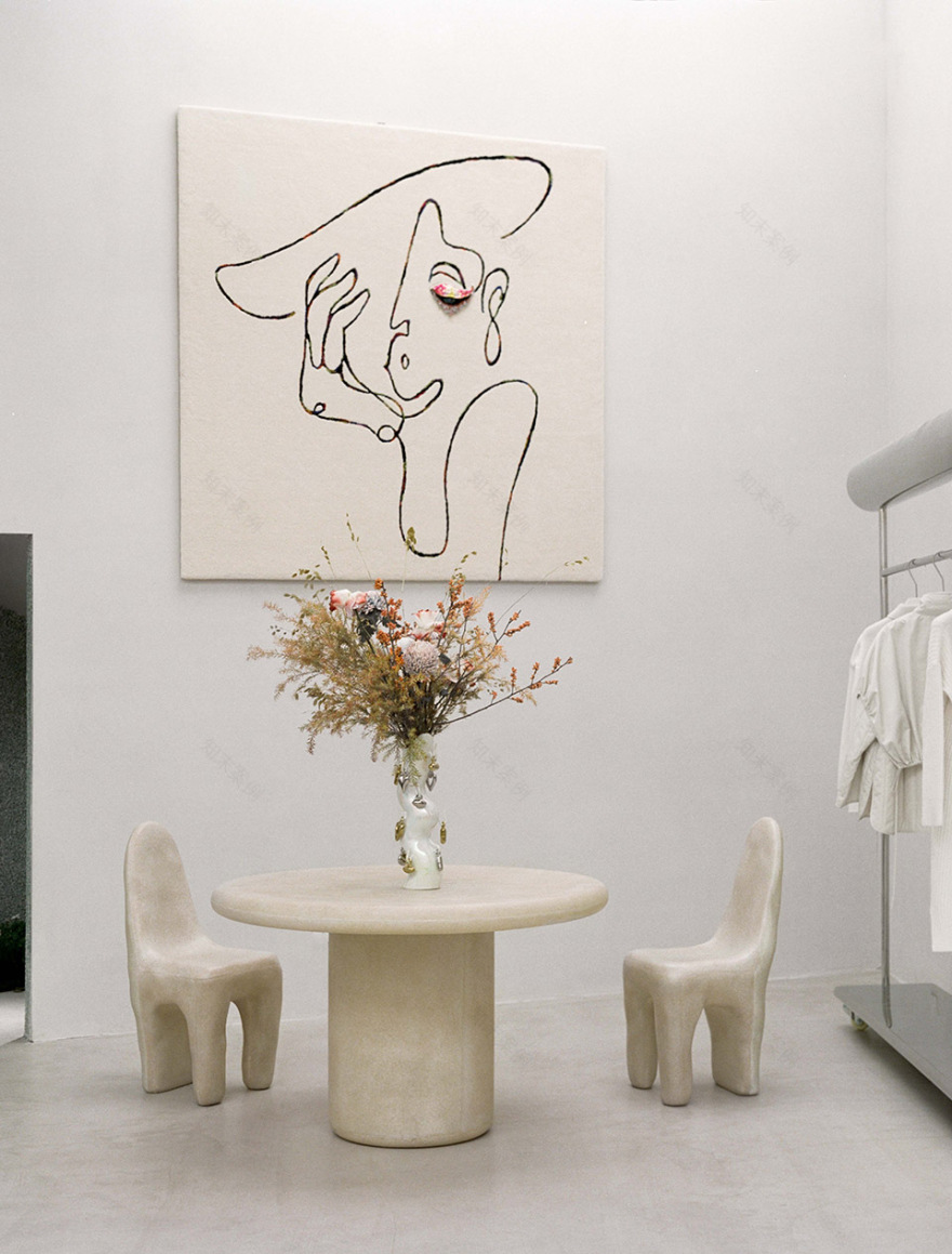
▼圆桌与单人桌品牌 Kar, 挂毯品牌
Objective,Table and Chair by Kar, Backstage by Objective
▼服装陈列架,Clothing rack
正如 Peter Zumthor 所说:“流动空间,是一个设计的体量之间的空间,它流经贯穿整个建筑物,连接所有的空间,创造一个平和的节奏。在这个空间中游移意味着发现惊喜,就像在树林里散步,每个人都在自己寻找一条路径。”
As Peter Zumthor said: “The meander, as we call it, is a designed negative space between the blocks, a space that connects everything as it flows throughout the entire building, creating a peacefully pulsating rhythm. Moving around this space means making discoveries. You are walking as if in the woods. Everyone there is looking for a path of their own.”
▼展示橱窗内大理石长桌与手工瓷砖墙绘细节,Bicolor sculpture marble table and Handmade ceramic tile painting detail
▼平面图,Floor Plan
项目名称:COMMON ZHANG 服装店
设计方:Offhand Practice
设计时间:2020
施工时间:2020
主创及设计团队:袁愿,聂璇,李月
项目地址:广州市荔湾区站前一街 ARAapm 服装商城 26 号
建筑面积:138m²
摄影版权:胡彦昀
软装设计:COMMON ZHANG
瓷砖墙绘艺术作品:Rain
平面设计:上海小工
客户:COMMON ZHANG
主要材料:水洗石,微水泥,艺术涂料,金砖,天然米色石材,镜面不锈钢,米色瓷砖
设计内容:外立面,室内,展示道具,灯光
Project name:COMMON ZHANG Retail Store
Design:Offhand Practice
Design Period: 2020
Construction Period: 2020
Leader designer & Team:Yuan Yuan, Nie Xuan, Li Yue
Project location:No. 26, ARAapM, Zhanqian 1st Street, Liwan District, Guangzhou
Gross Built Area:138m²
Photo credits :Hu Yanyun
FF&E:COMMON ZHANG
Handmade ceramic tile artwork:Rain
Graphic Design:SHANGHAI GRAPHIC WORKER
Clients:COMMON ZHANG
Products used in the project:Exposed Aggregate Stone, Micro Cement, Paint, Jin Brick, Natural Beige Stone, Stainless Steel, Beige Tile
Design Scope :Facade, Interior, Display Props and Lighting
客服
消息
收藏
下载
最近


