查看完整案例


收藏

下载
增一分则长,减一分则短空间设计,亦是在“增减”之间,用好了这两个字生活,也就妙不可言了~
"If you add one point, it will be long; if you subtract one point, it will be short"
Space design is also between "increase and decrease",Use these two words well
Life is wonderful~
SHOWME
D E S I G N
"韵染" "增一分则长,减一分则短。"这是楚辞家宋玉对东家美女的赞誉。一“增”一“减”二字,写极了女子的婀娜身姿。美人如是,居家生活,亦当如是。空间的合理利用,永远是居家生活中的永恒追求,现代生活节奏快,压力大,对居家空间的要求,不仅要阔大,还要舒适,更要符合业主的生活习惯。而本套案例中,恰好就用“增”与“减”,给出了一个空间利用的“最优解”。
"If you add one point, it will be long; if you subtract one point, it will be short." This is Song Yu’s praise to the beauty of his master. The two words "increase" and "decrease" describe a woman’s graceful posture. Beauty is like this, so is home life.
The rational use of space is always the eternal pursuit of home life. The pace of modern life is fast and the pressure is great. The requirements for home space are not only spacious, but also comfortable, and more in line with the living habits of the owners. In this set of cases, we just use "increase" and "decrease" to give an "optimal solution" of space utilization.
餐厅Restaurant
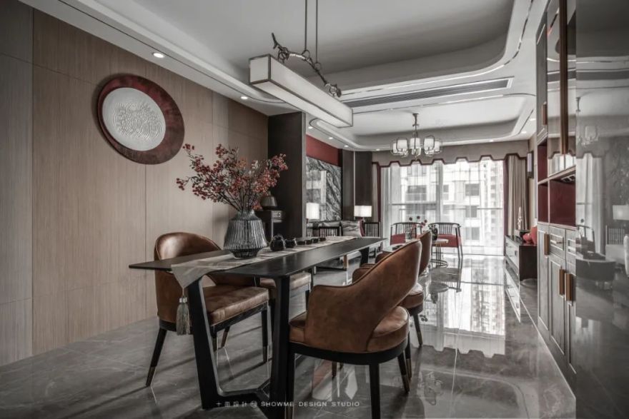
入户而视,自下而上,地面通铺浅灰色大尺寸亮光瓷砖,增加了空间视觉上的纵深感,通透、明净,让人顿觉豁然开朗。
From bottom to top, the floor is paved with light gray large-scale bright tiles, which increases the visual depth of the space, and makes people feel transparent and bright.
客厅Living room
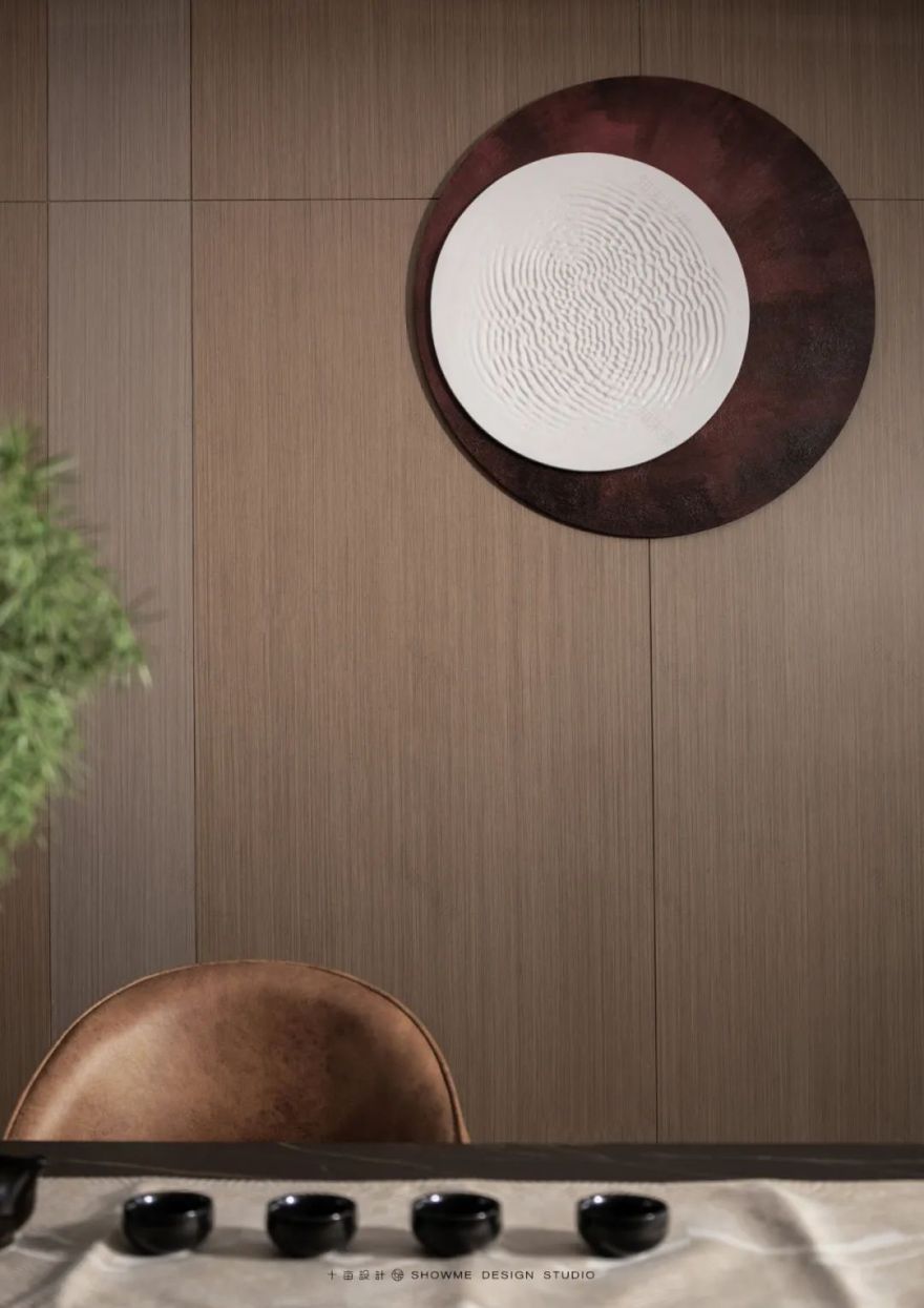
木色木质背景板,线条明,纵横交错,配上圆形软装设计,再借顶上暖光射灯源,增加了整个空间的温度。
Wood color wood background board, bright lines, crisscross, with a round soft design, and with the warm light source on the top, it increases the temperature of the whole space.
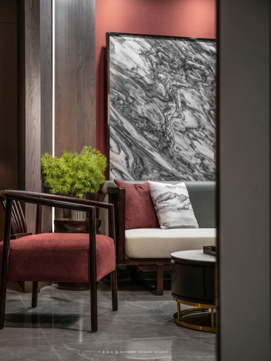
吊顶与沙发上的弧形设计,不仅丰富了空间的层次感、柔和感,更是给生活安心的一种可靠交待。
The arc-shaped design on the ceiling and sofa not only enriches the sense of hierarchy and softness of the space, but also provides a reliable explanation for life.
厨房Kitchen
主卧Master bedroom
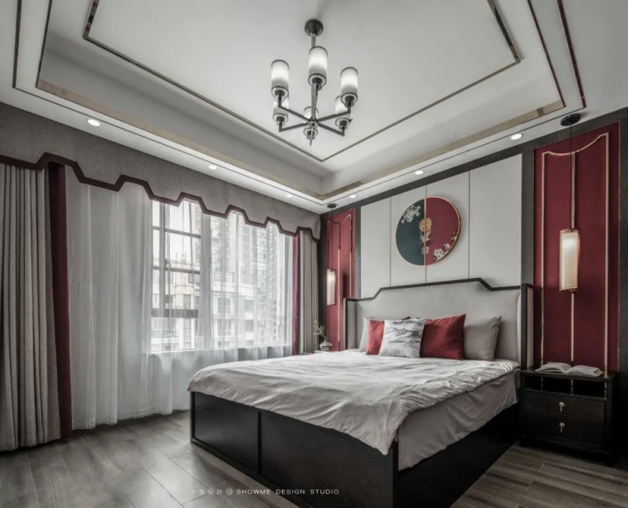
背景墙软包采用圆形设计,颜色以暗红暗蓝为主色,一分为二,既有儒家的“中庸”思想,又含道家的“太极”韵味,不至于太鲜亮,不至于太深沉,增减之间,空间意境提升到了极致。
The soft bag of the background wall adopts a round design, with dark red and dark blue as the main color, which is divided into two parts. It not only has the Confucian "golden mean" thought, but also contains the Taoist "Taiji" charm, so it is not too bright or too deep. The artistic conception of the space is enhanced to the extreme between the increase and decrease.
卫生间
Toilet
原始结构图
平面设计图
House type&Plane design
原始结构的厨房太小,鞋柜对于一个四口之家来说也不能够满足正常使用,所以将厨房往餐厅方向进了扩宽,既能扩宽厨房又能使鞋柜的储物空间满足使用。
使用一面墙将主卧分割成两个部分,仪式感与实用进行了平衡,使动线更加清晰。
The original structure of the kitchen is too small, the shoe cabinet for a family of four can not meet the normal use, so the kitchen to the restaurant into the direction of widening, not only can broaden the kitchen, but also can make the shoe cabinet storage space to meet the use.
A wall is used to divide the master bedroom into two parts, balancing the sense of ritual and practicality, making the moving line clearer.
设计机构 I Designer Department:十亩设计
项目地址 I Project address:四川内江
·邦泰天誉
项目类型 I Project type:全案
面积 I Square Meters:103
户型 I Door Model:平层
摄影师 I Photography:龙武
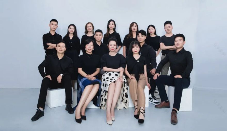
#SHOWME TEAM#
Awards荣誉
2017第五届日立中央空调Hi-Design室内设计大赛“优秀奖”2018中国(四川)首届鲲鹏奖大赛公寓类组“优秀公寓设计奖”2018十间坊中国实战设计大赛“全国入围奖”2018十间坊实战赛事创意空间手作西南赛区“第一名”2018中国人文设计大赛入围奖2019鲲鹏奖第二届中国室内装饰设计大赛公寓类组“银鲲鹏奖”2019鲲鹏奖第二届中国室内装饰设计大赛“中国百强设计师
2019-2020年度40 UNDER 40中国(四川内江)设计杰出青年
2019华鼎奖金奖
2019十间坊实战赛中国城市优胜奖
2019金住奖-2019中国(内江)十大居住空间设计师
2020十间坊中国实战设计大赛“中国城市优胜奖”2020金住奖-2020中国(内江)十大居住空间设计师
2020幸福家年度公益设计师
地址/ 内江市东兴区万达中央华城二期2号门旁十亩设计
#往期推荐#
客服
消息
收藏
下载
最近


