查看完整案例


收藏

下载
LYM Space Design 2021——
容易的事情,从不同方式去思考,在简单里发掘出巧妙的变易。在一个固有的空间里,从不同角度去拆解,万物有序而千姿百态。试图经过适应性改造与住户建立联系,这一过程,是「解」决,也是重「构」。Easy things to think of in a different way, in the simple to find a clever change. In an inherent space to be disassembled from different angles, all things orderly and various forms. This process is both "solution" and "construction".
| 广东房产频道·专访本案设计师-刘永明
Designer - Liu Yongming
·设计师的家与设计家·
“从事室内设计多年,做过很多风格,也接触很多业主。在整个装修过程中最大感受,大家永远都处于一个纠结状态。其实清楚了解自己需要什么,以及未来十年、二十年的生活是什么样子,学会取舍,平衡好一切就不会这么多纠结点。”
本案的设计师刘永明将这份“理性”融入到自宅。380 方的三层顶楼复式,设计线以每层平面铺展,化零为整,通过垂直交通实现空间的交叠,让每一层的功能都得到最大程度的释放。分为上中下三层,中间层为客厅、餐厅、茶区和中西厨功能,是本案重要一笔;往下一层是父母房、小孩房和带有书房的套房;往上一层一个主套房和视听室、起居厅和功能区。
极简思想贯穿设计,功能大于形式,重点诠释空间的体块架构,划分功能区,理性减少装饰和色彩元素,整个空间的功能分区做好了、实用性做好了,后面的软装部分自然水到渠成。
一层平面图
A layer of space
|一层 平面设计图纸呈现
Graphic design drawing
一层效果图
Renderings are presented
一层 效果图呈现
Renderings are presented
SCENE0
1 张 扬 与 克 制
「Entrance / Passing Hall」
从崇尚极简生活方式开始,有别于时下“轻装修重装饰”,设计师一开始便着重构筑整个空间克制性的美学基调,丰富结构层次为主,减少过度的元素铺叙,弱化陈设摆件的存在,让空间更为本真。
Starting from advocating a minimalist lifestyle, which is different from the current "light decoration and heavy decoration", the designer has focused on building a restrained aesthetic tone of the whole space at the very beginning, mainly enriching the structure level, reducing excessive element presentation, weakening the existence of furnishings and furnishings, and making the space more authentic.
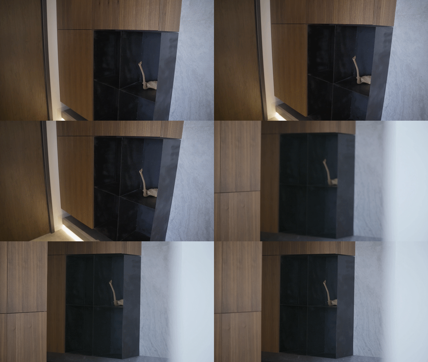
一进家门,入户悬空鞋柜体块,结合哑光黑色钢板搁架,将现代空间的利落鲜明感解构而出。底部一个大理石的踏步,在客厅与餐厅之间存在一个层次落差,赋予递进的空间情绪,玄关、茶区、沙发区成一线贯通。
Enter the door, enter the door suspends shoe ark body block, combine dumb smooth black steel plate to put aside frame, the agile and bright feeling of contemporary space is deconstructed and go out. The step of a marble at the bottom, there is an administrative level fall between sitting room and dining-room, gift the spatial mood that advance step by step, area of porch, tea, sofa becomes a line of cross.
SCENE02
融合与独立
「Teahouse / living room」
一层原先布局最大的问题:一进门便将整个空间一览无遗,私密感差,且沙发与电视背景没法摆放。
当面对这样一个“无拘束”的空间原型时,设计师想要实现空间里一个“转折”——半高的悬空白色矮墙。它既是沙发区的电视背景墙,又成了进大门对应的玄关背景,巧妙划分出沙发区和茶区,底部悬空与餐厅区相连,衔接三个空间成为一个“融合、与共”的整体。
When confronted with such an "unconstrained" space prototype, the designer wanted to achieve a "turning point" in the space -- a half-height suspended white low wall. It is the TV setting wall of sofa area since, became the porch setting that enters the door corresponding again, clever divide gives sofa area and tea area, bottom is suspended and dining-room area are linked together, join up 3 Spaces to become "confluence, with all" whole.
1.4 米高度的半悬空玄关隔断,就像一个半通透的屏风,将原本一目了然的客厅分割成两个不同的功能区。当坐下来时,家人相互之间可以感受到彼此的动态而避免了眼神对视。亲密时无间,独处时尊重。The partition of 1.4 meters height is like the screen that is connected half fully, the sitting room that be clear originally breaks up two different functional areas.
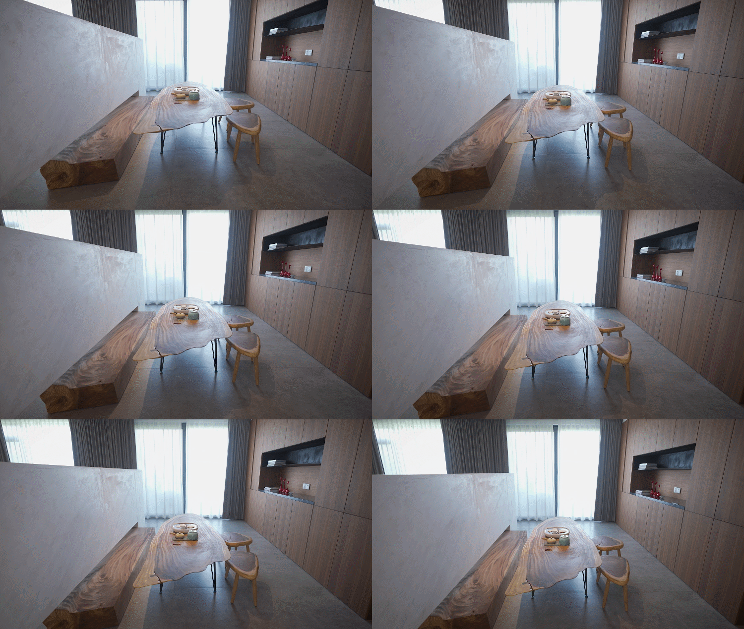
矮墙选用鱼肚白大理石做凹凸面处理,藏在细节里的艺术美。矮墙下方摆放 2.5 米长的实木,厚实、淳朴,与木质壁柜形成色彩统一,与白色大理石形成强烈对比。延伸出来的宽度刚好是茶区的条凳,也让客厅和茶区私密性更强,木头与矮墙之间的空隙方便了矮墙底部插座的使用。
A 2.5 meter long solid wood is placed below the low wall, thick and rustic, and the color is unified with the wooden wall cabinet, forming a strong contrast with the white marble. The width that outspread comes out just is the bench of tea area, also let sitting room and close sex of tea area privacy stronger, the gap between wood and low wall went to the convenience of the use of socket of low wall bottom.
茶区是隔而不断的开放空间,在胡桃木的质朴肌理间,围坐交谈或是一人品茗都能享受弥足珍贵的悠闲时光。懂得分寸,持守尺度,空间的融合和独立满足了不同场景切换。
Tea area is lie between and ceaseless open space, between the rustic skin texture of walnut, sit around talk or it is one person tea can enjoy the carefree time with precious.
客厅原有天花上的大梁,设计师没有刻意修饰,利用建筑本身的结构态势,与边上的窗帘盒设计一起创造层次感。窗外是车水马龙的喧嚣,窗内是与家人一起坐在柔软的墨绿皮革沙发上看电视的温馨,家的意蕴,随心绪徐徐展开。
The girder on sitting room original smallpox, stylist did not decorate painlessly, use the structural situation of building itself, with the curtain box on the edge design creates administrative level feeling together. Outside the window is the bustle of heavy traffic, it is to sit together with the family inside the window on soft black green leather sofa to see the warmth of TV, the implication of the home gathers, spread out slowly along with mood.
SCENE03 内敛与自由
「Guest restaurant/Bathroom」
“构”是空间设计的灵魂。大胆使用几何体块布局,既有效划分空间功能,又将零散整合为一,彼此连贯互动,让整体内敛沉稳的调性带有隔而不闭的现代韵律感。
悬空的独立洗手台卡在两面隔断墙间,营造引人入胜的探寻意境,墙体的设置刚好避免餐厅、楼梯间正对卫生间的尴尬。而洗手台高出部分恰好安装水龙头,人在客厅的时候看不到吧台上的水杯等物品,简洁的雅致在细节里得以呈现。
The hanging independent washing table is sandwiched between the two partition walls, creating an attractive exploration artistic conception. The setting of the wall just avoids the embarrassment of the restaurant and the stairwell facing the toilet. And the faucet is exactly installed above the raised part of the washbasin, so that people cannot see the articles such as the water cup on the washbasin when sitting in the living room, presenting a concise and refined detail.
卫生间依旧呼应“体块”理念。墙体隔断的运用,保有私密性又具有区分功能;楼上水管隐藏在墙体内,空间干净规整;而淋浴区与浴缸之间留有空隙,空隙之间悬空的玻璃方便干湿区分离。地面和墙面做哑面石材处理,统一莫兰迪色系,用肌理感和触感传递平静的情绪,锻造星级酒店般的体验,让人身心得以放松。
The toilet still echoes the concept of "volume". The use of wall partition maintains privacy and has the function of distinguishing. The upstairs water pipes are hidden in the walls, so the space is clean and orderly. And there is a gap between shower area and bath crock, the glass that hangs between the gap goes to the convenience of dry and wet area separation. The floor and walls are treated with matte stone to unify the Morandi color system. The texture and touch convey a calm mood, creating an experience like a star hotel and allowing people to relax physically and mentally.
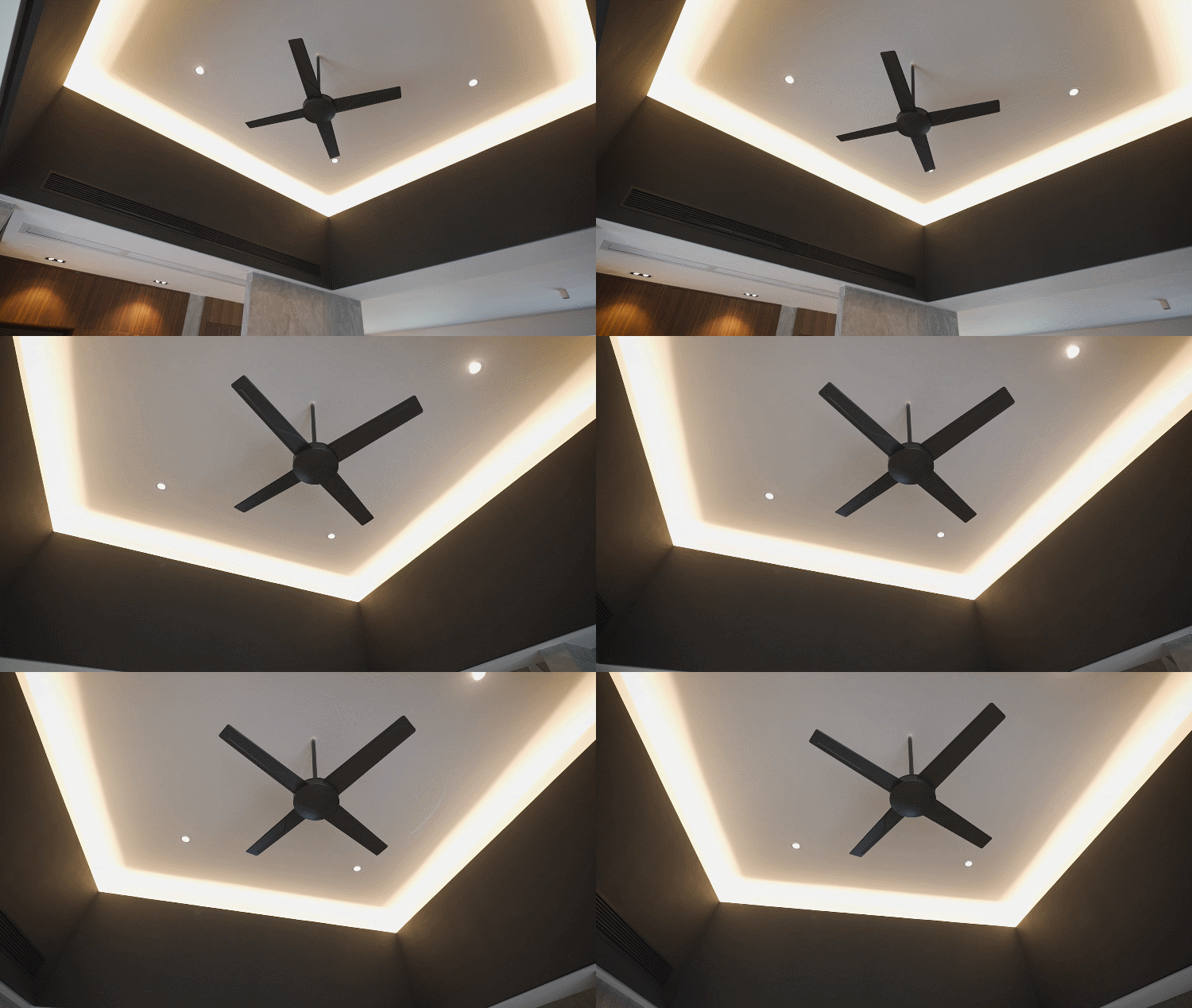
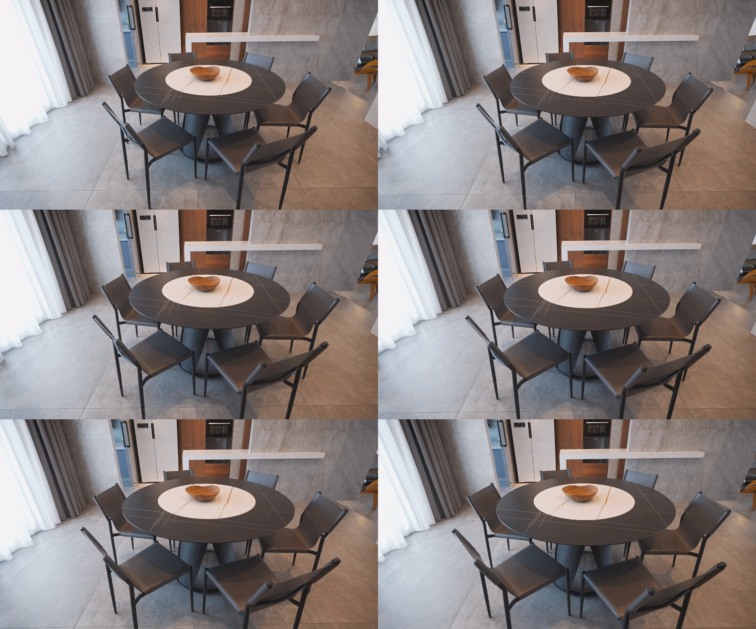
餐厅天花高度原本只有 2.6 米,把顶楼的小型泳池拆除后,让餐厅天花吊顶得以抬高,增设空间不显压抑。黑色的吊扇,黑色的餐桌,结合灯光,营造冷峻而充满戏剧性的高级氛围。
The ceiling height of the restaurant was originally only 2.6 meters. After the removal of the small swimming pool on the top floor, the ceiling of the restaurant was raised, making the whole space more sudden. The ultrathin black shape around the ceiling, combined with black ceiling fans, combined with lighting, creates a cold and dramatic high-level atmosphere.
向内有序,向外自由。元素少一些,肌理多一些;陈设少一些,留白多一些。天然石材像是留下时间的痕迹,两盆绿植向外蓬勃生长。光、意境、流动的生机,美好的生命体在这里捕获。
Orderly inward, free outward. Less elements, more texture; Less display and more white space. Natural stone is like leaving a trace of time, and two POTS of green plants grow vigorously outwards. Light, artistic conception, flowing vitality, beautiful life is captured here.
拾阶而上,顶楼觅得一处喝茶赏景的观景阳台,四方通达的流动空间与周遭自然景观和谐连接。
于极简主义里,从不同方式思考结构的意义和考究居住的需求,它还原本体的兼容性,验证空间的可变性。
解构纯粹,试着减少 20%的装点,展现 80%的品质生活。
In minimalism, we think about the meaning of structure and the needs of detailed living in different ways, which restore the compatibility of ontology and verify the variability of space. Deconstruct purity, try to reduce 20% of the decoration, show 80% of the quality of life.
Project name | 项目名称-解·构
Diesigner | 主案设计-刘永明
Address | 项目地址-广州番禺区
Spatial properties | 空间属性-住宅
Area | 项目面积-380㎡
Material | 主要材质-灰色哑光砖、胡桃木、白色大理石、黑色钢板
END
ABOUTDESIGNER
客服
消息
收藏
下载
最近


