查看完整案例


收藏

下载
集前端業務營銷和客戶服務等功能為壹體的綜合辦公空間,以個性化極強的設計語言表達前衛的科技感,致敬未來建築精神。
该项目位于南京青奥中心双子塔,是已故世界著名建筑师扎哈·哈迪德精心打造成的个性化超前卫的建筑体。
The project is located in the twin towers of Nanjing international youth cultural center. An architecture that designed by the late world-famous architect Zaha Hadid, representing individuation and avant-garde.
鑒於項目的獨特性和唯壹性,設計師有幸帶著對建築的幾分崇敬,打造了這樣壹個幾何體構架,塊面關系圍合的概念辦公空間。設計從基本功能切入,精準布局,以巧妙的手法劃分區域進而生成系列關系;塊面元素不同層級遞進組合釋放出無限的張力;紅色與白色鮮明碰撞亦激發出獨特的藝術感受……
Given the uniqueness of the project, the designer created such a geometric framework, a conceptual working space surrounded by blocks and planes, holding a reverence for the architecture. The design cuts in from the basic functions, precise layout, and subdivides the regions in a subtle way to generate series connections; the progressive combination of block and plane elements at different levels release infinite tension. The sharp collision of red and white also stimulates a unique artistic feeling...
設計師在深度挖掘了業主方河西醫美集團的業務屬性後,以藝術且實用的設計手法使整個空間更加具有廣泛的適應性,符合部門的功能定位。在理性裏尋求個性,在穩健中表達精神,同時,設計師運用解構手法,利用元素化的幾何關系,大塊面切分空間,從而使空間具有更強的指向性——現代的科技化智慧辦公。
After digging deep into the business attributes of Hexi beauty group, the designer made the whole space more widely adaptable and in line with the functional positioning of the department with artistic and practical design techniques, seeking individuality from rationality and expressing spirit in stability, meanwhile, using deconstructive techniques and elemental geometric relations to divide the space into large blocks. So as to giving the space a stronger directionality -- Modern technology-based smart office.
項目伊始,支撐建築完美外形的多個邊長達2米的結構柱體錯落分布於室內,這給設計帶來了不小的挑戰,這些柱子壹定程度上破壞了空間的完整性,那麼於設計來說就要在布局的時候巧妙地規避掉這些柱體,或者說讓它們在使用者的眼睛裏“消失”,自然融入室內設計中。
At the beginning of the project, the structural columns that support the perfect shape of the architecture with a length of two meters are scattered indoors, which brings great challenges to the interior design. These columns damage the integrity of the space at a certain degree, so in the meantime, it is necessary to evade them, or make them "disappear" in the view and naturally blend into the interior design.
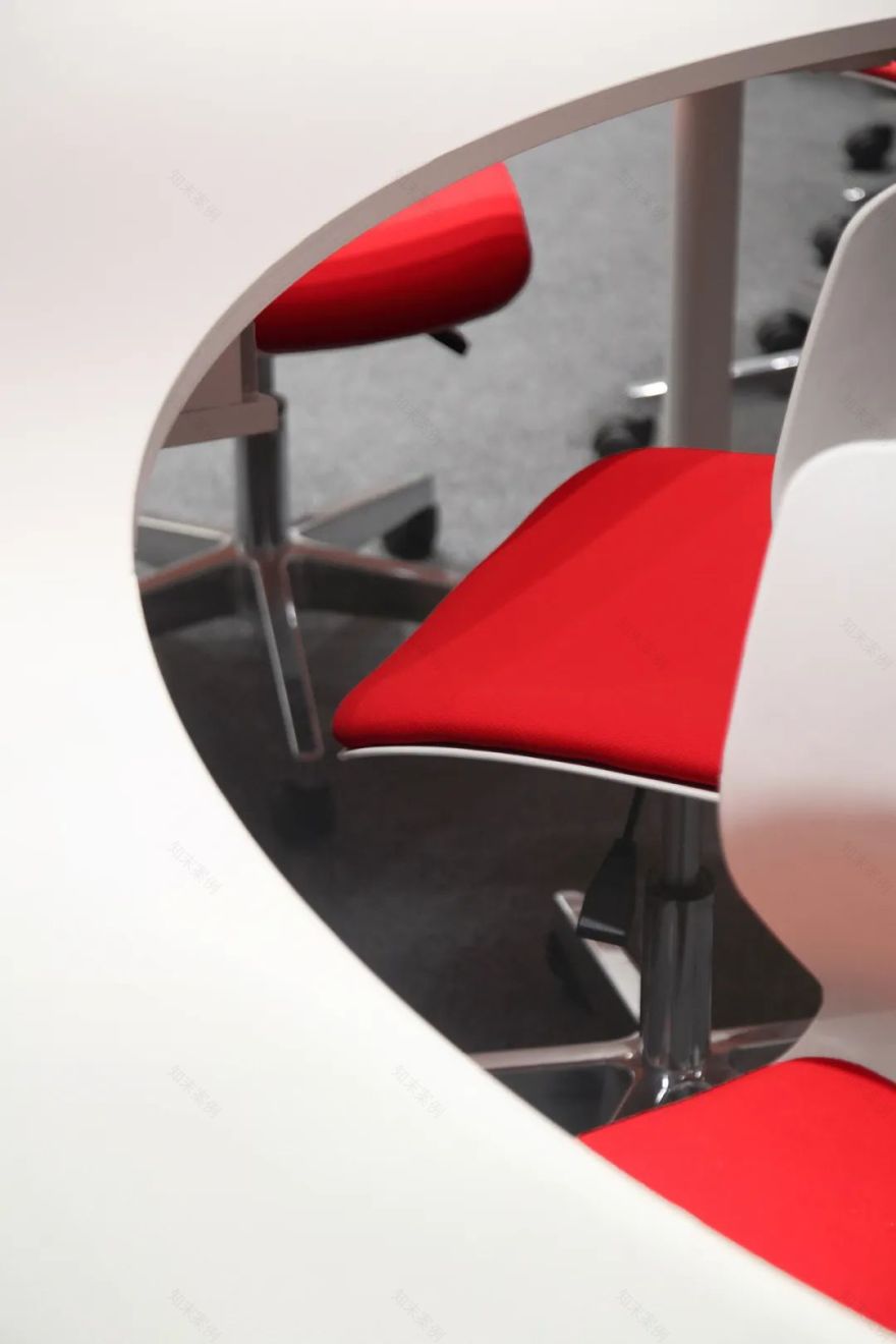
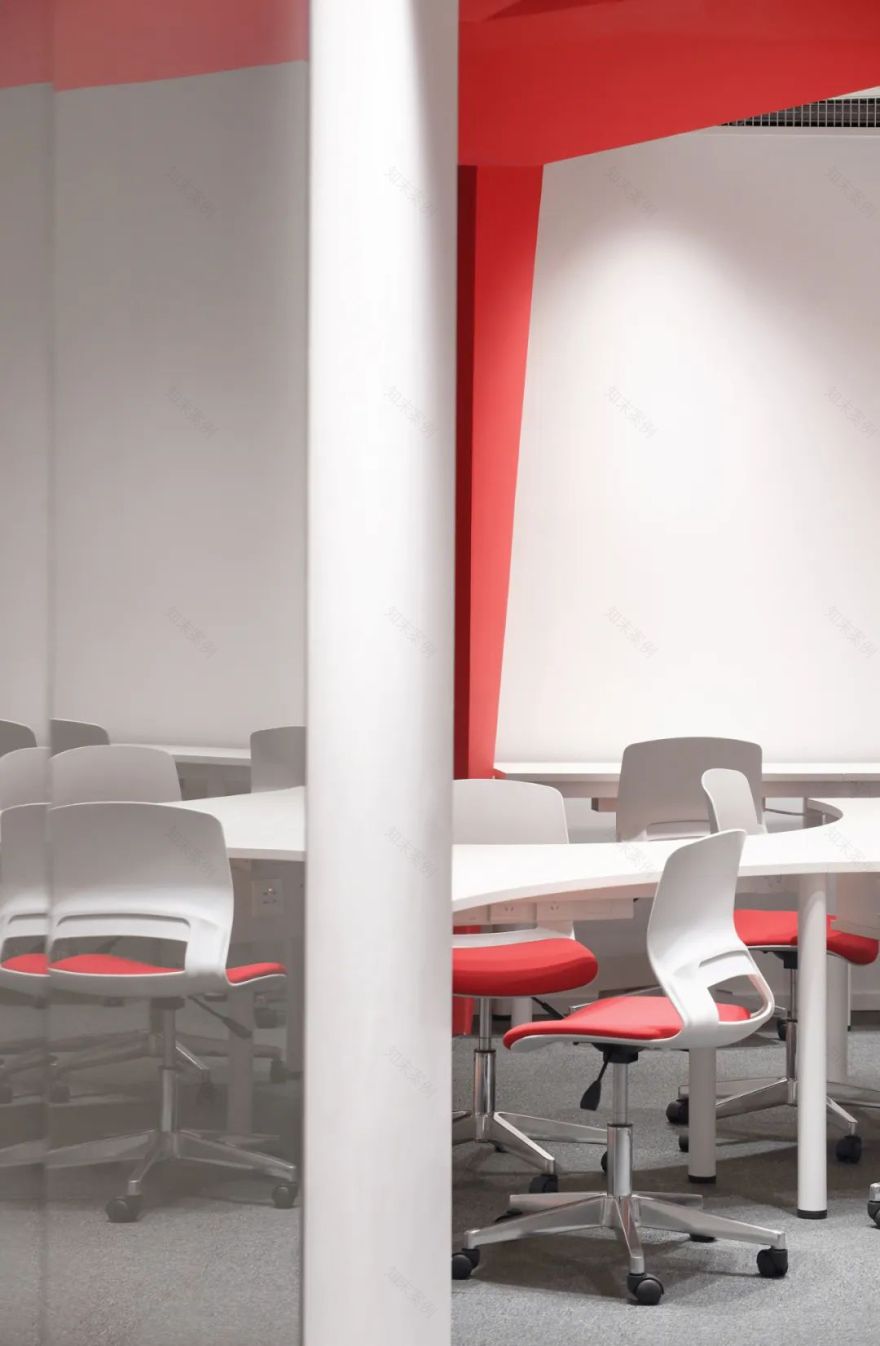
於是,設計師想到了利用圓弧的陰陽圍合屬性,將整個空間分成兩大主要區域,四個組成部分,完成了基本的空間規劃。“原始結構的空盒子內,插入塊面構成的雲狀結構體,而後以系列家具補充,構成完整的空間形態。空間的使用者大多依靠手機完成日常工作,那麼在辦公空間的四個組成部分內,我們選擇緊湊地排列多組辦公位,縮短寬度的流線型工位更便於溝通互助,這壹構思使得空間的利用率和工作效率大幅提升。
Therefore, the designer thought of using yin and yang to enclose the property with circular arc to divide the whole space into two major areas, four components, and completed the basic spatial planning. In the empty box of the original structure, a cloudlike structure composed of blocks and planes is inserted, and then supplement it with a series of furniture to complete the spatial form. Most users of the space rely on mobile phones to do their daily task. Therefore, in the four parts of the working space, we chose to arrange it in a compact manner, and the streamlined work stations with narrower widths are more convenient for communication and mutual assistance. This concept has greatly improved the utilization rate and working efficiency of the space.
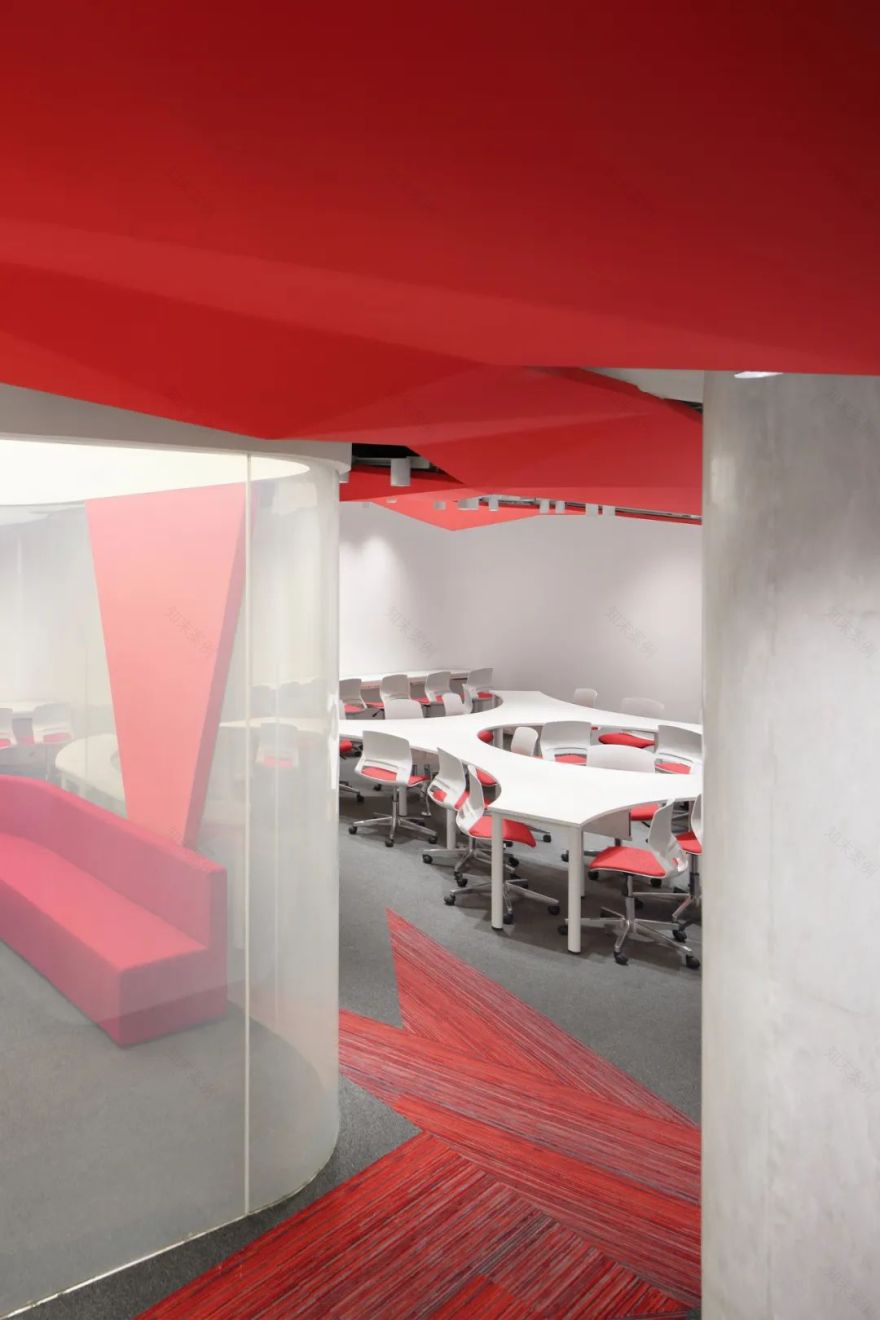
除了工位设置的巧思,设计还依据集团企业强调科技化体验的特点,将面部识别门禁系统运用其中,配合深色玻璃门禁,保持着空间的私密性和机密感,而会议室的玻璃墙体可根据需要,在雾化和透明之间任意切换,无痕迹的操作方式可将体验感被叠加放大。地面一抹条形红色地毯被刻意铺设的棱角分明,形似顶上红色“云朵”落在地上的影子,又是天地相连的交相呼应!
In addition to the ingenuity of the station setting, the design also uses facial recognition access control system according to the characteristics of technological experience that the enterprise has been emphasizing. The dark glass access control maintains privacy and confidentiality of the space; the glass wall in the meeting room could adjust according to necessity, switching between atomization and transparent arbitrarily in traceless operation mode which superimposes the experiences. A strip of red carpet on the ground was deliberately laid out with sharp edges and corners, resembling the shadow of the red "clouds" falling on the ground, calling out the echoes of heaven and earth!
項目大膽使用紅色為主導色,使其在整個空間多維穿插、連綿不斷,給人帶來鮮明的視覺張力,但又遠遠不止於此,它被賦予貫通聯結的角色,是最首要的顯著元素,更成為空間的第壹視覺形象。
The bold use of red as the dominant color makes it interspersed and continuous in the whole multi-dimensionally space, which brings a distinct visual tension to the people inside. However, it is far more than that. It is endowed with a connecting role and is the most important and significant element which becomes the first visual image of space.
犀利的設計手法內既有棱角鮮明的銳利切割,又有天地合壹的雲之縹緲,二者結合形成本項目獨特的空間形態走向。
The trenchant design technique contains sharp cutting with distinctive edges, as well as a ethereal integration of heaven and earth. And the combination of the two forms the unique spatial shape of the project.
空間軸側圖
爆炸軸測圖
項目名稱 | 南京河西醫美營銷事業部
項目地點 | 南京青奧中心雙子塔
項目面積 | 320㎡
完成時間 | 2019年5月
設計機構 | 登勝設計
主創設計 | 陶勝
設計團隊 | 張奕、蔡輝、黃婉、徐青華
項目攝影 |
ingallery
主要材料|地毯、鋼化玻璃、乳膠漆
聯系我們
商務合作
Mob:13817741417
媒體聯絡
Mob:13776661602
關注更多信息
Weibo:
登勝設計
官方公衆號
Add:南京市建邺區樂基廣場2號樓814室
客服
消息
收藏
下载
最近


