查看完整案例


收藏

下载
本案坐落于中国规模最大的软件产业园区之一,被誉为“南京硅谷”的徐庄软件园内,选址在紧靠苏宁中国总部200米处,步行3-5分钟即达。园区内主流工作人群多为80后和90后。突破传统的咖啡店模式,又能与园区文化和工作节奏相吻合,是设计的主导方向。业主想要打造一个极具现代感的快销咖啡品牌,来满足园区内办公族闲暇之余享受咖啡的乐趣。
This case located in one of the largest software industrial park, known as the "silicon valley" of nanjing Xu Zhuang software park, located in 200 meters close to su ning China headquarters, 3 to 5 minutes walk. Most of the mainstream working groups in the park are post-80s and post-90s. Breaking through the traditional coffee shop pattern and matching the culture and working rhythm of the park is the leading direction of design. The owner wants to create a modern fast retailing coffee brand to satisfy the leisure time of the office workers in the park.
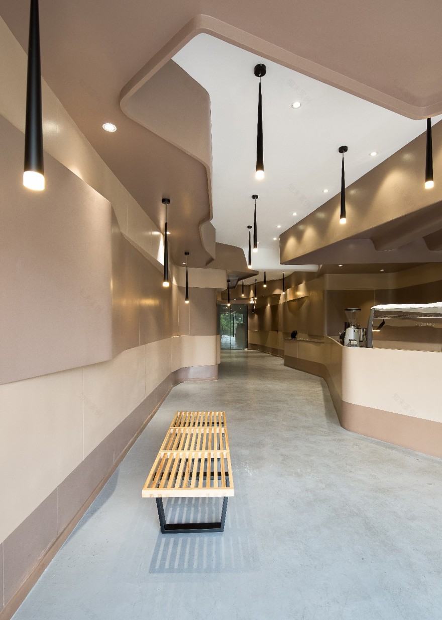
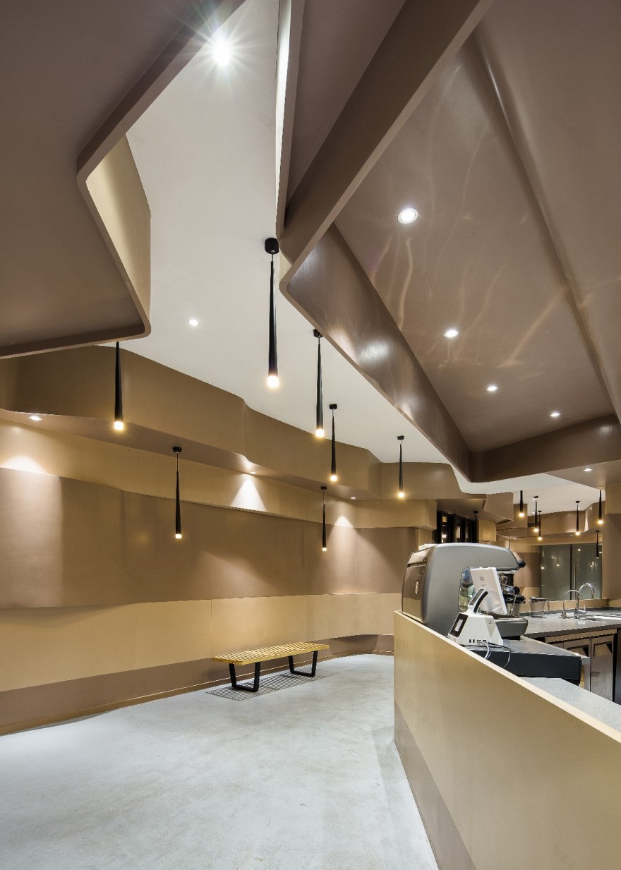
这是一个180㎡的门店,设计师结合业主的想法营造了一个极其炫酷和现代的室内环境,深咖色与浅咖色相间的墙面如丝带般蜿蜒融合,墙面造型如流水般贯穿整个室内,一直延伸至顶部,形成不规则的顶面造型,让顾客一进门就仿佛置身于咖啡的海洋,丝滑感油然而生。在梁体的处理上也充分利用墙面造型的独特性,用温柔细腻的手法将梁体隐藏于弧型的吊顶里面,使得整个空间蜿蜒曲折、连贯统一。
This is a 180 ㎡, its designers combine the idea of owner built a very cool and modern indoor environment, between the deep coffee color and light coffee color metope like ribbon winding fusion, throughout the indoor metope modelling is like running water, has been extended to the top, top of the formation of irregular modelling, make the customer an enter a door as if place oneself in the ocean of coffee, silky feeling arises spontaneously. In the treatment of the beam body, also make full use of the uniqueness of the wall modeling, with the gentle and delicate technique to hide the beam body in the arc type of the ceiling, so that the whole space twists and turns, consistent and unified.
独特的墙面造型增加了空间的造型感和立体感,弧型结构给人无比柔美的感觉,将咖啡这种可刚可柔的特点发挥得淋漓尽致,具有高度的匹配度。看似简单的形式和材料营造出纯粹概念的空间氛围,迸发出无限的张力。
Unique sense of the modelling of metope modelling increased space and stereo feeling, arc structure in the sense that gives a person extremely soft, the characteristics of the coffee that can be just soft play incisively and vividly, a high degree of compatibility. Seemingly simple forms and materials create a pure concept of the space atmosphere, burst out infinite tension.
设计师在设计上通过光与影的变化,赋予室内空间不一样的气质,提升了空间的品质。在黑色吊灯的照射下,凹凸不平的墙面呈现光与影的错落变化,暖色系的空间在冬天会给人带来温暖的感觉,自流平的水泥地面在夏天又会给人带来一丝清凉,是园区内放松心情、休闲小憩的好去处。
Stylist is in design through the change of light and shadow, give indoor space different temperament, promoted the quality of space. In under the irradiation of black droplight, uneven walls appear strewn at random change of light and shade, warm color department of space in the winter can bring warmth to the person, self-leveling cement floor in the summer and will bring a cool and refreshing, is to relax in the park, leisure, a good place for a nap.
细长的门店内在设置后厨和储物间后所剩空间不多,考虑店铺两个门进人的可能性,设计师大胆将操作台设计成了岛式布局,婉如从墙上抽拉出一条丝带围成一个吧台区,如此便可以轻松接待从不同入口进门的客人。有效节省空间并提升了功能价值。
Slender stores within set between the kitchen and storage after the rest space is not large, considering the store two door into the possibility of a person, stylist is bold will work station design into island type layout, wan, such as smoked pull out a ribbon from the wall into a bar area, so then you can easily receives guests from different entrance door. Effectively save space and improve function value.
半高的操作台让顾客可以直接看到咖啡制作的过程。而操作台的造型与上方的吊顶造型看似统一,实则错落有致,延续了整个空间的风格造型,浪漫且细腻。咖色系的室内环境在灯光的映照下显得温柔安静,连蛋糕都看上去更加的诱人了。
The semi - high operation platform allows customers to see the process of making coffee directly. And the modelling of the work station and the condole top modelling of above appear unified, in fact strewn at random have, continue the style modelling of whole space, romance and exquisite. The indoor environment of the cafe is gentle and quiet under the light, even the cake looks more inviting.
整个店面如行云流水般顺畅,从进门到后厨再至吧台,都是统一的流线形体和咖啡色彩,带来强烈的形式美感,没有一点多余的装饰。少即是多得到完美诠释,咖啡本就是时尚的宠儿,在这个时尚的空间内品尝咖啡可谓是相得益彰。
The whole storefront is as smooth as flowing water, from the door to the kitchen to the bar, it is a unified streamlined body and coffee color, bringing a strong form of aesthetic feeling, without any unnecessary decoration. Less is more perfect interpretation, coffee is the favorite of fashion, in this fashionable space to taste coffee is a perfect match.
工程名称:别止咖啡
设计单位:登胜空间设计
参与设计师:蔡辉、徐青华
主要材料:乳胶漆、钢化玻璃、自流平
坐落地点:苏宁易购总部
竣工时间:2017年8月
Project name: Bie Zhi Coffee
Design unit: Deesen design.
Host designer: Sheng Tao.
Participating designers: Hui Cai,Qinhua Xu.
Construction area: 180 meter square.
Main materials: Latex paint, toughened glass, self-leveling.
Location: Suning's headquarters.
Completion date: August 2017.
Photographer:Lei Zheng.
客服
消息
收藏
下载
最近


