查看完整案例


收藏

下载
随着生活水平的提高,美发行业逐步向年轻化、精细化、品质化方向发展,转型升级过程加速,突破了人们对沙龙空间的固有认知。因此,在空间品质上也应做出相应整合,让客户精神层次上体验更为丰富。
With the improvement of living standards, the hairdressing industry is gradually developing in the direction of youthfulness, refinement and quality, and the process of transformation and upgrading has accelerated. All these breaks through people’s inherent cognition of salon space. Therefore, corresponding integration should be made in improving the quality of the space, so as to enrich the customer’s spiritual experience.
MIX & SCOPE DISIGN
室内设计:品界设计 Interior Design: Scope Design
主创设计:品界主创团队
Creative Design: Scope Design Main Creative Team
设计参与:品界深化团队
Design Participation:Scope Design Deepen the tea
空间类别:商业空间
Space Category: Commercial Space
设计风格:极简主义
Design Style: Minimalism
项目面积:100㎡
Project Area: 100㎡
设计说明:
Design Description:
你认识什么样的美,你就会发现什么样的美,你就会创造什么样的美出来。没有人会拒绝美,不管多忙人们都会停下脚步,步入美发店对自己进行一番修饰...
What kind of beauty do you know
You will find what kind of beauty
You will create what kind of beauty
No one will refuse beauty. No matter how busy they are, they will stop and step into a hair salon to make some modifications to themselves...
/01
项目介绍
INTRODUCTION OF THE PROJECT
△ 概念图 - 发型飘
△ 概念图 - 狭缝
该项目位于商业街上的一个小店,在二层,以工作室的形式经营。狭小的一层店面,只够容纳一部楼梯的宽度。之所以选址在这,是因为甲方正处于创业阶段,空间小、造价低等各方面的条件限制,于是极简风便是对它最好的表达方式,但无疑也给我们的设计上带来了很大的挑战性。
The project is located in a small shop on a commercial street. It is operated as a studio on the second floor. The small one-storey storefront is only large enough to accommodate the width of a staircase. The site was chosen here because Party A is in the entrepreneurial stage. Due to the small space, low cost and other constraints, minimalism is the best choice, but it undoubtedly brought great challenges to our design.
从外面看,这个空间有点神秘。它是通过一条狭缝,拾级而上,来到内部空间。内部布局仍然很简单,1 个前台,10 个理发位,VIP 室,洗头间,与空余的区域作为顾客休息等待场所。
Seeing from the outside, this space is a bit mysterious. People should pass through a crack, climb up the stairs, and then come to the inner space. The internal layout is still very simple. There is only a front desk, 10 hairdressing booths, VIP rooms, hair wash rooms, and spare areas as waiting places for customers to have a rest.
/02
项目解读
PROJECT
I
NTERPRETATION
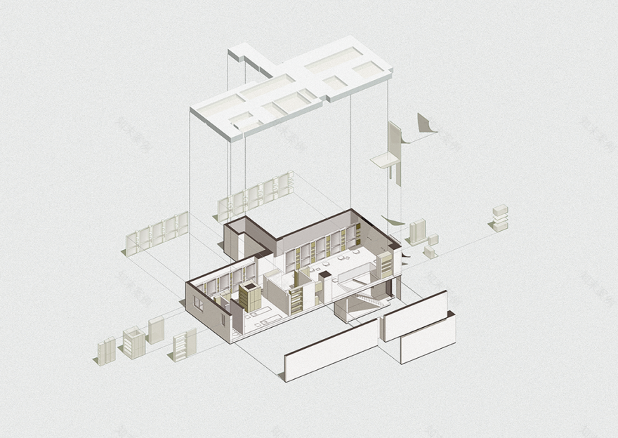
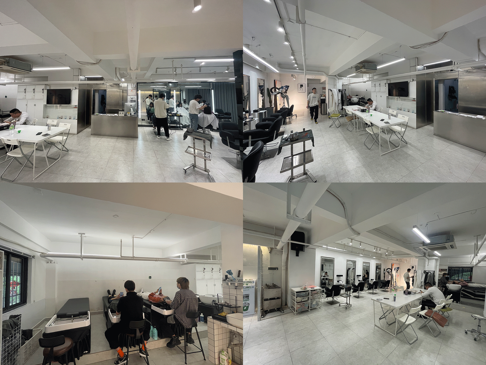
此项目是一个原始层高低矮的夹层。梁位粗旷复杂、管道交错显露于外。与它形成对比的是这个新空间,剔除了原有的灰白色基调,利用原结构合理规划体块造型,以原始的一体化暖灰漆面,均匀散布的灯膜,串连起来。
This project is a mezzanine between the original floors. The beam positions are rough and complex, and the pipes are staggered and exposed to the outside. In contrast, in this new space, the original gray-white tone is removed. We make use of the original structure to rationally plan the shape of the blocks, and connect them in series with the original integrated warm gray paint surface and evenly distributed light films.
整个外观如同女孩的背影一般、头上顶着飘逸发丝,屹立在这座城市街道的夹缝中。
...
The whole appearance is like a girl’s back, with flowing hair on her head, standing in the cracks of this city street...
改造前▽
外观门头以“发丝”为灵感,提取弧线元素,通过立体化、变形,构成曲面造型。在一个较窄的门面上,置入竖向方形体,方中有方、方中有曲,方是橱窗里看得见阶梯的方盒子,曲是飘扬的立体曲面造型。加上一体化的金属质感,整体给人一种仰视感、一种自下而上、向上而升的力量。
The appearance of the door head is inspired by "hairline". We extract the arc elements and finally form a curved modeling by three-dimensionalization and deformation in our design. We also place a vertical square on a narrower door surface, so as to achieve the effect of having Fang in the Fang and Qu in the Fang. Fang--is a square box with steps visible in the window, and Qu--is a flying three-dimensional curved modeling. Coupled with the integrated metal texture, the whole gives people a sense of looking up as well as a kind of bottom-up and upward strength.
在靠近玻璃栏杆的休息区,人们可以将视线放及一楼的“台阶”区域,从而实现了空间的灵动与贯通。
In the rest area near the glass railing, people can put their sight to the "step" area on the first floor, thus realizing the agility and penetration of the space.
/03
于错落中 规划秩序
PLANNING ORDER IN THE PATCHWORK
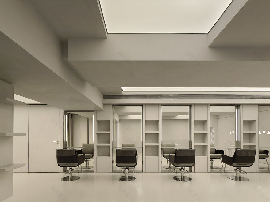
把空间这一框架比喻成无规则的盒子,对里面的每一方块进行合理化组织,突破原有条框,经过体块化组合,使得顶部的梁位井然有序。梁之间是往上凹的体块,将这一块块不同大小的方形做成发光体,犹如透窗而入的光。
Compare the space frame to an irregular box. Our design rationally organizes each square inside, breaks through the original frame, and combines them in blocks to make the top beams orderly. Upward concave blocks are placed between the beams. These square blocks of different sizes are made into luminous bodies, just like the light coming in through the window.
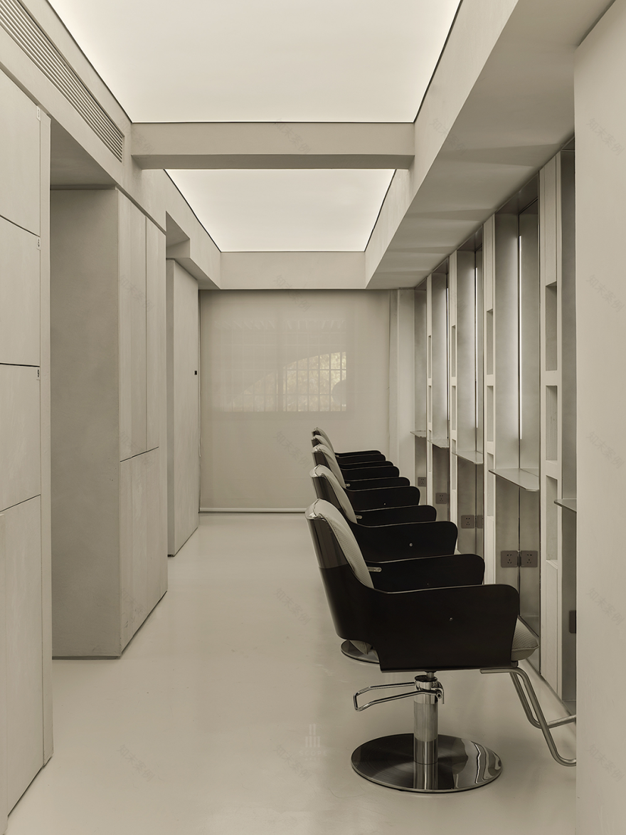
整齐划一的理发位,接连成了长条形,在无序中寻找秩序,给人以视觉上的延伸。每一面镜子都是落地,为顾客带来最大化视觉;把空余的位置做成产品柜和储藏柜,也起到了划分空间的作用。
The neat and uniform haircut positions are successively formed into long strips, looking for order in disorder and giving people a visual extension. Every mirror is on the floor to maximize the vision for customers. The vacant positions are designed into product cabinets and storage cabinets, which also play a role in dividing the space.
/04
于逃离繁杂 重获温度
ESCAPE THE COMPLEXITY & REGAIN THE WARMTH
△ 概念图 - 几何光
上帝说:”要有光!“于是,就有了光。光是环境中不可缺少的元素,在采光只有一面狭小窗户的空间中,怎么让它光源均匀自然呢?这值得我们思考。于是我们便应用了最为均匀的软膜天花,来作为主要照明,将整个空间的顶部能点亮的地方,全部点亮,且均匀又柔和。所到之处皆是明亮的,这无一不符合理发空间的照明需求,为理发师带来一个自然且舒适的工作环境。
God said, "Let there be light!" So, there is light. Light is an indispensable element in the environment. In a space where there is only one narrow window for lighting, how to make its light source uniform and natural? This is worth thinking about. Therefore, we apply the most uniform soft film ceiling as the main lighting, lighting up all the top spots of the entire space, evenly and softly. Everywhere people go is bright, which all meets the lighting needs of the hairdressing space, and brings a natural and comfortable working environment for the hairdressers.
暖灰色的空间,艺术漆朴实的质感,赋予空间平静的氛围,这种静与动的相互对比之下,无形中传递着一种温度感。
The warm gray tone and the simple texture of artistic paint give the space a calm atmosphere. Under the contrast between static and dynamic, the whole space conveys a sense of warmth invisibly at the same time.
空间是一点一点铺叙出来的,寄予每一位到访者一份更好的体验。
The space is laid out bit by bit, hoping to give every visitor a better experience.
主创设计师:翁德&梁剑峰
- Chen -
客服
消息
收藏
下载
最近


