查看完整案例


收藏

下载

翻译
Architects:Austin Maynard Architects
Area :418 m²
Year :2021
Photographs :Tess Kelly
Manufacturers : About Space, Brodware, Colorbond, Dulux, Signorino, Weathertex, Bosch, Fisher and Paykel, Franke, ILVE, ReeceAbout Space
Builder :CBD Contracting
Project Team : Andrew Maynard, Mark Austin, Natalie Miles
Engineer : Adams Engineering
Building Surveyor : Fotia Group
City : Northcote
Country : Australia
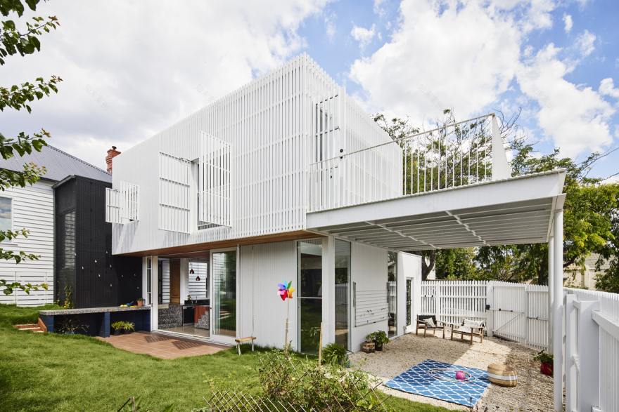
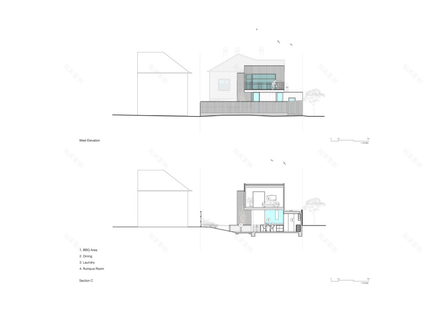
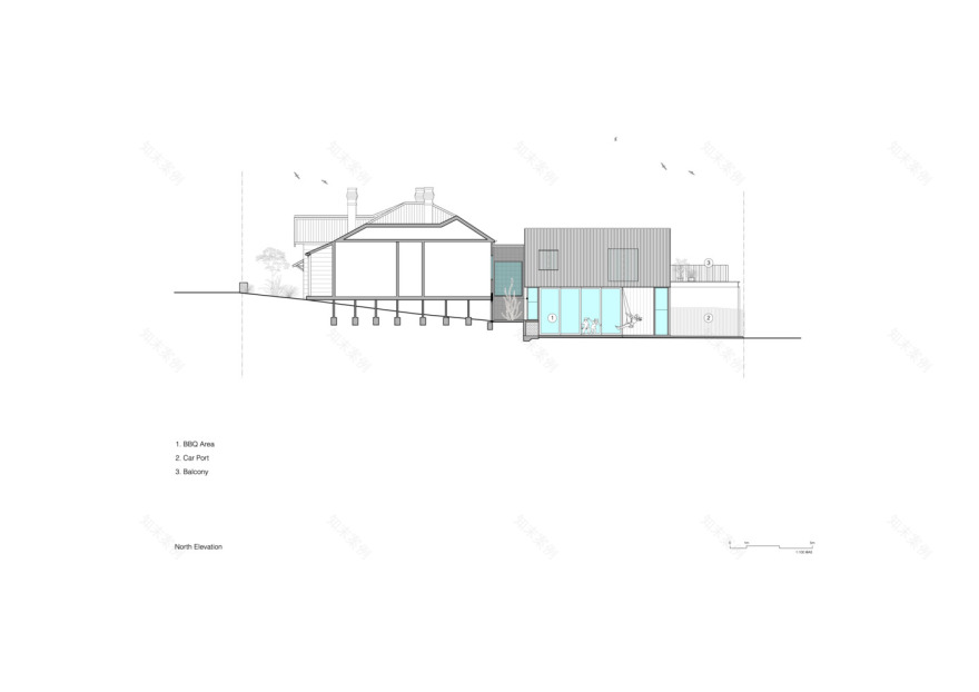
Picket House is a two-storey addition to a freestanding Edwardian timber house, on a corner block, at the top of a hill in Northcote. The old part of the house has been re-roofed and internally upgraded and now forms the sleeping quarters. The new addition has a kitchen, dining, and living, with a pantry, powder room, and laundry along the southern side. The living area is double-height to maximize light and volume. The first floor has a multi-functional open space and access to an external deck.
The owners Zoe and Merez, parents of two young children, began their renovation plans with a simple aim, they wanted a rear deck. The existing, run-down 70s lean-to “had to go” and by extending the footprint a more prescriptive brief evolved; coupling the owner's requirements with functional aspects and their desire for “an overall sense of warmth, volume, and light”. The typical approach by Austin Maynard Architects is to find the opportunities within the brief and the site, to seek responses that surprise and delight rather than adopting typical approaches to residential design. At Picket House suggestions such as the flexible space, the entry, and the separation of sleeping quarters and living zones, all evolved during the design process.
The block is sited on a fairly steep gradient, with the front of the house at the top of a hill, sloping downwards to the rear of the block. This presented the opportunity to investigate levels between spaces and the idea of vertical connection. At several points, the ground levels were pre-determined and could not be raised or lowered, such as the door between the old lean-to and original house and the footpath along the side of the block - but there was flexibility in setting new internal floor levels.
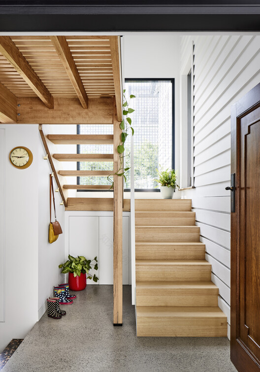
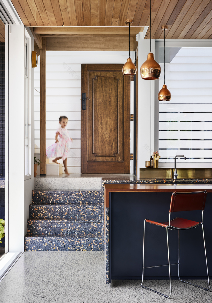
Having repositioned the front door at the side of the house, the entry floor level was set at kitchen bench top height, allowing a flow of space from the entry through to the kitchen and out to the BBQ zone. Half a flight up is the original doorway to the old part of the house. Another half stair up there’s a timber batten landing which provides a connection between the ground and first floor.
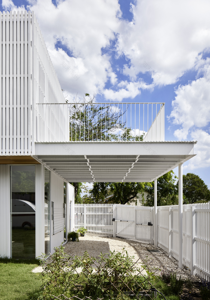
Though it serves to access a total of four levels within the layout of the house, the central staircase appears small and simple, by design. Having relocated the new addition along the southern boundary to maximize northern light, we sought to address the outcome of added bulk along the street. Rather than add on a big high contemporary box, we took a lighter approach, sinking the new addition to reduce the height and embracing the suburban language of the area. White pickets were an early option to creatively reinterpret the need for a new side fence. As the design progressed, the typical fence material of the paling/picket became the external cladding, concealing the lower level wall of the addition on the southern side, and wrapping the entire first floor of the addition.
▼项目更多图片
客服
消息
收藏
下载
最近


