查看完整案例


收藏

下载

翻译
Architects:Atelier Xianza
Area :452 m²
Year :2020
Photographs :Chao Zhang
Lead Architects :Qiuwen Luo, Zhixu Wang
Design Team : Licen Ye, Yuedan Su, Guoming Chen, Yingfeng Wu
The Client : Foshan A Thing of Beauty Art Communication Co.,Ltd
City : Foshan
Country : China
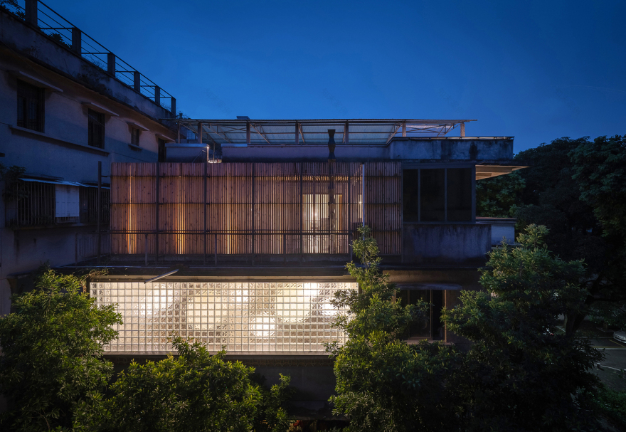
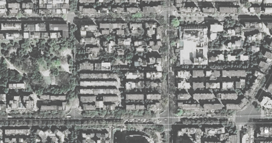
The city expansion accelerates along with the constant development of information. At the same time, a fierce renewal inside the city which is like a surging whirlpool is absorbing all kinds of resources radially from the center to the surrounding. In the situation of increasingly scarce resources, the re-use of the “old part” of the city is coming up as a new solution. The “272 Gallery” is generated in this background aims to innovation reuse. It is located in the Chuihong community of the center of Chancheng District, Foshan City. It is about 15 minutes walk from the Zumiao temple, a folk religious culture center of Foshan. It was built in the 1980s, the block is composed of several groups of residential districts with a pleasant scale of buildings and streets. Most of them are four to five stories brick concrete buildings. Nearby, there are community parks, schools, markets, coffee shops, and various types of small shops with a strong flavor of life.
Starting from the analysis of the current situation, we reassessed the building. We aimed to a clear and precise minimal intervention to achieve a kind of intimacy and interdependence between the old and the new, to create a harmonious space atmosphere to adapt to the new needs, and show that the same type of old space can achieve some new possibilities. How is the environment be used in the renovation of new buildings? Entrusted by the owner, the scope of the renovation includes two floors of the third and fourth floors. Space needs to transform the original residence into three basic functions of medieval furniture display, art gallery, and private gathering, so as to inject art elements into the community. In order to achieve this kind of "minimum" intervention, we try to have the "consultation" dialogue with space. Where should be demolished, repaired, or added? All the demolished parts will be truthfully reflected in the new environment, and on the contrary, the new parts will overlap with the original traces, which is a game process between the new and the old, so as to establish a new spatial order.
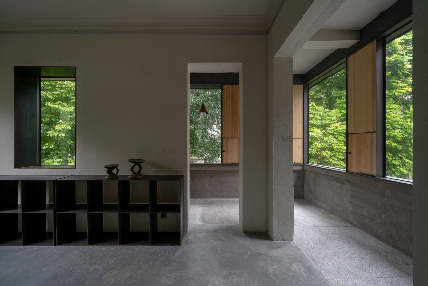
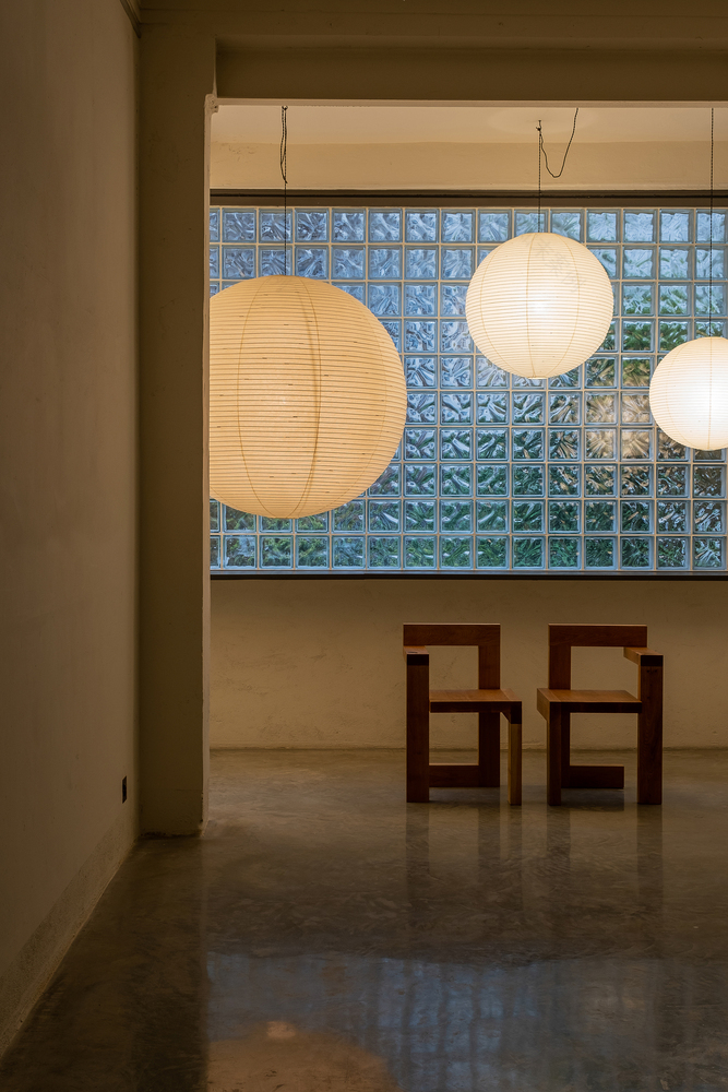
As the structural form of the original building limits the possibility of space reconstruction, while the third floor serves as a venue for furniture display and regular art exhibition, in order to meet the mobility between spaces and is conducive to exhibition and sightseeing, we demolish all the doors of the original house to form the experience of space integration. Due to the elimination of the door element, the relationship between rooms becomes equal, so as to meet the flexibility of carrying all kinds of art exhibitions.
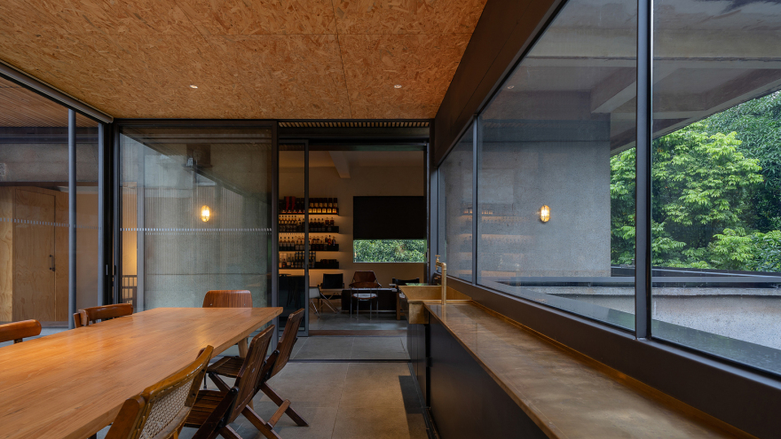
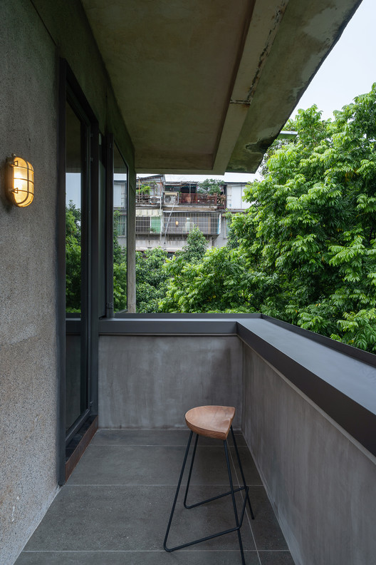
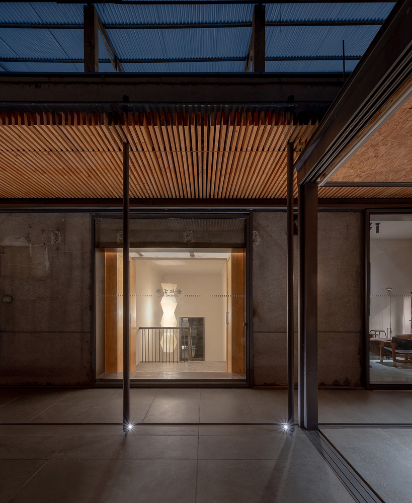
A fourth floor is a place for private parties, and the area of the interior part (whiskey room and antique collection room) is equal size to the terrace. We put a new rectangular space on one side of the terrace as a tea house, with the corridor connecting the new and old volumes as a transition, so as to increase the level sense and depth of the indoor space. The control of the proportion of doors and windows in all directions and the application of long horizontal windows are also matched to serve the tea house. The pine grating fence, the new tea house, and the original building together form a centripetal external space, which causes and connects different events in the courtyard.
Benefit from the big trees planted in the community, the height of the tree crown has reached three or four stories, which provides an intoxicating green vision and shelter for the whole site, and also brings a quiet atmosphere. Facing the rare scenery of the city center, we have carefully designed the windows in different directions and positions. Looking from the interior to the exterior, it seems that the windows themselves have disappeared, in order to perfectly present the pure green.
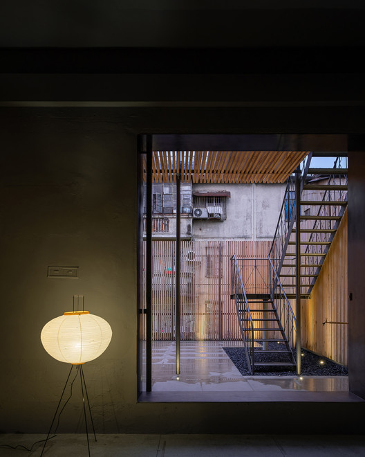
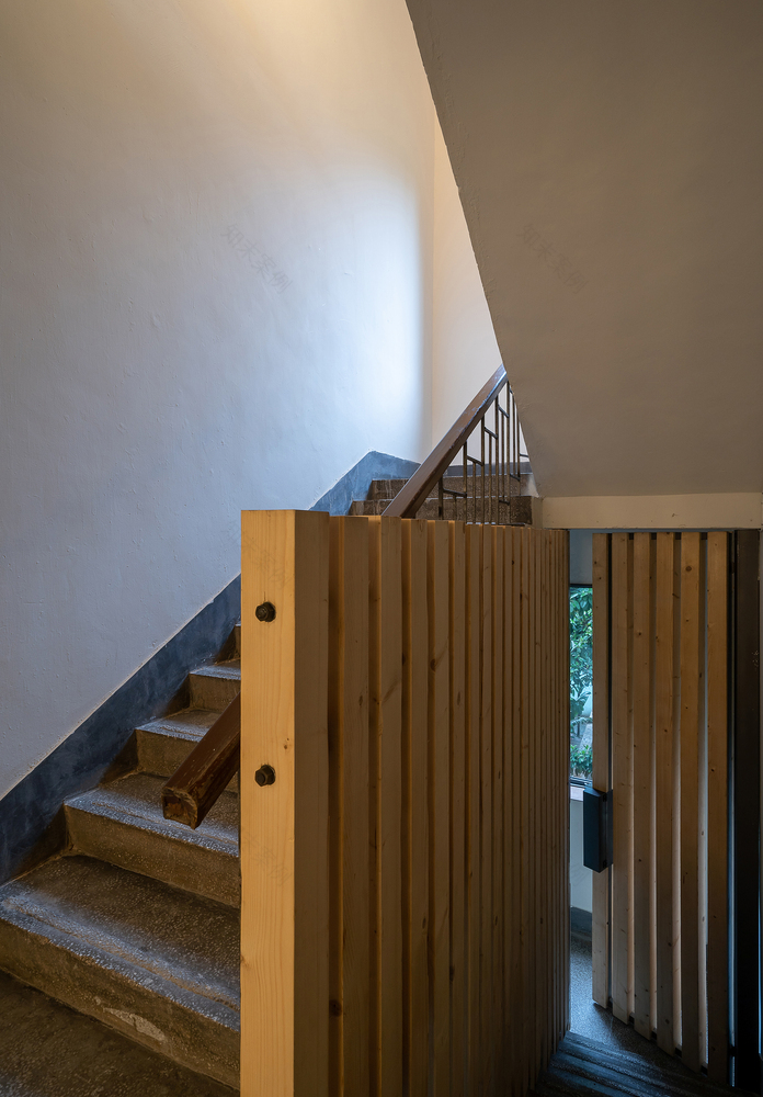
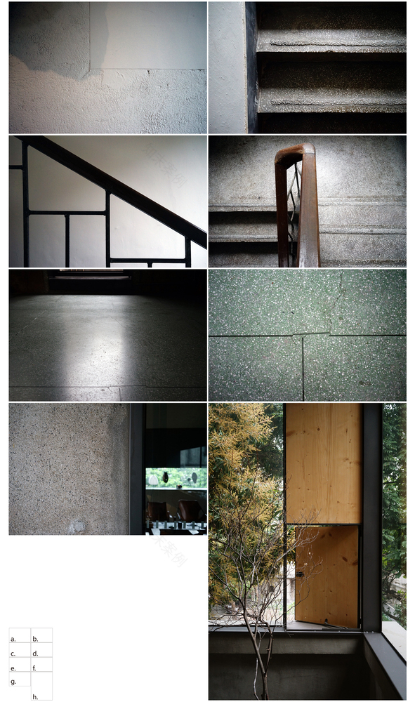
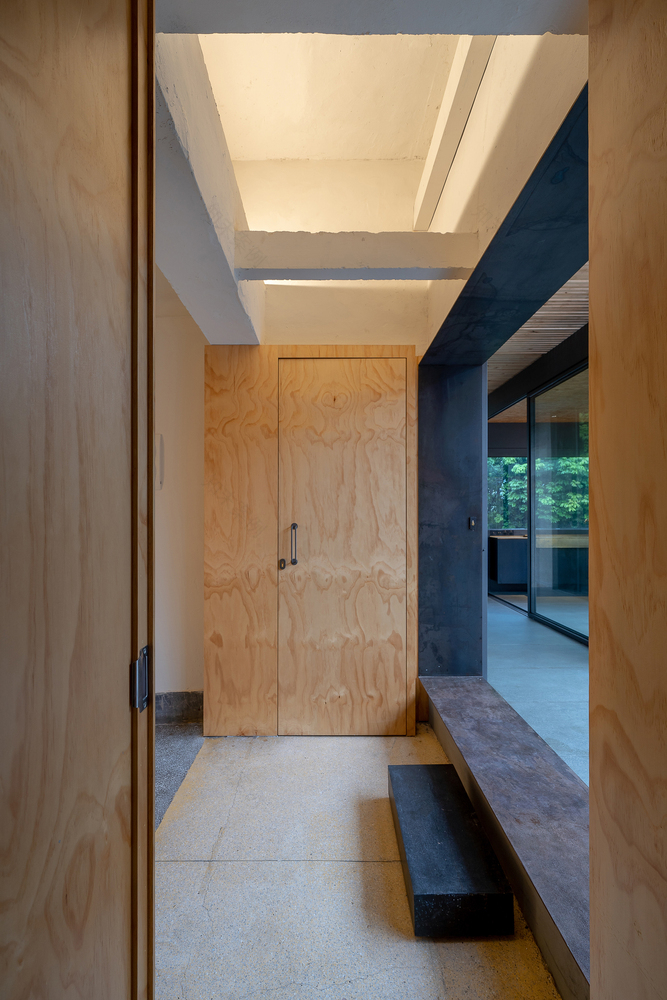
In the use of materials, we also continue the principle of "minimization". In addition to the unpainted pine and glass brick walls on the third floor, the external guardrails of the stairs and the courtyard are all made of iron. Due to the heavy feeling and the property of easy oxidation of iron, it matches the character of space and strengthens the atmosphere of space. For cost consideration, we chose to retain the original cast-in-place terrazzo floor and wall mechanism, wooden handrails of stairs, balancing the relationship between the old and the new.
The renovation practice is experimental, trying to inject some cultural elements into the old community with the renewal of architectural space. To touch the memory of the city, making people aware of the charm of the blocks. The city and architecture are closely connected through a pleasant environment and diversified cultural and artistic activities. Because we always feel that the environment is shaped by people, but also shape the people there.
▼项目更多图片
客服
消息
收藏
下载
最近


