查看完整案例


收藏

下载
Brella是由两名企业家Darien Williams和Melanie Wolff新近创立的儿童保育机构,它能够按照人们的需求来提供相应的服务。Brella的品牌理念在于让顾客提出自己的需求并设法满足,而不是将顾客局限在已设定好的服务项目中。Brella希望能够通过为3个月到6周岁的婴幼儿提供灵活的护理服务以及一系列支持性设施(如共享工作空间和精心策划的健康、教育和家庭的相关课程等),来打破现有的传统育儿模式。建筑事务所Project M Plus接到委托,来为这个创新型的初创企业设计品牌形象和其位于Playa Vista的旗舰店。
Brella is a new on-demand childcare provider founded by two entrepreneurs, Darien Williams and Melanie Wolff. Designed to be responsive, rather than restrictive, Brella aims to disrupt the current childcare paradigm by offering flexible care for 3-month olds to 6-year-olds, and supportive amenities including co-working space and curated wellness, education, and family classes. Project M Plus was commissioned to create a brand identity for this innovative start-up and to design their flagship location in Playa Vista.
▼项目入口,the entrance of the project
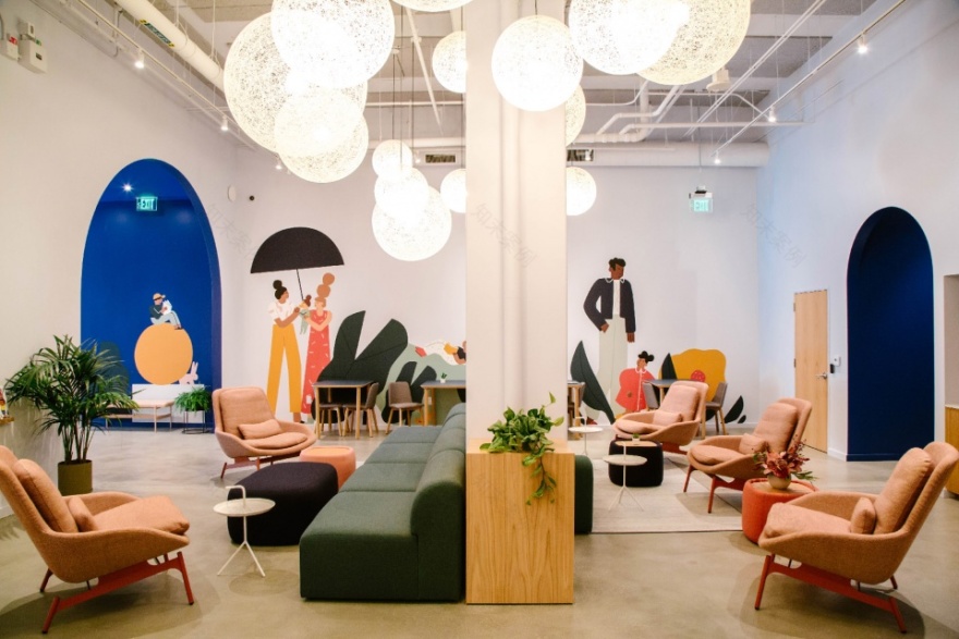
▼室内空间,墙壁上覆有壁画,the interior space with a mural
品牌形象 | Brand
建筑事务所Project M Plus与Brella密切合作,以期能够找到一种品牌设计方案,从而平衡这个亲子空间的可达性和简洁性。Brella将自己定义为一个传播想象力、智慧和反应能力的权威性机构。总体来说,它有四个主要的特点:平易近人、热情好客、丰富有趣和值得信赖。因此,设计团队以友好性和奇特性为基础,设计出一个既能适应儿童天性、又能向家长传达品牌价值观的空间。此外,Project M Plus还与Brella共同创建了一个开发平台,以便向非该行业内的投资者展示技术信息。
Project M Plus worked with Brella closely to develop a brand and a design approach that balanced accessibility and simplicity for parents with kid-friendly appeal for children. The Brella brand communicates imagination, intelligence, responsiveness, and establishes itself as a believable authority. Overall, Brella’s brand is shaped by four main tenants: to be approachable, welcoming, playful, and trusted. With friendly and whimsical touchpoints that everyone will recognize, Project M Plus speaks a kid-forward parlance, while conveying the values and philosophies that speak to parents. Project M Plus also worked with Brella to create a development deck, optimizing the presentation of technical information to non-industry investors.
室内空间 | Interiors
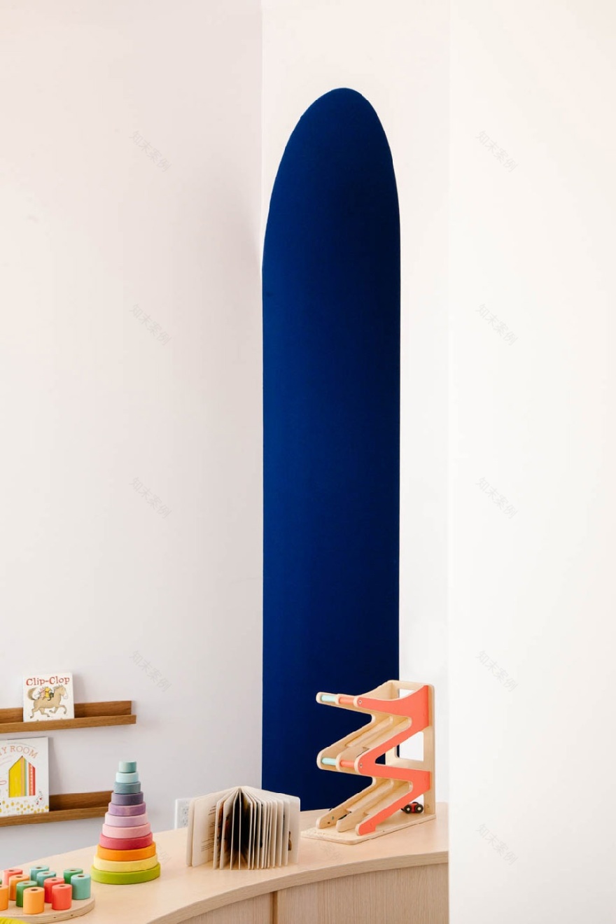
Project M Plus所提出的室内设计方案的目标是创建一个能够营造社区氛围的空间,从而既可以为孩子们带去欢乐和知识,又能在美学层面上吸引家长。为此,设计团队采用现代的方法,选择了坚固的商业材料以及中性的空间色调、家具、艺术品和配件等。他们有意识地在空间中加入大量的颜色和有趣的形状,以促进浅色柔和空间与深色活泼空间之间的对比和融合,从而确保整个空间的普适性。Gross Motors区域的油毡地板上覆有有趣的图案,从而为孩子们创造了一个充满欢乐的空间。此外,洗手间中的方形瓷砖也使用了类似的图案。
▼室内活动空间,油毡地板上覆有有趣的图案,interior view of the space with playful patterns in the linoleum flooring
▼室内活动空间,设有大量娱乐设施,interior space with playing facilities
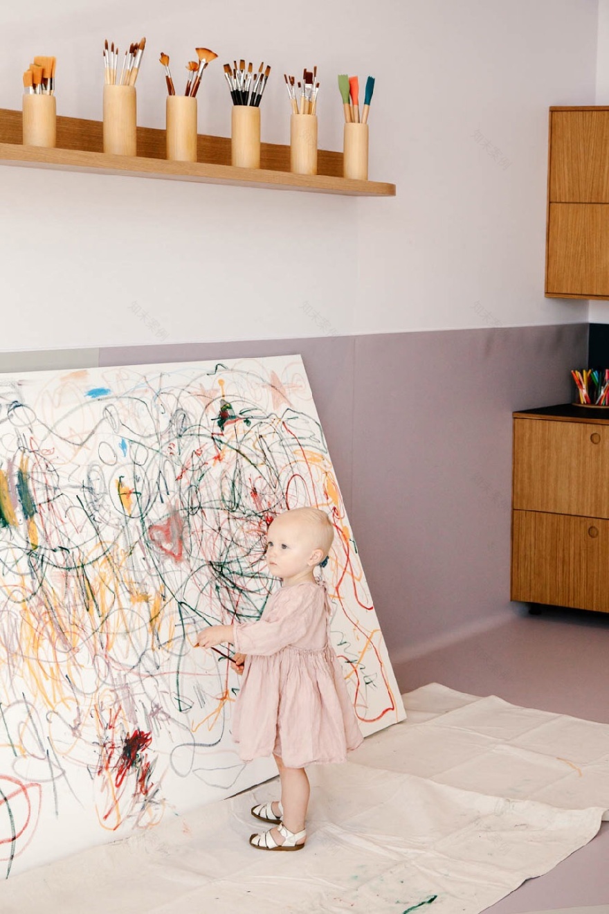
▼室内活动空间,即可玩耍又可学习,the interior space for playing or learning
▼在空间中加入有趣的形状,bringing in a lot of playful shapes
▼加入了云朵造型的天花板细节,details of the ceiling with cloud shapes
Project M Plus’ interior design goal was to create a space that fostered community and was at once fun and nurturing for the children as well as aesthetically appealing for parents. Taking a modern approach, Project M Plus specified sturdy, commercial materials and made gender neutral color, furniture, art and accessories selections. They purposefully brought in a lot of color and playful shapes, making sure to ground the lighter, pastel colors with darker, vibrant colors so that the scheme would not feel overly infantile. Playful patterns in the Forbo linoleum flooring in the Gross Motors area create a fun zone for kids. A similar pattern is repeated in the restrooms using 1” square tiles from Daltile.
▼浅色柔和空间与深色活泼空间之间形成对比和融合,grounding the lighter, pastel colors with darker, vibrant colors
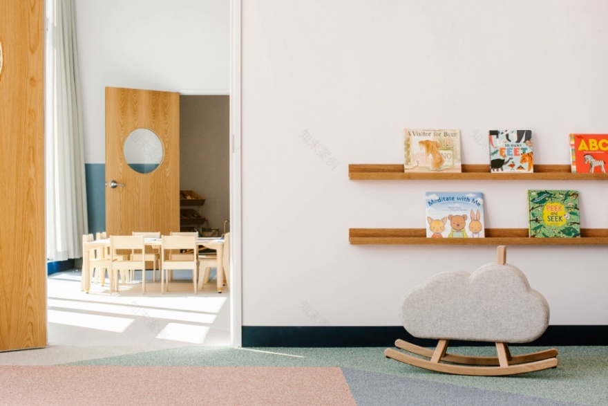
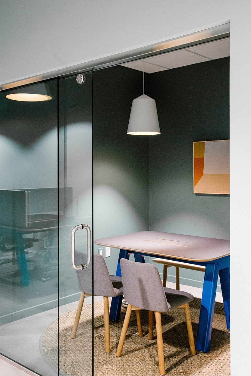
在家具方面,Project M Plus选择了由Muuto和Ferm Living等丹麦知名品牌所生产的斯堪的纳维亚风格的现代家具,以及由Blu Dot和Corral等现代美国品牌所生产的经典和定制家具。所有家具都具有简单利落的线条和柔和的弧形边缘,非常适合儿童使用。此外,色彩也成为了加强整体空间体验的一个不可或缺的因素。在设计团队的专业建议下,Brella使用了大量的颜色。然而虽然颜色多,但整体空间并不显杂乱,因为所有的配色都是经过精心设计的,从而营造出一种区别于传统该类型空间的整体色调。颜色与大量的木材混合在一起,打造出一种柔和宜人、温暖而轻松的环境。此外,落客区内还设有一面实用的磁性墙体。
For furnishings, Project M Plus mixed modern Scandinavian pieces by Muuto, Ferm Living and other well-known Danish brands, with classic and custom pieces by modern American brands like Blu Dot and Corral. All furniture features simple, clean lines with soft, rounded edges for a kid-friendly environment. Color became an integral tool to accentuate the overall experience. Applied masterfully by Project M Plus, Brella uses a lot of color but the palette is refined and considered and does not include any
traditional primary hues. Color mixed with lots of wood results in a space that is soft and welcoming, warm and relaxing. The magnetic wall in the drop-off area is a nice design touch that also happens to be utilitarian.
▼颜色与木材混合在一起,打造出一种柔和宜人、温暖而轻松的空间,color mixed with lots of wood results in a space that is soft and welcoming, warm and relaxing
▼家具都具有柔和的弧形边缘,the furniture with soft, rounded edges
▼室内空间使用了大量的木材,the interior space uses a lot of wood
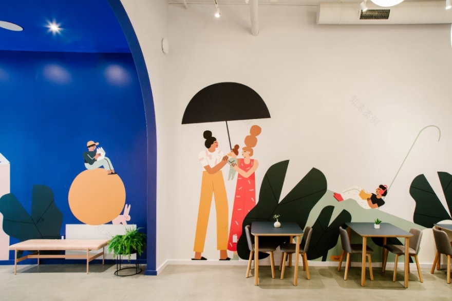
此外,为了探索人与人、人与自然之间的联系,Project M Plus还委托艺术家Amelia Giller创作了一幅壁画,从而向人们传达这样一个信息:对于每天的日常生活来说,Brella的护理模式就像是太阳升起那样必不可少。品牌和空间都传达出一种趣味性和活力,并通过类似于社区营造的方式将手绘的图案与干净的布局结合了起来。
Exploring ideas of connection, to each other and the natural world, Project M Plus commissioned artist Amelia Giller to create a mural that conveys how the Brella model of care is as natural and essential to daily life as the rising sun. The brand and the space communicate playfulness, vibrancy, a community approach to thriving, pairing a hand-drawn artisan layer with clean typography in all sans.
▼壁画向人们传达Brella护理模式的重要性,the mural conveys how the Brella model of care is as natural and essential to daily life
最终,这种沉浸式的娱乐和工作空间不仅吸引了小朋友前来玩耍,也让父母们更加放心。本项目的设计是非凡的、宏伟的、广泛的,但绝对不繁琐。可以说,Brella的这家旗舰店会比现下流行的育儿模式更加永恒。
Ultimately, this immersive play and workspace universally appealing to boys and girls, grown-ups and children alike. The design features are singular, grand and broad, with absolutely nothing fussy. Brella’s flagship space leans more timeless than trendy.
▼学习空间,the learning areas
Name: Brella
Studios: Interior Design, Graphic Design, and Branding
Client: Darien Williams, Melanie Wolff
Location: Playa Vista
Address: 12746 W. Jefferson Blvd. Suite 3-3100 Los Angeles, CA 90094
Completion: Fall 2019
Size: 8,070 sf
Photography: Project M Plus
客服
消息
收藏
下载
最近


