查看完整案例


收藏

下载
很多客户朋友经常会反馈的一句话是:“我也不知道怎么描述,但是我就是喜欢田艾灵的设计,让我喜欢上呆在家里的幸福感觉,朋友来了都说你们家好艺术哦!”
“安放心灵的泛艺术感”——这是田艾灵的设计标签。
Many customer friends will often feedback a sentence: I don’t know how to describe, but I just like Tian Ai Ling’s design, let me like the happiness of staying at home, my friend is coming to say your good art! Panic artistic sense of the soul is the design label of Tian Ai Ling.
关注自然光线、内外关系的运用,尊重使用者的功能诉求,理性专业地去构建动线与功能逻辑清晰的空间,又用流动的人文情感铺陈空间氛围。
Pay attention to the use of natural light, internal and external relationship, respect the users functional appeal, rational professional deformation of the spatial and functional logic clear space, and use the flowing humanistic emotional space atmosphere.
提供一种独特的当代城市生活里的诗意生活方式。设计的目的和演化,无不以行为人为主要目标对象,关注个性化需求,增进人、场所和环境的互动以及提升居住者的幸福感。
It offers a unique contemporary city life. Design purpose and evolution, none of the actor as the main target object, pay attention to personalized demand, enhance people, places and environment interactions, and enhance the happiness of residents.
聚焦身边微末的平凡,带给我们绵长的感动,让生活回归到平和持久的宜居本质。
Focus on the madness of the micro-ray, bring us long movement, let life return to peace and long-lasting livable essence.
“专业是技术,情感是温度!”室内空间是解决问题的实用艺术美学,这句话是指导和践行我设计思考及落地的核心!
Professionalism is technology, and emotion is temperature! Indoor space is the practical art aesthetics to solve problems. This sentence is the core of guiding and practicing my design thinking and landing!
每一次的设计说明,回顾构思之初。设计的价值永远在于立意与审美高度,又落地于日常生活、功能齐备、动线流畅、舒适宜居!而不仅仅是画图、图片展示好看,细节经不起日常持久的使用耐用以及生活便利舒适性。短平快快的全球图片传播,影响着一大批设计师靠阅图借鉴做展示场景感设计,消费者也被误导靠看设计师精选输出的效果图为参考去选择设计师,而忽略了空间设计必须首先是满足好用基础上与美学结合……
Every design description, review the beginning of the idea. The value of design always lies in the conception and aesthetic height, but also in daily life, with complete functions, smooth moving lines, comfortable and livable! It’s not just that the drawings and pictures are good-looking, the details can’t stand the daily lasting use and durability, and the convenience and comfort of life. The short-term, fast-paced global image dissemination has influenced a large number of designers to rely on reading pictures for reference to show the sense of scene design, and consumers are also misled to choose designers by looking at the renderings selected by the designers as a reference, and ignore the space design must first meet the combination of aesthetics.
设计师田艾灵聚焦居住者向往的理想住宅,摒弃装饰主义的演绎,从人与空间、人与自然的舒适关系出发,实现业主所向往兼并简约宁静、自然通透的家。
Designer Tian Ailing focuses on the ideal residence that the occupants yearn for, abandons the interpretation of decorativeism, and starts from the comfortable relationship between people and space, people and nature, and realizes the simple, quiet, natural and transparent home that the owners yearn for.
原户型负二负一层几乎没有采光,同时楼梯窄陡于黑暗角落,不利于上下行走;一楼厨房、客餐厅等拥挤于一个空间;二楼房间琐碎而凌乱……
The original household negative two negative layer is almost no light, and the stairs are narrow and steeped in the darkness, which is not conducive to walking down; the first floor kitchen, the restaurant, etc. are crowded in a space; the second floor room is trivial and messy......
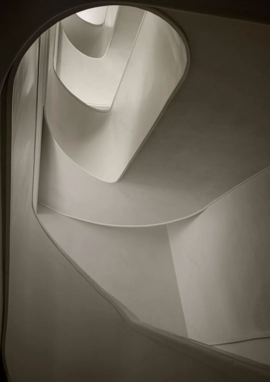
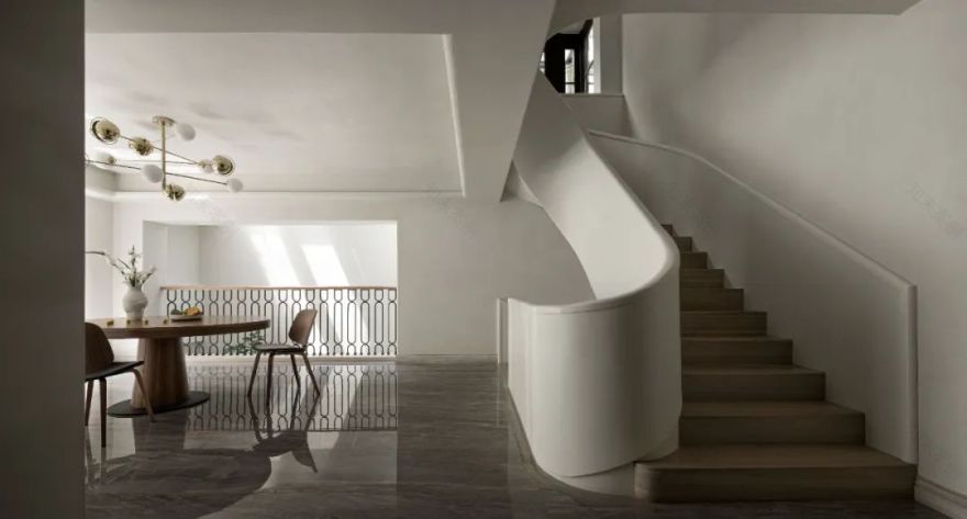
首先调整链接上下四层楼的楼梯位置,更合适的尺度、更光线充沛的位置,如雕塑般的静态而流畅的线条,让我们回家的心情如轻松行走于画境里。
first adjust the link to the stairs of the four floors, more suitable scale, more light, smooth, smooth lines, let us go home in the painting.
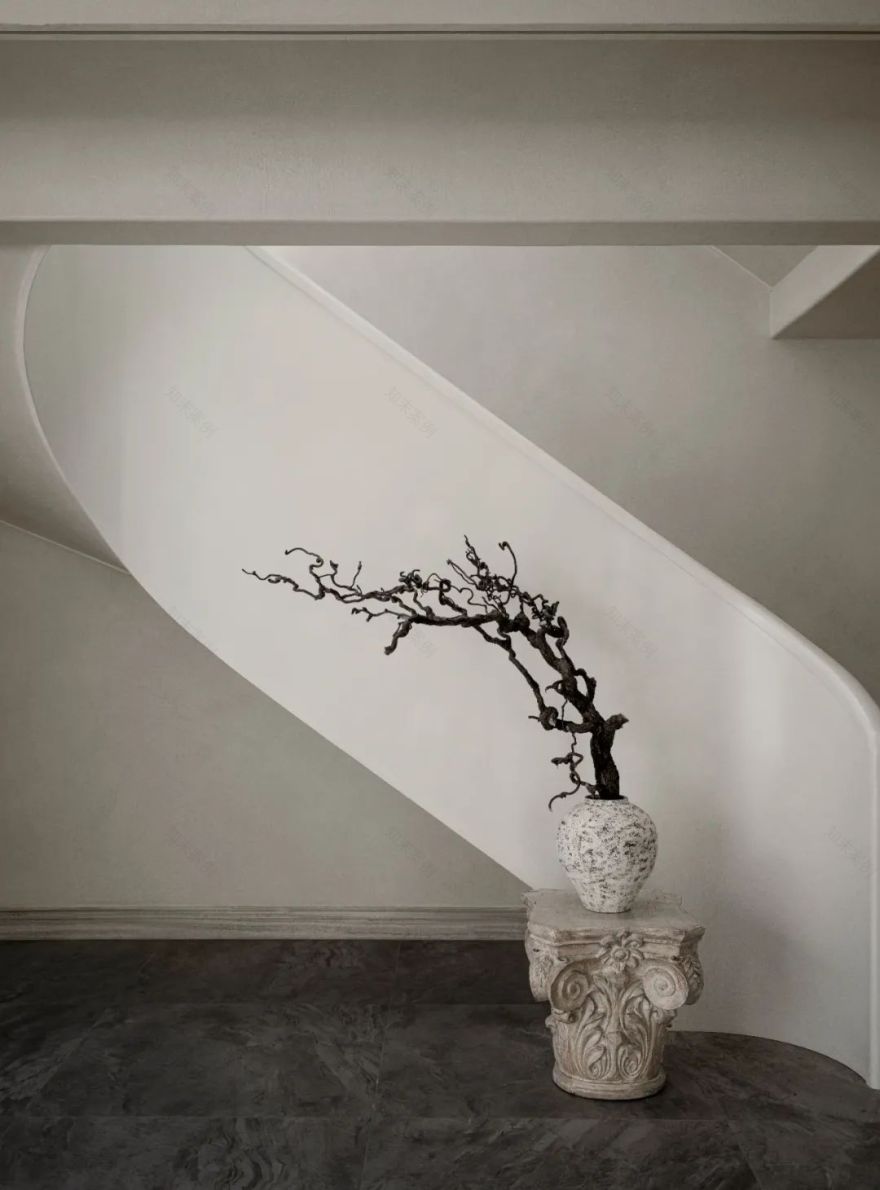
白色楼梯在满足刚性功能的同时,将空间的结构线条在此交汇,使整体视线结构有序而不呆板,同时原木梯步给人安静与平和,散发淡雅的生活温度。
While satisfying the rigid function, the white stairs meet the structural lines of the space here, so that the overall visual structure is orderly and not rigid. At the same time, the log color steps give people quietness and peace, exuding an elegant living temperature.
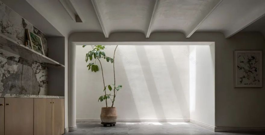
负二层天井贯穿而下的自然光肃穆而安静,在一株植物的树荫下,正是练习瑜伽的好地方;留白的艺术前厅、细节而质感的外用鞋柜成为语言,同时暗藏功能齐备的备用收纳间;开阔的多功能厅,预留了投影位置,可以观影、唱 k、体感游戏……在负二层减少邻里正常生活层的干扰。
the two-story patio is quiet, and in the shade of a plant, it is practicing yoga. Open multi-purpose hall, reserved projection location, you can watch, sing K, Sports game... at the lowest negative two-layer interference.
沐浴在光影下的干净纯粹。观察测量准确花园落差与房屋关系,侧面花园适当下挖,开出负一层的立面补光,斜斜洒满负一层,将曾经的阴郁一扫而光。
observation and measurement accurate garden drop and housing relationship, the side garden is properly digging, and the negative layer of the facial fill light is opened, and the oblique sprinkles will be full of gloomy.
因为一系列关于自然光的改善动作,让曾经黑暗空间负楼层释放出来,就将厨房、餐厅调节到负一层,餐厨一层而置,可以更开阔地去使用它,联动曾经黑暗鸡肋杂物间打造为功能齐备的长尺度厨房操作区;同时侧面采光还能够让负一层拥有一个舒适的客房。
because a series of improved movements about natural light, let us have released the dark space negative floor, just adjust the kitchen and restaurant to the negative layer, the kitchen can be used to use it, linkage once. At the same time, lateral lighting can also have a negative layer with a comfortable room.
光充盈着的空间和流畅的线条、白沙滩一样的底色,室内的“不饱和”状态,与后续的复古木作质感,平衡与不平衡间,随着时间推移,与居住者相互之间彼此关联,几许生活痕迹,去不断产生情感的共鸣和岁月的自然痕迹。设计去细腻、去生活体悟、专业是技术,情感是温度。
Light charges and smooth lines, white sandy beaches, unsaturated in the indoor, and subsequent retro wood, balance and imbalances, Over time, with the residents associated with each other, a few laces of life, and continuously produce emotional resonance and natural traces of the years. Designed to exquisite, go to life, professional is technology, emotion is temperature.
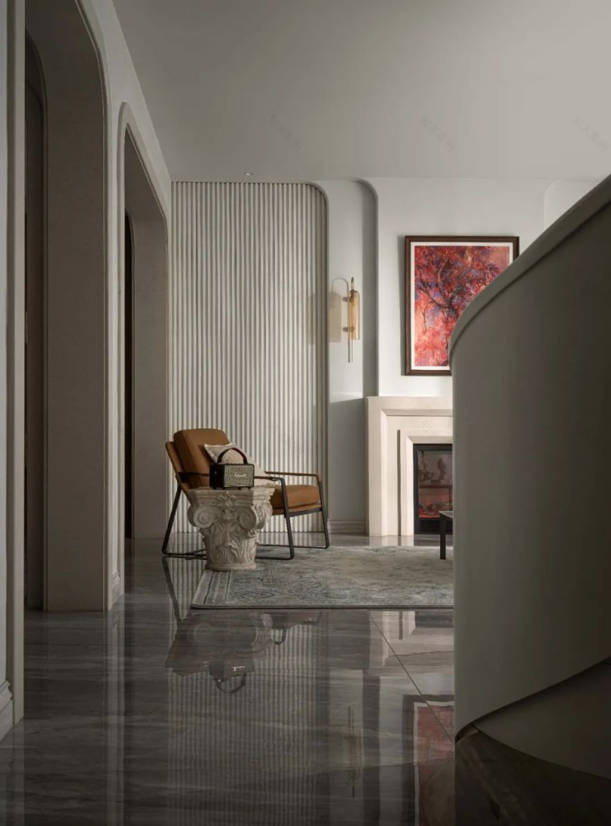
空间在静谧自然的气息下,呈现一种感官上的舒适,色彩搭配切合时宜,在不露声色间演绎当代克制的美学范本,同时注重人与环境的情感提升体验,从细节处的精微巧思捕捉层层的感知关系,让居住者在细腻的浸润中,倾听来自内心深处的动容。
In the quiet and natural atmosphere, the space presents a sense of comfort, the color matching is suitable for the time, and the aesthetic model of simplicity and restraint is interpreted without revealing the sound. Capturing the layers of perceptual relationships, allowing the occupants to listen to the moving feelings from the depths of their hearts in the delicate infiltration.
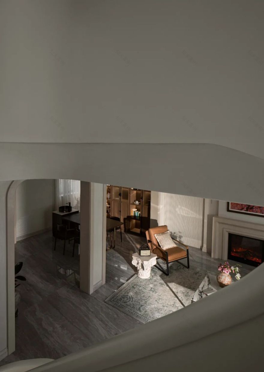
餐厨的挪移释放出一层更多的空间,开放出曾经的两个小空间,成为书房茶歇区,与客厅相联,会客品茶、孩子阅读学习、家人围坐、看书、闲聊……满足各种不同使用状态。曾经的厨房、楼梯间联动而成尺度足够的又一客房。
The migration of the kitchen releases a layer of space, opens the two small spaces, becomes a book tea break area, associated with the living room, will be a tea, children reading learning, family surrounding, reading, talking…Meet a variety of different use status. Once the kitchen, the stairwell is linked and the scale is enough.
借用一点花园空间做了利于联动室外花园阳光休憩区的质感玻璃门廊,让一楼的客厅尺度有余、动线清晰、光线更美的贯穿洒入楼梯间。
borrow a little garden space to make a texture glass porch that is to link outdoor garden Sunshine Remote Zone, let the first floor of the living room is more, the movement is clear, and the light is more beautiful and sprinkled into the stairs.
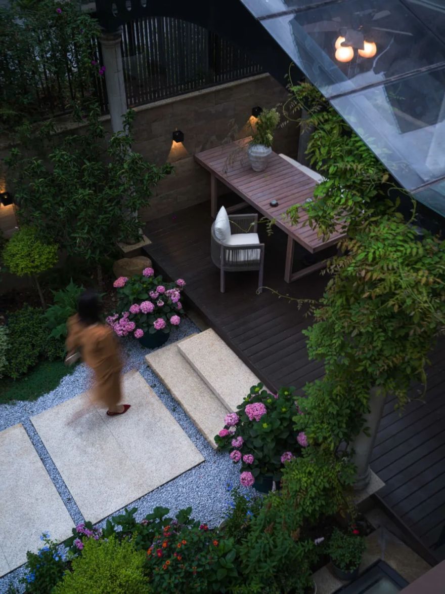
三面环绕的花园,前院有形态的主树成为入户的仪式感、室内茶歇书房区的借景,攀爬的凌霄构成回家的绿意;
The garden surrounded by three sides, the front yard has a form of main trees become the ceremony of the household, the borrowing of the indoor tea book area, the climbing of the lingering constitutes the greenery of the home;
下层错位的侧院主要借光给予负一层,同时巧妙隐藏设备间;
The underlying side of the lower misplaced side is mainly borrowed to give a negative layer and smartly hidden equipment.
后院联动室内的玻璃阳光房,错落有致的花径、鱼游池底的安逸。
The backyard links the glass sun room in the indoor, the wrong path, and the fish booth in the bottom of the pool.
春听雨声赏花,夏早晚听蝉鸣,享受一个冰镇西瓜的惬意,秋高气爽好喝茶,冬期待一场飘雪……
Spring listening to the rain, listen to the rain, listen to the summer, enjoy the coziness of an ice watermelon, drink the autumn and cool, drink tea, winter is looking forward to snow...
将三层化零为整,再次感叹新设楼梯间位置的巧妙一笔,将主卧与儿子房隐私分离;曾经零碎的空间、楼梯间等通过巧妙规划,形成各自尺度合理的套房;主卧衣帽间打破传统思路,化增加收纳,开放柜的模式通过纹理细节搭配又成为空间构成语言,纳入露台的主卫空间充裕,干湿分区还拥有舒适的泡澡区。
the three layers of zero is complete, once again sighing a new position in the position of the stairwell, separating the master bedroom with his son room; once zero-smashing space, stairwell, etc. The main bedroom is broken, maximizing increasing storage, the mode of open cabinet is used through texture details, and it is a space constituent language. It is incorporated into the terrace, and the dry and wet partition also has a comfortable.
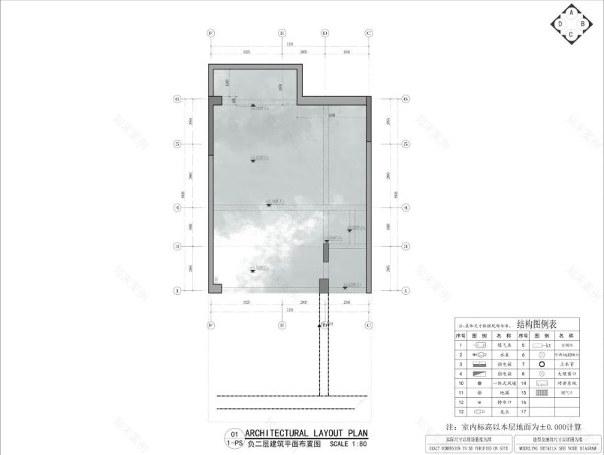
的浑然天成,离不开前期专业的设计构思梳理,先有逻辑清晰的骨架,进而有血有肉的去表达,才能成就不止好看更多生活的空间。通过认真仔细的现场勘测,田艾灵做的专业调整。
The final taste is inseparable from the pre-professional design concept. There is a logic clear skeleton, thereby there is blood to express meat, in order to achieve the space of more life. Through careful on-site surveys, the professional adjustment of Tian Ai Ling.
原始结构—梳理后的空间布局
Original structure - Space layout after combing
Information
项目名称:泊舍|构建宜居空间,共鸣生活诗意
Project Name: Bohe | Construction of Yisheng
Project Location:Chongqing
设计机构:岭众联合-田艾灵设计
Design Company:Elin Imperial Institute of Design
Artist Director:Elin Tian(Tian Ai Ling)
Chief Design:Elin Tian
方案深化设计师:刘佳佳
Deepening Scheme Designer: Liu Jiajia
软陈拍摄布场:桓墅空间-阿怪
Soft decoration : Hertrue art design-aguai
Construction unit:Perfect decorate
软陈配饰产品:桓墅空间艺术设计机构
soft accessories:Hertrue art design
Elin Imperial Institute of Design
开创新空间,塑造新关系:人与物,人与人,人与内心。让使用者拥有更多的体验、更多的自由、更多的自我,是设计师不变的责任。创意就是创造记忆!“创”是不同于从前的想法,“作”则是把东西做出来。
Create a new space, shaping new relationship: people and things, people, people, people and inner. Let users have more experience, more freedom, more self, is the responsibility of the designer. Creative is to create memory!
领衔人田艾灵女士 1999 年从四川美术学院毕业,进修于米兰理工大学设计与战略管理硕士等。2002 年创立了十二分空间设计;2020 年裂变创立了软装品牌桓墅空间艺术设计机构;2022 年在足够的作品沉淀力和全系统落地执行力的基础上,厚积薄发创立专注于更专业、更系统领域、面向全国高阶空间设计需求的品牌“岭众联合-田艾灵设计”。
Ms. Ren Tian Ailing, the leader, graduated from sichuan fine arts institute in 1999 and studied for a masters degree in design and strategic management at Milan Polytechnic University. In 2002, 12-minute space design was established. In 2020, Fission founded Huanshu Space Art Design Institute, a soft-packed brand. In 2022, on the basis of sufficient work precipitation and system-wide implementation, we will build a brand Lingzhong Union-Tian Ailing Design which focuses on more professional and systematic fields and meets the needs of national high-level space design.
客服
消息
收藏
下载
最近


