查看完整案例


收藏

下载
「 Booshy 」
项目:名称
Project Name:Booshy
项目:面积
Project Area:263㎡
项目:时间
Project Time:2021年
设计:成都壹阁设计
Design:ONE SPACE DESIGN
摄影:贺川
Photographer:形在空间摄影
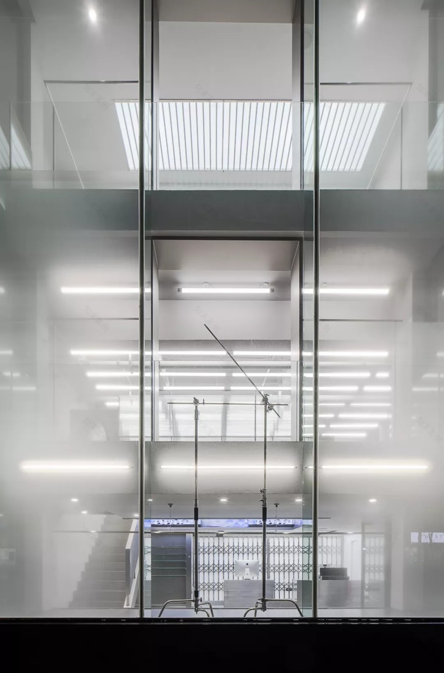
白色的空间,水泥地板,金属质感的衣架,感受这由空间带来的未来感。
The white space, the concrete floor, and the metal-textured hangers will feel the future brought by the space.
服装展示区挂衣杆将地面与顶面,墙与墙连接在一起形成了一条展示链,将分散的区域完美的联系了起来。
The clothes rail in the clothing display area connects the ground with the top surface, and the wall to the wall to form a display chain, which perfectly connects the scattered areas.
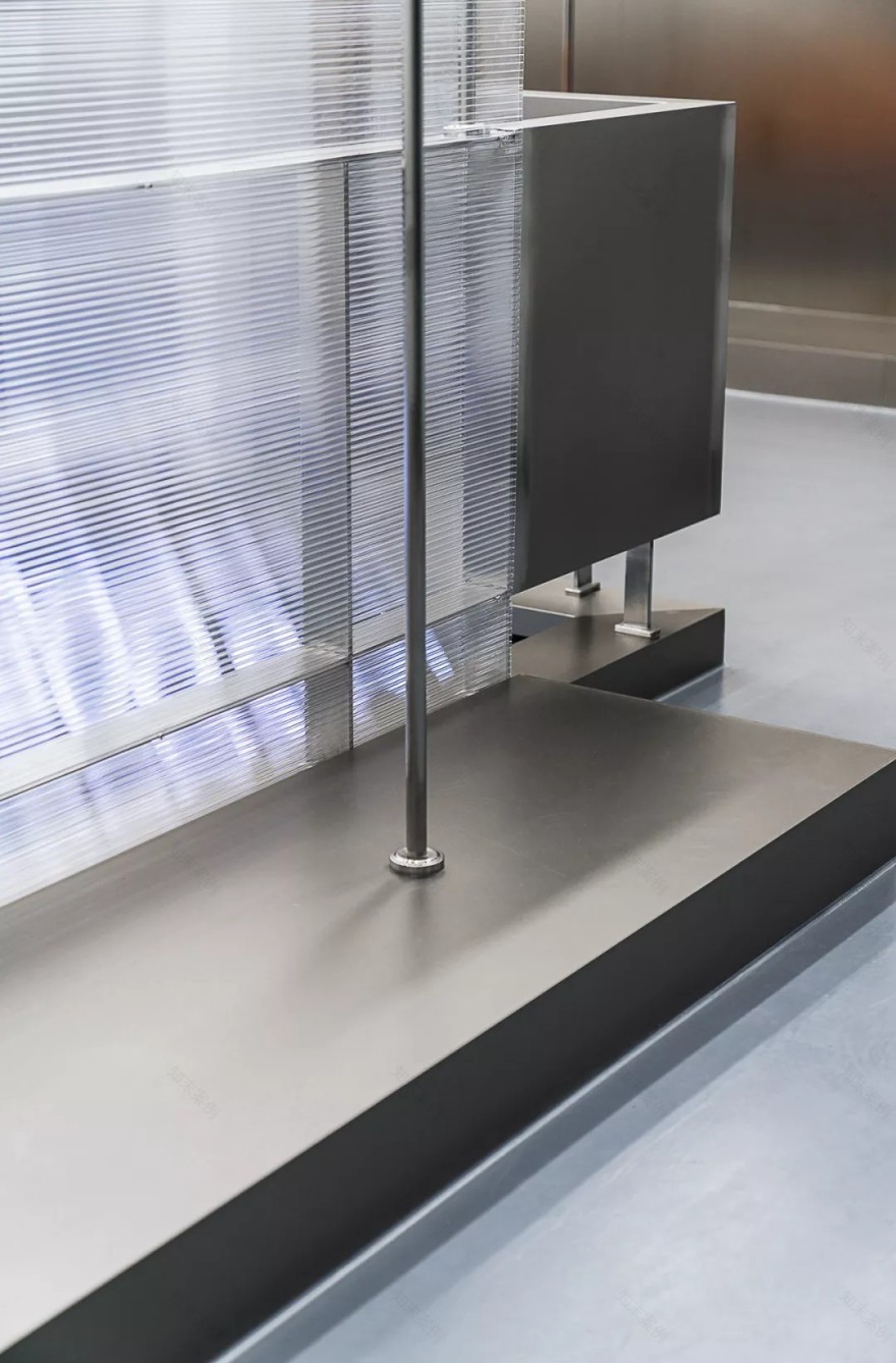
金属材质构成的物件与空间整体形成别样的趣味,给人带来强烈的视觉冲击力,将简约而不简单的设计诠释的淋漓尽致。
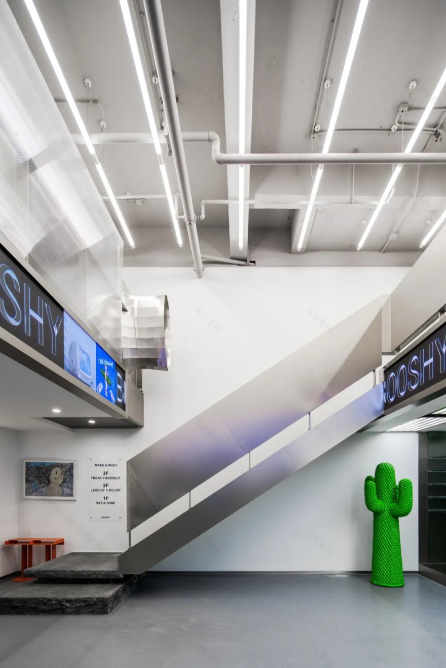
橙色排椅为整个开放区多了些新鲜的色彩,富有活力的橙色让人感到眼前一亮,逛累了就坐下歇歇,购物是一件愉快又轻松的事情。
The orange chairs bring some attractive colors to the entire open area. The vibrant orange makes people feel bright. When you are tired, you can sit down and rest. Shopping is a pleasant and relaxing thing.
最为吸引眼球的一定是收银台后的铁质栅栏,而栅栏的背后其实藏着一个小秘密,这是一面以电梯形式表现出来的墙体。
The most eye-catching thing must be the iron fence behind the cashier counter, and behind the fence there is actually a little secret. This is a wall expressed in the form of an elevator.
留白的墙体,金属材质的点缀,表面粗糙的石材,三者巧妙的配合形成了这个空间独有的魅力。
The blank wall, the embellishment of metal materials, and the rough surface of the stone work together to form the unique charm of this space.
客服
消息
收藏
下载
最近


