查看完整案例


收藏

下载

翻译
Location:6-10-1, Ginza, Chuo-ku, Tokyo, Japan; | ;
Project Year:2017
Category:Offices;Shops
GINZA SIX with main space designed by Gwenael Nicolas, opened this April. It is located in the area of concentrated commercial activity that incorporates cutting-edge innovation while also continuing Japan’s great tradition and history, the Ginza area is a symbol of Japan. It is approximately 47,000 m² boasts the largest area for a retail facility in the Ginza area and become a world-class commercial space that brings together a wide range of 241 brands.This unrivalled lineup brings together brands that gather the attention of the global stage in a place where you can taste both the current trend of Japan and the cutting-edge worldwide tendency in one place under the concept “LIFE AT ITS BEST”.
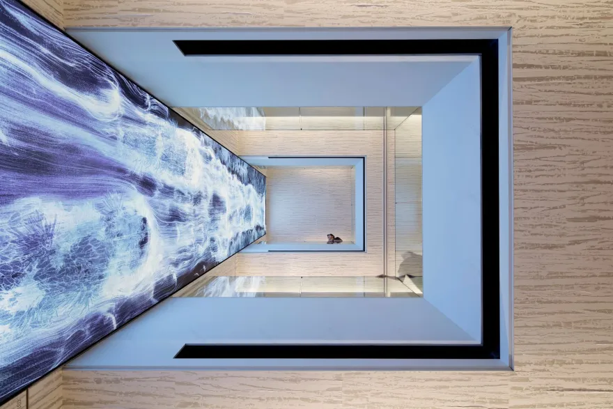
The GINZA SIX design is symbolized by the central atrium, created as the core of Ginza. A space with unique warm and refined atmosphere, and very time-dynamic feeling. A delicate balance between Japanese tradition and a futuristic architecture. Asanoha pattern (hemp leaf motif) used for the ceiling of Atrium creates a warm and inviting atmosphere that is unique to GINZA SIX. The pattern is also an abstract symbol recreated by the six faceted light sculptures. The washi (Japanese paper) textured and transparent fabric covers the three-dimensional sculptural ceiling.
The quality and the sense of luxury are created with attention to details and carefully crafted materials. A close collaboration with artisans and artists bring a human touch and a sense of proximity and compassion to the project.
The space revolves around the atrium like a spiral that infuses energy into the space. The floor and escalators overcome one movement at a stroke of light that spins around the space. The visitors are invited to discover the upper part of the facility.The different areas and floors are visible from the atrium through the filter of angled louvers. Transparency, mystery, and curiosity guide the visitors throughout the space. The layer of light and delicate lines unify the space.
The notion of hospitality is the key to GINZA SIX concept. The “Noren” (a shop curtain) concept of the façade by Mr. Taniguchi is the first symbol. The entrance is symbolized by a large “Andon” (paper shade lantern) which draws the attention to the entrance in a welcoming gesture.
The space is always spinning to create a sense of continuous discovery and attracts the visitors through the different floors and areas. To create a sense of surprise and renewed discovery, the street of the retail area has layout with an angle and skip-shape. Walking through the street reveals a new perspective.
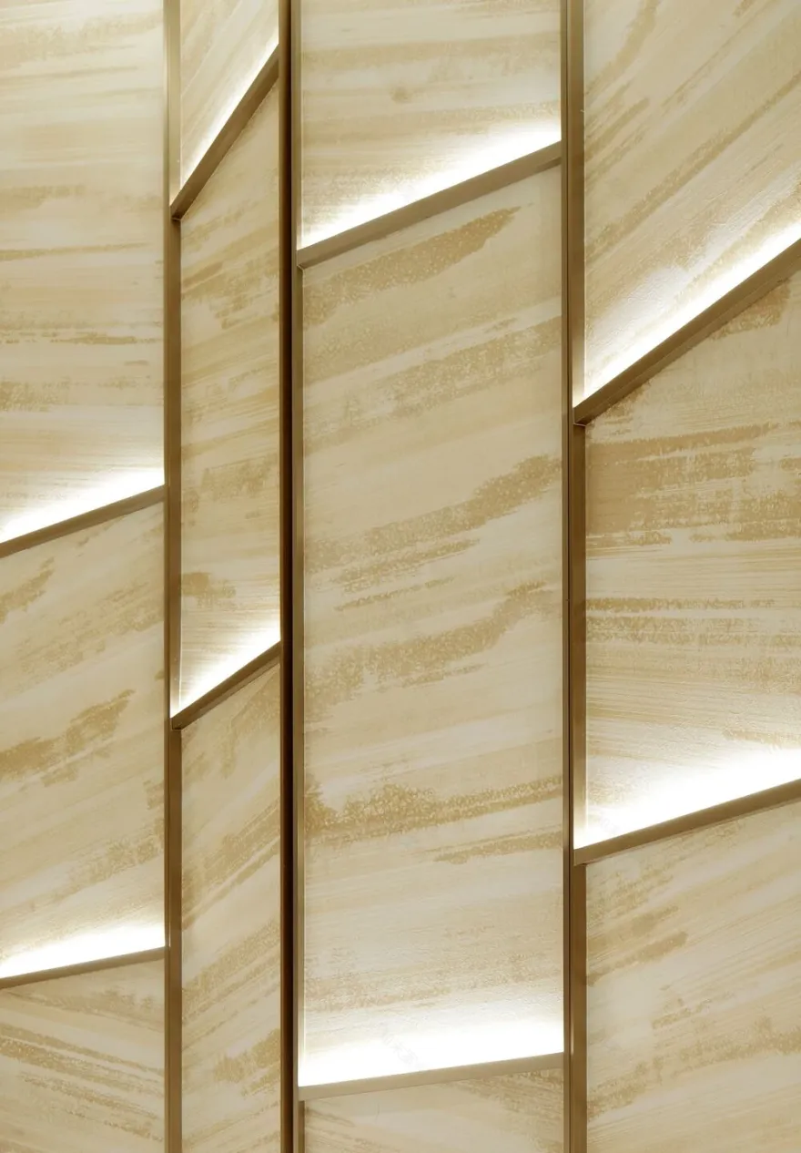
Each store has a different shape and its own identity. The apparent random feeling of the layout is actually carefully choreographed to highlight each store, which was inspired by a small Ginza street For the unity and easy navigation, icons and graphical elements have been used throughout the space. The elevator hall is represented by the angled graphical lines, which surround it. Light dynamism and transparency guide the visitors through the different areas. The angled motif is used throughout GINZA SIX, even for the screens.
1. Floor (1st floor) – Stone (Tiger Ivory)
2. Floor (2nd – 5th floors) – Tile (Travertine white)
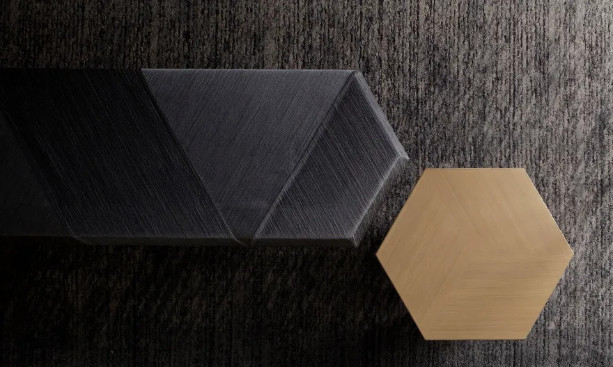
3. Louver of atrium – aluminum extrusion with paint
4. Lighting (ceiling of atrium) – glass fiber cloth
▼项目更多图片
客服
消息
收藏
下载
最近


