查看完整案例


收藏

下载

翻译
Firm: AS ARQUITECTURA
Type: Commercial › Office
STATUS: Built
YEAR: 2011
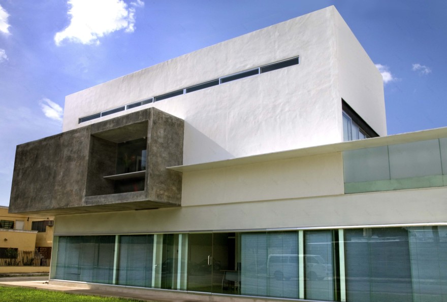
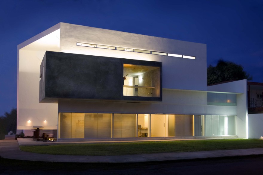
The project consists of an office building. The requirements were three premises for rent and the offices of an architectural practice. The field of 15 x 20 meters in a corner forced the building to be compacted in order to leave enough area for parking required. A building in 3 levels was proposed, the ground floor is occupied by the rent premises and the parking area, and the other two plants belong to the offices of the firm.
One of the major challenges in designing this mixed-use building was to achieve the harmony between two elements of different needs. Because of their gender, the firm needed to project a strong image with character, and the premises, being for rent, required a moderate investment.
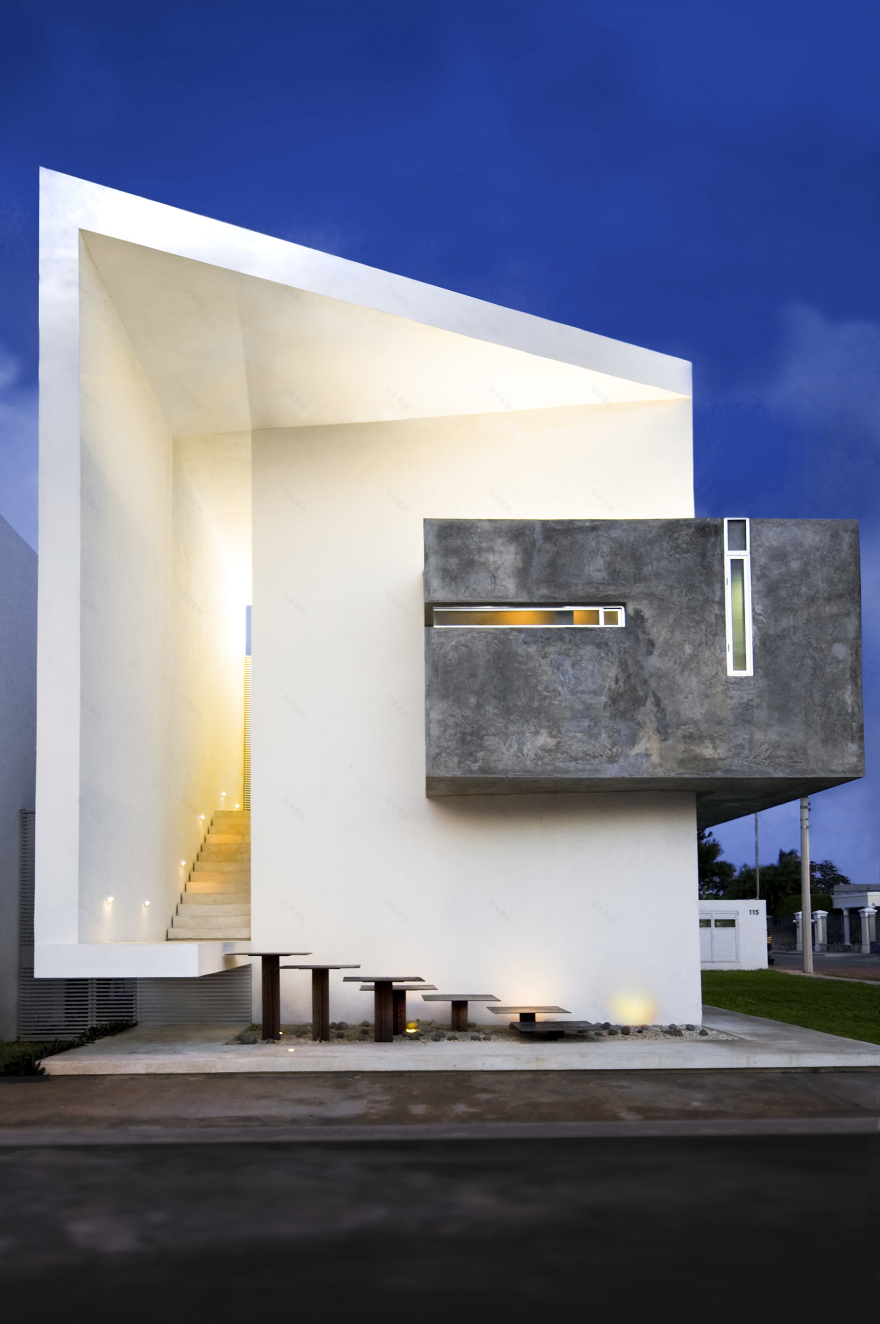
The general concept of the project was to work with a white prism that unfolds itself. This prism is wall free and includes the working areas (rental area in the ground floor and workshop and meeting rooms in the upper levels). An apparent concrete cube is embedded in the prism. This cube, which is more closed, includes the service area and the reception. In this way the creative spaces are emphasized in the free areas, more opened and bright, where ideas flow.
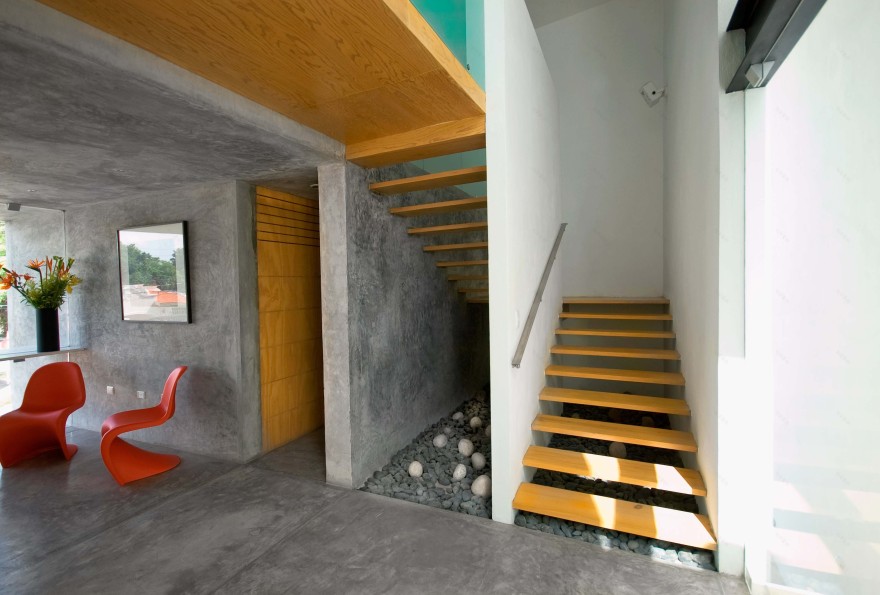
The premises for rent were located with a view to the south, where is the busiest street. Access to the office was placed in the corner on West Street. This same entrance to the office, with a triple high, is developed in two stages: a steel stairway that floats above a stone garden and rests in a cantilever, and after the landing, an apparent concrete stair, that ends in a window that overlooks to the sky and is located in the lobby that gives access to the office reception.
The office is organized in two levels. The first level contains the reception, bathrooms, kitchen, warehouse and workshop. At 2nd level is located a private room and a boardroom. At the reception, which is contained in the gray cube, opens a window that allows visual amplitude and frank relationship with the outside, allowing light to bathe walls and floors and give different shades to gray concrete depending on the time of day. The gray concrete spans the entire reception area, bathrooms and kitchen, on walls, floors and ceiling, and combined with wood coatings and doors, creates a contemporary and warm atmosphere.
The workshop area, which is the heart of the office, is a double-height space that opens onto a balcony terrace. The window overlooking the terrace allows having natural light and avoids artificial lighting must part of the day, in addition to having a choice of natural ventilation. Through this glass wall the workshop extends to the exterior and integrates with it.
The terrace becomes the social area when there is an event and also functions as a rest area on days of intense work. The private room located on the 2nd level opens to the workshop area through the mezzanine, visually integrating these two areas and allowing this office to enjoy the spaciousness of double height and the visual to the balcony.
As for the finishes, stucco walls painted white and walls finished in gray cement were used. All interior floors are made of gray polished cement and the exterior floors are made of white chiseled cement. In stairways and interior doors light wood was used in order to help lighting spaces and large clear windows were also used for greater integration with the outside areas.
The furniture is in concrete and wood. The desks are replaced with concrete plateaus and the other office furniture, part of the firm designs, are in light and dark wood in order to achieve contrasts and integration with the wood used in the rest of the office.
The building appears as the image of the firm, with a contemporary and simple design that represents the office living it and allows users to enjoy working areas with a large spatiality.
客服
消息
收藏
下载
最近


