查看完整案例


收藏

下载

附件

翻译
Architect:Raz Melamed
Location:Tel Aviv, Israel; | ;
Project Year:2021
Category:Apartments
With a view of the Tel Aviv’s skyscrapers and its urban vegetation, a wonderful apartment has evolved, combining quiet materiality and a touch of humor. The building has undergone a massive renovation designed by architect Raz Melamed with the aim of adapting to the needs and desires of the young tenant, who has a fondness for order and a love of art items that symbolize aesthetics equally as much as good memories. From the beginning, it was clear that the design of the apartment would place emphasis on displaying diverse art, and would respond to the client's requests such as a large bedroom, gym, and a place to entertain.
Prior to the renovation, the layout of the apartment included 3 bedrooms, a small kitchen and a crowded living space. In addition, the laundry room and the original guest bathroom created a long, narrow corridor that led to the rooms, which was a disruptive factor in the natural flow of architecture.
And so, we got to work! In this renovation, the apartment’s entrance is enhanced with resin paving and a cloud finish creating a sand-toned concrete look. This material is flexible without partitions, which serve as a great contribution to the quiet that welcomes those who enter the house.
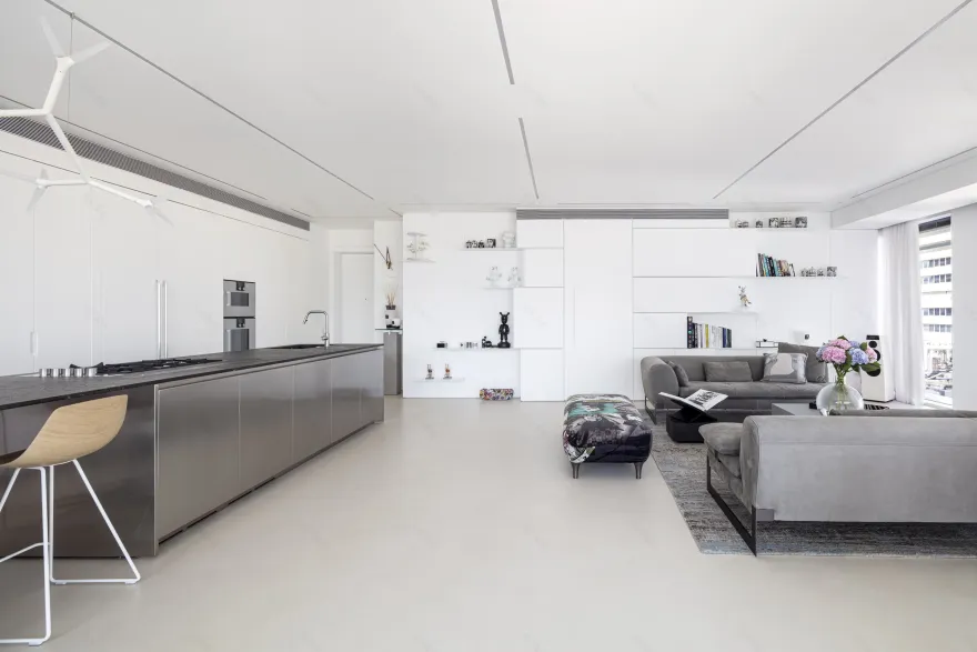
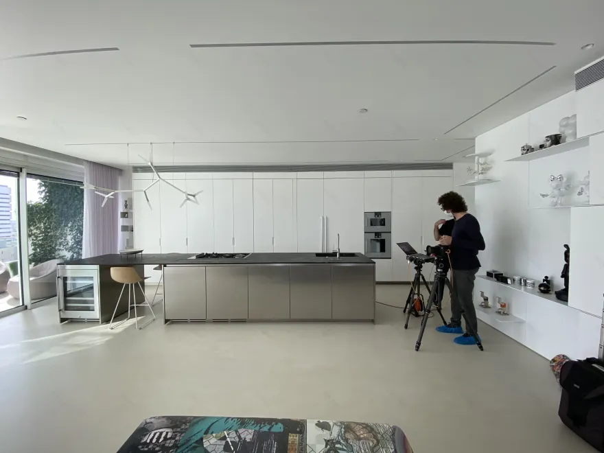
Next to the entrance hall is the pillar between the island and the white kitchen cabinets, which are built of concept doors that hide work surfaces and everyday electrical products. The island was created with a noble material for such a feature, stainless steel. This unique island houses a wine refrigerator for hospitality that emphasizes the nobility of the place. It is designed for an intimate morning coffee and is equipped with light wooden bar stools, as well as for multi-participant hospitality with visible interaction between the kitchen and the dining area and living room, as if the cook is a DJ in charge of the guests' enjoyment.
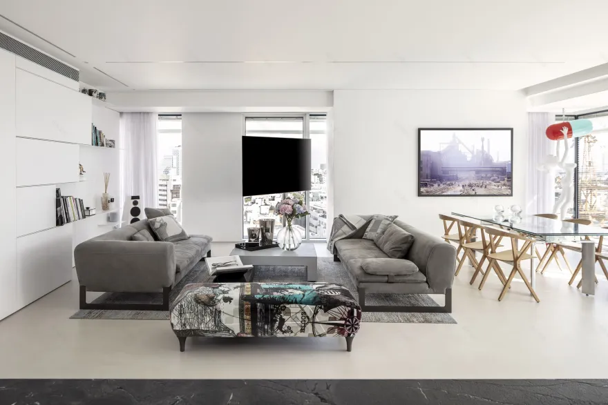
Opposite the kitchen is the living room which features a gray carpet in an interesting pattern. Sitting on it are 2 luxurious sofas and between them a lump of charcoal on which is mounted a gray concrete plate that serves as a table. The traditional TV sideboard is absent, and instead it is free on a pole and does not block the cityscape from the large windows. The versatile textile that envelops the iconic footstool adds a touch of color to the space, as well as playfulness that does not take itself seriously in its meticulous surroundings.
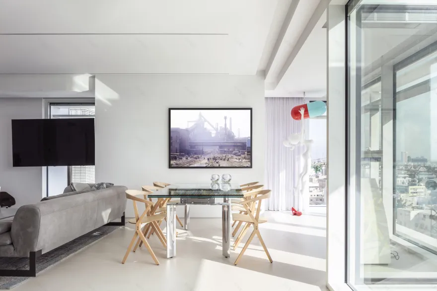
Next to it is the dining area, in the center of which is a table whose design is a technological marvel - a glass gear mechanism is implanted in the glass plate, which when pressed elevates the table to the sides. It is surrounded by light wooden chairs, which bring in heat and soften the glass around which they gather. It is a practical piece of furniture that is first and foremost a work of art, similar to the art that stands next to it, the "capsule girl" that brings in intense interest and color. Added to the hospitality potential is the patio furniture, which consists of armchairs wrapped in plunging fabric, and indeed invites guests to relax and sink into the chairs.
Throughout the house, the ceiling was slightly lowered for technical systems, which allowed the architect to place recessed lighting fixtures, which are played on in a geometric play of stripes and circles. This lighting’s fascinating design is reminiscent of a joint from the human body that connects the vertebrae and serves as their turning point, and on the ceiling this is reflected in the encounter between elongated elements and the rounded spot that is between them and indicates their mobility. The iconic luminaire hanging above the island also repeats the same geometry and is used not only as lighting but as a real work of art, joining those around it.
The white carpentry wall that separates the public space from the private has a dual function - one is to serve as a separation and create complete privacy between the spaces, and the other is to display art items that contribute to both the meticulous aesthetics and humor of the space. From the white carpentry cubes emerge thin sheets of tin, which are also white, and serve as a perfect substrate for the art that rests on them. The grilles of the air conditioner that are integrated in the carpentry also show the same thin white lines and look like part of the artistic composition. This wall is in addition to the other materials that dominate the house that represent Melamed's architectural concept - natural charcoal, glass, resin and wood - all in their original, unprocessed form, creating a pristine and refined shell for the exclusive art collection in the house.
Behind the wall, a private space is carefully hidden, sitting completely separated from the public eye to such an extent that it is impossible to even guess that it is there. In an architectural design that emphasizes space maximization and aesthetic creation, a guest bathroom was been designed along with the washing machine hidden behind glass doors. This design does not give away the fact that this is a utility room, but rather a luxurious guest bathroom. It is covered with sawn stone in the pattern of thin stripes in varying sections, in the repetitiveness that in the architect's perception produces silence in the space that demands it. This cladding will also return in the master bath and connect the wet spaces. The star of the place is a freestanding sink made of stone by Antoniolupi, who came to the apartment as a sawn block of stone weighing 300 kg and took its final shape through numerous blows of a hammer. Its design was a shared experience of the client, contractor and architect Which surprises everyone who enters the bathroom.
The entrance to the master suite passes through a constructive wall on which the bed rests, which delimits it from the direction of the corridor and gives it a back, literally. Behind it is a closet that is in a constructive space without a window, thus leaving the front with the view to the bedrooms and bathrooms.
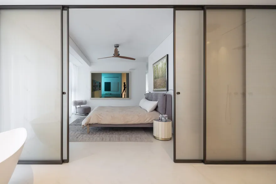
In the center of the room is the spacious bed in warm tones, with a TV in front of it on a pillar that reveals the view, next to tables on light legs that beautify the space. A breath-taking wooden ceiling fan brings warmth to the room, and it is noticeable that the quiet colors that control it also enter the bathroom, through sliding glass doors inside which a fabric is planted to soften the atmosphere. They allow complete openness towards the bed that overlooks a free-standing bath in a unique geometry that overlooks the landscape through a white curtain that unfolds and continues to the front of the bed, creating with it an all-encompassing design language.
Just like the rest of the house, the various components of the master bedroom envelop softness and feminine lines. In this plan, Melamed refrained from using exposed construction elements or rigid and dominant materials and created an appearance in which even the straight lines to the poetry that is this home. Whether it is sawn cladding or longitudinal lighting, these are elements that present softness in the home, and adapt themselves to soft decor for one cohesive home.
1. Kitchen- Boffi
2. Island chair- Habitat
3. Lighting fixture above the island - QUASAR HOLLAND SPARKS
4. Dining table - ASTROLAB model by ROCHE BOBOIS
5. Dining chair- BD BARCELONA
6. Balcony table - NENDO model ARAM
7. Armchairs on the balcony - Ottoman of habitat
8. Living room sofas - Baxter
9. Living Room Footrest - Marcel Wanders
10. Guest bathroom sink - Antoniolupi
11. Separation doors between bed and bathroom Master-glas Italia
12. Baxter Master Bed
13. Boffi Bedroom Ceiling Fan
14. Master cassina armchair
15. Habitat's Poliform closet
▼项目更多图片
客服
消息
收藏
下载
最近


