查看完整案例


收藏

下载

翻译
Architect:FGP Atelier;CNADRI
Location:Shenzhen, Guangdong Province, China; | ;
Project Year:2020
Category:Offices;Shops;Apartments
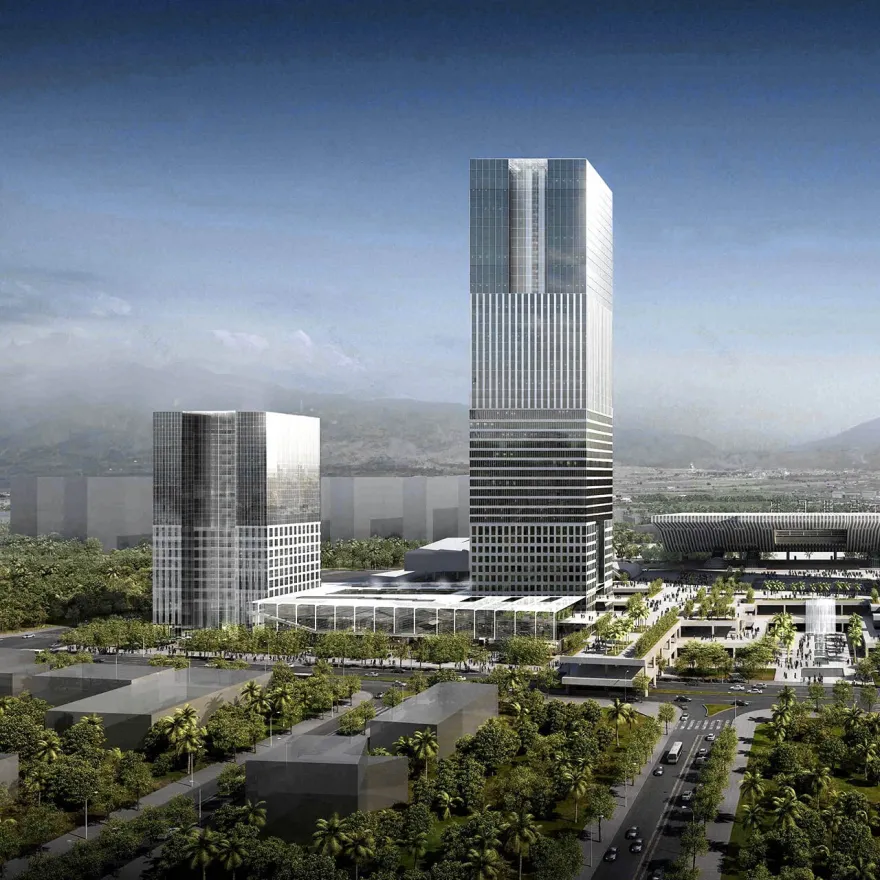
The site is located within a key transitional zone between the Shenzhen North Railway Station and key business districts to the east. Regional high speed rail, local rail, intercity rail and international checkpoints are to eventually be incorporated within the station. Such intensity of use will tremendously benefit the proposed office, service apartment, hotel and retail uses if utilized properly.
After examining both the existing and proposed conditions, it quickly became clear that in order to maximize the success of this project, both sites would need to be designed to provide a level of cross-connectivity through the east plaza that would not be overshadowed by the strong axial relationship that the park, the east plaza, and the north station have already established. The sites must work to dissipate and diffuse that intensity across the site in order to capture the energy of the surrounding context.
From an urban planning perspective the NE-SW axis becomes the gateway, which is naturally created by the towers zoning requirements and their spatial relationship to both the station and the park across from Mintang Street. The physical difference in the plot’s geometry, not only between them but also in relationship to the station’s axis, provides an asymmetry within the composition that translates into a unique architectural vocabulary for each site. The gateway provides the urban framework, but each complex must have its own image. The project began as a competition to design 4 towers on two sites (C2 and D2) opposite a central axis. Ultimately, we were awarded the contract to design 2 of the towers. In submitting the vision for both sites, we created a strong physical and visual connection by linking the two sites and the central plaza along Mintang Street. Each lot’s elevated platforms have their own character, landscape elements and scale, creating a seamless flow across the entire block. This is critical in developing a vital and energetic community.
In terms of design focus, the open space is as important as the buildings. Due to their grand and diverse scales, both play an important role in creating a sense of place and becoming a landmark. The procession from the street up to the plaza is a unique experience for each. Lot C2 is cartesian. Lot D2 was to be organic. In difference to the current space under the plaza which contains back of the house functions, our proposed design for each lot under their respective platforms is driven by creating a sense of community, a place of trade, leisure and interest.
Lot C2 is composed of linear blocks of retail that define paths and plazas, walkways and atriums. It links the space both vertically and horizontally while forming an unpredictable grid as they stack. The spatial richness and innovative attitude is unparalleled to any traditional retail complex. New spaces emerge within the intersections and the possibilities of creating a dynamic environment are endless.
The architecture of the towers in lot C2 continues the layering concept. Both towers are based on stressing the horizontal character of the composition. They are clearly defined by stacking volumes with unique characteristics in terms of layout and enclosure, the idea is to create a vertical neighborhood that gives both the tower and its different parts a unique expression that responds to views, scale, materiality, and orientation. Atriums neutralize the rich character of the façade grids. They give each block a unique face and bring daylight and interconnectivity within each one of the stacking volumes.
This project represents a remarkable opportunity to become the generator of a new urban tissue that will have a profound impact in the future of the area. In a project of this scale, it is important that ecology and sustainability become part of the design agenda. Therefore, we proposed the following strategies: within plot D2, in order to strengthen the connection to lot C2, a large open and public platform is extended from the east plaza. This platform serves as the inflection point between ground and sky. Below the platform, connections are made horizontally. Above the platform, we connect vertically. The program is broken into five volumes: the west tower, the east tower, the atrium retail building and the bridge retail buildings. It is then unified by these distinct platforms, an open and public plaza, and a covered internal connection.
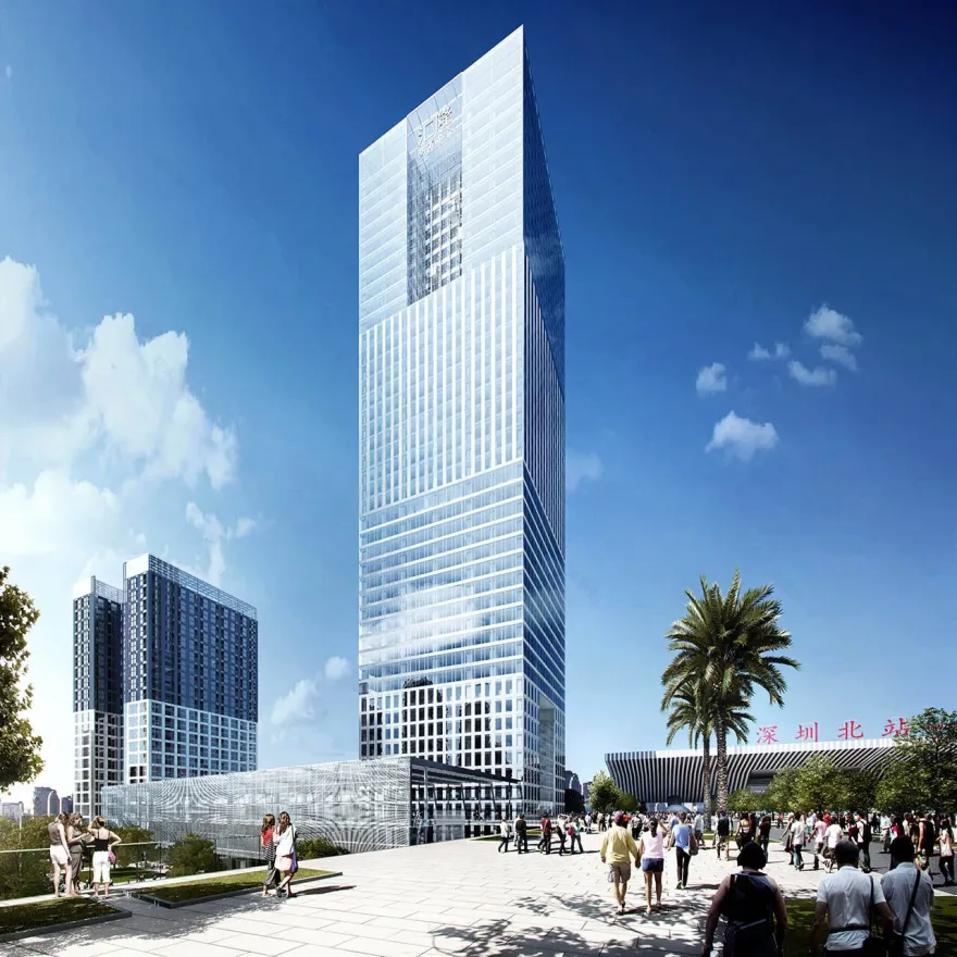
The west tower is the site’s programmatic and visual anchor. Rising 250m, it is broken down into retail at the base, office in the mid portion and a 5 star hotel at the top. There are 65,473m2 of office divided among large and efficient floor plates, oriented to maximize south, east, and west exposure. At the hotel levels, the towers square footprint becomes an l shape, creating a large atrium which will support various hotel amenities and create an identity for the 47,649m2 hotel along Mingtang and Liuxian streets. The l shaped floor plate also allows hotel rooms to be consolidated along the south facing façade.
The east tower is set at the intersection of Mingtang and Liuxian street. The 100m tall tower provides 30,727m2 of service apartments in an efficient floor plate. At the buildings upper levels, an atrium is created providing the building a face along the street, and instilling a unique amenity for the upper level units.
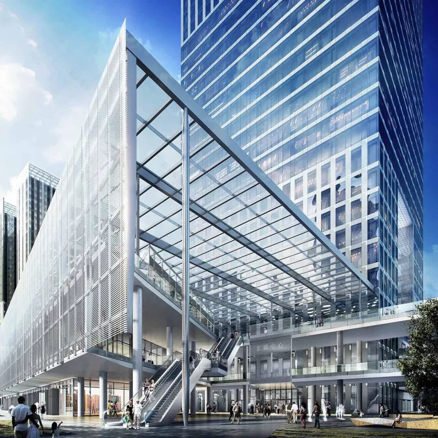
The retail is broken into 3 volumes. However, the two pavilions along Liuxian Avenue can operate in tandem with a series of connecting bridges above the +13.0m platform level. Each retail pavilion has its own means of circulation, allowing each pavilion to be truly independent, enhancing an already unique retail experience. In a typical retail setting, central circulation spaces become the organizational focus of the complex. We have reversed that, making the retail the central organizing force. It is a unique solution suited for the site.
The towers and retail pavilions are unified by a dramatic platform connecting the train station’s east plaza to the site. This platform will establish Lot D2 as a primary point along the northwest/southwest axis instead of a secondary point along the already established northeast/southwwest axis. Directly below the +13.0m platform at +6.15m, a secondary connection is made to the train station and retail functions.
Façade
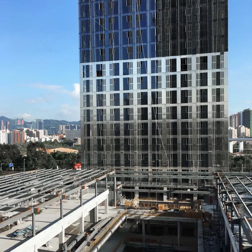
The towers façade reacts directly to the demands of Shenzhen’s environment and the program’s uses. Utilizing the orientation of both towers to maximize south, west and east exposure, folds in the façade are created to vary each façade panel’s specific orientation. The variation between a south west facing unit and a south east facing unit for instance creates the opportunity to fine tune how each unit expresses solid and void. This treatment of the façade can then respond directly to the differing requirements of retail, office, hotel and service apartments as well as environmental conditions while providing a uniform aesthetic and texture.
The retail façades address the conflict between individual brand identity and the complex’s architectural identity by creating a consistent facade which is articulated with glass and another material. One pavilion is wood, one is stone, and one is metal. Each pavilion’s glass facades will allow for the display of individual brand graphics. In this way, individual brand identity is emphasized through its graphic display, individual pavilions identity is emphasized through its materiality, and the complex’s identity is emphasized through the articulation of these facades.
Landscape
Lot D2 landscape plan creates three different expressions of a single concept which provides a counterpoint to the curvilinear platform. The ground floor is broken up into large diamond shaped pieces of green, glossy finished concrete and luminous floor panels. The large scale of each landscape piece relates to the scale of each program volume coming to the ground. The light panels create a luminous space which will draw users in, urging them towards the retail and program lobbies. The intermediate +6.15m level revisits the angularity of the ground floor, but creates more direct connection paths between each function. At the +13m plaza, the ground floor pattern is replicated but at a much smaller scale. Backlit panels, various glossy concrete colors, green pavers and plantings create a multitude of individual spaces within the grand space. Plantings are concentrated around the periphery to create a loose sense of enclosure as well as a variety of semi-private spaces. The shift in scale reinforces the idea that the platform is a place to linger and interact.
The urban connectivity of site C2 is achieved in a much different way than site D2. C2 is expressed as a composition of opposing stacked volumes. The relatioships that are created through this design concept provide a spatial experience that is connected through more linear and layered movement. The volumetric organization of the retail base provides a porosity that captures the pedestrian movement along all four sides of the site. Once inside, the connectivity between the levels is provided as users interact with the shifted volumes above, creating a captivating and unique retail experience.
The complexity of the volumetric composition allows for all three levels and 19,692 square meters of retail program to be presented to users in a more human scale. The void between the retail programs provides a perfect opportunity for small roof terraces, gardens, and places of solitude to exist within such a bustling environment. To further unify the 18 meter tall retail base, all retail volumes are contained within a continuous roof structure that turns down the face of the east and west façade to become a protective screen for the roof terraces on the third level.
▼项目更多图片
客服
消息
收藏
下载
最近


