查看完整案例

收藏

下载

翻译
Firm: 10 Design
Type: Commercial › Office
STATUS: Concept
SIZE: 25,000 sqft - 100,000 sqft
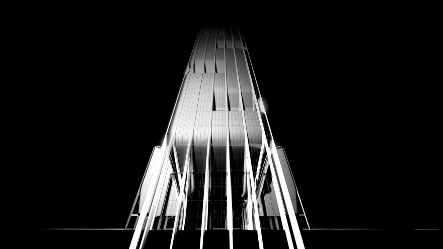
Inspired by the concept of water, which is associated with good fortune in Chinese culture, the international architecture practice, 10 Design’s (part of Egis Group) design proposal for the Qianwan Financial Headquarters mimics a series of cascading waterfalls which defines this new tower in the cityscape of Qianhai in Shenzhen, China.
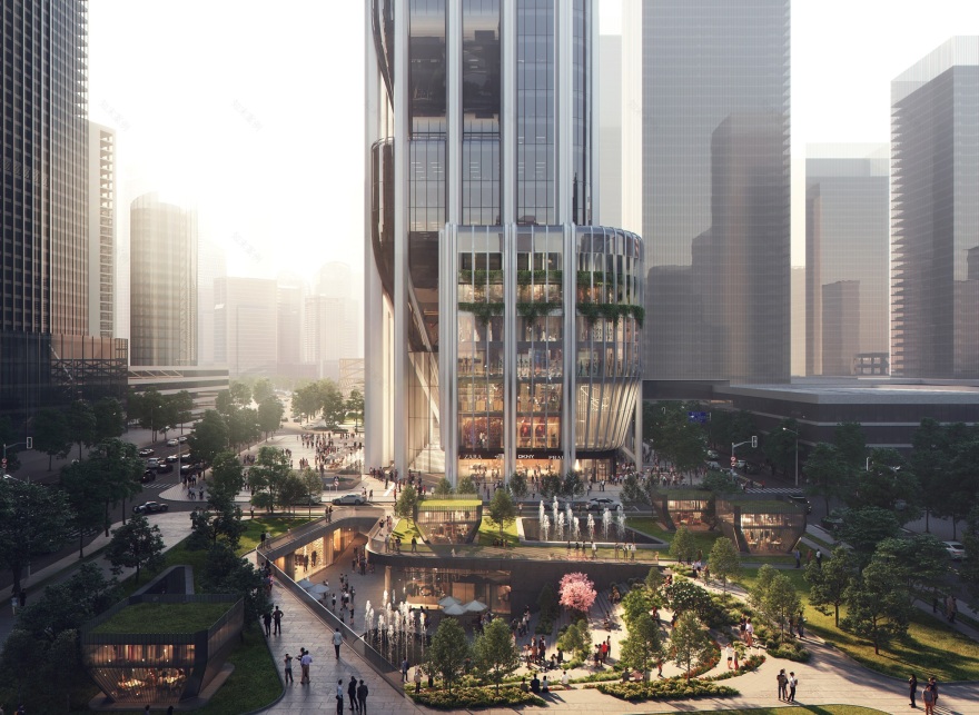
As the waterfalls cascade down into the urban plaza, the tower form pulls back to express the primary structure. The primary structure creates this very simple and elegant colonnade which allows a transition from the main urban plaza through the colonnade and into the office lobby space.
The design team has proposed a very strong, simple and elegant statement for the new emerging Qianhai CBD, where the site enjoys fantastic views across the Zhujiang River Estuary.
Design Partner Nick Cordingley commented:
“The vision of the headquarters tower is to place the health and well-being of the tenants at the forefront when conceiving the design. The concept design can be seen as a vertical community within the city, all sharing a series of connected spaces which bring the work community together, and allowing a greater level of social interaction and a greater level of enjoyment of coming to the site and this new area of CBD.”
The image of the new financial headquarters is to convey aspects of stability, strength, and growth. The concept of a series of waterfalls cascading down to the urban plaza below defines this new tower with a very strong image within the cityscape.
The water is further articulated by a series of layers, taking the glass and fine lines of texture to flow down through the body of the tower.
Each of these lines then is pulled into the tower at certain moment to create external terraces and external plazas which frames views and vistas of the surrounding landscape.
The site occupies a very important corner junction within the masterplan. Due to this location, the design team has sought to create a new public space, the new urban plaza is open, visible and permeable, giving back the space to the city.
The new urban plaza created is then extended into the lobby space, the design of the lobby space itself is also seen as the continuation of the overall concept for the building.
The headquarters tower also considers the integration of an active retail environment and food & beverage spaces. The retail areas of the project are connected on multiple levels to the wider cityscape.
At B1, retail will connect through directly into the railway stations (MTR), which will allow fantastic foot flows to move into the building and also at grade, at L1. The retail will also be connected at the upper level at L3, the bridge connection into its grander context.
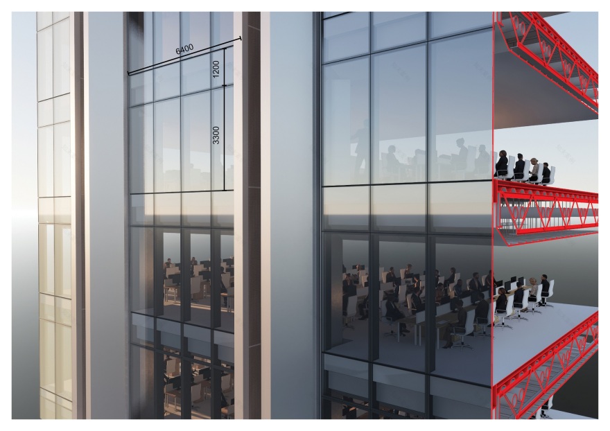
The design team has proposed a side core arrangement, which allows greater connectivity to the office space, and also allows greater opportunities to enjoy the views. The side core configuration will also help with the sense of community and the workspace, improves the dynamic working environment, and improves team communication.
The design team collaborated with Elioth by Egis to incorporate sustainability initiatives into the scheme: A low carbon approach to the site is considered by integrating natural ventilation within the façade to maximise users’ comfort. The side core located to the south absorbs the majority of radiant heat through the middle of the day, incorporating façade mounted PV cells for on-site renewable energy.
Moreover, the principle of a sponge city is introduced to minimise urban runoff.
客服
消息
收藏
下载
最近


