查看完整案例


收藏

下载

翻译
Firm: BLANK ARCHITECTS
Type: Commercial › Shopping Mall
STATUS: Built
YEAR: 2020
SIZE: 500,000 sqft - 1,000,000 sqft
BUDGET: Undisclosed
The Baltia (Baltic) Mall is the largest shopping center in the Kaliningrad region. It is designed to be a center with regional significance, targeting different groups of people, and to be the perfect place for both family trips and for younger people to spend their time in.
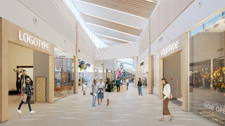
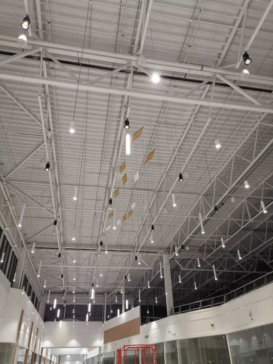
The geometry of the shopping center involves wide galleries, high ceilings and a lot of daylight zenithal lanterns above the galleries. The project employs a classical one-level module scheme.
Concept — feeling of nature
What are the first associations which come into our mind speaking about the Baltic sea? Windy endless beaches, silver colored sea, high and lonely pine trees, growing on precipitous shores, covered with the dry herbs. Sand, colored with dark blue stripes into dunes. Long shadows form the pine trees. Amber coloured sunset. Pier, going far away into the sea.
When designing the interior, our main task was to create as comfortable a space as possible for relaxation and shopping. We wanted to convey a feeling of comfort and a friendly atmosphere, whilst creating a memorable visual style.
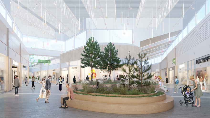
The main idea of the design was to create the feeling of the nature of the Baltic Sea area. Thus, the shopping center is divided onto three theme zones: a forest zone, a beach zone and a sea zone. For each zone, we tried to use materials which would communicate the suggested thematic feeling. The theme of nature implies the use of wood textures, a lot of greenery, smooth transitions and the use of light, natural colours.
Design – forest
"When designing the interiors of the shopping center, the main task of the architects was to create the most comfortable space for recreation and shopping: to convey a sense of comfort and friendly atmosphere, while forming a memorable visual style of the object. For each of the zones, the designers used materials and shapes that would convey the mood of nature of a certain area of the landscape - wood textures, an abundance of greenery, smooth transitions and light, natural colors. Neutral shaded ceramic granite tiles were chosen for the floor decoration. The texture is made in a smooth design with gradient transitions from one color to another. The idea is emphasized with an unusual image that mimics the shadows cast by the leaves of trees", - Magda Cichon, Founding Partner at Blank Architects.
Food Hall
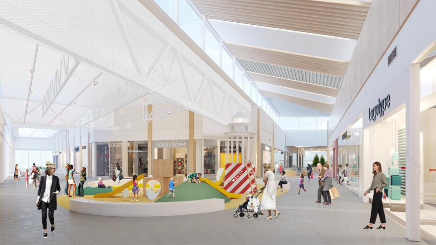
The large foodhall is a cozy and warm space that includes various seating areas that would appeal to both families and young people. The project provides spaces and playgrounds for children, podiums with seating and greenery, bar tables and comfortable chairs. There are two accent cafes on the border of foodhall and shopping galleries, and a podium is provided at the intersection of the galleries, which becomes a stage for events if it necessary. The design combines different textures and materials and a large amount of artificial greenery.
Ceiling design
The multilevel ceiling of the shopping center with complex rooflights in some places, which adds natural light and lightness to the interior. The ceiling design uses different techniques and solutions – white metal slats with built-in vertical greenery, slats with a wood texture, hanging ceiling greenery, PVA grids with different cell sizes and translucent fabric.
Floor design
For the floor finishing we chose neutral, shaded ceramic granite tiles. The floor layout consists of a smooth, flowing design, plus gradient transitions from one color to another are expressed through the creation of an unusual image, which imitates shadows cast by the leaves of trees.
客服
消息
收藏
下载
最近


