查看完整案例


收藏

下载

翻译
Firm: Hesefaza Studio
Type: Cultural › Gallery
STATUS: Built
YEAR: 2020
SIZE: 0 sqft - 1000 sqft
BUDGET: $0 - 10K
Soo is an art gallery, with an area of 210 m2, which dates back to 50 years ago and is located in Chaharbagh-e Khajou, Esfahan, iran. The building is duplex structure with two floors of which the ground floor is renovated.
An enlightened and resourceful client, initiated this project whose support flattened the way for reaching an agreement and mutual understanding between herself and the design team.
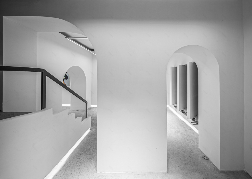
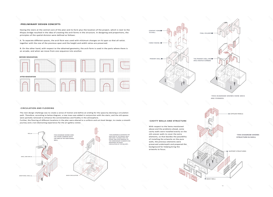
Having the stairs at the center of the space and its form in addition to the location of the project, which is next to Khajou bridge, resulted in the idea of creating arch forms in the structure. In designing and proportions, the principles of the spatial division were defined as follows:
On the one hand, To separate different spaces, the arch form was used with minimum changes on its span so that all ratios together with the size of the previous span and the height and width ratios are preserved.
On the other hand, regarding the obtained geometry, the arch form is placed between two subsequent spaces in order to connect them together.
There were several limitations such as: time and budget Which inevitably resulted in minimum changes in the space.
By Using basic-minimal forms and desaturating colors, the audience is able to pay more attention to artworks displayed in the gallery. In fact, the space purity makes it easier for the visitor to have a better understanding of the artworks.
The reason why least changes where made is that the property is on leasehold and also budget was limited, all leading to numerous challenges in the design process. One of the early solutions was to adding layers of surfaces to preserve existing walls. In this method, a different form was created wich decreased the manufacturing cost.
There is a harmony ln Esfahan historical buildings, which have been formed by some parameters such as Forms, proportions, scale, contrast and combination of colors which is the signature of this city.
By creating an introverted space, inner and outer space were separated which created contrast between them and a level of curiosity in the visitor. In fact, this contrast was made via combinating old and designed space.
Considering mentioned approaches, both limitations and design ideas will be discussed:
Limitations
1. Time constraint in design delivery and manufacturing 2. Destructions and moving elements 3. Budget in contruction.
Ideas
- Practical changes based on client’s needs and changing residential building into a gallery
- Choosing cheap materials with high speed installation (using Knauf panels)
- Creativity in openings, forms, and different perspectives
- Spatial clarity and fluidity, and defining the entrance and final spaces
- Alterability and flexibility in window openings functions
- Space circulation by defining a one way path
- Using minimal design and preserving main elements in an abstract method in compliance with the phrase “less is more”
- Ground floor is unified and made of one material (concrete) to exhibit the form purity and spatial circulation.
客服
消息
收藏
下载
最近


