查看完整案例


收藏

下载

翻译
Firm: Architects for Urbanity
Type: Cultural › Cultural Center Gallery Museum Pavilion
STATUS: Concept
SIZE: 3000 sqft - 5000 sqft
BUDGET: $10M - 50M
shortlisted project 2015
Project Team 1st phase: Irgen Salianji, Karolina Szóstkiewicz
Project Team 2st phase: Irgen Salianji, Karolina Szóstkiewicz, Alberto Salvador Martin
Landscape Architect: Marina Kounavi
Curatorial Consultant: Liana Sofiadi
Statement
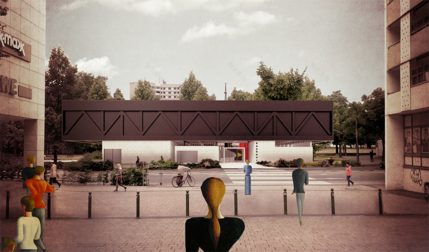
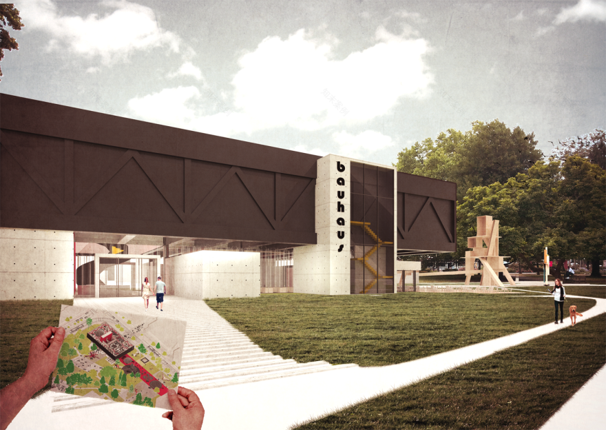
The Bauhaus Container proposal suggests a connection of all the Bauhaus fragments in Dessau by addressing the museum as the first stop for visitors that arrive in the city through the train station. Designed with the fundamental principles of the Bauhaus School, such as the free plan and the iconographic volumetric abstraction, the museum performs as a physical and conceptual link between the history of the Bauhaus School and the urbanity of Dessau. The Bauhaus Container is a modest and efficient pavilion-building that merges with the landscape of the City Park, yet at the same time it engages with the continuum of the city fabric on the street level.
Cityscape & Urban Development
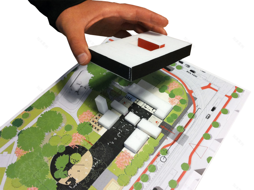
The museum establishes a strong connection with the city and its green surroundings. Placed on the junction of Kavalierstrasse and Friedrichstrasse, it suggests a compact building mass on the right top corner of the park, partly filling up the green void, creating urban front to the city, strengthening the urban character of the two streets and the city fabric continuity. Having integrated part of the park’s existing pedestrian circulation paths and upgraded it into a circulation lane that crosses transversally the museum, the connection between the city and the museum is achieved. The museum serves not as a border, but as a bridge between the park and the city. The Bauhaus production line opens towards the park through an exterior ground lane that extends from the museum and leads the visitors to the Second World War Monument and the fountain square. It dissolves in the grass ground respecting the park’s soft materiality, however offers the platform needed to exhibit art and the workshops’ production in pubic, or to hold outdoor events. The material differentiation on the linear ground element serves the distinction between the workshop/sitting areas (denser pattern), and the art exhibition areas (sparse pattern). Moreover, the use of different colors and materials bring the human scale in presence, but is also linked to the Bauhaus textile tradition and its craftsmanship. Within the green area a circular pattern is developed in a free-style way, creating a garden that encircles the café and functions as a transition between the park and the urban, an urban-garden-natural.
Concept
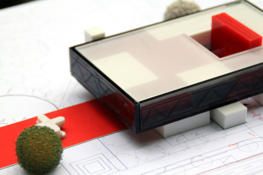
The project proposes a conceptual possibility for the Bauhaus archive and exhibitions to function as a physical container of knowledge and historical wealth. Elevated from the ground floor, the black exhibition volume shelters underneath its mass the contemporary cultural production of today. By explicitly separating the exhibition spaces from the public program and raising them above the ground, the street level works as a specific domestic space for articulations of public events, workshops, cultural activities and encounters. Therefore, the physical volume of the exhibition hall which contains an influential part of modern history, is elevated from the level of the park and the street, which represents the city itself and the momentum of life in the present time.
Plan
The ground floor of the Bauhaus Museum is organized as a micro-scale cultural city and the first floor as a simple elevated orthogonal black box-container. The separation of the exhibitions from the rest of the program of the museum aims to provide maximum efficiency and technical excellence for the strict requirements of the museum, and moreover it permits the building to integrate with both the city park and the urban fabric.
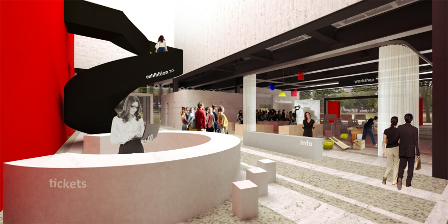
All the public program, such as the visitors’ center, cafe and event space of the museum are therefore articulated around the central foyer on the ground floor. Each programmatic entity is contained inside a separate specific volume, which is always opening both towards the park or the city and the interior common space of the museum. A continuous path from Kavalierstrasse towards the park passes through the central foyer of the museum, where the visitor center is positioned, thus creating two clear entrances in the building, namely one from the city (main entrance) and one from the City Park (group entrance).
Curatorial Approach
Bauhaus was not just an art/design movement, but it proved to be a way of living. The students lived together in a community where there was no clear hierarchy. They were not “taught”, but motivated and directed to research, experiment and develop. Everyday life was filled with creativity, passion and authenticity within a context of craftsmanship and technological awareness. These qualities of Bauhaus living and the central life-orientation of ‘being creative’ and ‘doing art with your hands’ should be communicated within the exhibition space.
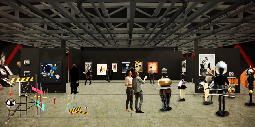
The exhibition space is designed to be a flexible, orthogonal space, easily adaptive to the need of each individual exhibition. The exhibition hall allows the grouping of the six topoi, thus achieving different interrelations between them according to the exhibition theme. Considering the programmatic space for each topos and taking some grouping decisions, the plan can be read either as a central big space encircled or followed by smaller entities, or as a sequence of equivalent spaces. The temporary exhibition space can be fully integrated in the ‘permanent’ collection corpse, be a complementary part, or function as an isolated and independent exhibition space. The two vertical cores of the building reinforce this argument and multiply the way that the space could be divided.
It is clear that flexibility becomes a concept to enrich a manifold manipulation of the visitors’ circulation. A circular, an boustrophedon, a radial, a “C” or “8” shaped or a free route could be suggested to the visitor, according to the exhibition scenario. Either suggesting or not a specific route, the space can be divided by moving walls and exhibition elements, such as portable stands, or a composition of shelves. Having engraved the floor with an orthogonal grid of 2x2m and providing a column-free interior through the building’s external structure can prove to be helpful in the arrangement of the exhibition elements.
The museum as a Narrative
In accordance with the Bauhaus non-guiding spirit, on the ground floor the visitors will be informed about the six topoi and each one’s location, free to decide their own route. Therefore they will be able to “read” the Bauhaus narration according to their own interests, focus, priorities and pace.
The approach taken by the curator is telling the story of Bauhaus composed of six topoi cross-referenced: Inventor space-Factory-Department store and Museum-School-Clubhouse. The six topoi is the filter through which the Bauhaus material on art and architecture, theatre and design, film and typography is organized. The aim is to narrate a story in a non-chronological matter, in a way that shows the parallel activity and development in the above fields, within various geographical benchmarks that were developed always in accordance with the spirit of modernity: the creation of a new aesthetic; the industrial aesthetic.
This complex, holistic and multi-perspective way of presenting the Bauhaus story should be reflected to the way objects are presented. Therefore, it is suggested that there will be a contextual and “multi-media” representation of the objects.
In this way the boundaries of the six topoi become blurry and obtain a supplementary with each other character. The visitor navigating in the exhibition space can accumulate knowledge that crosses all the Bauhaus activity fields simultaneously. It becomes clear that in this way the whole exhibition concept relates to learning based on constructivist thinking. According to the Jean Piaget, supporter of developmental psychology, the constructivism’s predecessor, “learner must interact – either mentally or physically – with the material to be learned”. The exhibits are no sequential. The visitor is not directed or obliged to follow a specific order. However, the messages sent are sequential. All the exhibits are interlinked either by sending to the visitor common messages or messages which in a way are the evidence to other given messages. For example, the message “Bauhaus entailed a vital relationship with the emerging consumer society and formed the imaginary and real places of modern life” is supplementary/ explanatory to the message “Change of the factory, where inexpensive, large-volume manufacturing took place rationally in mass-production according to the latest findings and using modern technology, was a central goal of the Bauhaus agenda”.
Construction and Material qualities
The ground floor plan can be read as a triptych of public, private and designated public spaces. The circulation zone that links the park with the city and incorporates the main core is the most public space. On its right side the museum’s private space includes the logistics and some storage area, all hidden from the visitors’ view. On the other side the public space (including inquiry and workshop area) that continues and stretches out of the museum is encircled by predefined public zones, like the shop and the restrooms or, within a wider radius, private places, like administration and storage. In this way it becomes easily obvious where the visitor is allowed to navigate and the private zones are clearly separated from this route.
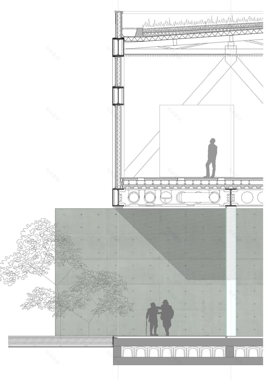
In order to optimize the design the proportions of the buildings were optimized. The floating box was slightly elongated in order to fit perfectly a 5x4.6m perimetric structural grid of triangular trusses, while it was also shifted to the right, creating cantilevers with length the 1/5 of the overall length. In this way, the building abides to some basic bridge structural prerequisites and can rest on four points in absolute balance. The 5x5.6m structural grid continues to the inner part of the building, however using linear structural elements that are incorporated in the designated public zones of the ground floor, leaving the public space column-free.
The ground floor facade is created by the boxy volumes of the separate, public zones. The gabs between them are covered by glass, creating a beautiful depth degradation effect. On the other hand, the upper floor is a solid box created by perforated metal panes that reveal discretely the bridge-like, peripheral structure.
Overall energy concept
The exhibition space is the most demanding space energy-wise. It requires special conditions according to each exhibit’s sensibility. The fact that the exhibition space is confined to the upper floor serves in a good way the energy design. A microclimate of low temperatures can be established and maintained with the lowest losses possible on the upper floor. The atrium that accommodates the main core can act as a chimney that intensifies the air circulation, keeping the ground floor temperatures low during the summer time and achieving better air quality. Defining no openings on the north side of the building where logistics are located contribute also to a steady temperature also the packaging area of the art works, while it contributes to the general energy saving plan. On the other hand the glass surfaces on the south and west sides of the building allow sunlight to enter the public zones of the building.
客服
消息
收藏
下载
最近


