查看完整案例


收藏

下载
设计机构:猫眼设计
DESIGN INSTITUTE: MaoYan Design
项目地址:遂宁市蓬溪县
ADDRESS:
Pengxi County, Suining City
项目类别:店铺设计
TYPE:
Shop Design
项目面积:200平
SIZE: 200
m
2
设 计 师:蒙芽
DESIGNER: MengYa
助理设计师:胡爽屹
ASSISTANT DESIGNER: Hu
ShuangYi
设计时间:2022年
TIME:2022
这是一家针对20岁左右的年轻群体的一家服装品牌。甲方想要一家很有潮玩风格的店面形象。
This is a clothing brand faced to the young groups at the age of 20s. The owner wants to a store image featuring with art toy style.
在针对连锁品牌设计时,我们首先和经营者进行深入沟通,了解到该品牌的服装是针对20岁左右的年轻人,因此我们希望打造出当下年轻人喜欢的时尚、酷帅的潮玩气质。
As focusing on the brand design in chain, we initially take deep communications with operators and learn that this brand is designed for the youngsters at the age of 20s. Therefore, we hope to forge the fashionable, cool and art toy quality that the youngsters appreciate.
首先像,品牌VI的设计,是用一个很有力量感的一个“M”,再用富有活力的橙色作为品牌主题色,这个色彩不光在logo上用到,空间装饰上也连贯起来用。
First of all, the design of brand VI uses a powerful "M", which uses vibrant orange as the theme color of the brand. This color is not only used in the logo, but also used in the space decoration in accord.
从门头说起,品牌方这次选址的是个一、二楼的临街店铺。我们把品牌logo“M”放大,做成LED屏幕,播放动态影像,这样会形成强烈的视觉冲击力和品牌记忆力。对于新品牌来说,品牌符号让人记住,是非常重要的。门头除品牌logo以外,其余采用的都是灰色金属波浪板和灰色铝板作为底色,把店名和logo凸显出来。整体看起来,既高级,又简洁,重点又很突出。
Speaking to the storefront signboard, brand side chooses a store along the street on first and second floor this time. We have enlarged “M” of the brand logo and have projected it on LED screen with dynamic images, which would form an intense visual shock and impressive brand image. For the side of the new brand, it is definitely important that the brand symbol can be memorized by people. Apart from the brand logo of the storefront signboard, the rest of place adopts gray metal wavy plate with grey aluminum panel as the backboard color, capturing the store title and its logo together. As a whole, it looks sophisticate and terse, while the key points are manifested.
在门头和室内的货架,运用LED屏幕滚动播放品牌的推广内容,强化品牌形象的同时,运用动态时尚感的影像,抓住顾客眼球,吸引顾客进店,并传播了品牌logo符号。
In the storefront signboard and indoor shelves, the LED screen is used to display the brand promotion content, and strengthen the brand image. Meanwhile, the dynamic fashion sense image is used to catch customers' eyes, attracting customers into the store, and spread the brand logo at the same time.
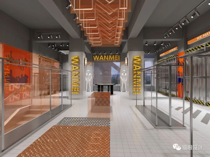
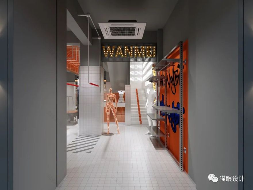
空间装饰用工业感的金属玻璃板、小白砖、做出冷静的气质,再运用活泼的橙色做为主题色,形成强烈的视觉冲击力,在酷帅中带有活泼的氛围。
Space decoration is composited with industrial sense of metal glass plate, small white brick, intending to create a calm temperament, and then adopts lively orange as the theme color, forming a strong visual impact, adding a lively atmosphere with a sense of cool.
客服
消息
收藏
下载
最近


