查看完整案例

收藏

下载
之江ART,拥有近20年发展历史,是一个以打造艺术教育铁军品牌为愿景的实力企业。之江画室是其四大业务板块之一。BOB DESIGN OFFICE为之江画室最新打造的办公空间坐落于杭州硅谷总部校区,
占据教学楼的一二两层。
Zhijiang ART is a powerful enterprise with a vision to create an invincible brand in art education, enjoying a history of almost two decades in its evolvement. Zhijiang Art Studio is one of the four businesses of Zhijiang Art. Its’ new office space designed by BOB DESIGN OFFICE is located in Hangzhou Silicon Valley which takes up the first and second floor of the teaching building.
●
整体空间以灰色为基调,墙体与顶面大面积使用灰色
特殊
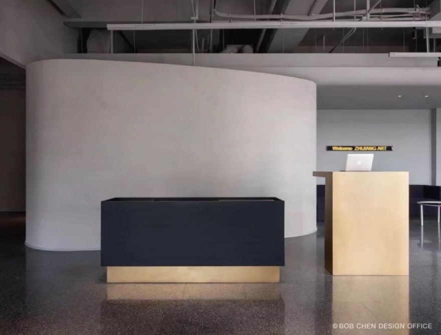
涂料,呈现良好的触感与温润的色泽。得益于一侧落地窗的设置,大厅在自然光的映照下更为通透、敞亮。接待区正对入口,沙发上方的LED灯光装置滚动着欢迎语,以迎接访客落座。
Overall background being grey, the wall and the top surface are applied with a special grey paint that showcases a good touch and a mild color. The hall becomes clearer and more spacious in natural light due to the French window on one side. Facing the entrance is the reception area, where greeting messages scroll on LED above sofas to welcome visitors to be seated.
接待台设置于临近处,配有一座结合现代化功能的水台,可供煮水泡茶、洗涤杯具。
Nearby locates the reception desk which is equipped with a platform with modern features available for boiling water, preparing tea and washing cups.
两片弧形墙面将大厅划分为若干各具特征、功能不一的区域,流畅的弧形曲线
引导着动线走向,并将
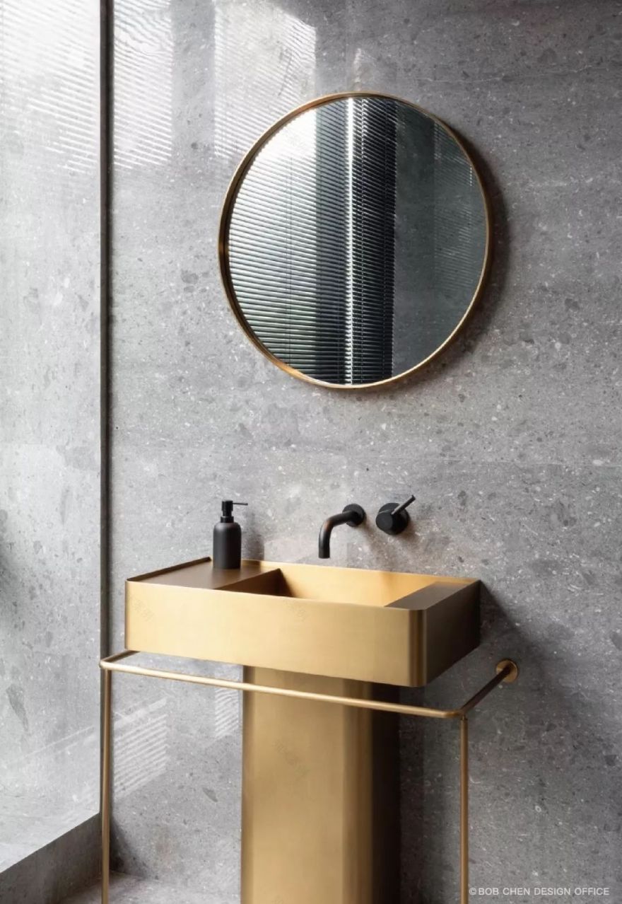
洗手间和楼梯隐藏于背后,大厅被“收拾”得更为整洁。
Two curved walls divide the hall into different areas with a variety of features and functions. Smooth curves point to the direction of exhibition, and allow both bathroom and staircase to be hidden behind. The hall turns out to be cleaner.
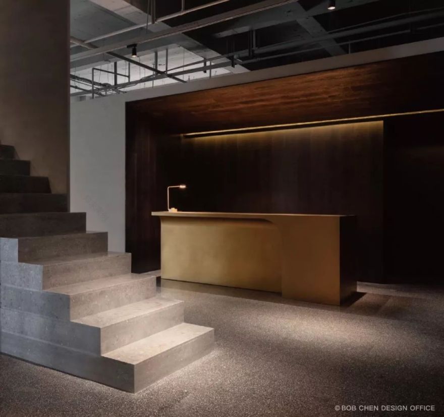
在楼梯的另一侧,由木地板打造的内嵌式区域正是收银区所在,金色灯带勾勒出内部轮廓,黄铜收银台在形体结构上与空间的建筑语言相呼应。财务室、私人洽谈室等配套空间则设置于收银区的后方。
On the other side of the staircase lies in the nested cashier area made of wood floor. Golden light strips outline the interior, and brass cashier desk echoes the architectural language of the space. Supporting spaces such as the finance office and private negotiation room are situated at the rear of the cashier area.
不规则的立体几何构造构成空间的重要特征,承担视觉识别属性。一楼的弧面结构延伸至二楼,形成楼梯口的立体景观,灯光下灰度与光影的细微变化强化着立体感。
The irregular solid geometric structure proves to be a key element of the space and functions as the visual identification. The curved surface structure of the first floor extending to the second floor constitutes a three-dimensional landscape of stairs. The subtle changes of gray shades, lights and shadow under the light strengthen the three-dimensional sense.
这一表现手法贯穿于公共区域,走廊两侧造型各异的橱窗即为新的引导方式,设计模糊了接待空间、美术馆和公共区域之间的界限,创造出一种能够回应访客内心艺术需求的体验。
Such art technique is applied in the entire public area. Those windows with different shapes on both sides of the corridor serve as a new way to guide visitors. The design blurs the boundaries between the reception space, art gallery and public area, creating an experience that responds to visitors' inner artistic needs.
二楼的空间使用更具私密性,多功能会客室、会议室、校长办公室均设置于此,为会客方式提供多元、灵活的选择,满足团队与各方沟通协作的需求。
The space at the second floor is more private where the multifunctional reception room, meeting room and principal’s office are all located here. It offers a variety of flexible selections for meeting guests and meeting the needs of communication and coordination between team and other parties.
多功能会客室
Multi-functional reception room
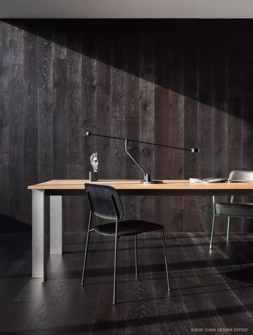
锡板台面 Tin plate surface
会议室
Meeting room
校长办公室
P
rincipal’s office
洗手间
Wash room
项目名称:
之江ART·硅谷总校办公空间
设计单位:BOB DESIGN OFFICE
主创设计:陈飞波
设计团队:李祥、茹燕
设计撰文:SALOME STUDIO
项目摄影:稳摄影
项目地址:中国杭州
项目面积:600平方米
竣工日期:2019.3
主要材料:石材、黄铜、地板
主要品牌:TOUCH FEELING触感空间、
杭州Enjoy space(Vitra, HAY)、WUU
Project Name: Zhijiang ART - Office Space of
Hangzhou Silicon Valley
Designing Group: BOB DESIGN OFFICE
Design Team: Li Xiang, Ru Yan
Author of Article: SALOME STUDIO
Photographer: Wen Office
Project Address: Hangzhou City, China
Project Area: 600 m²
Completion Date: March 2019
Main Materials: stone, brass, floorboard
Major Brands: TOUCH FEELING,
Hangzhou Enjoy space(Vitra, HAY), WUU
●
建筑。室内。家具。视觉。
Architecture。Interior。Furniture。Graphic。
•
更多请关注
•
欢迎分享至朋友圈
Welcome to Share to friends
Reproduced please specify bobchen design office,
Rights Reserved.
客服
消息
收藏
下载
最近


