查看完整案例


收藏

下载
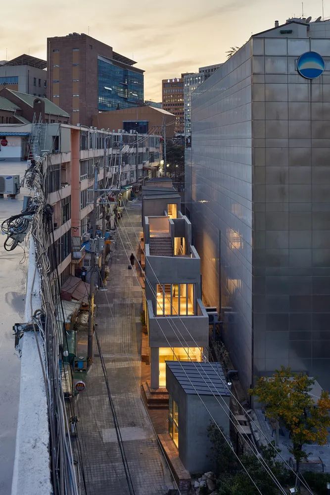
这栋建筑坐落在老城区边界的一座小山上。场地长55米,宽1.5到6米不等。海拔相差8米。狭长的场地面对着4米宽道路对面的圣约瑟夫公寓(汉城最古老的公寓之一)的商业建筑。乍一看,新建筑看起来就像是公寓的迷你模型,或者从它的部分延伸出去。因此,新建筑的设计注重道路的连续性,而不是建筑的整体。
The building is located on a hill in the old town boundary. The site was 55 meters long, while its width ranged from 1.5 meters to 6 meters. The difference in its elevation was 8 meters. The long and thin site faces the commercial building of Saint Joseph Apartment (one of the oldest apartments in Seoul) on the other side of the 4-meter-wide road. At a glance, the new building would look like a Mini-Me of the apartment, or it would be extended from its part. Hence, the new building has been designed focusing on the continuity of the road as a flow rather than on the building as a mass.
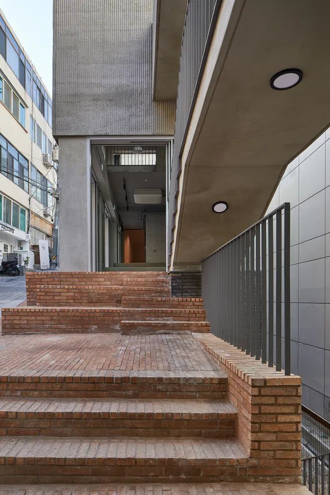
The traces as old as 50 years are not a straight road but the zig-zagged routes formed impromptu. The shops that bulged irregularly were the natural records of the time. Hence, it was perceived that such meandering routes should be represented in the outdoor spaces and mass of the building. On the other hand, the attributes of the hill were positively made use of. The concept of the front gate was diluted so that the building could be approached from every direction. Although the form of the building could not be guessed well, the front of the 1st floor has been fully open, so that everything within the building could be seen at a glance. As a result, those remaining in the building could call the passers-by to get together in the building.
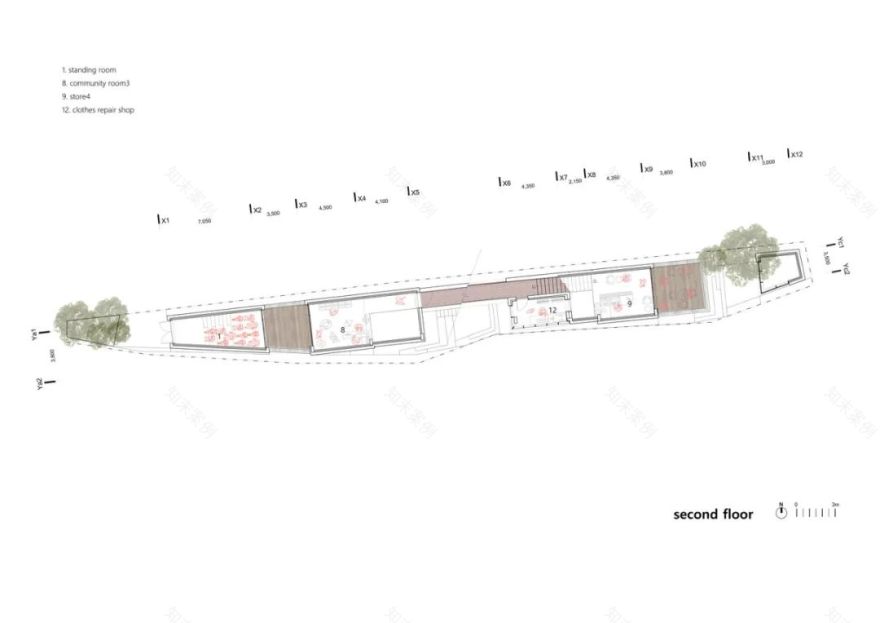
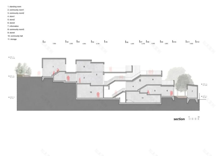
建筑内部的整个循环反映了狭窄小巷的元素。内部各部分相互连接,你站在一个角落就会看到另一个角落。这样的深空感将外部空间与垂直环流相连接,然后,将断开连接到另一个方向。结果是视觉上的差异。内部空间可以作为一个单独的空间,也可以作为一个独立的空间,由于层次的不同。单元空间是多样化的: 高空间,低空间,那些连接到二楼或外面。空间可以根据用户的需要而改变。因此,居民可以使用这些空间,或者聚在一起举办活动。否则,他们可以把这些地方当作临时商店。
The entire circulation within the building has reflected the elements of the narrow alley. The inside parts are connected with each other; you standing in one corner would see the other corner. Such a sense of deep space would be connected with the outside space and the vertical circulation and then, would be disconnected to be linked to another direction. The results are visual diversities. The inside space may be used as a single one, or as an independent space owing to the differences of the levels. The unit spaces are diversified: high spaces, low spaces, those linked to the 2nd floor or the outside. The spaces can well be varied to meet users’ needs. Hence, residents can use the spaces or get together in them for an event. Otherwise, they can use the spaces as temporary shops.
材料的选择是创造一个景观的建筑最重要的,与简单的街区在市中心协调。因此,在构建和谐的立面时,我们使用暴露的混凝土作为材料,看起来很熟悉,但看起来很新,有着看起来很新但很旧的纹理,随着时间的推移,它会像这个老城镇一样老去。然而,通过稍微改变混凝土装修技术,熟悉但不同寻常的外观,似乎从一开始就是这个街区的一个场景。
The choice of materials was paramount in creating architecture as a landscape that harmonized with unsophisticated neighborhoods in the city center. Thus, in composing the harmonizing façade, we used exposed concrete as a material that looked familiar but seemed new, had the texture that looked new but old, and that would age as in this old town over time. By changing the concrete finishing technique a little, however, the familiar but uncommon exterior became a scene that seemed to have been in this neighborhood from the beginning.
客服
消息
收藏
下载
最近


