查看完整案例


收藏

下载
项目信息
■ 项目地址 | 上海市
■ 项目户型 | 2室2厅
■ 项目面积 | 105㎡
■ 项目设计 | 成筱设计
说在前面
本案是一套105㎡的老房重装,业主三口之家居住。
设计师结合业主的喜好重新定义新家,
将情怀融入设计中,
将幸福融入生活。
LIVING ROOM
客厅
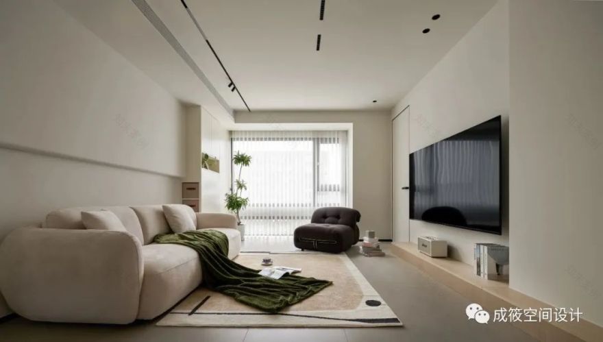
客厅采用无主灯的设计,通过窄边磁吸灯的辅助光源,让空间的灯光层次更加丰富,沙发背景,结合收纳与装饰的设计,让空间的利用率和层次感得到提升,阳台梦幻帘的选用,增加了空间的柔和感,墙顶采用一个色号的颜色,空间的整体性更高。
The living room adopts a design without main lights, and the auxiliary light source of narrow edge magnetic absorption lamps makes the lighting level of the space more rich. The sofa background, combined with storage and decoration design, improves the utilization rate and sense of hierarchy of the space. The selection of balcony dream curtains increases the softness of the space, and the wall top adopts a color code, which enhances the overall integrity of the space.
客厅和餐厅的连体设计,让空间的视觉通透感增加,客厅弧形吊顶的延伸,增加了空间的柔和感,电视背景采用原木地台的设计,让空间的温馨感增加。
The integrated design of the living room and dining room increases the visual transparency of the space, while the extension of the curved ceiling in the living room adds a sense of softness to the space. The TV background adopts a design of a wooden platform, which increases the warmth of the space.
KITCHEN AREA
餐厨区
厨房采用木色+咖灰色的素色门板,厨房吊顶采用防水石膏板+防水涂料的顶面,去挡水条的台面,让厨房空间高级感满满。
The kitchen adopts a solid color door panel of wood color and coffee gray, and the ceiling of the kitchen adopts a waterproof gypsum board and waterproof coating top surface. The countertop without water blocking strips gives the kitchen space a sense of luxury.
餐厅中岛+餐桌得结合,增加了厨房台面的使用功能,中岛上的水管,采用黑色不锈钢的材质进行包管,既节约了面积,又成为点睛之笔。中岛后的收纳柜设计,满足了餐边柜的功能。
The combination of the island and dining table in the restaurant has increased the functionality of the kitchen countertop. The water pipes on the island are wrapped in black stainless steel material, which not only saves area but also becomes the finishing touch. The storage cabinet design behind Nakajima meets the functions of a food side cabinet.
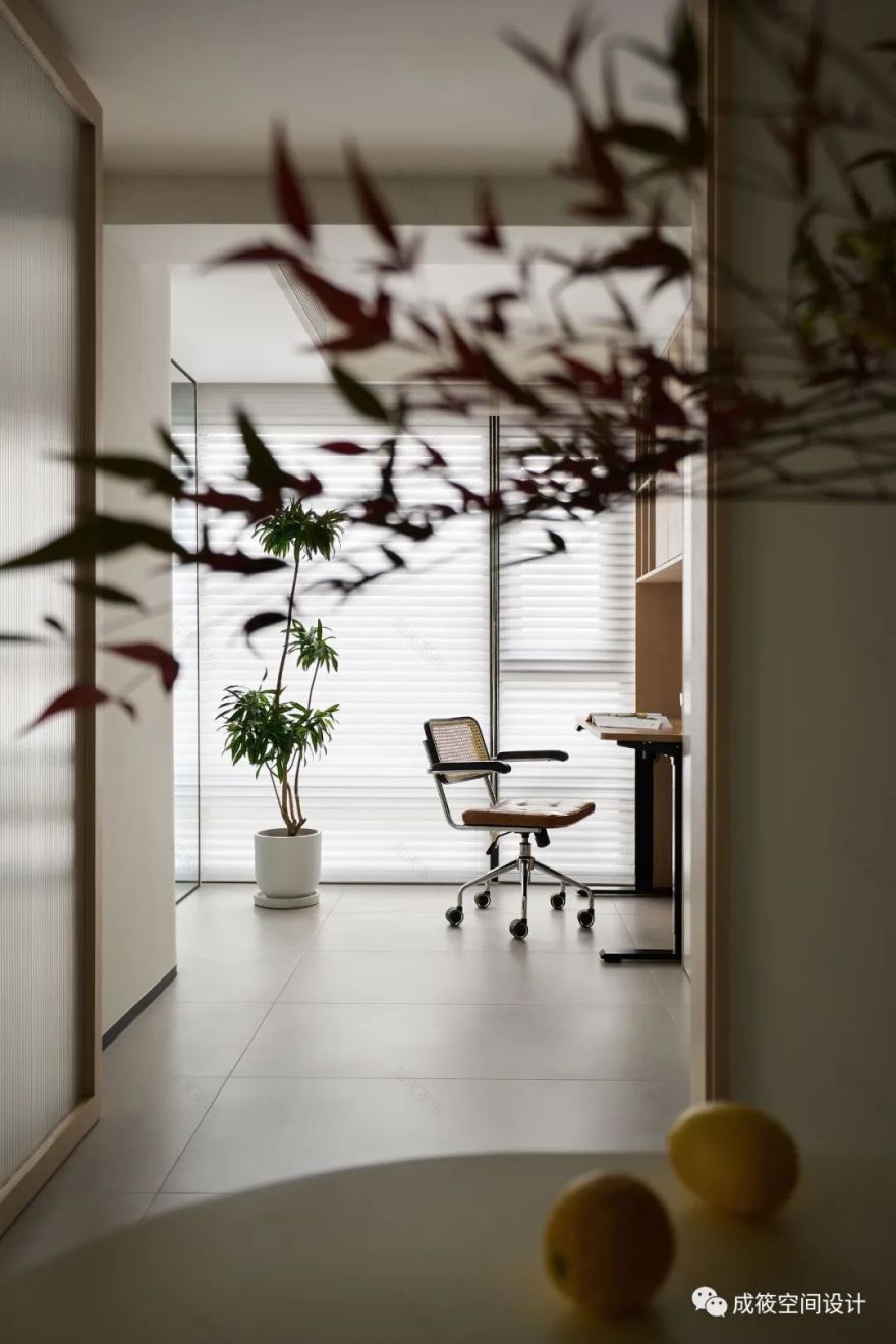
餐桌采用与墙面同色系的颜色,让空间的一体性更强,餐桌上的红叶竹,为空间增添了一抹色彩。
The dining table adopts the same color scheme as the wall, making the space more integrated. The red bamboo leaves on the dining table add a touch of color to the space.
MASTER BEDROOM
主卧
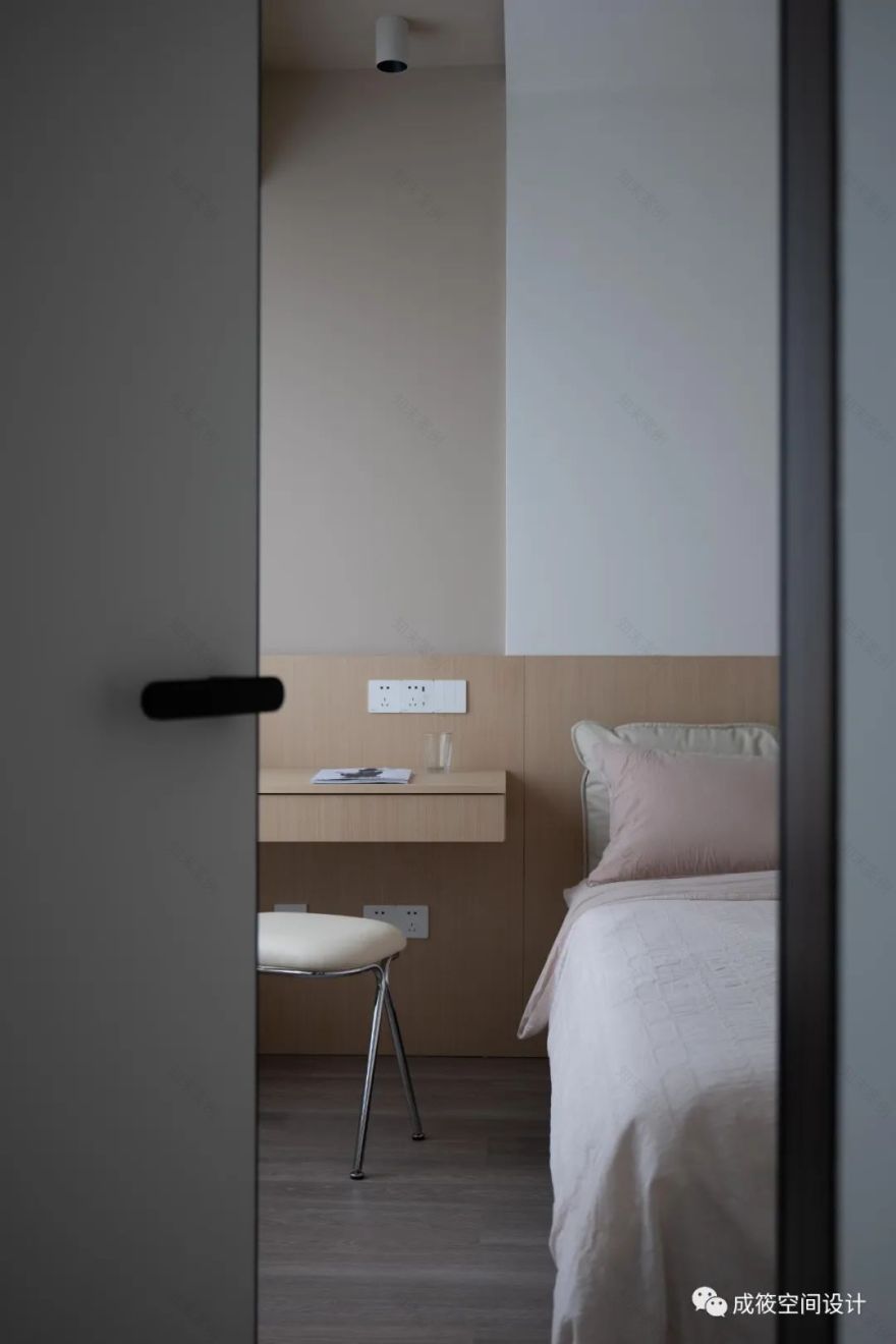
主卧延续整体的无主灯设计,通过墙壁造型的层次和颜色的区分,给主卧的层次感得到增强,床头背景延续到窗户,增加了书桌的功能,无靠背床的采用,让空间的宽阔度得到增加,灰粉色+奶白色+原木色的搭配,让空间的柔和感满满。
The master bedroom continues the overall design without main lights, enhancing the sense of layering through the layering and color differentiation of the wall shape. The bedside background extends to the window, adding the function of a desk. The use of a backless bed increases the width of the space, and the combination of gray pink, milk white, and natural wood colors fills the space with a soft feeling.
衣帽间通过衣柜门板的设计和床头柜的延伸,使空间更加的整体简约。色调采用同墙面的色系,空间的整体性增强。
The design of the wardrobe door panel and the extension of the bedside table in the cloakroom make the space more overall simple. The color scheme adopts the same color scheme as the wall, enhancing the overall space.
CHILDREN'S ROOM
儿童房
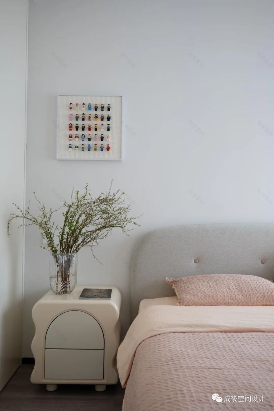
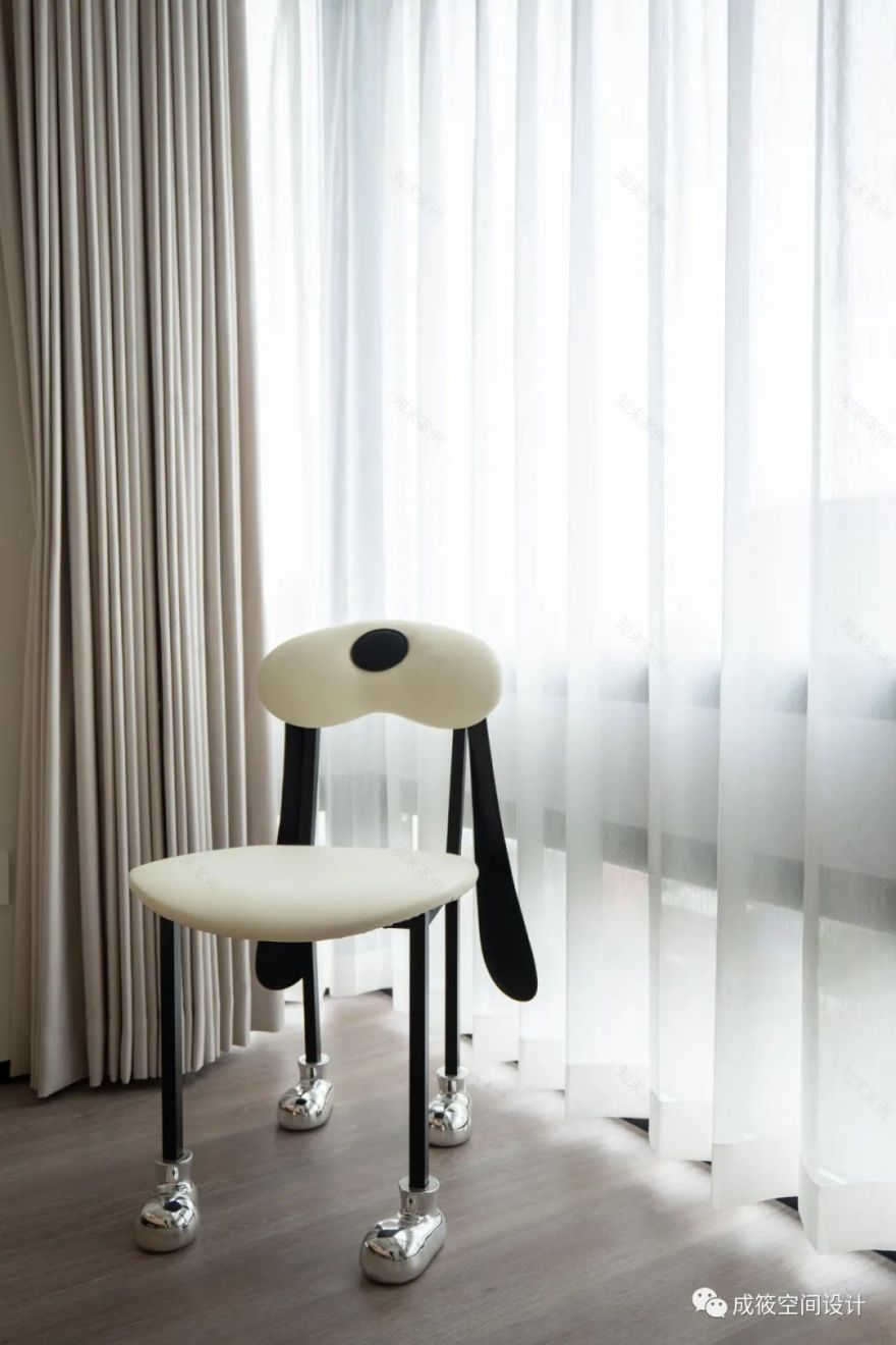
儿童房的设计,通过无主灯和弧形吊顶的运用,让空间的柔和感得到增加,多边形的床头柜点缀和单品桌椅融入,不仅增加的实用功能,也增加了儿童房的童趣,衣柜同样采用一门到顶和墙壁同色的色系,空间利用率提高,和整体感增强。
The design of the children's room increases the softness of the space through the use of mainless lights and curved ceilings. The polygonal bedside table embellishments and the integration of single item tables and chairs not only add practical functions, but also enhance the childlike charm of the children's room. The wardrobe also adopts a color scheme from door to top and the wall is the same color, improving space utilization and enhancing the overall sense.
STUDY ROOM
书房
书房窗帘,采用升降罗马帘的方式,大大的节约了空间的面积,也增加了书房的采光。地面采用客厅的瓷砖,让空间的视觉通透感得到增加,书房长虹玻璃折门的运用,让书房的自由灵活性得到提高,从而不影响餐厅的采光。
The study curtains adopt the method of lifting Roman curtains, which greatly saves space and increases the lighting of the study. The floor adopts ceramic tiles from the living room, which increases the visual transparency of the space. The use of rainbow glass folding doors in the study enhances the freedom and flexibility of the study, thereby not affecting the lighting of the restaurant.
BATHROOM
卫生间
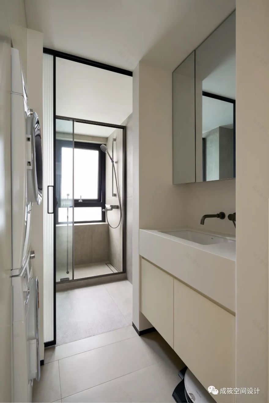
干区通过墙体的改造后,增加了台盆和洗衣区的功能,大大提高了空间的利用率,镜柜的使用,让空间的通透感和实用功能增强,台盆柜体采用悬空设计,巧妙的将拖地机融入,入墙龙头的采用,增加了台面的实用率,也让空间的高级感得到增加。
After the renovation of the walls in the dry area, the functions of the basin and laundry area have been added, greatly improving the utilization rate of the space. The use of mirror cabinets enhances the transparency and practical functions of the space. The basin cabinet body adopts a suspended design, cleverly integrating the floor mop, and the use of wall entry faucets increases the practicality of the table, and also enhances the sense of luxury of the space.
卫生间长虹磨砂玻璃的移门,不仅满足了干区的采光,也让湿区的空间得到便利,墙地同色的瓷砖运用,也增加了空间的整体性,入墙龙头的采用,为打扫卫生提供了方便。
The sliding door of Changhong Frosted glass in the toilet not only meets the lighting in the dry area, but also facilitates the space in the wet area. The use of tiles with the same color on the wall and the ground also increases the integrity of the space. The use of tap into the wall provides convenience for cleaning.
End
■ 原始结
构图
■ 平面布置图
客服
消息
收藏
下载
最近


