查看完整案例


收藏

下载
我的设计内核是理性的,外在的感性部分都是通过我理性的推理和计算得来的
—— 蔡星宇
The core of my design is rational, and the outer perceptual part is obtained through my rational reasoning and calculation
—— Archer.C.Gelu
本项目是 2M 咖啡品牌位于成都东边区域的第一家融合了 Brunch 产品的店。2M 运营团队想借此项目对成都东边区域年轻时尚的咖啡消费市场传达一个信号——靠产品口碑立足的 2M 强势入驻了。2M 运营团队希望本项目的室内空间舒适、时尚、个性、令人印象深刻,能给该区域的年轻消费群体带去不一样的消费体验。当我陷入思考之后,“强势”“年轻”“时尚”“印象深刻”这几个字眼让我的脑海中浮现出了一个身影。
This project is the first store of 2M coffee brand in the eastern area of Chengdu that integrates Brunch products. The 2M operation team wanted to take this project to send a signal to the young and fashionable coffee consumer market in the eastern part of Chengdu that 2M, which relies on product reputation, has entered the market. The 2M operation team hopes that the interior space of this project will be comfortable, stylish, personalized and impressive, and will bring a different consumption experience to the young consumer groups in the area. When I fell into thinking, the words "strong", "young", "fashion" and "impressive" made a figure appear in my mind.
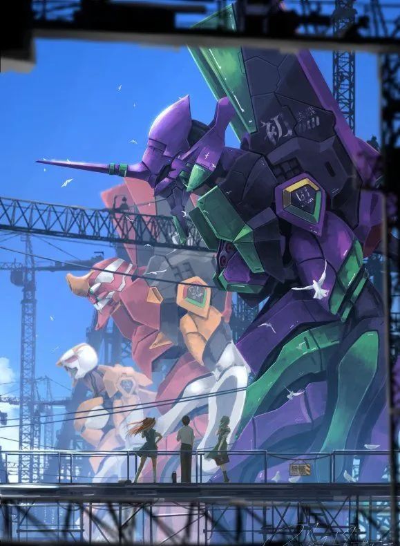
动漫《EVA》中的初号机。没错,就是这个风靡全球二次元世界的动漫角色给了我初步的空间灵感。
作为目标消费人群是 90 后的 2M,《EVA》在 90 后尤其是女性消费者当中的知名度是非常的高,近些年各大潮牌都会争相与《EVA》这个 IP 合作推出联名款产品。
刚好 LAE 团队在做市场调研的时候发现全中国没有一家餐饮类商业空间曾经采用过如此大面积的紫色来做空间的主色调,如果在本项目中采用紫色,那么也就奠定了本项目在全国餐饮行业的唯一性和独特性。
That’s right, it was this anime character that was popular in the two-dimensional world that gave me the initial space inspiration. As the target consumer group is 2M born in the 1990s, "EVA" is very well-known among the post-90s, especially female consumers. In recent years, major fashion brands will compete to launch co-branded products with the IP "EVA". It happened that when the LAE team was doing market research, they found that no catering commercial space in China has ever used such a large area of purple as the main color of the space. If purple is used in this project, it will establish the project’s national Uniqueness and Uniqueness of the Catering Industry.
从色彩学分析,紫色除了有浪漫、神秘、富贵的色彩语言,还有强势、独特的色彩语言,这就刚好与 2M 运营团队期待本项目强势入驻成都东边市场的商业姿态相吻合。
From the perspective of color analysis, in addition to the color language of romance, mystery and wealth, purple also has a strong and unique color language, which is just in line with the business attitude of the 2M operation team looking forward to this project entering the eastern market of Chengdu.
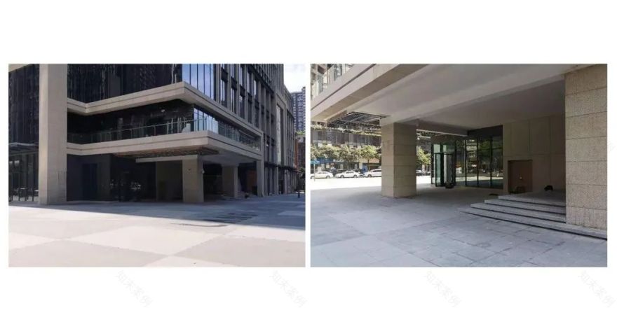
原始空间最大的难点就是过于深邃的室外门厅和低矮的门头空间,这会导致品牌露出的效果大打折扣,如果采用常规思路来设计,门头的品牌昭示效果会很差。
The biggest difficulty of the original space is the excessively deep outdoor hall and low door head space, which will greatly reduce the effect of brand exposure. If the conventional design is adopted, the effect of brand exposure at the door head will be very poor.
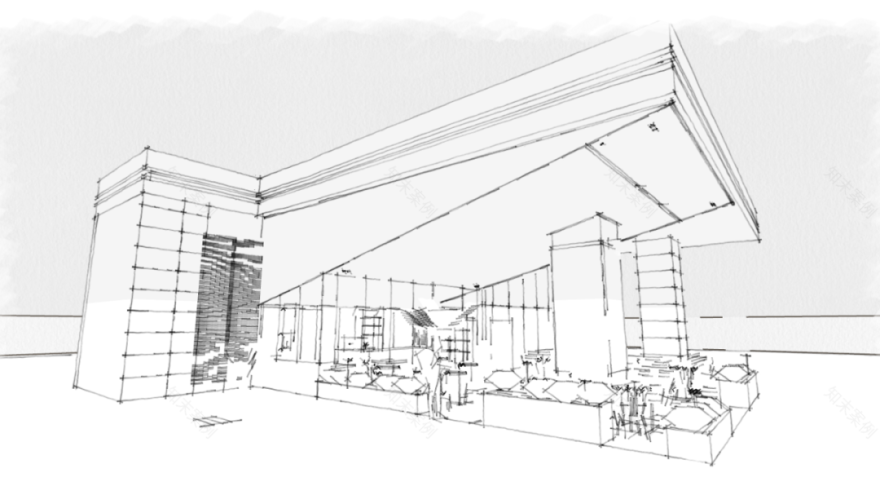
设计手稿
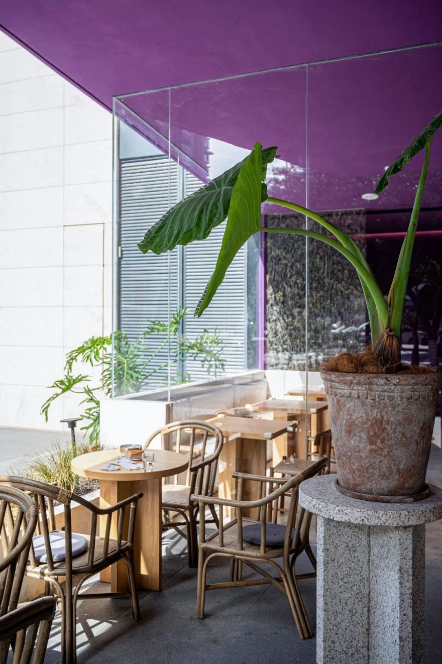
经过思考,我决定采用打通室内外边界的建筑设计手法来处理门头问题,为了让室内视野不受深邃的门厅影响,我用一根斜线将室内标高 2800 处与室外门厅屋檐相连,保证了室内人员的视野开阔和通透。
这样的设计让建筑侧面形成了一个锐角三角形,而三角形的图形语言正好就有个性和强势。
After thinking, I decided to use the architectural design method of opening the boundary between indoor and outdoor to deal with the problem of the door. In order to keep the indoor view from being affected by the deep hallway, I used a diagonal line to connect the indoor elevation 2800 to the eaves of the outdoor hallway, ensuring that the field of vision for indoor personnel is wide and transparent. This design forms an acute triangle on the side of the building, and the graphic language expressed by the triangle just has personality and strength.
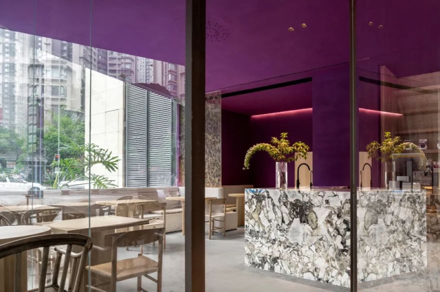
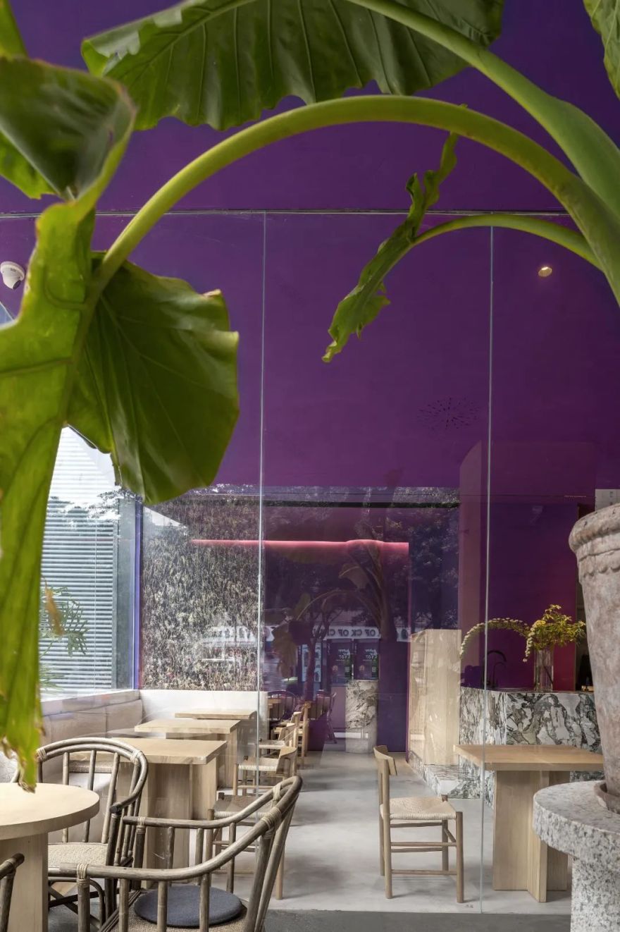
紫色在室内设计中大面积使用是很少见到的,原因是紫色的色相过于独特,很容易与其他颜色造成格格不入的视觉感,稍有不慎就容易造成项目的翻车。为了驾驭好蓝紫色相的“初号机紫”,室内家具都用本色白蜡木上清漆制作,让强势的紫色在白蜡木的浅木色搭配下不那么强硬。吧台选用的冷翡翠岩板,通过冷翡翠中的芥末绿和墨绿来过度紫色和米白色的微水泥地面,让空间的上下视觉色彩有平缓的过度,观感更舒适。
Purple is rarely used in interior design on a large scale. The reason is that the hue of purple is too unique, and it is easy to create a visual sense that is incompatible with other colors. A little carelessness can easily cause the project to roll over. In order to control the blue-purple color of the "first machine purple", the interior furniture is made of natural ash varnish, so that the strong purple is not so strong with the light wood color of ash. The cold jadeite slate selected for the bar counter uses the mustard green and dark green in the cold jadeite to change the purple and off-white micro-cement floor, so that the upper and lower visual colors of the space have a smooth transition, and the look and feel is more comfortable.
为了增加正门的开扇宽度,我采用了转轴门的设计。与此同时,我将“幸运星盘”这一灵感引入,黄铜制作的十二星座平嵌于入户地面,像时钟刻度一般,自由的门扇开扇角度,指向不同星座,预示着今天给你带来好运的人会是什么星座的。神秘的星象文化与紫色的神秘感恰好呼应。
In order to increase the opening width of the front door, I adopted the design of the revolving door. At the same time, I introduced the inspiration of "lucky astrolabe". The twelve constellations made of brass are flat embedded on the ground of the home, like the scale of a clock. The free opening angles of the doors point to different constellations, indicating that today will give you What zodiac sign is the person who brings good luck? The mysterious astrological culture and purple mystery echo exactly.
室内地面与卡座采用微水泥一体成型,让室内格调干净简洁,减少了不必要的施工缝。The indoor floor and the deck are integrally formed with micro-cement, which makes the interior style clean and concise and reduces unnecessary construction joints.
卡座区的隔断采用了定制的植物标本玻璃,透光投影的同时,体现了空间的自然格调和与众不同的视觉记忆。
The partition of the booth area is made of custom-made specimen glass, which reflects the natural style of the space and unique visual memory while transmitting light and projection.
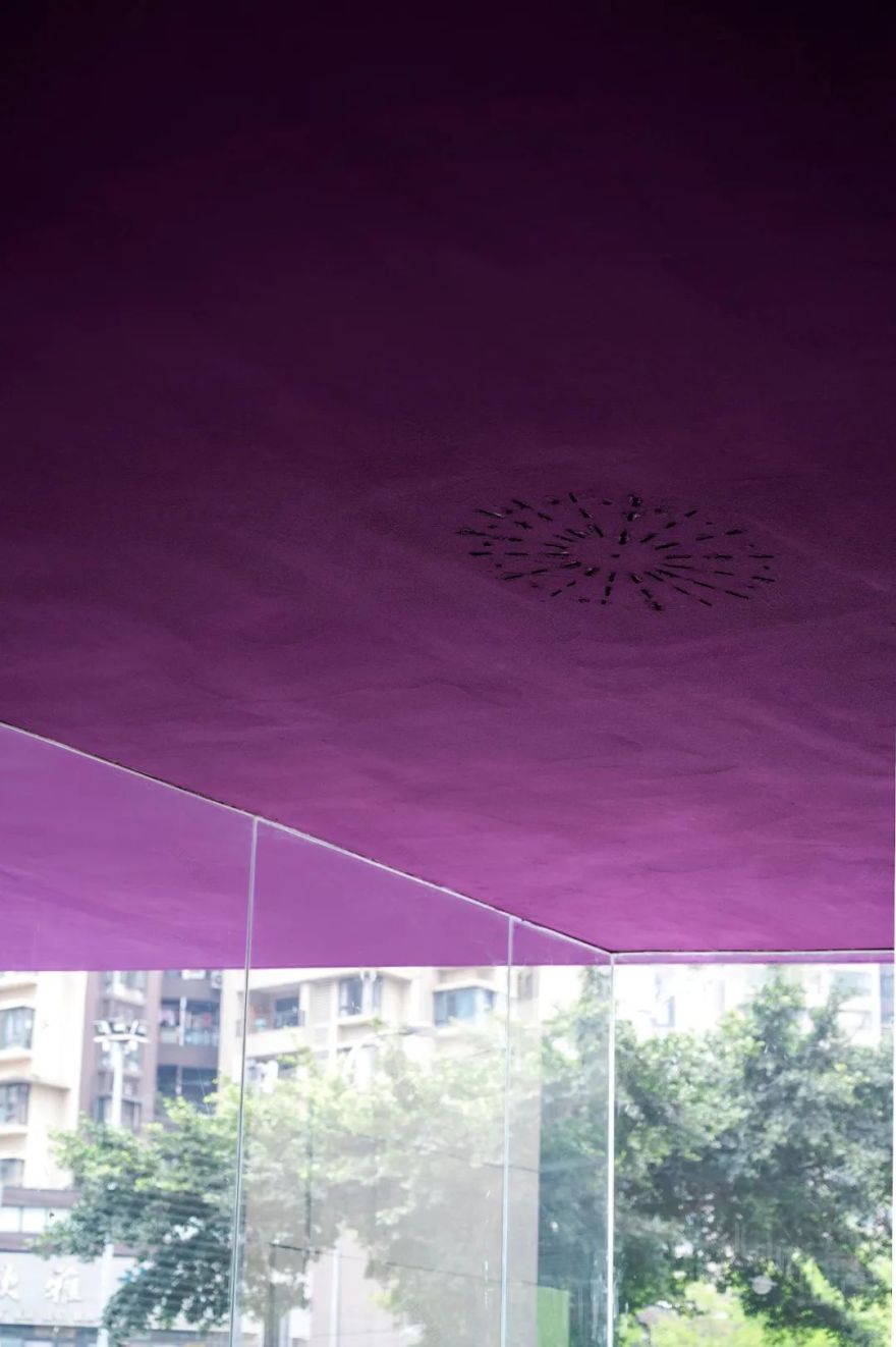
为了让三角形造型的吊顶更纯粹和简洁,音响采用了隐形设计。
In order to make the triangular-shaped ceiling more pure and concise, the speaker adopts an invisible design.
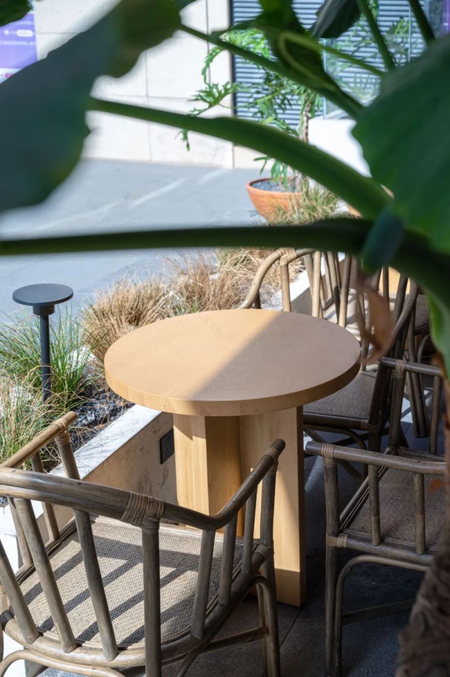
花岗岩花柱和餐桌的造型是我根据项目格调特别设计的。
The shape of the granite columns and dining table is specially designed by me according to the style of the project.
为了让消费者有舒适别致的用餐环境,外摆区域设计了高低起伏的花池和上下错落的植物陈设,让空间层次和自然亲近感能够很好地体现出来。
In order to provide consumers with a comfortable and unique dining environment, undulating flower ponds and scattered plant furnishings are designed in the outdoor area, so that the spatial hierarchy and the sense of intimacy with nature can be well reflected.
PS:对我而言这是一个非常有意义的项目,在项目交付前一天,我用手机记录了这个“孩子”的降临时刻。
相关图纸|Related Drawings
建筑外立面草图
平面图
空间拆分图
Coffee Shop丨Interior design丨2022
Project Information
Location:Chengdu,China
Project Complete:Jan 2022
Space Design :LAE Design
Design in charge:蔡星宇
Design Team:
石镇琪
黄士敏
Photography :宋琦
Area:145㎡
—
END
LAE 空间设计·生命与永恒
▼更多咨询可添加
好好住:成都 LAE 空间设计
版权声明
本文均为 LAE 室内设计原创,请勿盗用
如果您喜欢【LAE 空间设计】
可以“推送”或“分享”给身边的朋友
—往期案例—
客服
消息
收藏
下载
最近


