查看完整案例


收藏

下载
在快消费时代,颜值日益成为人们判断价值的第一要素。而在普遍焦虑的背景下,颜值也似乎是大众超越现实门槛最直接的途径。”颜值即正义”,不仅是戏谑式的宣言,也是颜值皮肤管理店的品牌宣传语。有限设计受颜值皮肤管理店委托进行的体验店设计,利用这句宣传语创造出富于想象力的视觉转换效果,为该品牌重新进行时尚定位并拓展邻近的大学生市场。
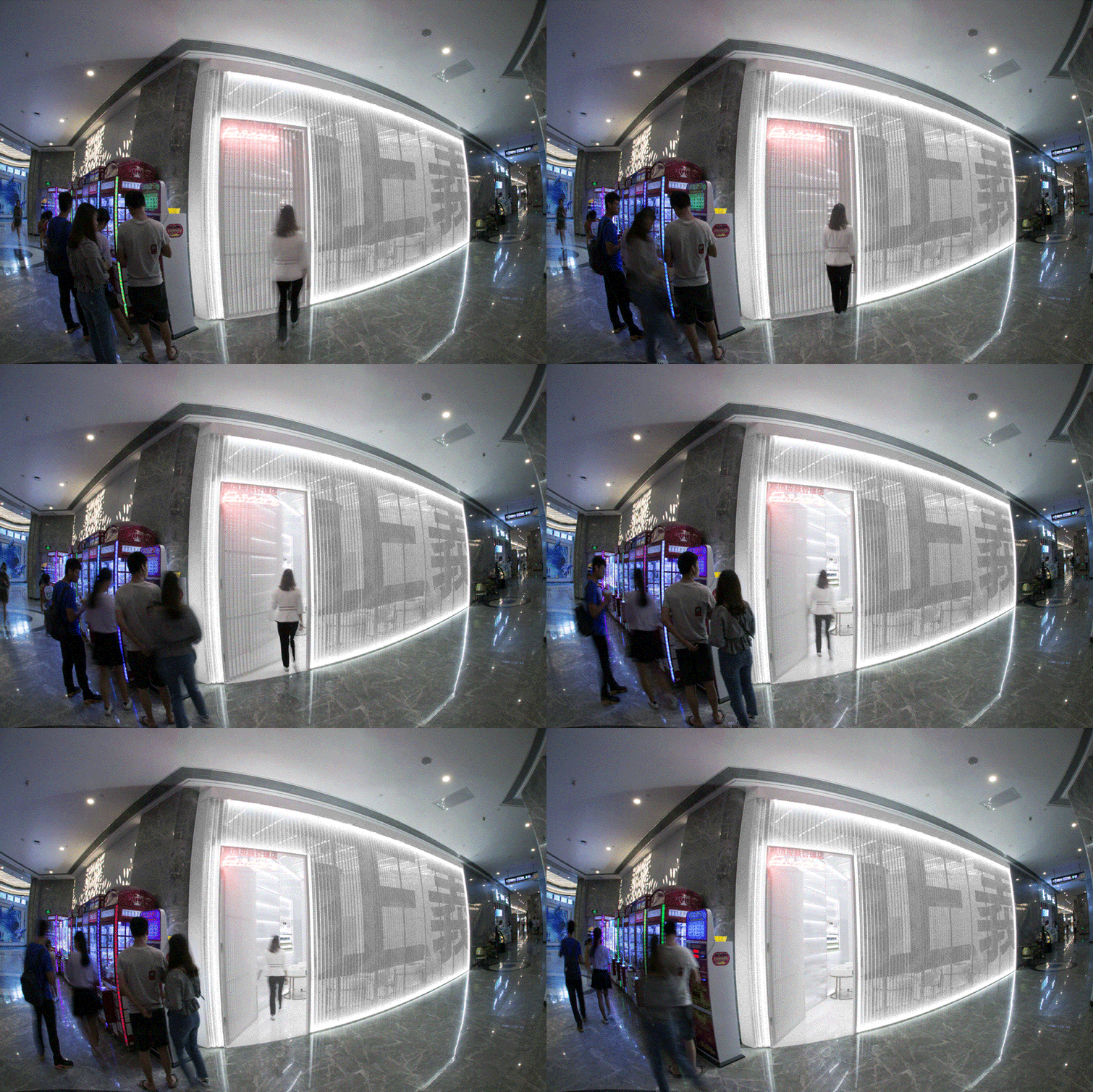
▼入口,entrance
“Beauty” has progressively become the primary factor in value judgment in the era of fast consumption. People postulate the Great Unease resulting from reality will be allayed by enhancing “beauty” in individuals. “Beauty is Justice” is not only a playful manifesto but also as the core brand slogan of Fascore Skin Management Store. Designed by YXStudio, the store features a bivisual storefront facade that allows the brand to remarket and retargeting the millennial group in the adjacent area.
▼店铺招牌,signboard
▼白色立面在色彩斑斓的商场中更易脱颖而出,Both internal and external spaces of the project are characterized by the whiteness
▼白色冲孔铝板细部,detail
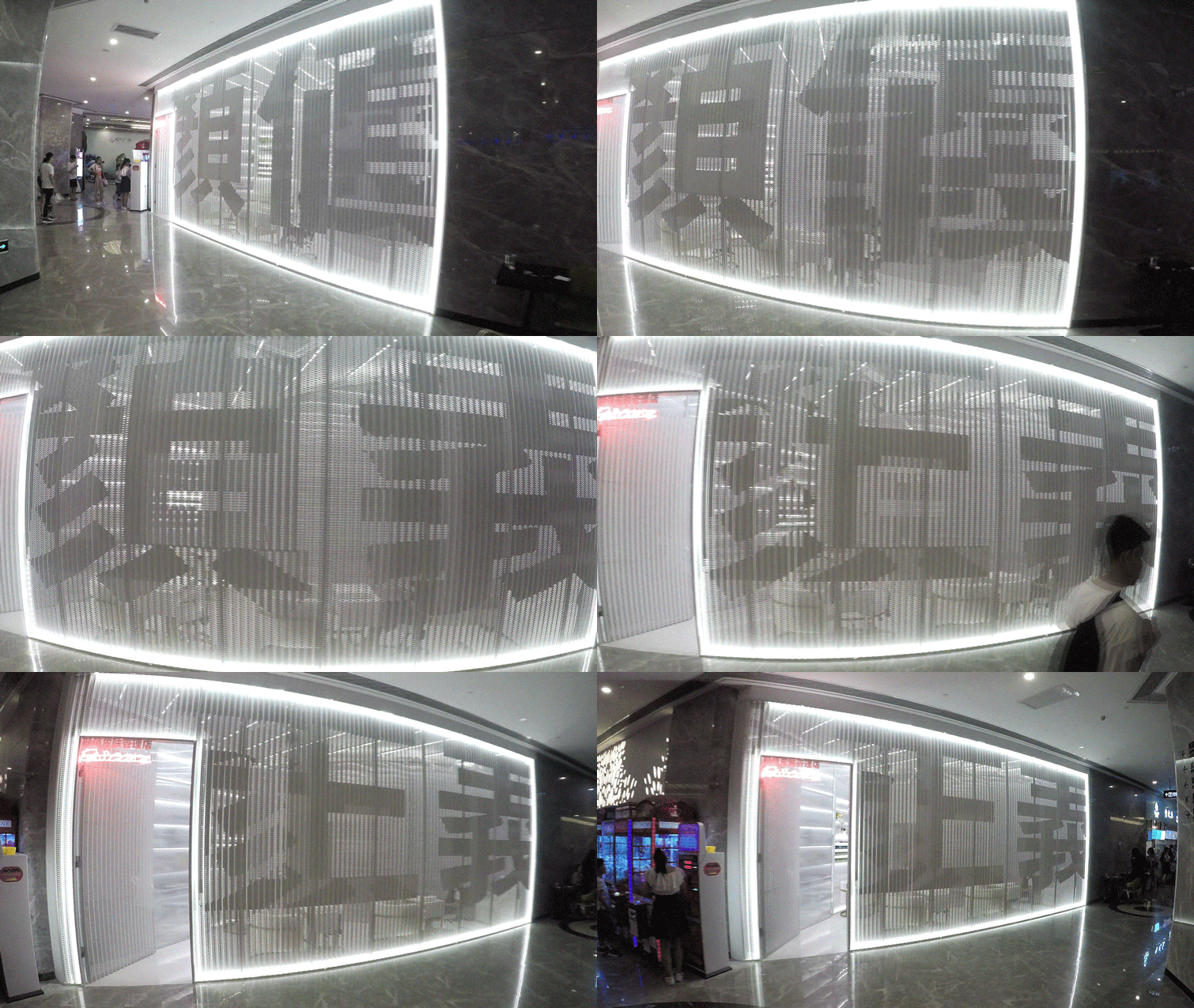
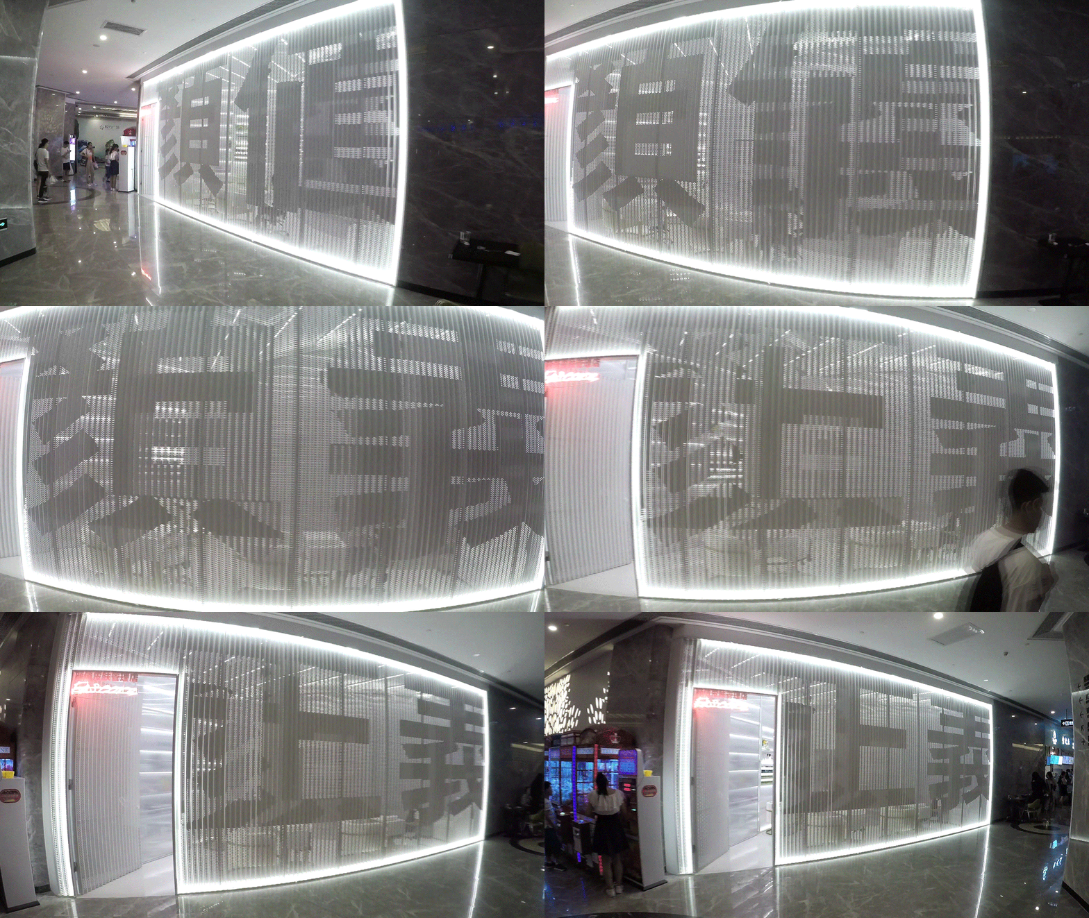
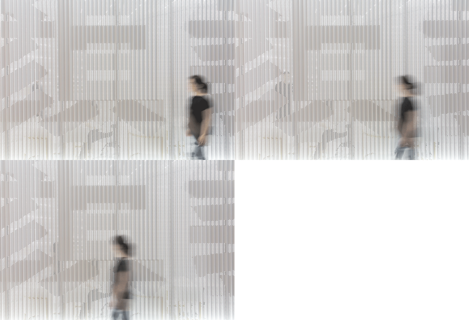
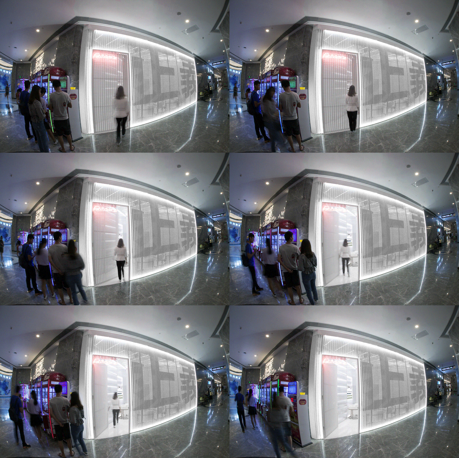
该体验店位于深圳悦方广场首层一隅,其室内空间约30平方米,却拥有宽达八米的商铺界面。有限将体验店看作是颜值品牌的巨型“广告牌”,最大限度利用商铺界面的宽度,为狭小的体验店塑造一个具趣味性的立面以抓人眼球——将广告语“颜值即正义”融入其中,当行人路过门面,会发现“颜值”和“正义”随着视线变化而相互转换。
Located in the corner of the Shenzhen Yuefang Shopping Mall, the project has a 30-square-meter store space and an eight-meter-width storefront. The strategy of the storefront is to create an eye-catching lenticular facade that is set to intrigue visitors. The slogan “Beauty is Justice” integrates with the facade in a form of angular image-the phrases on the storefront shift between “Beauty” to “Justice” with the change of angle of view.
▼当行人路过门面,会发现“颜值”和“正义”随着视线变化而相互转换,The slogan “Beauty is Justice” integrates with the facade in a form of angular image-the phrases on the storefront shift between “Beauty” to “Justice” with the change of angle of view
立面材料为50%孔率的白色冲孔铝板,过往行人隐约可见铝板后的空间、人影及动作。左侧开一小门,内部明亮的光线倾泻而出,激发行人入内探秘的欲望。色彩的单纯赋予体验店最为强烈的形象。白色立面在色彩斑斓的商场中更易脱颖而出,而室内空间的白,则为美容服务提供了干扰最小的色彩环境,并削弱狭窄空间带来的局促感。
The storefront comprising numerous pierced aluminum planks allows visitors to see through and take a glimpse of the interior. On the left, the interior light streams out of the entrance, stimulating the intention to walk in. Both internal and external spaces of the project are characterized by the whiteness. The image of the store is enhanced by the signature color thus becoming a luminous beacon in the chaotic consumption environment.
▼室内空间的白,为美容服务提供了干扰最小的色彩环境,The image of the store is enhanced by the signature color thus becoming a luminous beacon in the chaotic consumption environment
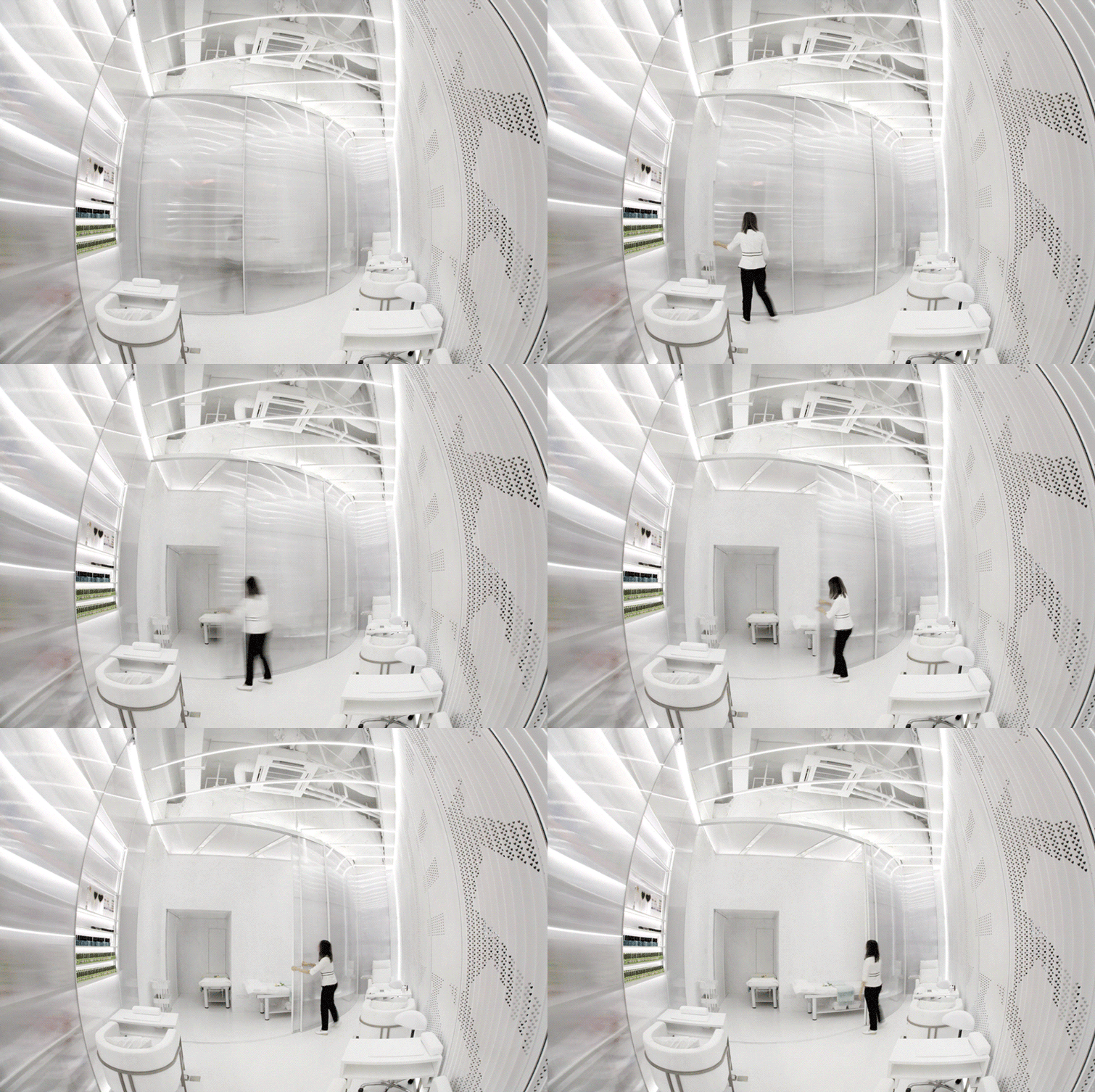
有限在拆除原有店铺吊顶的施工过程中发现室内层高达到3.8米(管线设备距离地面高度)。利用此空间优势,有限设计了一组3.6米高度的柜子和推拉门,使体验店凭借非寻常的家具尺寸获得与小型画廊类似的空间尺度,并赋予美容行为以仪式感。 美容床区域,在工作时需要围蔽以保护客人隐私。弧形推拉门被用作空间划分,在美容床区域没有客人时,推拉门将开启以保持视线的通达,向外部区域的客人展现昂贵的美容床设备。
During the construction, the original ceiling height of 3.8 meters was revealed after removing the existing suspended ceiling. YXStudio takes an advantage of the height to create a typical small gallery experience by designing a set of furniture with unusual dimensions, particularly the ceiling high shelves and sliding door. The sliding door encloses the facial spa area, as an element to divide privacy and publicity. The door will close during the facial time while it will open again to display cutting-edge facial equipment in available time slots.
▼弧形推拉门,sliding door


