查看完整案例


收藏

下载
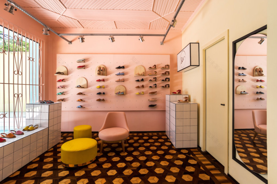
The modern and alternative look of that shoe store in Curitiba does not let you suspect its retrofit made just a few modifications to the original design. With a simple design approach and without major investments, the MOCA architecture office, ruled by architects Ana Sikorski and Katia Azevedo, managed to transform this antique house into a colorful space.
The architects designed plywood furnitures, creating a kind of shelf/frame that would enhance the shoes. In addition, they came up with wooden boxes coated with ceramic tiles that are used as product displayers. That allows the store to have many layout settings when moving the displays, bringing new air to the interior every time a new collection arrives.
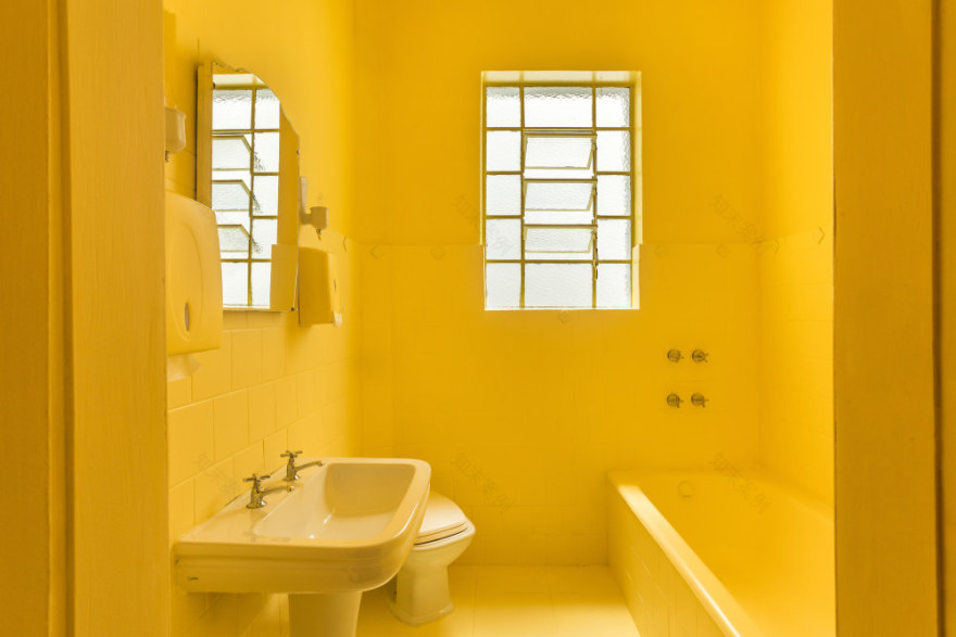
Colors also stand out in the project. On the façade, geometric painting unites the 3 colors of the brand, but inside the architects valued a clean aesthetic that focuses on monochromatic arrangements for the environments, causing great impact on the meeting room and the bathroom. That artifice brings authenticity to the store, a place that proposes to bring together unique and creative products.
项目完工照片:
平面与结构图:
待补充……
效果与概念图:
待补充……
坐落:Curitiba / Brazil / 2019
语言:English
阅读原文
客服
消息
收藏
下载
最近


