查看完整案例


收藏

下载
Officespace design · Completed 2022
250㎡
Designer:Liu Chang
Shanghai, China
浮光掠影中的纯净一隅
A pure corner of the floating light
通透的结构、充沛的光线,是一个空间最大的魅力。正因如此,刘畅在第一次来到这里时,就决定将它改造为 nothing design 的第二间工作室,在上海匆匆流逝的繁华之中,营造一个安静、纯粹的艺术支点。
The transparent structure and abundant light are the biggest charms of this space. Therefore, when Liu Chang first came here, he decided to transform it into the second office of Nothing Design, creating a quiet, pure artistic fulcrum in the midst of Shanghai’s rushing bustle.
与北京西店记忆的第一间工作室不同,这个空间位于长宁区定西路一栋改造后的老建筑中,拥有 L 形的两排大窗,引入充足阳光的同时也提供了绝佳的视野。
有了光与景的加持,室内装饰便可以更单纯,像一块富有质感的画布,任光影与陈列来慢慢雕琢。
Unlike the first studio in Beijing Xidian Memory, this space is located in a renovated old building on Dingxi Road in Changning District, with two rows of large L-shaped windows that bring in plenty of sunlight and provide an excellent view. With the addition of light and scenery, the interior decoration can be more simple, like a textured canvas that can be sculpted by light and display.
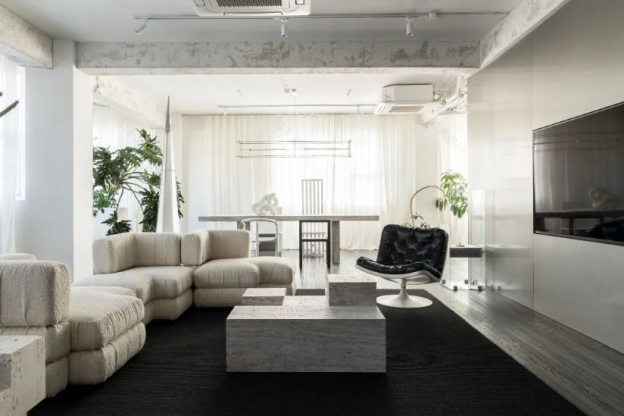
▼空间概览,interior preview
01滤掉多余的色彩
一切只与材质相关
Filter out excess color
Everything is only related to the material
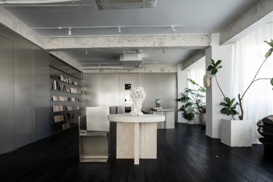
250㎡的尺度,一小半留给容纳 8 人的工作区,剩余所有,全部保留原本开放的格局。
空间的基底是简单而纯净的。黑色细长条木地板贯穿始终,颇有上海老洋房的韵味。
Space of 250㎡, a small half is reserved for the work area that accommodates 8 people, and all the remaining, all retain the original open layout.
The base of the space is simple and pure. The long and thin black wooden flooring is used throughout, which has the charm of old Shanghai houses.
▼沙发区,sofa area
沙发区用一块定制的黑色地毯衬托,与地板在视觉上几乎融为一体,不打破地面的整体感,只在触觉上增添了舒适度,同时丰富了材质的层次。
The sofa area is set off with a customized black carpet, which is visually almost integrated with the floor, not breaking the overall sense of the floor, but only adding comfort in the sense of touch, while enriching the layers of materials.
▼沙发区家具,furniture for sofa area
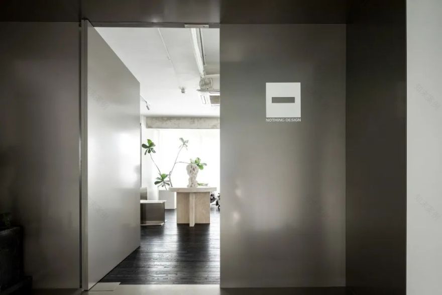
无窗的墙面通体被不锈钢饰面覆盖,其中包括进入工作室的中轴门。由于材质完全一致,门关闭时仿佛隐形,让空间成了与外界隔绝,“没有出口”的独立存在。
The windowless walls are covered with stainless steel finishes throughout, including the central door into the studio, which seems to be invisible when the door is closed because the material is identical, making the space an isolated, "no exit" existence.
▼入口,entrance
窗子之间的立柱和小面积墙体留白,白色的落地窗帘某种意义上是墙体的延伸,但它轻盈、柔软,释放着慵懒的气质,让这个充满直线条的硬朗空间瞬间松弛下来。
The walls and columns on the side of the windows are left white. The white floor-to-ceiling curtains are in a sense an extension of the wall, but they are light and soft, releasing a lazy air that instantly loosens up this hard space full of straight lines.
▼轻盈柔软的氛围,light and soft ambiance
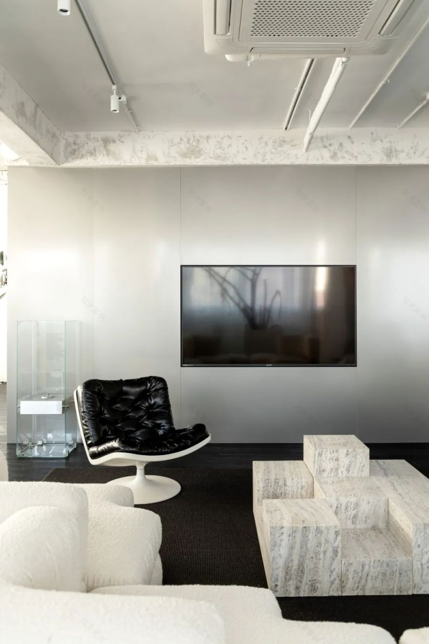
沙发区对面的墙壁上,无缝嵌入了大屏幕,内部开会或和客户商讨方案时非常方便。平时屏幕关闭的黑色状态,在这个黑白灰构成的极简空间里也毫不突兀。
The wall opposite the sofa area is seamlessly embedded with a large screen, which is very convenient for internal meetings or discussing proposals with clients. The bleak state of the screen, which is normally turned off, is also unobtrusive in this minimalist space composed of black and white and gray.
▼无缝嵌入的屏幕,seamlessly embedded screen
不加修饰的白色天花板与立柱和窗帘呼应着。横梁的处理做了“减法”,铲掉原本表面的覆盖物,露出水泥的斑驳与粗糙,与不锈钢墙面细腻的质感形成强烈反差。
The unadorned white ceiling echoes the columns and curtains. The beams are "subtracted", the original surface coverings were removed to reveal the stain and roughness of the cement, forming a strong contrast with the delicate texture of the stainless steel walls.
▼斑驳的天花,mottled ceiling
黑色的地面、灰色的墙体、白色的天花板,三者在这里形成了无色相的明度阶梯,由深至浅、由重至轻,过度自然却又层次分明。滤掉一切纷杂的色彩,只保留黑白灰的纯粹,让这个空间仿佛置身于时间之外,安静而恒久,不为岁月所动。
The black floor, gray walls and white ceiling form a colorless luminance ladder here, from dark to light, from heavy to light, with a natural but clear hierarchy. Filtering out all the mixed colors and keeping only the purity of black, white and gray, the space seems to be outside of time, quiet and constant, untouched by the years.
不锈钢展示墙,stainless steel display wall
不锈钢墙面还延展出两个重要的区域——材料区和阅读区。阅读区的不锈钢书架,陈列着设计师们工作时经常需要翻阅的书籍和资料。材料区除了展示墙之外,还有一个双面都布满抽屉的方形岛台,同样是不锈钢材质的,它方正的造型、无拉手的极简设计,将这种金属的美感发挥到极致。
The stainless steel wall also extends two important areas - the material area and the reading area. The stainless steel bookshelves in the reading area display books and materials that designers often need to look through when working. In addition to the display wall, there is also a square table covered with drawers on both sides, also made of stainless steel. Its square shape and minimalist design without handles bring out the beauty of this metal to the extreme.
▼材料区,material area
材料区是刘畅最喜欢的空间之一,他总是能在这里发掘很多灵感。干净的不锈钢基底能够将每种材料的特质释放到最大。
The material area is one of Liu Chang’s favorite spaces, where he always finds much inspiration. The clean stainless steel substrate is able to release the qualities of each material to the maximum.
材料区细节,details of material area
"不锈钢是我很喜欢的材料,"刘畅解释说,"它很现代、很酷,质感非常好。"
"Stainless steel is a material I really like," Liu Chang explains, "It’s modern, cool and has a very nice texture."
▼办公区入口,office area entrance
材料区旁一扇隐蔽的滑动门后,是纯黑色的办公区域。桌子、椅子、定制柜体,包括日常所需的一切电子设备,都是黑色的,并且几乎都采用了方正的直线条设计,在极简中透露着理性。
Behind a hidden sliding door next to the material area is a pure black office space. Desks, chairs, custom cabinetry, including all electronic equipment needed on a daily basis, are all black and almost all are designed with square, straight lines, revealing rationality in their minimalism.
▼纯黑色的办公区,pure black office area
02每个物件都是一段设计故事
Each object is a design story
开放的空间往往对于陈列的要求更高。在这个黑白灰构成的基底之上,大到家具,小到台灯、摆件,每一件物品都有自己精准的位置和存在的意义。
Open spaces tend to have higher requirements for display. On top of this base composed of black and white gray, from large furniture to small table lamps and ornaments, each item has its own precise position and meaning of existence.
▼精心挑选的软装陈设,carefully selected soft furnishings
除了固有的功能外,这些物品藏着许多故事,触摸、使用它们,穿行其间,会感觉无时无刻不在与设计交流,聆听它们传达出的独到理念。
In addition to their inherent functions, these objects hide many stories. Touching them, using them and walking through them, you will feel that you are constantly communicating with the design and listening to the unique ideas they convey.
▼入口陈设,entrance furnishings
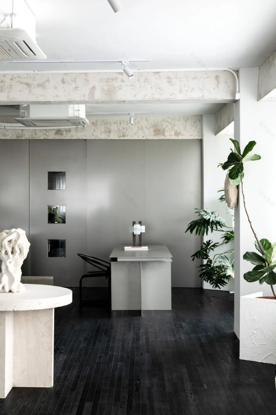
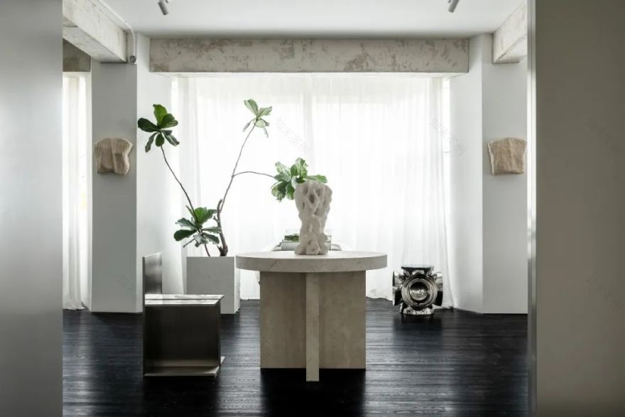
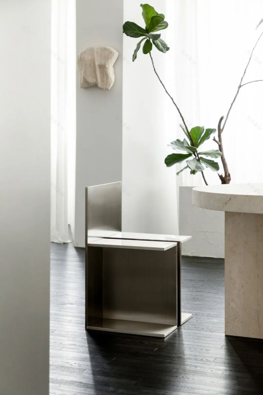
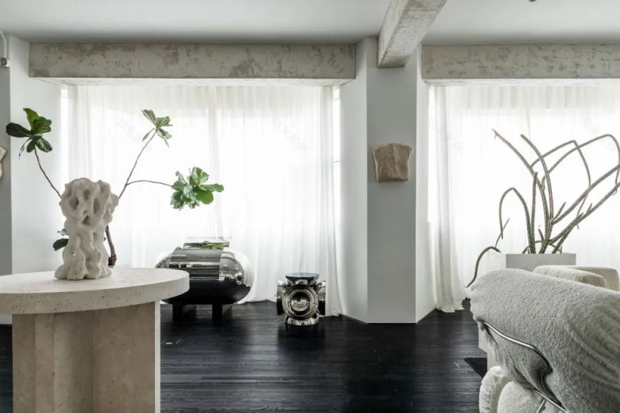
初入空间,视野中心的三件物品便为这里定下了基调,一张洞石小圆桌、一把方正笔挺的铝制座椅,和一个形态恣意的雕塑。方圆规整,而雕塑不羁,有机的造型仿佛拥有生命,为景致注入活力。座椅来自 Thomas Gayet 的 UNTITLED 无题系列。雕塑出自 95 后艺术家冯杰之手,以粗糙的匣钵泥制成,有机的形态表达着对自然万物的理解。
Enter the space, three objects in the center of your view set the tone: a small travertine table, a square aluminum chair, and a sculpture with a free form. The organic forms seem to come to life, enlivening the landscape. The seat is from Thomas Gayet’s UNTITLED series. The sculpture is from the post-95 artist Feng Jie, made of rough sagger mud, the organic form expresses the understanding of all things in nature.
▼陈设细节,details of the furnishings
金属的冷感、洞石的肌理和匣钵泥的粗糙天然,三者之间也形成了材质上的冲突之美。
The coldness of metal, the texture of travertine and the roughness and naturalness of sagger mud also create a beauty of a material conflict between the three.
材质的对比,comparison of materials
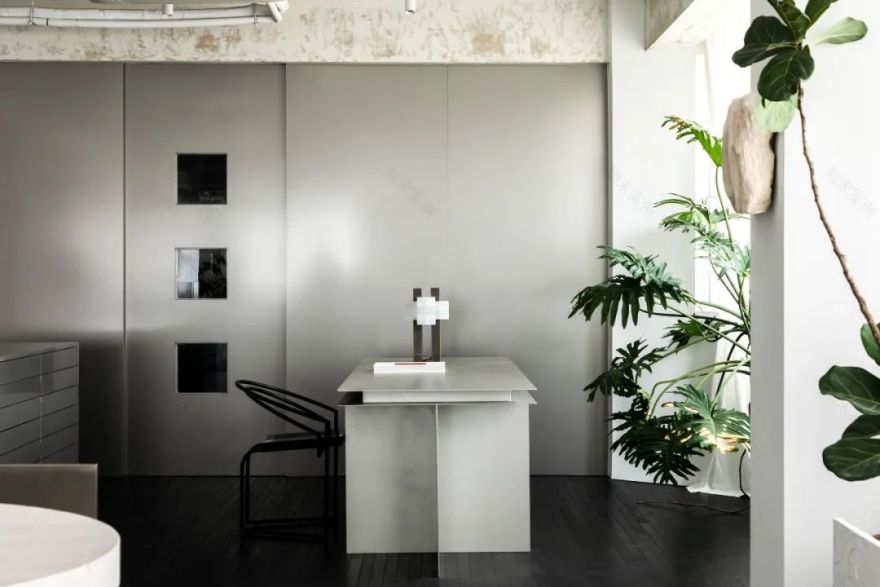
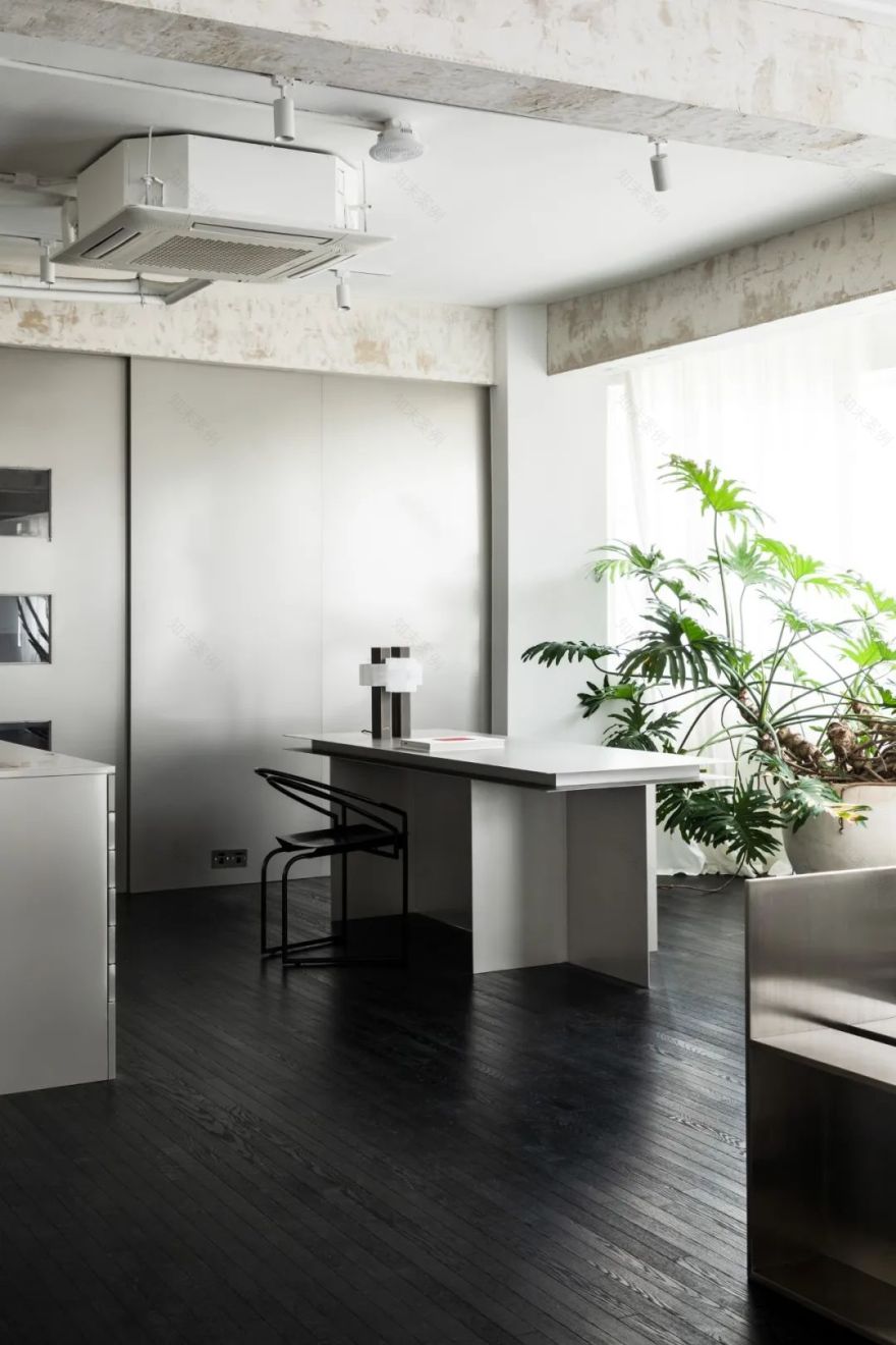
圆桌左侧是材料区和一张金属书桌。座椅是瑞士建筑师 Mario Botta 在 1986 年设计的 Latonda Chair。椅子弧形的线条造型中和了书桌的冰冷体块感,也形成了“面”与“线”交织的和谐景象。
To the left of the round table is a material area and a metal desk. The chair is the Latonda Chair designed by Swiss architect Mario Botta in 1986. The curved lines of the chair neutralize the coldness of the desk and create a harmonious interplay of "surface" and "line".
▼材料区陈设,material area furnishings
台灯是袁媛的作品 Unlock,灵感来自中国传统建筑中的榫卯结构。
The table lamp “Unlock” is the Yuan Yuan’s work, inspired by the mortise and tenon construction in traditional Chinese architecture.
袁媛的 Unlock 台灯,”Unlock” lamp from Yuan Yuan
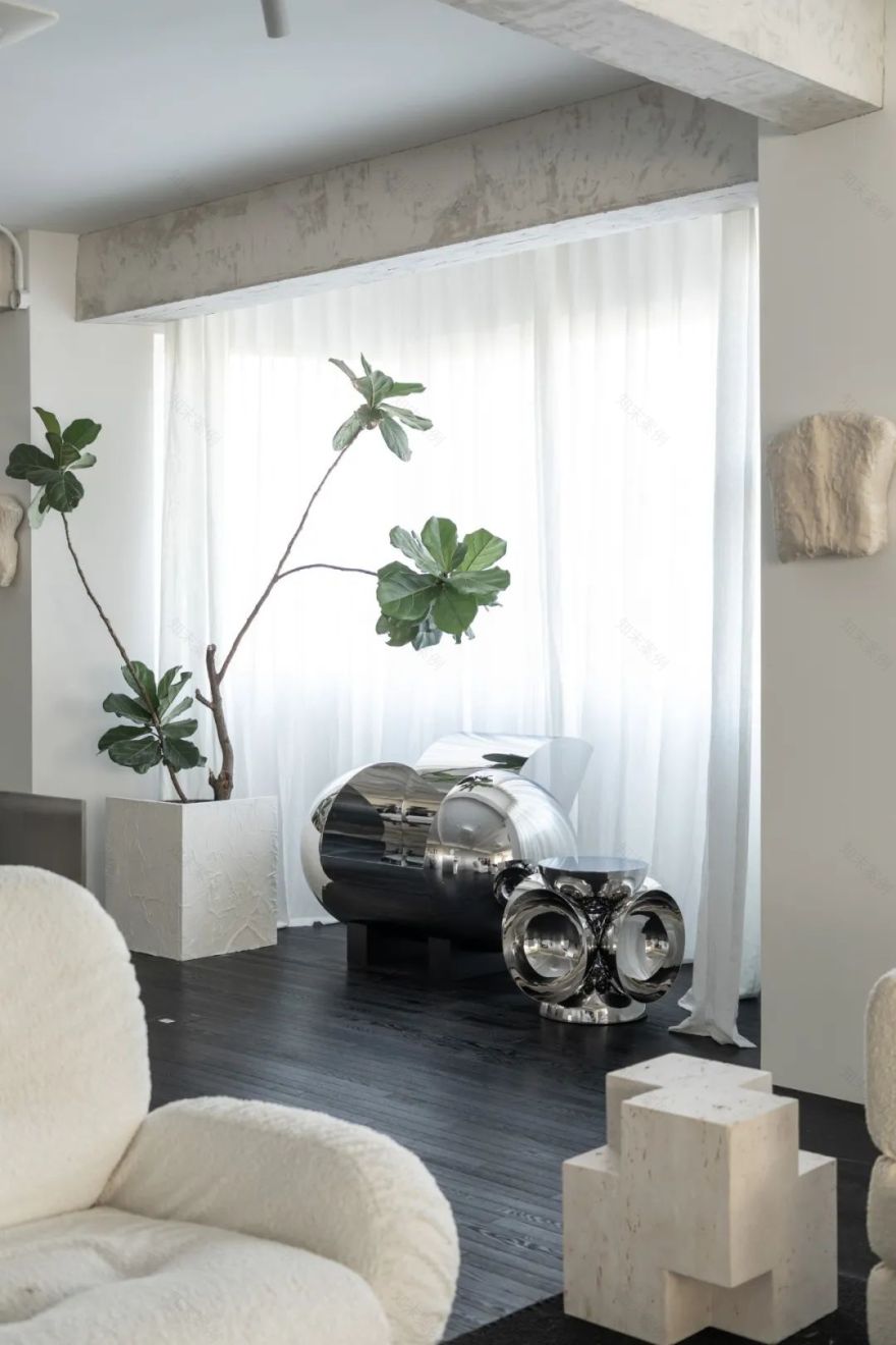
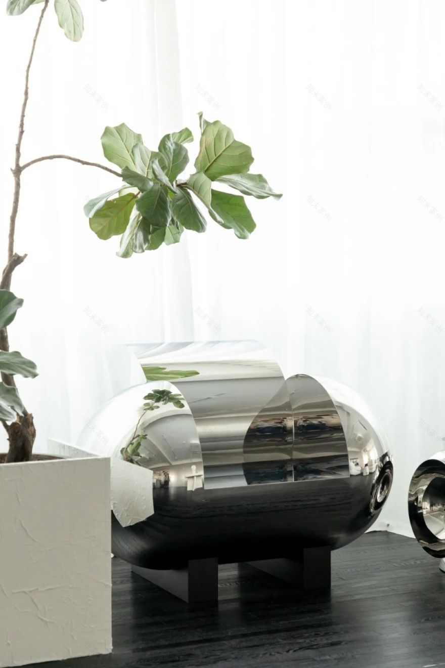
窗边摆放着刘潇设计的座椅和边几。座椅名为“消失的古城”,以不锈钢制成,深受同为不锈钢爱好者的刘畅喜爱。
By the window, there are seats and side tables designed by Liu Xiao. The seat is called "The Disappearing Ancient City", made of stainless steel, which is loved by Liu Chang, who is also a stainless steel lover.
▼窗边的陈设,furnishings by the window
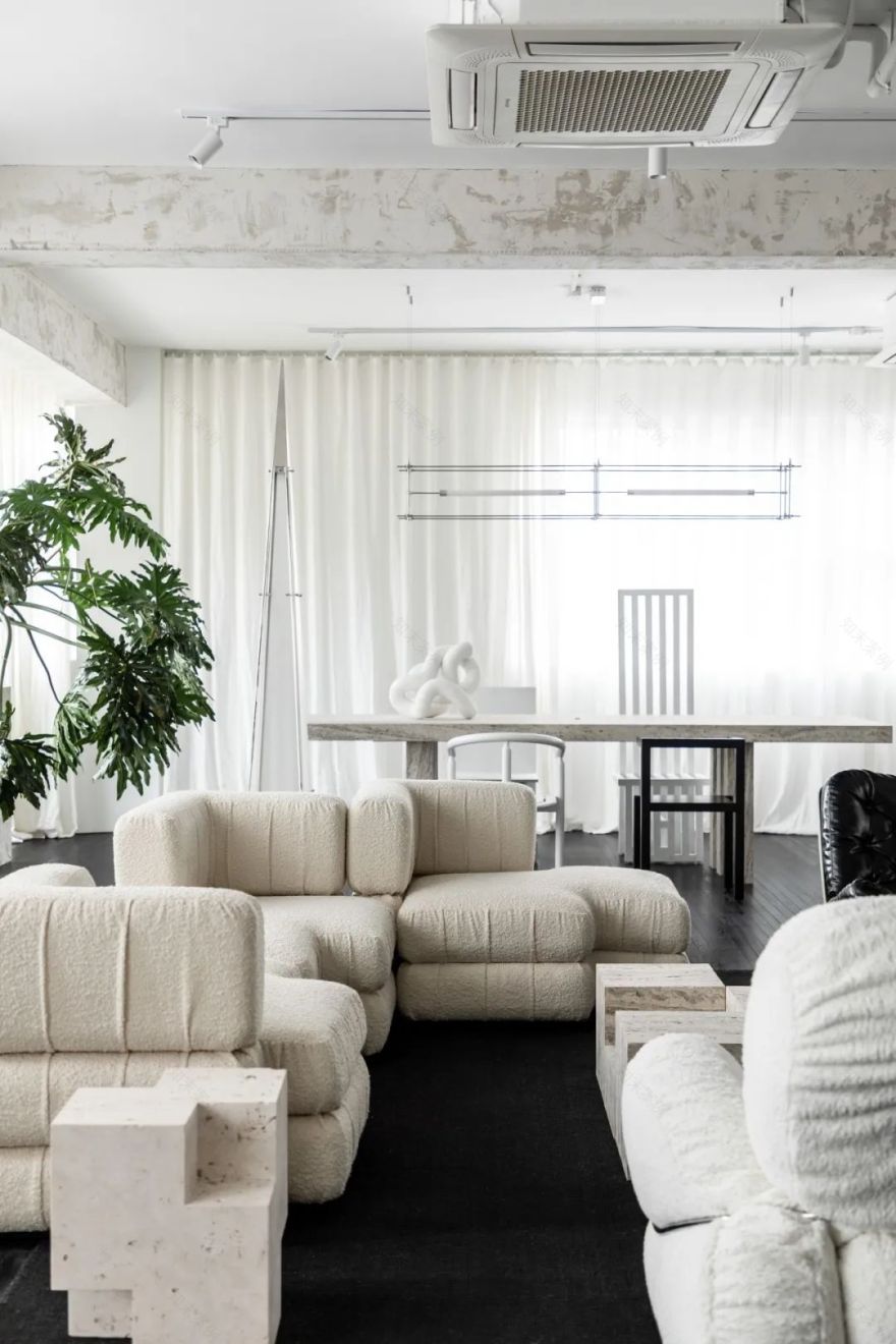
会客区由一组沙发和两把座椅围合起来。沙发是刘畅在中古家具店中一眼就相中的款式,错落的方块造型极具雕塑感,圈绒的面料在表面堆起自然褶皱,有型又不会呆板。
The meeting area is a combination of a sofa and two chairs. The sofa is the one that Liu Chang liked at first glance in the Chinese antique furniture store, the staggered square shape is very sculptural, and the looped velvet fabric piles up natural folds on the surface, which is stylish and not dull.
▼雕塑感的沙发,sculptural sofa
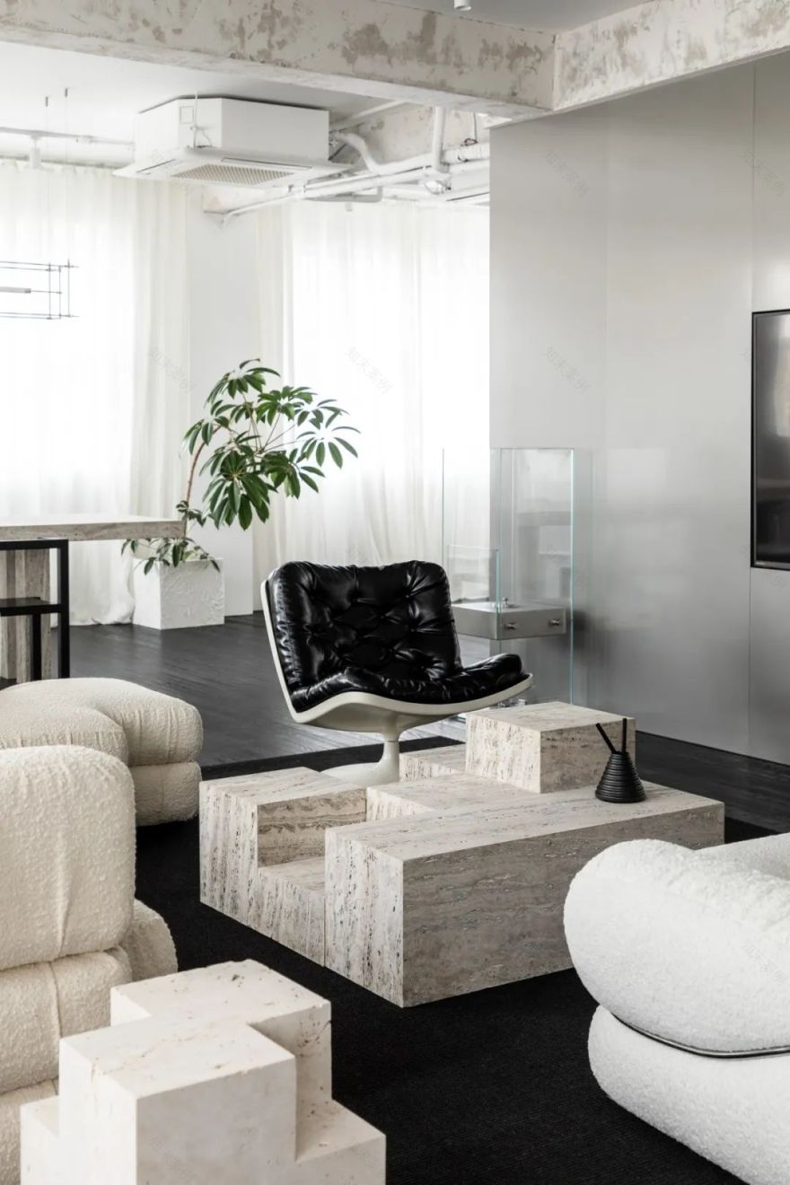
两把休闲椅都是上世纪 Space Age 的作品。沙发背后是艺术家陈星宇的落地灯,高耸的造型犹如尖塔里的小宇宙。
The two lounge chairs are both from Space Age in the last century. Behind the sofa is a floor lamp by artist Chen Xingyu, with a towering shape like a small universe in a minaret.
▼不同时代作品的碰撞,collision of works from different eras
Space Age 时期的家具与当代先锋作品,跨越近一个世纪的设计在此碰撞,一下子拉宽了时间的维度,身处其中,恍若隔世。有趣的是,这些横贯东西、相差百年的作品,似乎都在阐述着同一个主题——对未来的探索。
The collision of Space Age furniture and contemporary pioneering works, which span nearly a century, instantly widens the dimension of time and makes it seem like being in a different world.Interestingly, these works, which span a century between East and West, seem to be articulating the same theme - the exploration of the future.
▼几何感的洞石茶几,geometric travertine coffee table
洞石茶几和边桌都是刘畅为这个空间定制的,几何造型变化重组,呼应着沙发的雕塑感。
Travertine coffee table and side table are designed by Liu Chang for this space, the geometric shape changes and reorganizes, echoing the sculptural sense of the sofa.
▼茶几细节,details of coffee table
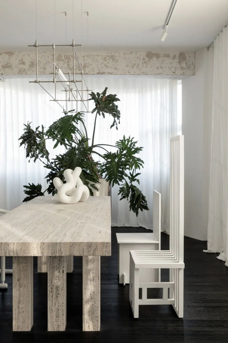
阳光最好的区域是 L 形窗转角的位置,这里放置着一张洞石长桌,四把造型迥异的座椅分立两侧。桌子上方悬挂着蔡烈超的马扎灯,纤细的线条纵横交错,灵感来自于城市中的建筑工地手脚架。
The sunniest area is at the corner of the L-shaped window, where a long travertine table is placed, with four seats of very different shapes standing on either side. Above the table hangs Mario Tsai’s Mazha Lighting, with its slender lines crisscrossing the floor, inspired by the scaffolding of a construction site in the city.
▼转角区陈设,corner area furnishings
四把座椅都有自己的个性,“选最喜欢的来坐”是每个人在这个区域都会产生的心理,也是人与家具之间有趣的互动。
Each of the four chairs has its own personality. "Choose the one you like the most to sit" is the psychology of each person in this area, and it is also an interesting interaction between people and furniture.
陈设细节,details of furnishings
每一件家具、每一个物品,都有趣到可以引发一个话题。设计师们甚至为植物 DIY 了装饰围栏,富有肌理的白色表面完美融入空间。
Every piece of furniture and every object is interesting enough to spark a conversation. The designers even made DIY decorative fences for the plants, and the textured white surfaces blend perfectly into the space.
▼每一件物品都在叙说故事,each object tells a story
从租下这里到敲定设计方案,刘畅只用了一个晚上,或许人与空间也有奇妙的缘分存在。这间工作室对于他来说,不仅仅是工作的场所,也不仅仅是繁华都市中的落脚点,而是凝聚了当下的思维与理念,情绪价值高于一切。
From renting this place to finalizing the design, Liu Chang spent only one night, perhaps there is also a wonderful destiny between people and space. For him, this office is not just a place to work or a place to settle in a busy city, but a place where the thinking and ideas of the moment are cohesive and the emotional value is above all.
设计工作室:NOTHING DESIGN
设计师:刘畅
项目位置:中国 上海
项目面积:250㎡
项目类型:办公空间
完成时间:2022 年
材料:不锈钢、木地板、洞石、玻璃
摄影:WM STUDIO
Project Info
Design:NOTHING DESIGN
Designer:Chang Liu
Location:Shanghai,China
Area:250㎡
Type:Office
Completion Time:2022
Materials:Stainless Steel,Wooden Floor,Travertine,Glass
Photography:WM STUDIO
客服
消息
收藏
下载
最近


