查看完整案例


收藏

下载
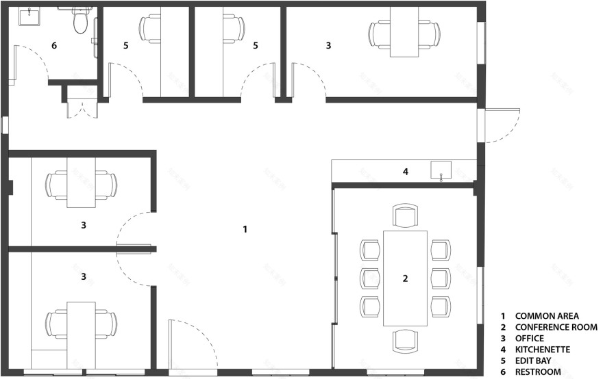
Wick Architecture & Design和LAND设计事务所合作,完成了Lazy Eye产品工作室一期工程。项目位于洛杉矶Frogtown地区的一栋面积约为460平米的单层混凝土砌块建筑中,分两期建造。一期工程的主要任务是将原仓库的前部改造成意见创意办公室,面积约为123平米。新设计的空间包括一片公共办公区,一间会议室,两间办公室,两间剪接房以及一个小厨房。
Wick Architecture & Design, in partnership with LAND Design Studio, is proud to unveil Phase 1 of the Lazy Eye production studio project in the Frogtown district of Los Angeles. Built within the shell of an existing 4,957 sq. ft., single-story CMU (Concrete Masonry Unit) block building, Phase 1 of the two-phase project focused on a creative office build-out of the front portion of the former warehouse. Completion of Phase 1 delivers 1,325 sq. ft. of newly-designed space comprised of a common work area, a conference room, two offices, two editing bays, and a kitchenette.
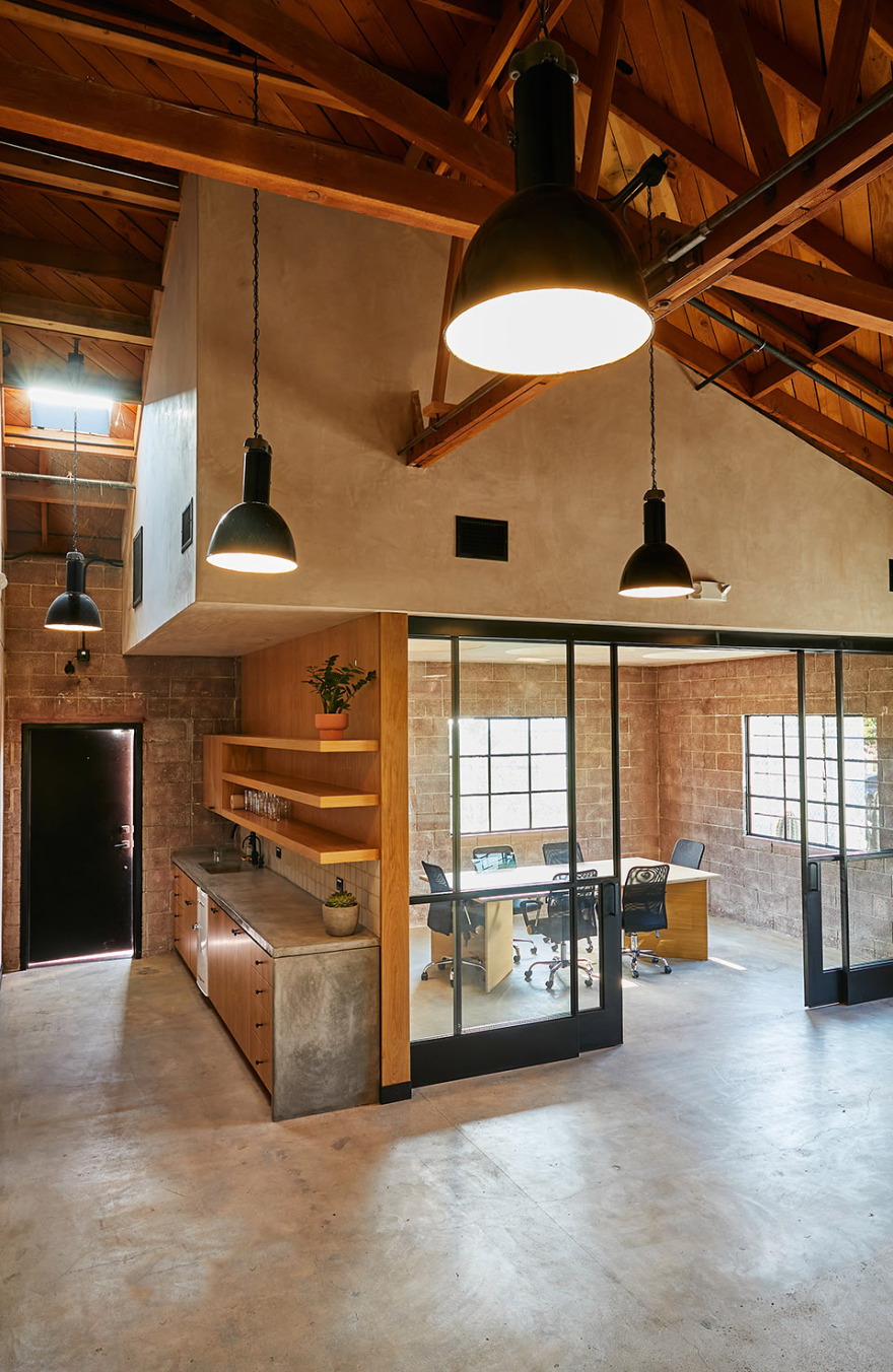
▼空间概览,overall view of the space ©Nicole LaMotte
“Frogtown地区中多是独栋住宅和工业建筑。近年来的发展,包括洛杉矶河绿带自行车道复兴,为这片区域创造了新的关注点。”Wick Architecture & Design的主创建筑师David Wick说道,“一批艺术家首先涌入了这里,产品设计公司紧随其后。”
“Frogtown consists mainly of single-family homes and industrial buildings, but recent developments, including rejuvenation of the Los Angeles River Greenway Trail bike path, has created new interest in the neighborhood,” says David Wick, principal and lead designer of Wick Architecture & Design. “It started with an influx of artists, and now production companies have followed.”
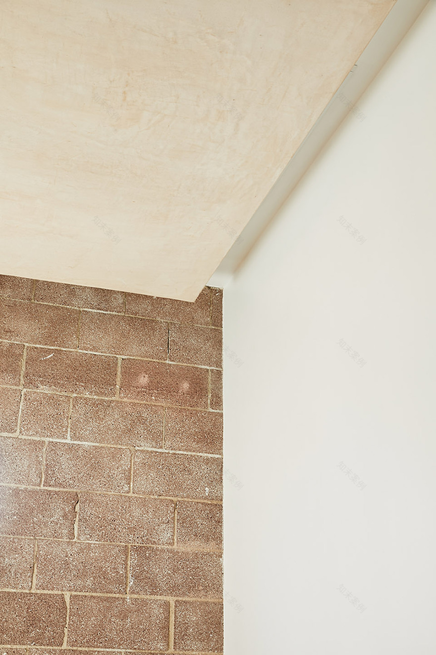
Lazy Eye产品工作室的粉色立面采用喷砂处理,室内原有的围墙和隔断全部被拆除,成为了一张空白的画布。设计将原本的混凝土地面打磨光整,并以哑光密封材料修饰;1932年建造的木制桁架和托梁表面喷砂,依旧暴露在人们眼前。原混凝土砌块墙面的内部剖面也被保留,不均匀的分红色调喷砂传达出建筑的历史。
Within the sandblasted, pink-primed exterior of the Lazy Eye production studio, the designers demolished all existing interior walls and partitions in order to create a blank canvas. Existing concrete floors were then ground, polished, and finished with a matte sealant, and original wood trusses and joists of the building, built in 1932, were sandblasted and left exposed. Sections of the original CMU block wall were also maintained internally, with sandblasting exposing non-uniform, pinkish-red tones that express the building’s history.
▼建筑外观,粉色墙面,external view of the building with pink toned surface ©Nicole LaMotte
“业主想要一个永恒的设计,尊重建筑原有的部分元素。”LAND设计事务所主创建筑师Andrew Lindley解释道,“我们的选材反映了这一过程,翻新的复古吊灯、灰泥、木材和钢等材料作为原有混凝土砌块和木结构的补充,使空间更为完整。”
“The client wanted a timeless design that respected some of the original elements of the building,” explains Andrew Lindley, principal and lead designer of LAND Design Studio. “Our use of materials reflects that process, with vintage refurbished pendant lights, stucco, wood, and steel that complement the existing CMU blocks and original wood structure.”
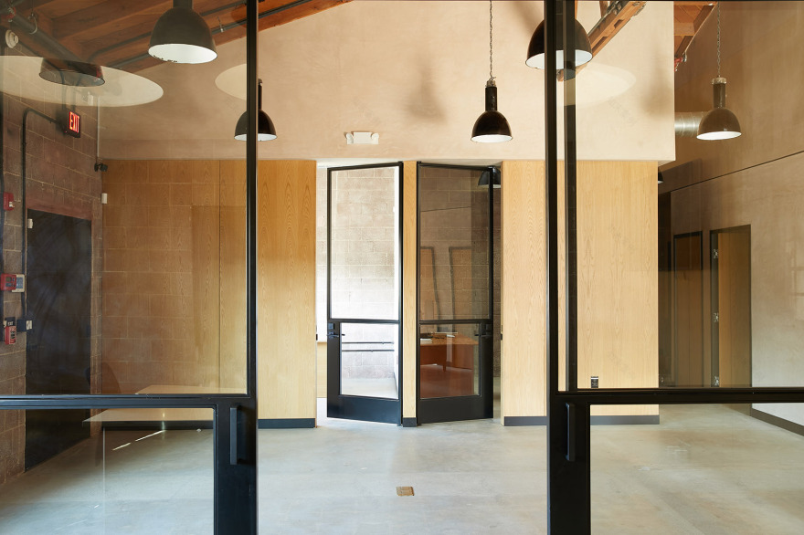
设计在焕发历史魅力的结构框架内设置了一条水平基准线,标识出空间内新建墙面的材料轮廓。室内较低的部分大量使用白橡木板,创造出一种当代感;基准线上方墙面涂以灰泥,略凸出于木板之上。镶嵌在空间后部灰泥墙面中的黑色钢条亦与基准线同高。
The design tandem established a horizontal datum line within the framework of the structure’s rejuvenated historic charm, marking a delineation of materials applied to the space’s newly constructed walls. The abundant use of book-matched white oak paneling adds a contemporary feel to the lower interior, with stucco applied above the line and jutting slightly outward as if resting on the wood. Along the new stucco wall at the rear of the building, a mounted black steel inset also respects the datum line.
▼水平线条标识出新建墙面,horizontal line marking the newly constructed walls ©Nicole LaMotte
▼上方的灰泥墙面略凸出于下方木板,stucco wall lightly jutting outward the wooden panels below ©Nicole LaMotte
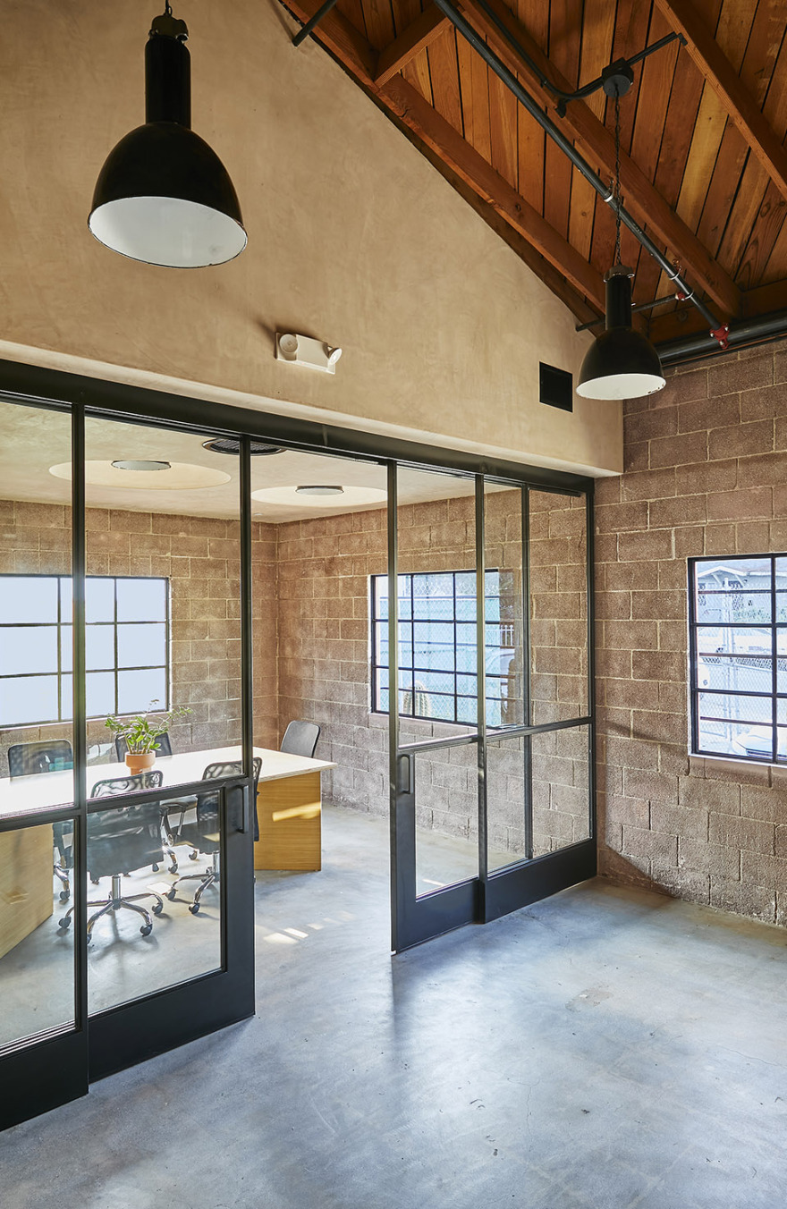
功能区围绕开放的公共办公空间设置,封闭的办公室和剪接房位于空间外围。工业灯具和定制的圆形天窗结合,为封闭空间提供充足光照。会议室的灰泥天花上设有三个圆锥形天窗开口,每个开口中都安装了一盏悬挂吊灯。白天的时候,自然光透过天窗充满空间;夜晚,自然光的角色由位于相同位置的吊灯替代。总共14展工业灯具均从英国Trainspotters进口,设计团队对其进行了重新布线,以适应项目的具体安装需求。
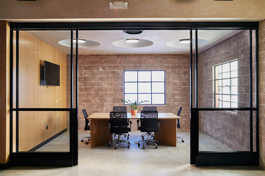
The functional areas are organized around an open, communal working space, with enclosed offices and editing bays designed along the perimeter. Abundant light permeates the enclosed spaces through a combination of industrial lighting and custom-built circular skylights. The conference room’s stucco ceiling cap features three circular skylight cuts, each embedded with a cylinder housing a suspended pendant light. By day, the skylights infuse the room with an abundance of natural light, while the pendants emanating from the same location assume that role at night. In all, 14 industrial light fixtures were imported from UK-based Trainspotters, which the design team rewired and installed in accordance with the specifications of the project.
▼位于空间边缘的会议室,conference room located along the space perimeter ©Nicole LaMotte
▼会议室天花上设有三个圆形天窗,three circular skylights mounted in the ceiling of the conference room ©Nicole LaMotte
▼天窗和灯具细部,details of the skylight and the lightings ©Nicole LaMotte
▼定制灯具在夜晚可以代替天光,customized lightings replace the skylights during night ©Nicole LaMotte
由于剪接工作的特殊性质,设计为剪接房提供了不同的照明方案。为了减少直接照明,团队将天花板压低,涂以灰泥,将沿空间四周布置的灯槽彻底隐藏。凹进的灯具直接照射混凝土砌块墙面,降低了房间内的反射光强
The nature of the work to be conducted in the client’s editing bays required a different lighting scheme altogether. In order to provide less direct illumination, the team designed a lowered ceiling plane, clad in stucco, which conceals hidden perimeter cove lights. The cove lights are directed towards the CMU wall surface, resulting in lower intensity reflective lighting in the rooms.
▼压低的灰泥天花减少空间中的直接光照,lowered stucco ceiling reducing direct lighting in the space ©Nicole LaMotte
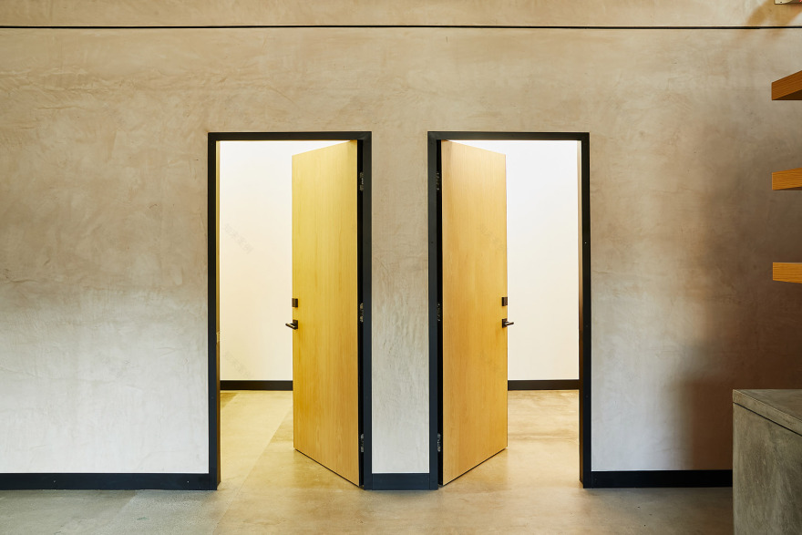
为了进一步将新与旧整合在一起,Wick和Lindley定制了一系列钢框玻璃门窗,作为旧式仓库钢窗的当代转译。优雅的玻璃门采用纤细的黑色钢框架,体现当地的经典样式,并且与项目整体的的现代设计美学相融合。
Further integrating the blend of old and new, Wick and Lindley custom-designed a series of steel-framed glass doors and windows as a contemporary interpretation of the building’s existing vintage steel warehouse windows. Tempered glass doors with thin black steel frames embrace the vernacular of that classic style, combined with the overall modern design aesthetic of the project.
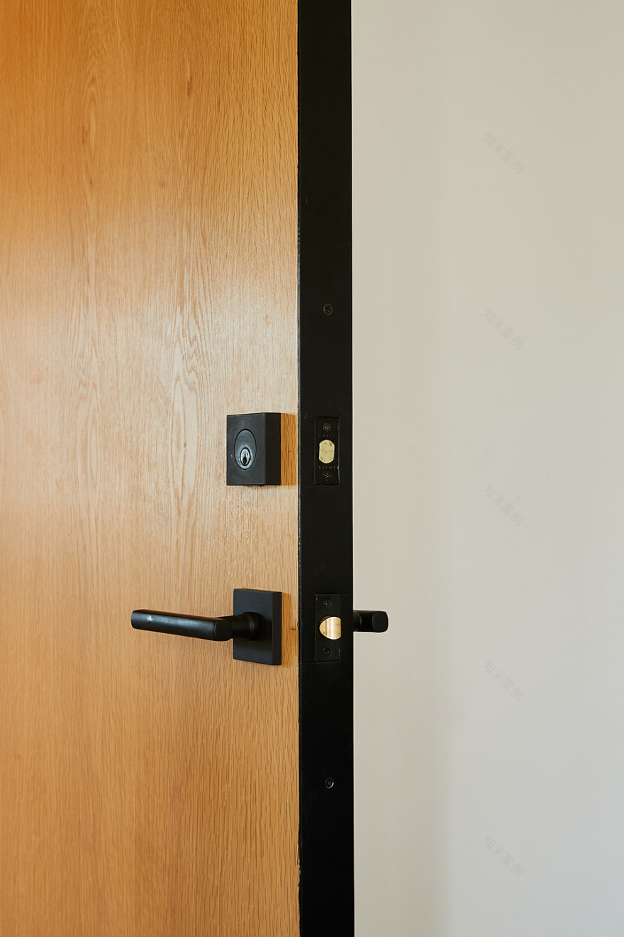
▼纤细的黑钢框架呼应工业建筑特征,thin black steel frames corresponding with the industrial character of the building ©Nicole LaMotte
▼材料细部,material details ©Wick Architecture & Design + LAND Design Studio
项目二期也即将开工,包含一个商业空间,一个市场,以及一家带有树木环绕的室外就餐区的餐厅。
Phase 2 of the design project will begin soon and will consist of retail space, a market, and a restaurant featuring outdoor dining in a tree-lined setting.
▼平面图,plan ©Nicole LaMotte
Project Name: Lazy Eye Project Size: 1,325 square feet Client: Lazy Eye Project Location: 1993 West Blake Avenue Los Angeles, CA. 90039 Architect: David Wick of Wick Architecture and Design in collaboration with Andrew Lindley of LAND Design Studio. General Contractor: Analog Construction Structural Engineer: J & J Engineering and Testing Inc. Mechanical Engineer: Linwood Engineering Photographer: Nicole LaMotte Lighting: Bauhaus Pendant from Trainspotters Wood: Rift Cut White Oak Opening Date: May 2020
客服
消息
收藏
下载
最近


