查看完整案例


收藏

下载
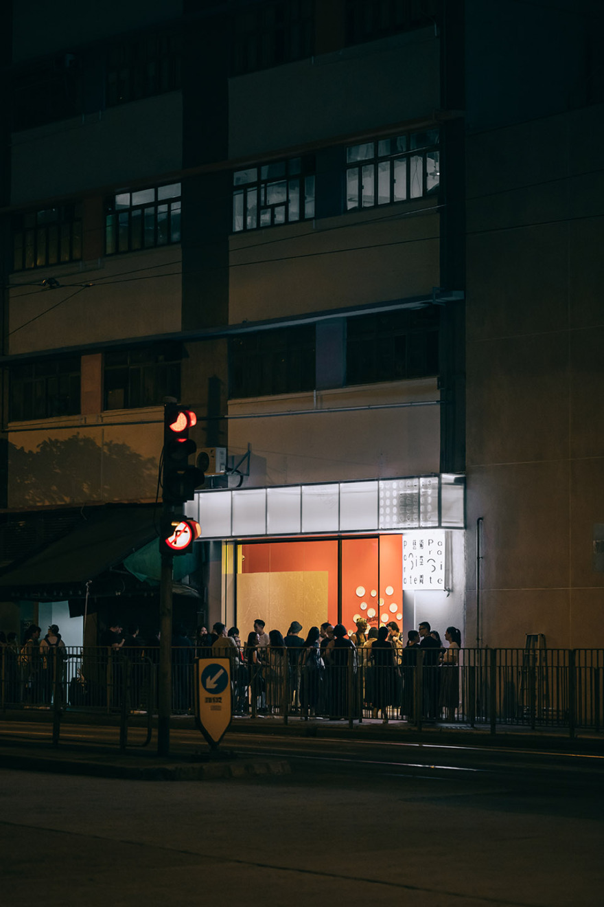
这是为本地一间非盈利艺术单位设计的一个临街艺术展示空间。作为其位于楼内22层主要展厅的一个门户,这个小小的画廊通过临街的3.3米高的店面以及硕大的移动门,尽可能地向街道敞开,看起来就像是人行道的延续,而并非一个独立的室内空间。人行道上采用了微妙而独特的边缘地砖则会激发起路人的好奇心,引导人们的目光向上观望。
This new street-side presence, for a local non-profit art space, acts as a ‘front door’ for their main 22/F gallery. The tiny gallery opens up onto the street as much as possible with a slim 3.3m high storefront and large sliding doors, preferring to be seen as almost a continuation of the sidewalk rather than a standalone space. The subtle yet uniquely tiled edge at the sidewalk piques the curiosities of passers-by, calling their gaze upwards.
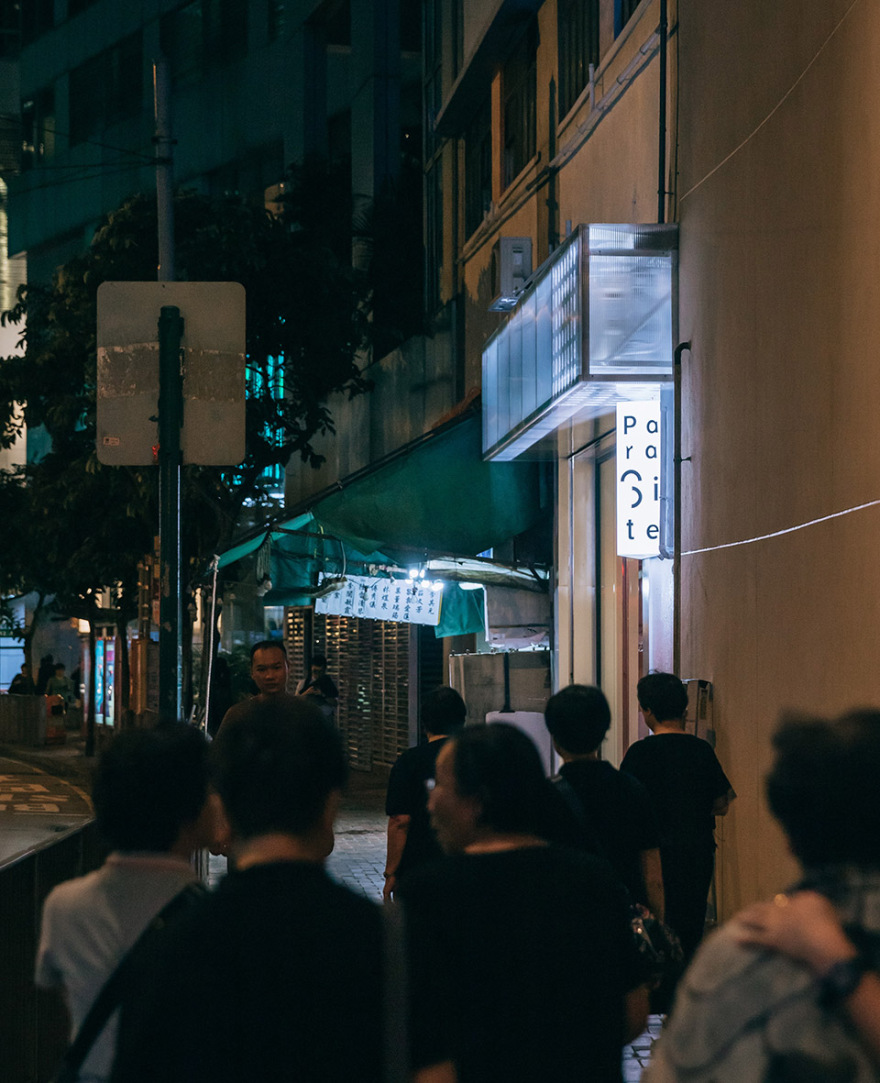
▼临街外观,street view
▼主立面,main facade
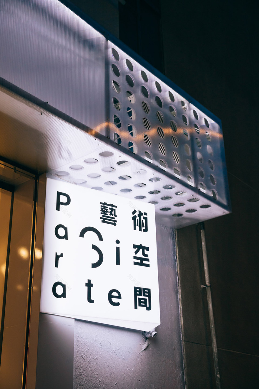
▼外观细部,detailed view by night
▼人行道上采用了微妙而独特的边缘地砖,the subtle yet uniquely tiled edge at the sidewalk
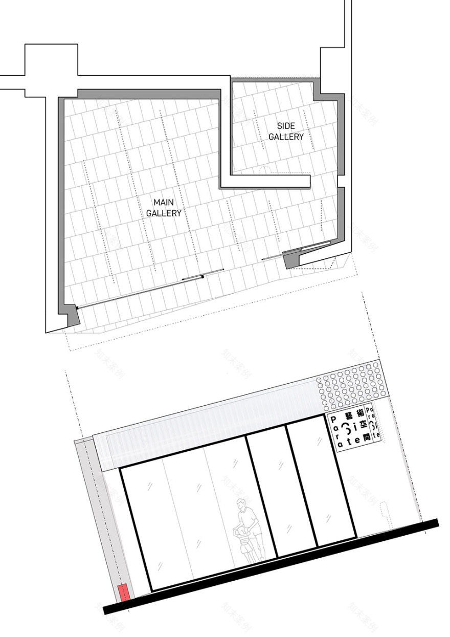
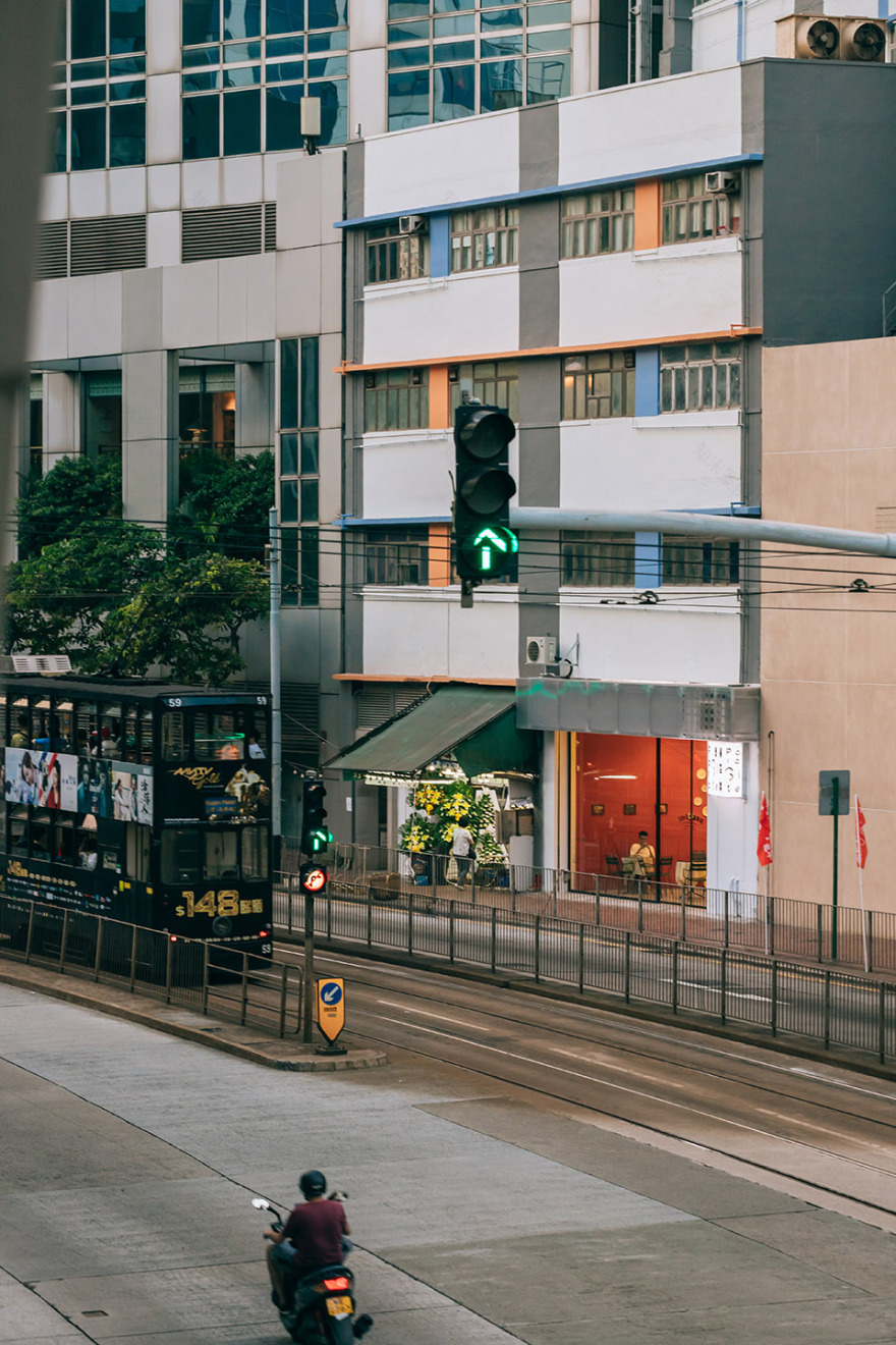
在空间上,画廊的设计将狭小空间可能带来的局限转化为独特的机会。占地小空间高的特点使得我们可以在街道上营造起超大玻璃面板的效果,从而吸引行人和车上乘客的注意力。墙与墙之间的夹角以及从关键视野的不同角度(例如沿着人行道和从地铁站看过来),都是根据微妙的美学和几何学的原理而设计的。
▼平面&立面,plan and elevation
Spatially, the gallery navigates and turns the potentially awkward limitations of the site into unique opportunities. The small footprint and tall ceilings help create the effect of an oversized vitrine from the street, inviting to both the pedestrian and the tram rider; the varied angles between walls, and from key perspectives (such as along the sidewalk and from the MTR station), form a basis for the subtle aesthetics and geometries.
▼超大玻璃面板能够吸引行人和车上乘客的注意力, the effect of an oversized vitrine from the street invites both the pedestrian and the tram rider
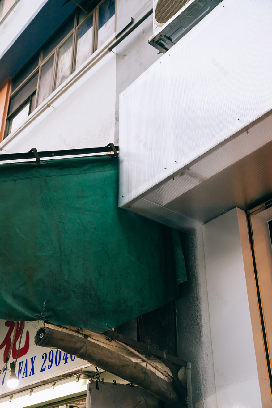
▼转角细部,detailed view of the corner
考虑到Para Site根植于香港本地艺术界的文化传承,外墙的设计采用了典型的香港店面的建筑和结构。这样做的目的首先是要尊重(并尝试)一种典型的当地建筑方法和建筑类型——同时表明了Para Site对这一文化传承的自豪感。这样做的另一个好处是通过采用本地纯熟的施工技术来实现成本的最小化。
Taking into account Para Site’s legacy rooted in the local Hong Kong arts scene, the facade takes the typical construction and composition of Hong Kong shopfronts as inspiration. Primarily, the purpose of this is to pay respect to (and experiment with) a typical local construction methodology and building type—and to signal the organisations pride in its heritage. The additional benefit of this strategy is that it leverages local know-how to minimize costs.
▼设计根植于当地建筑方法和建筑类型,the design pays respect to (and experiment with) a typical local construction methodology and building type
最后,为了抓住这个日新月异的艺术机构的精髓,这个不寻常的店面充当了画布的角色。以Para Site现有品牌形象的中性色彩作为起点,而简洁的油漆工作,朴素的材料和多种照明选项则提供了一定程度的简单灵活性,可以简单轻松的加以调节和改变。
Finally, and in another attempt to capture the essence of this ever-changing organisation, this unusual storefront acts as a canvas. Neutral colours inspired by Para Site’s existing brand image acts only as a starting point; unfussy paint jobs, unpretentious materials and multiple lighting options allow a level of simple flexibility for easy and constant transformation.
▼室内空间,interior view
▼望向侧面的画廊,view into the side gallery
▼街道视角,view from the street
▼城市中的集会空间,a gathering spot in the city
Project size: 300 ft2 Completion date: 2019 Building levels: 1 Project team: The Office as a Project
客服
消息
收藏
下载
最近


