查看完整案例


收藏

下载

翻译
+ location // Westfield Carousel, Cannington + construction value // $430,000 + area // 98m2 + date // 2016 - 2017 + scope // Full design service
Located within Westfield Carousel, this tenancy was identified as the organisation’s most prominent national retail presence and is the first to showcase the new direction for the business - one that acknowledges that hearing complaints are not an illness and therefore customers don’t need to be treated in a traditional medical environment. We were very excited to help create a new aesthetic and environment for the staff and customers.
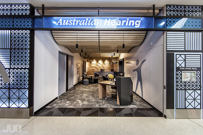
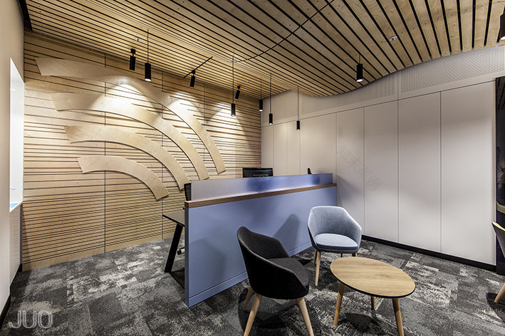
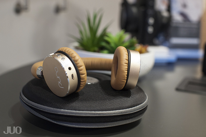
Our brief for the 98m2 tenancy was to provide three audio rooms, two administration positions, a staff room and a display that would allow clients to interact with various products. The formal reception was to be replaced with a “welcome desk” where staff would stand rather than sit, allowing easier transactions with clients. Aesthetically, we were told to be creative and to disregard the existing company fitout guideline.
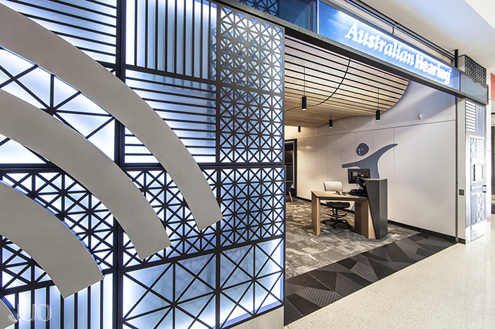
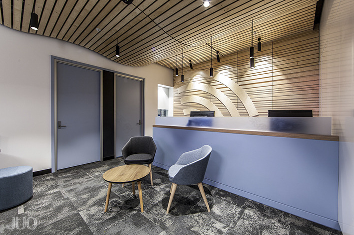
To accommodate the requirements of the brief, the three audio rooms and staff room were located along one side of the tenancy creating a rectilinear space flanked by storage that was concealed behind gloss white doors. This space is what is viewed from the shopping mall outside and is designed to catch the eye of passers-by. A rolling timber slatted ceiling adds warmth and interest to the space, which in section replicates the ear lobe portion of the internationally recognisable sign for deafness. The slatted ceiling intentionally lowers the otherwise cavernous ceiling above and conceals all the mechanical and service outlets. Pendant light fittings hang below offering a soft lighting level throughout the store with specific focused lighting over the display table, admin desks and lounge area. The overall aesthetic being a cross between a retail fitout and hospitality venue, which is in stark contrast to the previous medical centre fitouts.
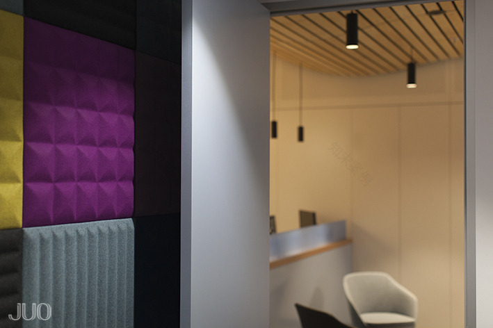
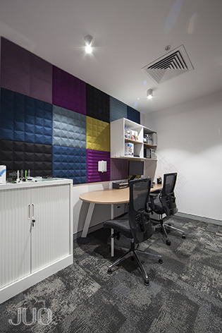
A centrally located lounge area sits adjacent the interactive display table, and incorporates a booth seat with integrated television. The specifically selected seating is both comfortable and practical, and draws on the colour palette of the colourful acoustic panels within the Audio Rooms. It is these colours that add an element of fun to the main washes of colours of the fitout.
Internally, corporate signage is introduced in a contemporary way. The “wifi” curves are texturally applied within the timber cladding on the back wall, and the “figure” is routered into the storage unit doors and painted in a contrasting colour that acknowledges the blue of the organisation’s brand.
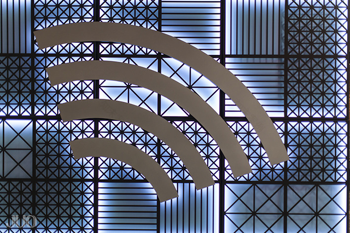
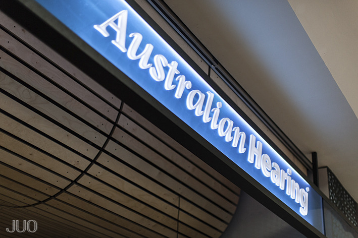
Externally, an elaborate illuminated trellis structure constructed from laser cut powder-coated steel obscures the bulk of the audio rooms that take up almost half of the shopfront. A suspended signage blade with coloured acrylic intersects the shopfront opening allowing the timber ceiling to penetrate the void above, yet is translucent enough to not interrupt the view of the space beyond. The trellis pattern of the illuminated cladding was generated from the design of the acoustic panels within the audio rooms and unifies the design of the store inside and out.
客服
消息
收藏
下载
最近


