查看完整案例


收藏

下载
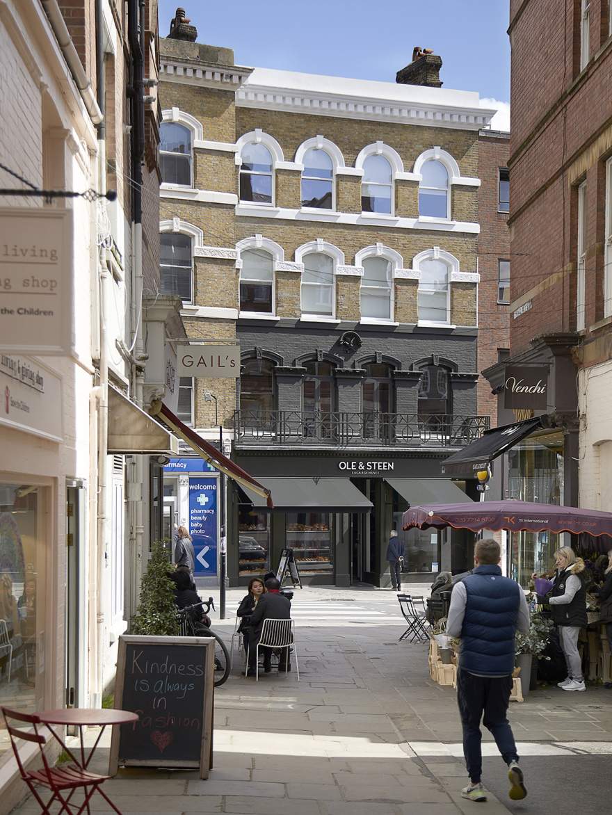
建筑通常始于理解和应对特定任务和场地的种种限制。该项目也同样如此:一栋位于汉普斯特德的维多利亚式建筑,需要进行重新配置和扩建,然而其介于汉普斯特德高街和Bird in Hand Yard的突出位置为空间带来了很大的限制。
Architecture often begins with understanding and embracing the constraints of a particular brief and site. This proved especially true for the reconfiguration and extension of an existing building in Hampstead, where – given its prominent yet nestled position between Hampstead High Street and Bird in Hand Yard – space was considerably confined.
▼建筑和周边环境 The Bird in Hand, nested within the Hampstead Village setting © Julian Abrams
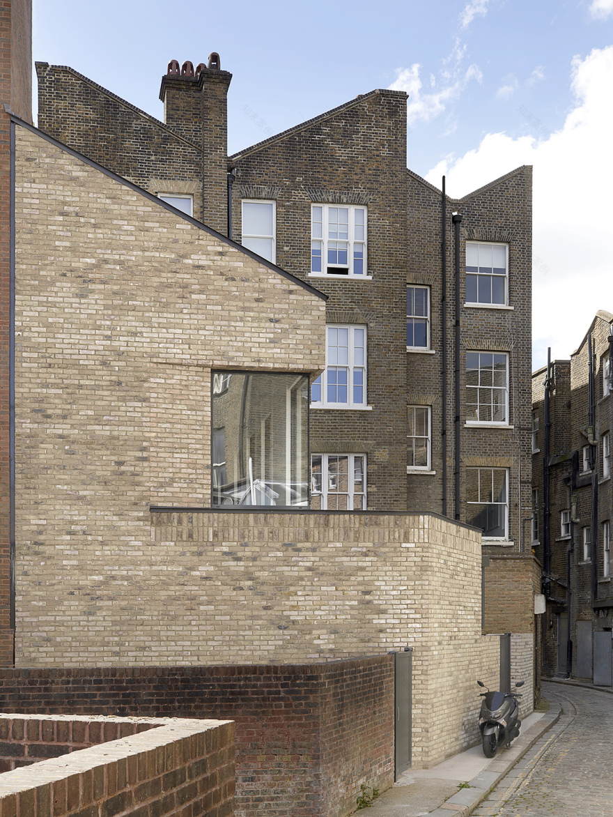
▼从Bird in Hand Yard望向建筑的背立面 rear elevation view from Bird in Hand Yard © Julian Abrams
Bird in Hand原本是汉普斯特德当地的一家饮品店,后来于80年代初期转让给The Dome咖啡馆,后来又变成Cafe Rouge。五层高的建筑包含两套狭小的顶层公寓,需要从建筑后方的户外逃生楼梯进入。经过翻新和扩建之后,原来的公寓均变成了两居室住宅,建筑二层用作办公室,首层和地下一层成为了灵活的商业和餐厅空间。
The Bird in Hand, once a local watering hole of Hampstead until it changed hands to The Dome cafe in the early 80’s and later Cafe Rouge, is a five- storey Victorian structure, which included two cramped flats to the upper floors, accessed via an external escape stair to the rear. It has been refurbished and extended to create two two-bedroom flats to the upper floors, offices to the first floor and flexible retail / restaurant spaces to the ground and basement floors.
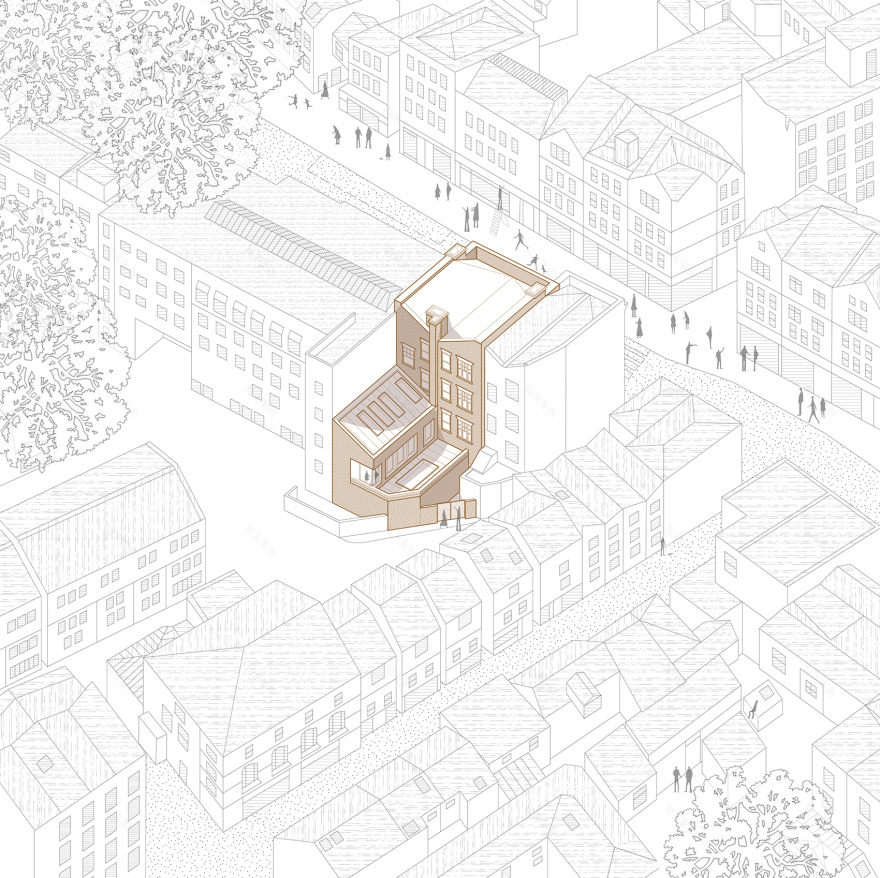
▼轴测图:后方扩建空间和周围环境 axonometric of final scheme showing the rear extension development in the Bird in Hand Yard context
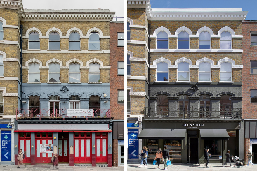
▼改造前后的立面对比,existing Café Rouge front elevation condition & completed front elevation © Julian Abrams
在该项目中,场地的限制因素反而从各个方面为设计赋予了经济且精致的特征,包括整体结构的组织和施工细节。在与结构工程公司Michael Hadi Associates的紧密合作下,建筑团队通过从建筑后方进行逐步扩建,使整个设计思路得到了最优雅的展现。
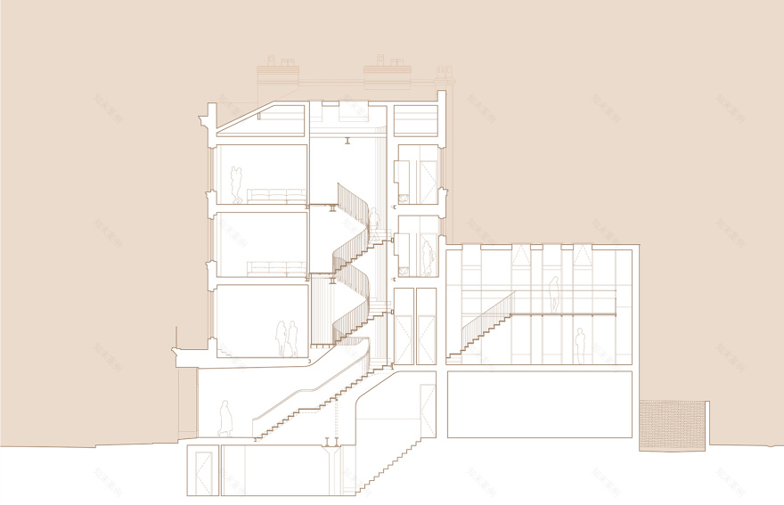
▼改造方案剖面图BB,proposed section BB © Julian Abrams
The constraints informed a spatially economical yet refined approach to all aspects of the design; from the overall structural arrangement to the construction details. Working in close collaboration with structural engineers Michael Hadi Associates, this approach was articulated most elegantly through the evolution of the rear extension design.
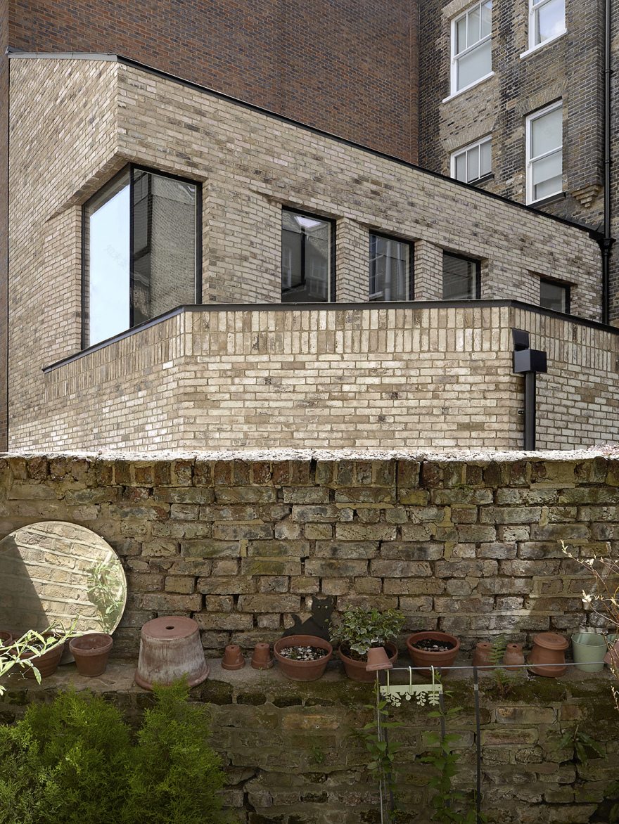
▼既有立面体量和开窗 © Julian Abrams completed rear extension; volumetric and fenestration arrangement
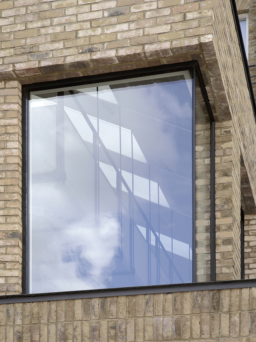
▼背部立面转角窗,从外部可以窥见悬浮的夹层 © Julian Abrams completed rear extension; external glimpse of suspended mezzanine through corner window
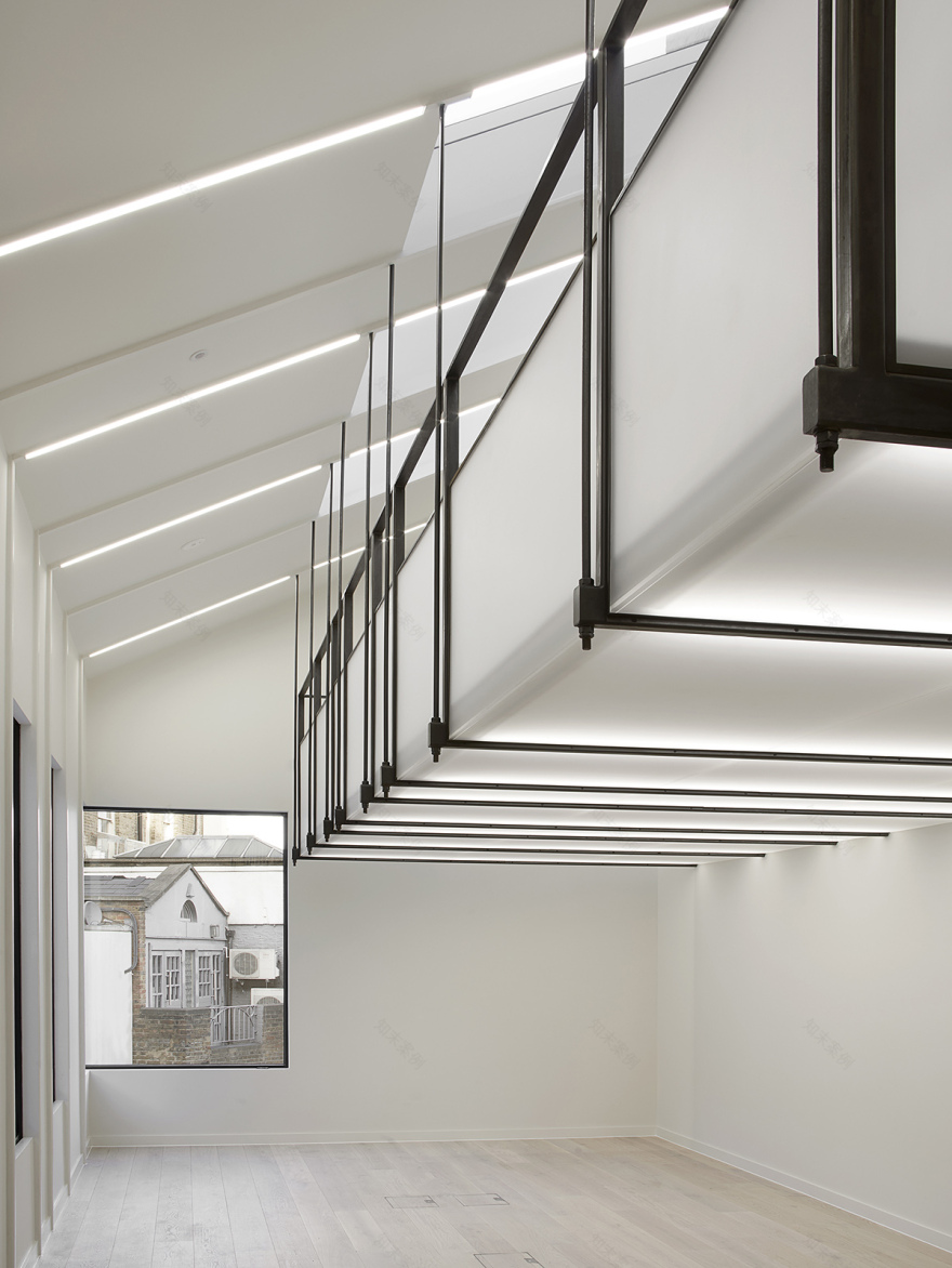
一系列40毫米宽的门框共同承载了夹层的结构负荷,门框上的悬挂杆将夹层巧妙地置于简洁的单坡屋顶内部。在卡洛·斯卡帕的设计和日式屏风(障子)的启发下,富有趣味的连接构件和不透明树脂填充板使精致的蜡面低碳钢构件得到补充和突显。
The resolution of the mezzanine support led to distributing the structural load through a series of reduced, 40mm wide portal frames on which a series of suspension rods delicately poises the mezzanine level within the modest, mono-pitched volume. Inspired by the beautifully considered details of Carlo Scarpa and Japanese Shoji screens, the fine, waxed mild steel structural components are celebrated and expressed through the playful junction details and complementing opaque resin infill panels.
▼后方扩建空间,从带有夹层的二层办公区望向原始建筑立面 © Julian Abrams completed rear extension; view of first floor office with mezzanine toward the existing rear elevation
▼望向Bird in Hand Yard的视野 © Julian Abrams view of first floor office with mezzanine toward Bird in Hand Yard
▼夹层精致纤细的支撑构件 © Julian Abrams refined and slender mezzanine structural support details
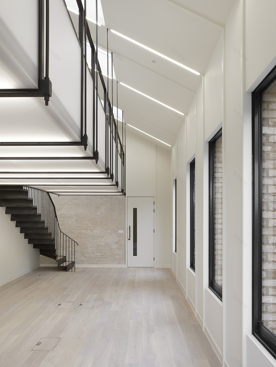
▼夹层空间和纤细的框架结构,slender rods suspending lightweight first floor mezzanine and expressed frame structure © Julian Abrams
▼楼梯细部受到卡洛·斯卡帕的设计和日式屏风的启发 © Julian Abrams transition between mezzanine balustrade and stair, with Shoji screen panels providing glimpses through
既有建筑独特的蝶形屋顶影响了体量的表达和建筑后方切角砖的铺设方式,与周围建筑的材料建立了和谐的关系。在建筑内部,屋顶天窗将日光引入下方的新空间,同时也提供了从屋内望向蝶形屋顶的局部视野。
The characteristic butterfly roof to the existing building informs the volumetric expression and chamfered brick reveals of the sensitively proportioned rear extension, which compliments the surrounding materiality. Whilst internally, light canons flood the new spaces below with daylight and offer a glimpse to the historical butterfly roof geometry above.
▼从夹层望向既有建筑的蝶形屋顶 © Julian Abrams first floor mezzanine view through rooflights toward existing butterfly roof
▼室内空间采用了简洁的材料,窗户细节呼应了以40毫米为单元的结构主题 © Julian Abrams kitchen / living area pared-back material palette, and window reveals echoing the 40mm structural motif
▼天窗将自然光引入入口大厅,同时创造出与既有建筑的联系 © Julian Abrams light canon flooding entrance lobby with natural light and creating connection to the existing volume
▼浴室天窗和墙面细节 © Julian Abrams light canon flooding natural light to and highlighting the textured walls of the bathroom space
从建筑后方扩展出来的空间与夹层形成了精致的比例关系,而以40毫米为单位的结构主题和材料在住宅单元和通往公共区域的悬臂式低碳钢楼梯的细节中均得到了展现。楼梯由Weber Industries制造,结合了多种传统和现代设计方法,螺旋的形式和钢结构解决了显著的层高等具有挑战性的空间限制。当用户从办公层进入上方的住宅层时,会发现入口处的实心护栏以优雅的姿态逐渐过渡为开放式的栏杆,从而感受到功能上的变化。
Encouraged by the refined proportions of the rear extension and mezzanine, this 40mm structural motif and materiality was echoed in the detailing of both the residential units and the new, waxed mild steel cantilevered staircase to the common area. Fabricated by Weber Industries and developed using a diverse range of traditional and contemporary design tools, the stair’s helical geometries and steel construction methods were also adopted to negotiate the generous floor to ceiling heightsand challenging spatial constraints. The solid balustrade from entrance level elegantly transitions into an open one at first floor level, gradually demarcating the change of occupancy as one ascends from office use to residential on the upper two floors.
▼公共区域的旋转楼梯,completed common area staircase © Julian Abrams
▼实心护栏以优雅的姿态逐渐过渡为开放式的栏杆 © Julian Abrams transition section between solid balustrade at ground floor level to open balustrade above
在项目的推进过程中,发现并选择性地暴露一些历史性的元素是一件令人兴奋的事情。例如,我们用石灰浆覆盖了建筑背立面室内一侧的部分砖墙,保留了原始窗口的痕迹,并在新扩建的部分复制了一个新的对照物,与历史上的蝶状屋顶形成了几何形状上的呼应。除了提供潜在的可持续解决方案之外,这样的干预措施也表明了对现状的利用能够同时突显建筑和历史的丰富性,这是拆除和新建所无法实现的。 ——Simon James,Patalab Architecture事务所副总建筑师
During the course of the project, it was exciting to uncover and thereafter selectively expose some of the historic layers discovered. Lime slurry partly coats the existing rear elevation brick internally, for example, leaving traces of the historical openings on show and forming a palimpsest within the new extension, which echoes the historical butterfly roof geometry. As well as offering potentially more sustainable and resourceful construction solutions, such interventions demonstrate that working with existing buildings can offer an architectural and historical richness otherwise not possible by demolition and new-build. —Simon James, Associate Architect, Patalab Architecture
▼二层与夹层之间的楼梯,从中可以瞥见既有建筑的墙壁 © Julian Abrams mezzanine stair transition to first floor office, with glimpses to existing rear elevation brick openings
▼楼梯和材料细节,stair detailing and material palette © Julian Abrams
Bird in Hand住宅的设计呼应了其名称所包含的寓意,即掌握和利用好现下拥有的条件,在最大化发挥既有优势的基础上营造出鼓舞人心的全新空间。
Perhaps both challenging and respecting the synonymous proverb, The Bird in Hand, sustains yet maximises the potential of the existing by embracing its constraints to provide new, inspiring spaces for the centre of Hampstead Village.
▼夜晚,灯光透过夹层边缘的半透明障子 © Julian Abrams considered integrated lighting glowing through transparent Shoji screen panels
客服
消息
收藏
下载
最近


