查看完整案例


收藏

下载
随着市场的变化,烘焙行业需要巨大的变革,原有固化的模式在被打破,如何抓住消费者塑造属于这个时代的品牌形象成了烘焙品牌迫切需要解决的问题。
With the changes in the market, the bakery industry needs huge changes, and the original solidified model is being broken. How to grasp consumers to shape the brand image of this era has become an urgent problem for bakery brands to solve.
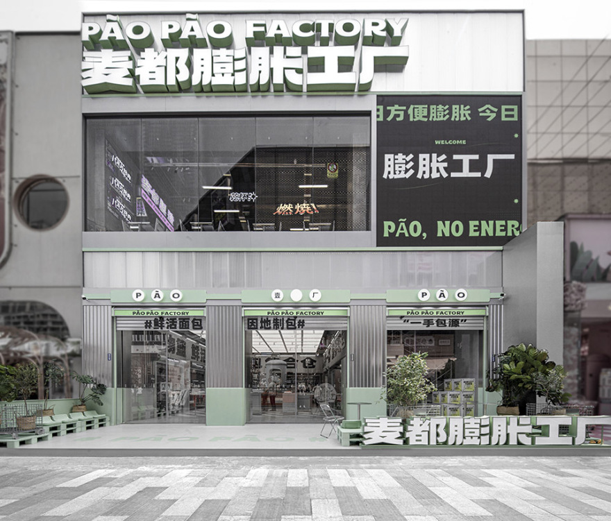
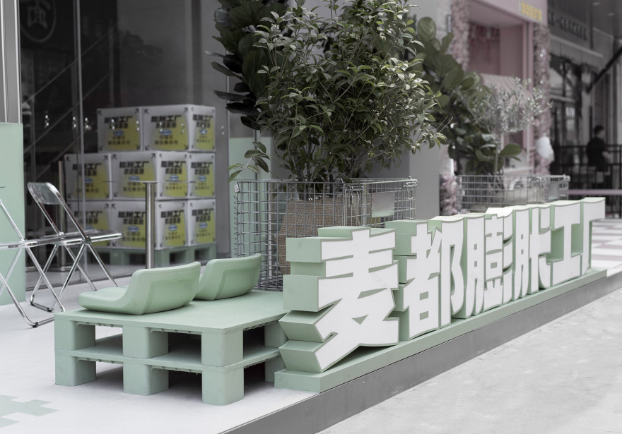
▼项目外观,exterior view ©或者设计
麦都面包,一个屹立30年载的烘焙品牌,依然面临着市场变革的危机。长久以来,烘焙行业不论视觉风格还是购物体验都向大众传递“传统”的既定印象。购买面包的过程始终只框定在“购买—吃”的阶段。大众急需一个新的消费体验,在这个购物场景中应该不仅有“吃”,还要“好玩儿且有趣”。
MALTOAST Bread, a baking brand that has been standing for 30 years, is still facing the crisis of market change. For a long time, the bakery industry has conveyed the established impression of “tradition” to the public regardless of visual style or shopping experience. The process of buying bread is always only framed in the “buy-eat” stage. The public urgently needs a new consumer experience. In this shopping scene, there should be not only “eating”, but also “fun and interesting”.
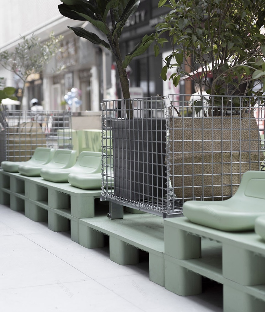
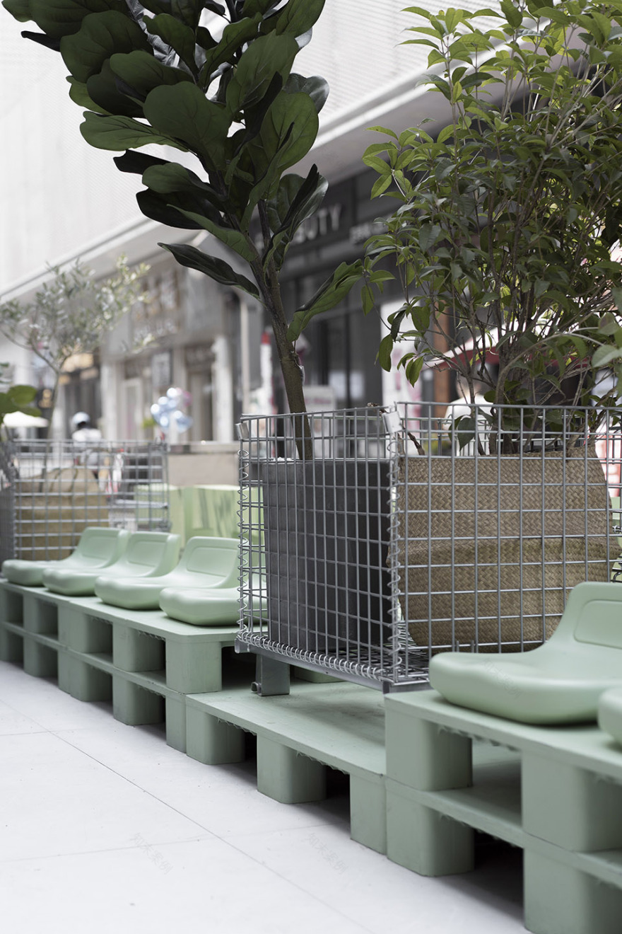
▼入口景观,landscape at the entrance ©或者设计
随着品牌负责人对商业模型的革新,“麦都膨胀工厂”这个品牌应运而生。一个具有沉浸式体验的面包工厂是这次设计的主题。区别于传统面包店着重表现面包温度与质感的方式,我们认为一个可以“快乐购物”的体验更能打动消费者。让进入空间的顾客有可以愉悦的选购任意一款产品。店铺每一款产品都是当日现烤,这种新鲜制作的状态与工厂的的生产方式从本质上是吻合的。
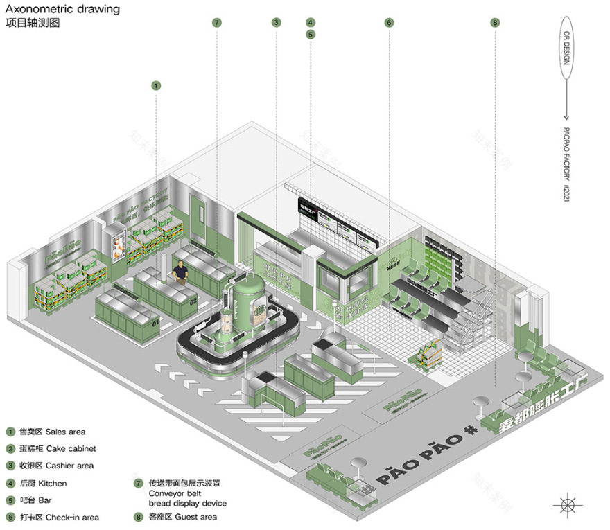
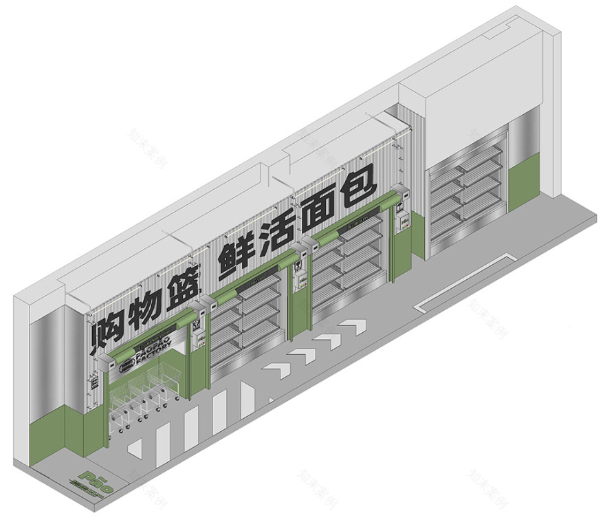
▼轴测图,axonometric drawing ©或者设计
With the innovation of the business model by the person in charge of the brand, the brand “MALTOAST Paopao Factory” came into being. A bread factory with immersive experience is the theme of this design. Different from the traditional bakery’s way of emphasizing the temperature and texture of bread, we believe that an experience that can be “happy shopping” can more impress consumers. Let customers who enter the space have the pleasure to choose any product. Every product in the store is freshly baked on the same day. This freshly made state is essentially consistent with the factory’s production methods.
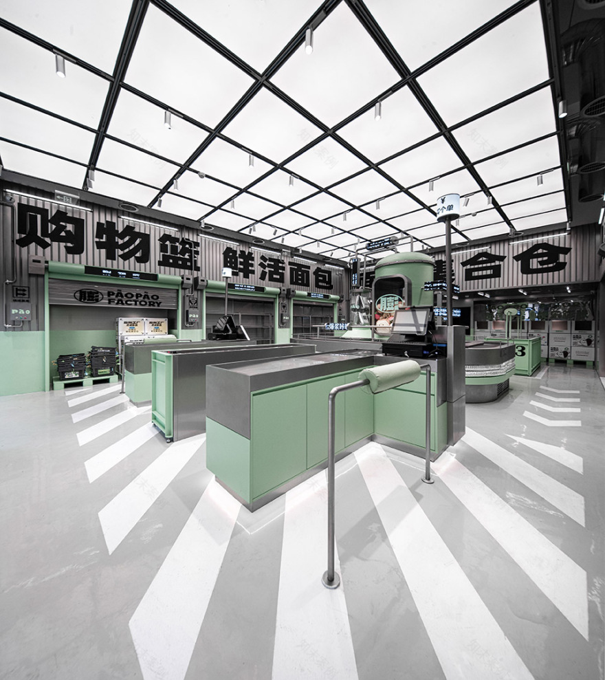
▼室内空间概览,overview of the interior space ©或者设计
我们希望传递:膨胀工厂不是一个只有购买面包的单一行为的场所。这里可以承载这个时代消费者更多的需求与可能性。顾客能在这里选购、拍照、享受美食、分享社交。膨胀工厂从商业模式、空间设计、品牌视觉设计都给予了整个烘焙行业新的可能性。开业之际被无数消费者喜爱。
We hope to deliver: The Paopao factory is not a place with a single act of buying bread. Here can carry more needs and possibilities of consumers in this era. Customers can shop, take photos, enjoy food, share and socialize here. The Paopao factory has given the entire baking industry new possibilities in terms of business model, space design, and brand visual design. When it opened, it was loved by countless consumers.
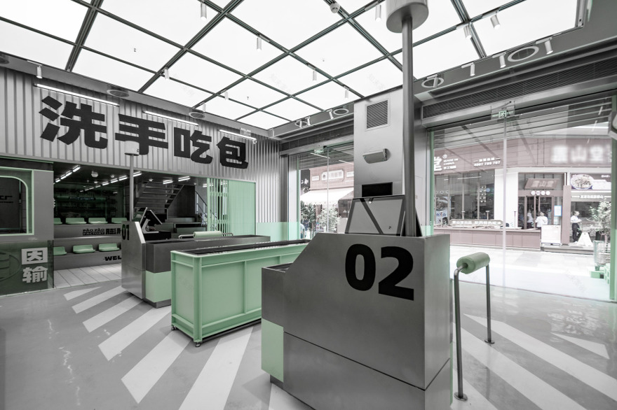
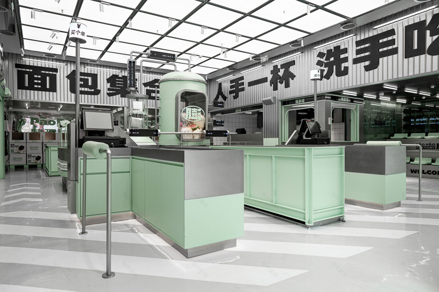
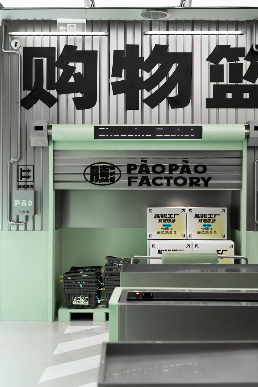
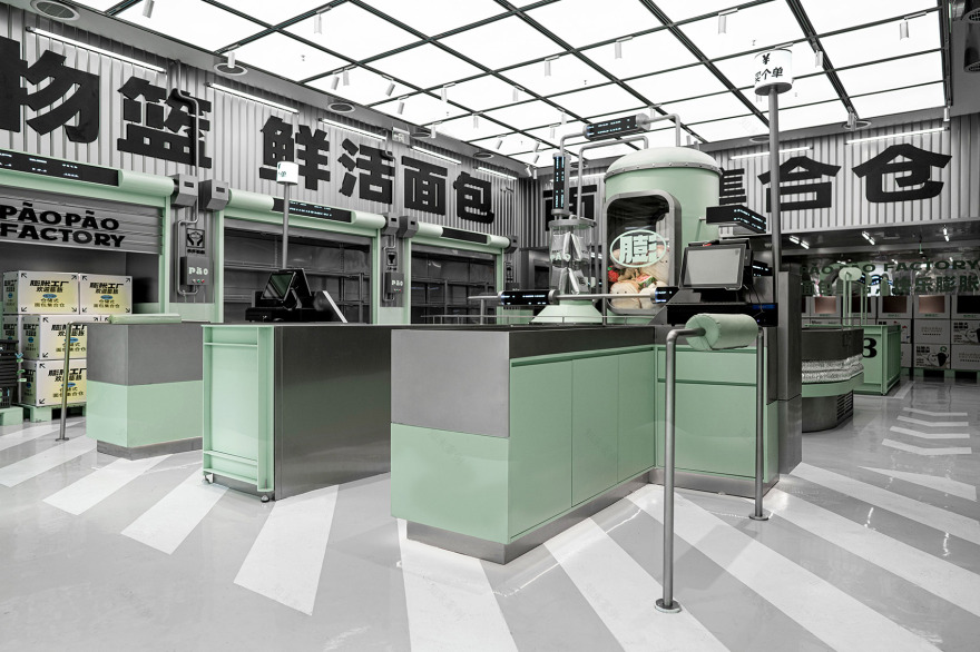
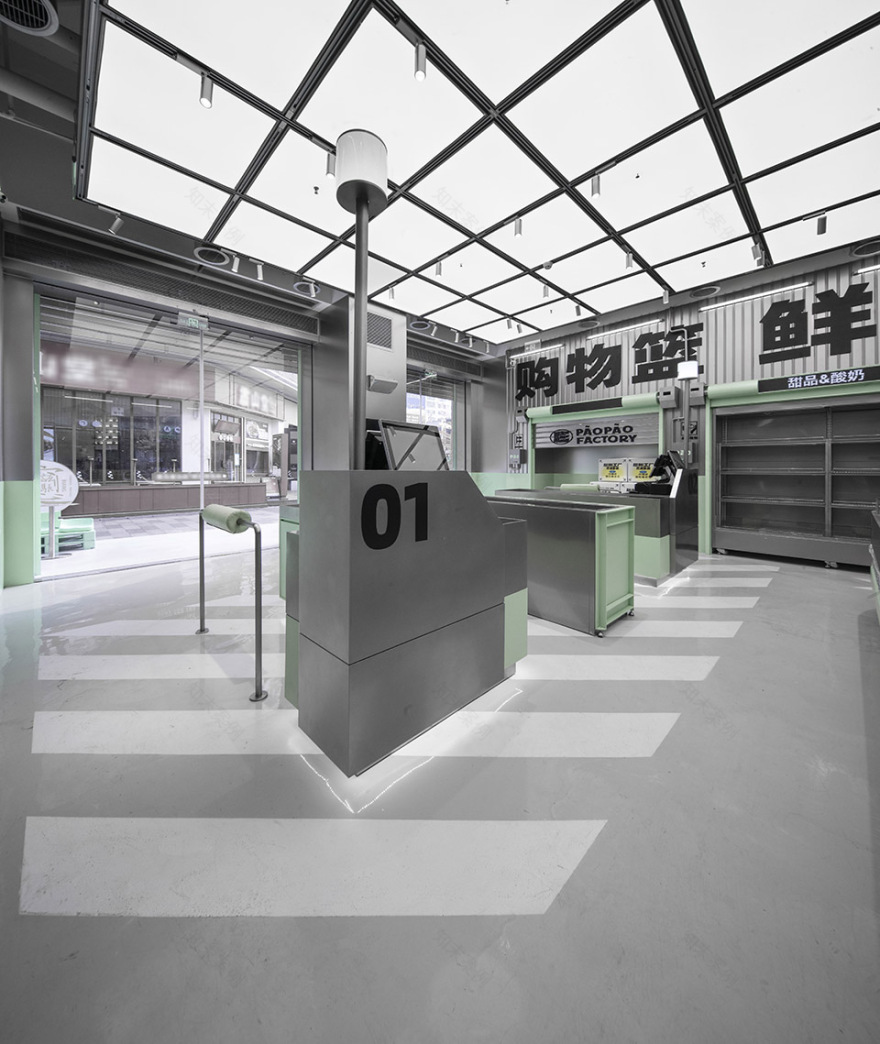
▼入口收银区,cashier area at the entrance ©或者设计
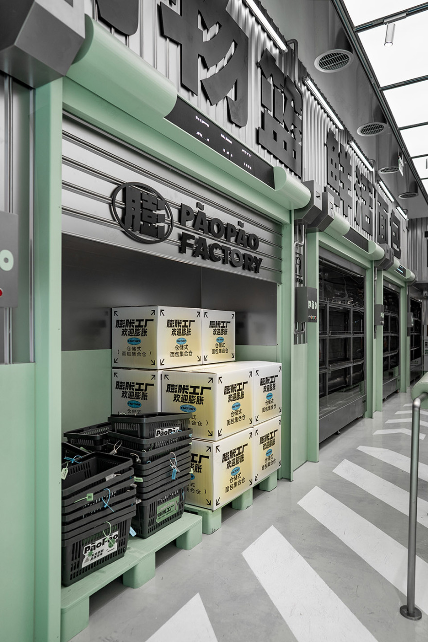
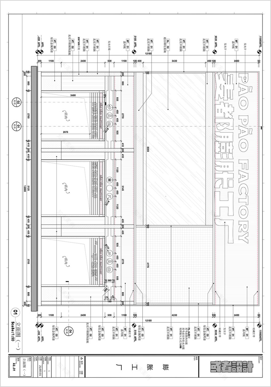
门店门头有整面的展示空间。我们受工厂会放置大且显眼的厂名启发,也将品牌Logo字体放大,增加工厂的主题性和氛围感。巨大的展示屏每天滚动播放产品视频,是强有力的品牌宣传。
There is an entire display space at the front of the store. We are inspired by the large and conspicuous factory name that the factory will place, and we also enlarge the font of the brand logo to increase the theme and atmosphere of the factory. The huge display screen rolls out product videos every day, which is a powerful brand promotion.
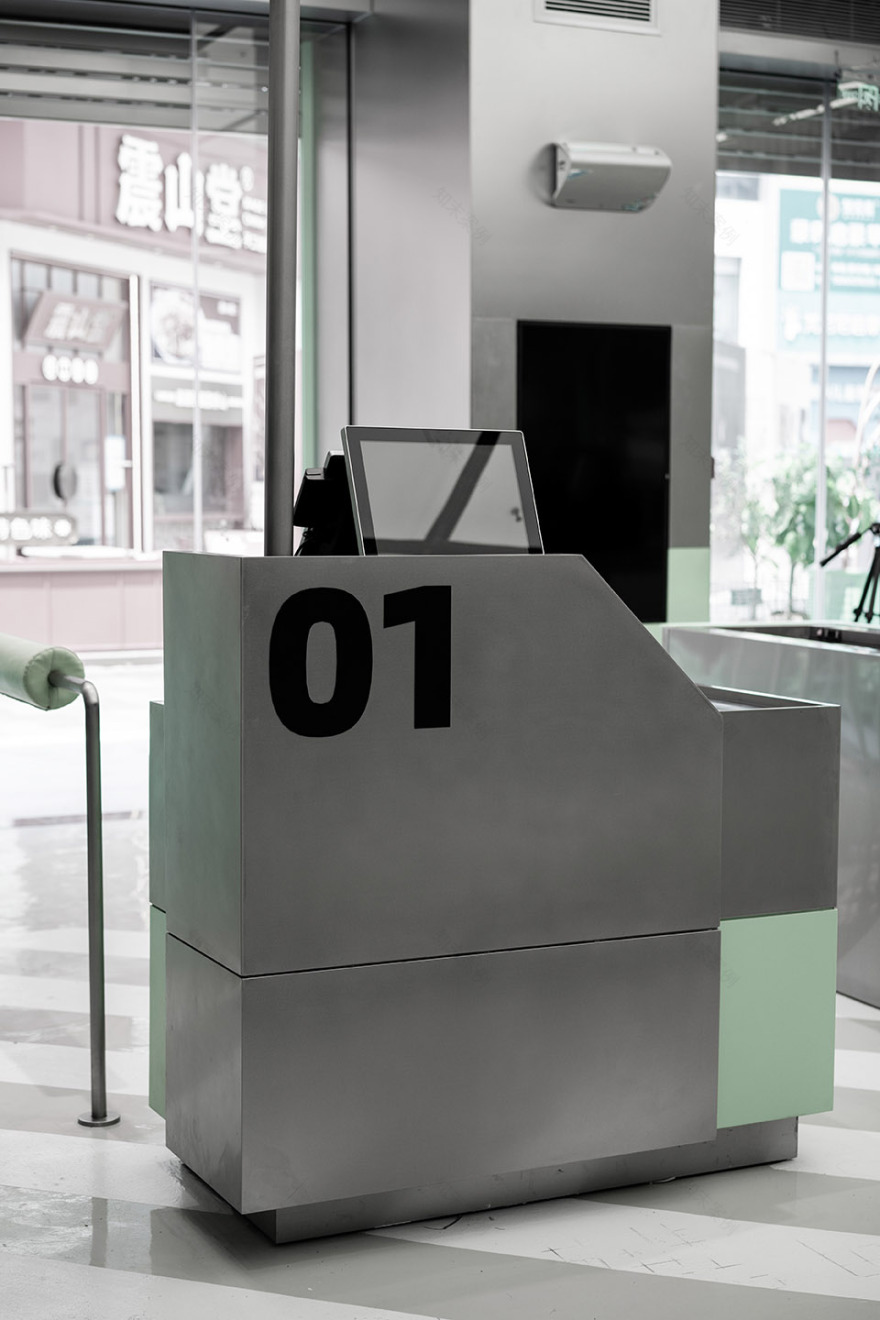
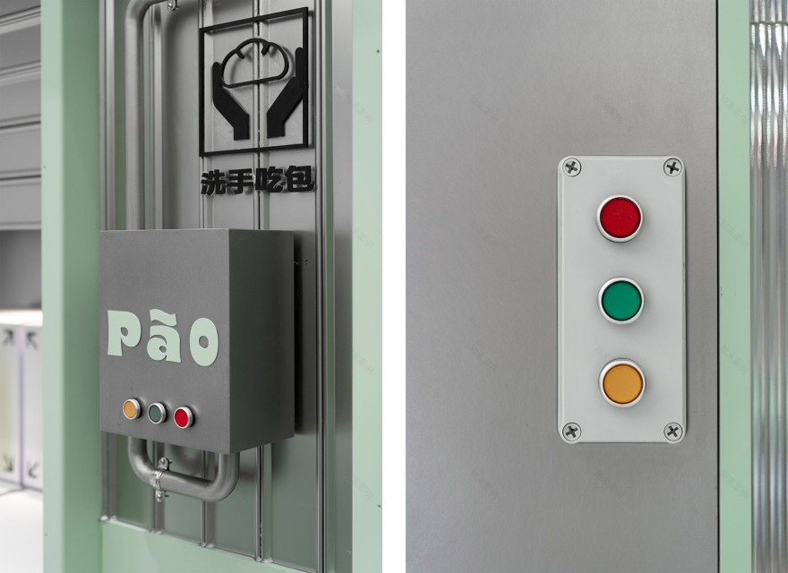
▼收银台细部,details of the cashier ©或者设计
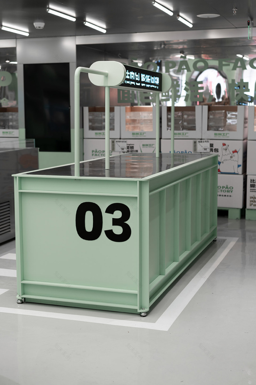
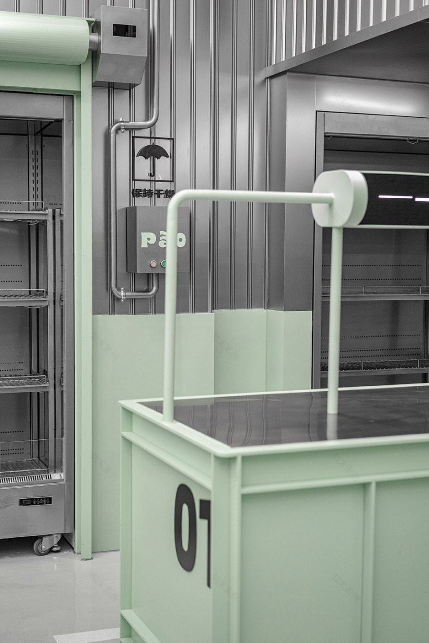
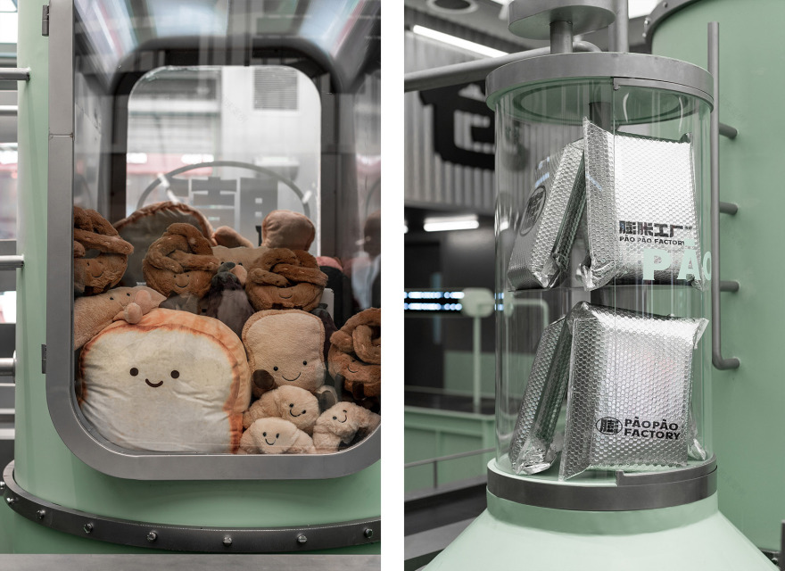
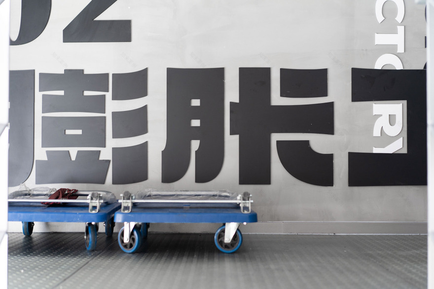
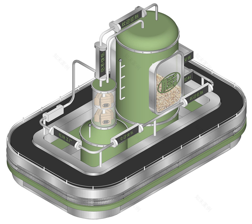
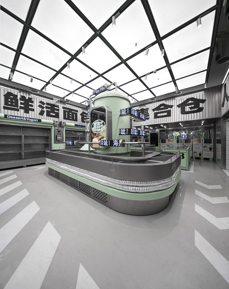
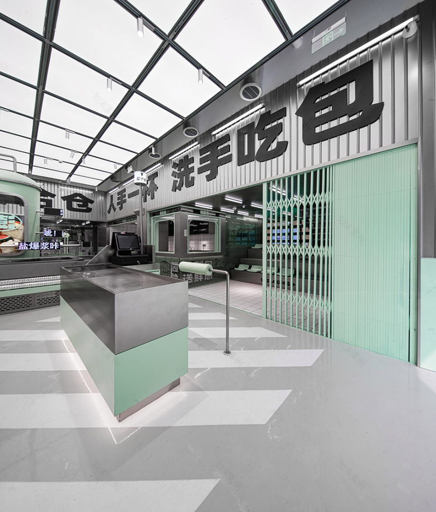
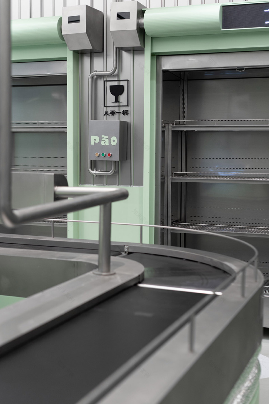
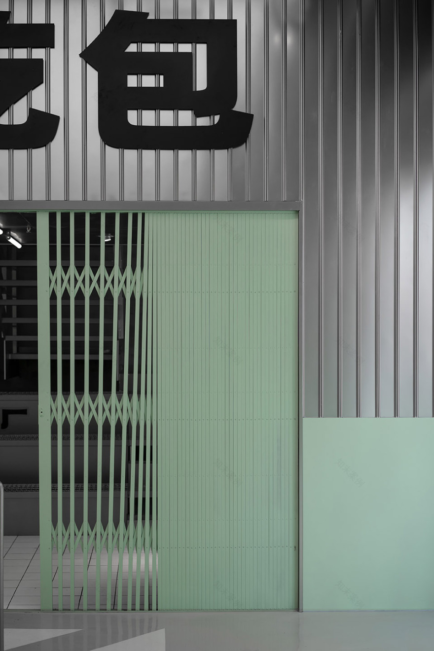
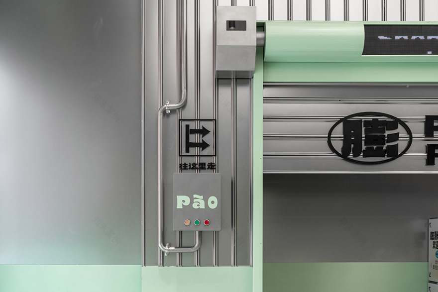
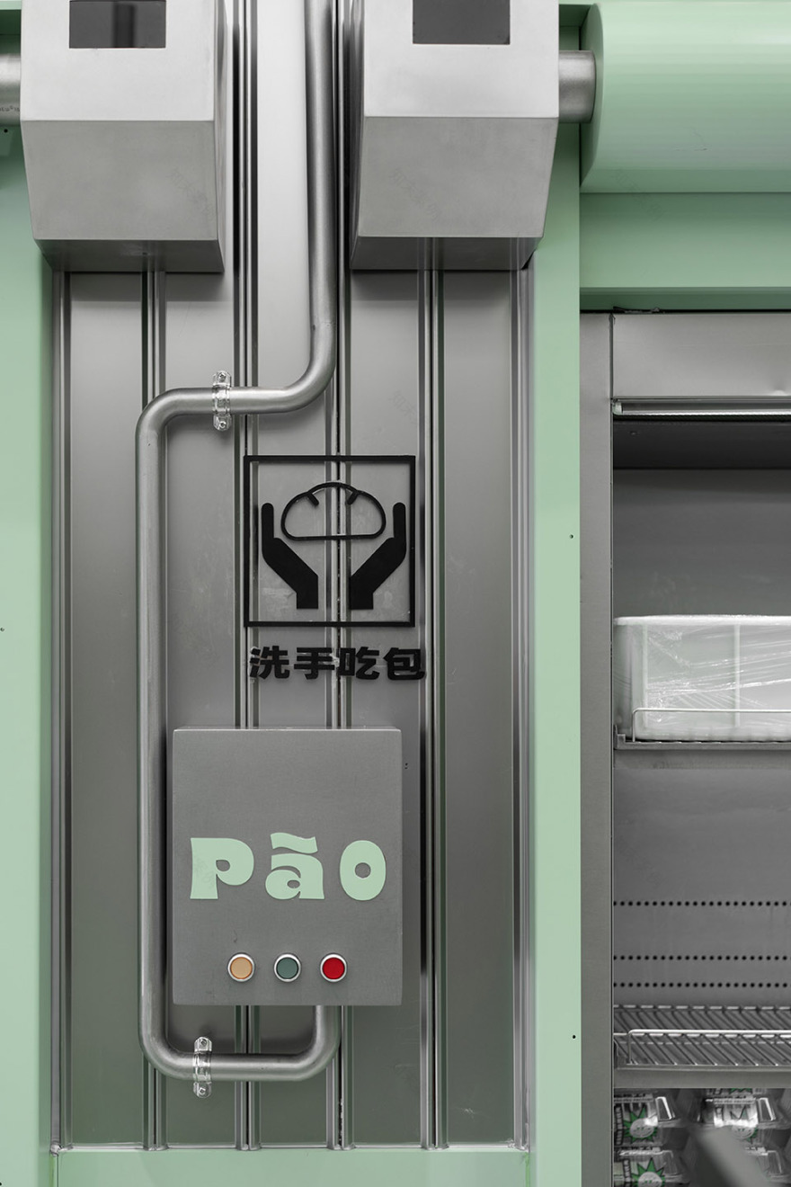
进入空间内部,我们用加粗的黑体无称线文字填满整个室内上层空间,在整体不锈钢材质的加持下,让顾客置身于巨大的工厂“生产标语”中。不锈钢、马卡龙绿金属烤漆板、电子屏构成纯粹而有趣的材质变化。店内产品陈列柜共设置为三种不同的形式,组成丰富的卖场动线。中心流水线式的展陈道具是整个空间的点睛之笔,圆筒容器被LED屏环绕。
Entering the interior of the space, we filled the entire upper interior space with bold black unlined text. With the blessing of the overall stainless steel material, the customer was placed in the huge factory “production slogan”. Stainless steel, macaron green metal paint board, and electronic screen constitute pure and interesting material changes. The product display cabinets in the store are set up in three different forms, forming a rich store flow. The central pipeline-style display props are the finishing touch of the entire space, and the cylindrical container is surrounded by LED screens.
▼售卖区,sales area ©或者设计
▼售卖区细部,details of the sales area ©或者设计
▼传送带面包展示装置,conveyor belt bread display area ©或者设计
▼墙体展示区,display area by the wall ©或者设计
▼饮品区,drinking sales area ©或者设计
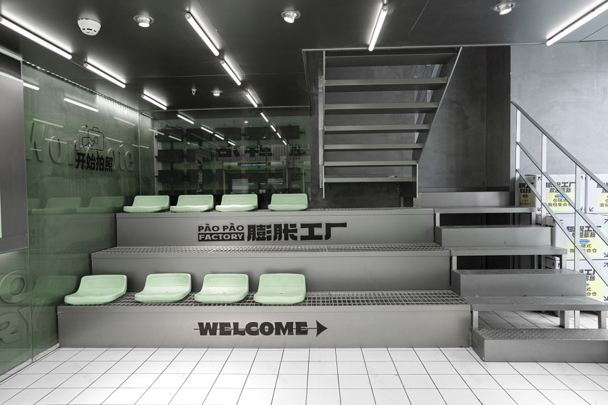
空间右侧区域,我们在空间中划分了一个拍照打卡和休憩的区域。不锈钢材质搭配品牌绿色、并排放置的奶绿座椅、增强设计感的黑色广告贴字,我们精心安排这些要素,希望客户能拍出一张张获赞无数的打卡照。
In the area on the right side of the space, we have divided the space into an area for taking pictures, checking in and resting. The stainless steel material is matched with the brand green, the milk green seats placed side by side, and the black advertising stickers that enhance the design sense. We carefully arrange these elements, and we hope that customers can take pictures of countless check-ins that have been praised.
▼打卡区,check-in area ©或者设计
我们希望我们的设计不仅仅是停留在“空间的设计”这一单一层面,还能运用设计拉近品牌与消费者的距离,帮助品牌重塑内外价值,这是我们做商业空间设计最大的追求与成就,也是设计最迷人之处。
We hope that our design not only stays at the single level of “space design”, but also uses design to narrow the distance between the brand and consumers and help the brand reshape internal and external values. This is our greatest pursuit in commercial space design. And achievement is also the most fascinating part of design.
▼细部,details ©或者设计
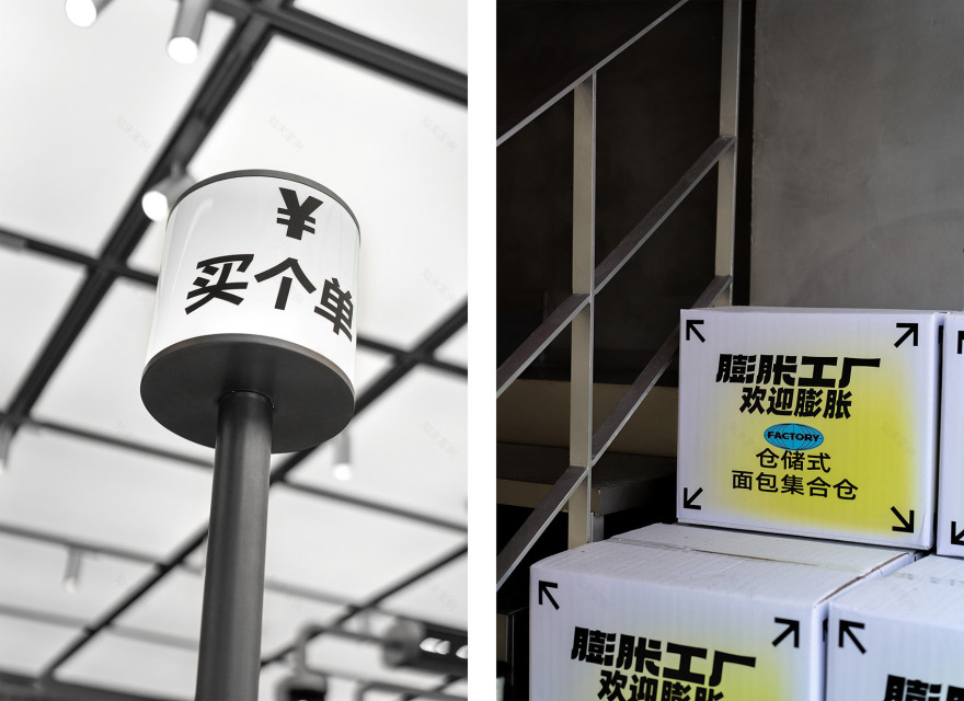
▼VI设计,VI design ©或者设计
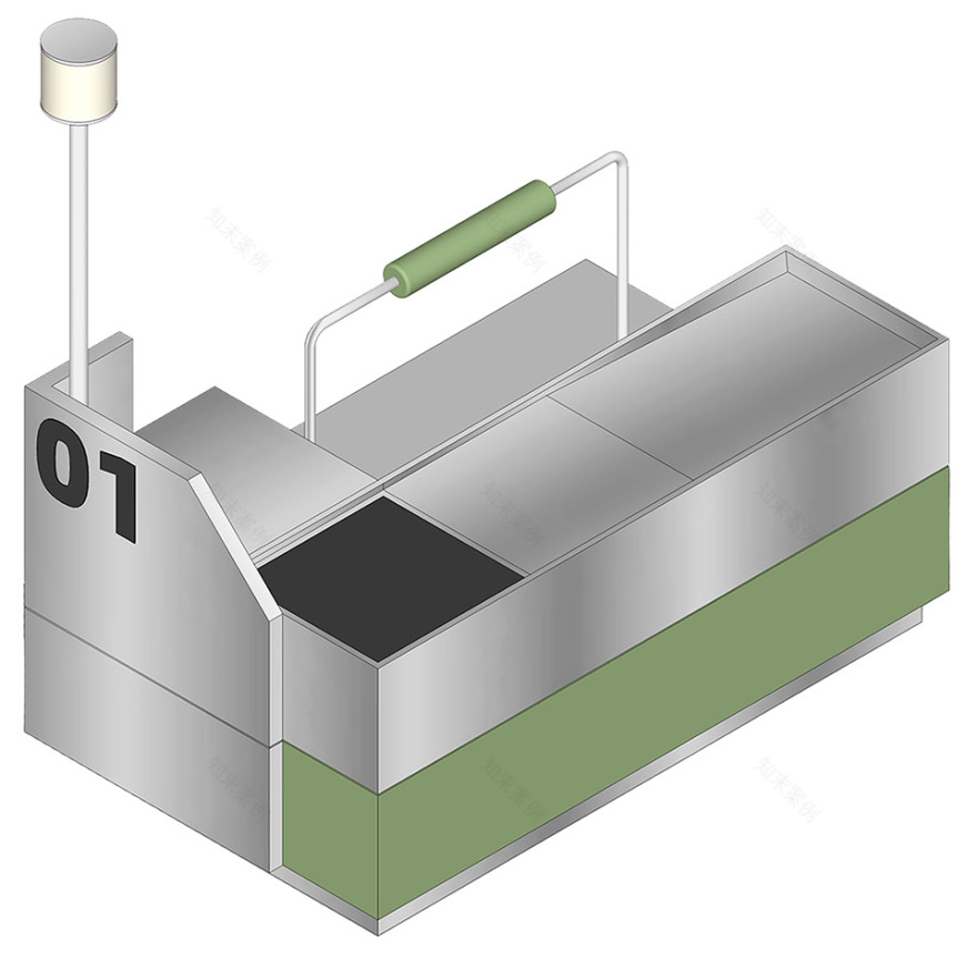
▼轴测图,axonometric ©或者设计
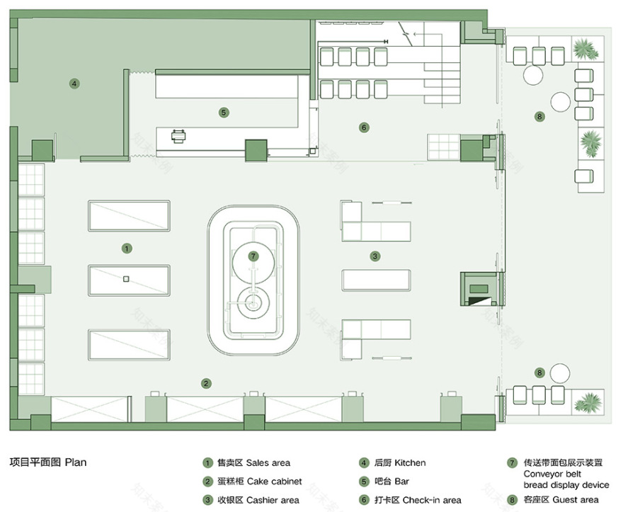
▼平面图,plan ©或者设计
项目名称:麦都膨胀工厂PaoPao Factory 项目地点:泉州市浦西万达广场 主持设计师:巫国源 设计团队:柳奕豪,赵丽颖,彭博文,华子鸣,叶昀儒,许晓瑜 项目业主:麥都食品 主要材料:不锈钢、金属烤漆、地坪漆、 室内面积:203㎡ 完工时间:2021.7 施工单位:金艺装饰设计有限公司 摄影:或者设计
Project name: PaoPao Factory Designer: OR Design,ShangHai Project location: Wanda Plaza, Puxi, Quanzhou Indoor area: 203 square meters Design Director: Guoyuan Wu Project team: Yihao Liu, Liying Zhao , Bowen Peng,Ziming Hua,yunru Ye,Xiaoyu Xu Design content: facade design, interior design, lighting design, prop design Main materials: stainless steel, green paint, epoxy floor paint, acrylic, glass Completion date: July, 2021 Construction team: Jinyi Decoration Co., Ltd. Client: MALTOAST Photography: OR Design
客服
消息
收藏
下载
最近


