查看完整案例


收藏

下载
ABF Developments(房地产开发公司)的新总部设计充满了挑战。首先,建筑需要代表这家创新型公司,体现出他们致力于设计出满足客户需求的地产项目。因此建筑应在景观中呈现出引人的形状和设计,确保公众与之产生关联。
Designing the new headquarters for ABF Developments was full of invigorating challenges. The first one was to represent a groundbreaking innovative company, focused on designing real estate properties that correspond directly to the customers’ needs and longings. Assuring that this rigorous public felt connection to the project’s language was one of the main purposes of the intriguing and appealing design and shape in the urban landscape.
▼项目鸟瞰,aerial view ©Alcindo Dedavid
建筑所在街区大多是没有特定风格的老旧住宅区,因此,设计出既醒目又融于环境的建筑是该项目面临的第二个挑战。最后,设计需要在狭窄的场地中满足上述需求和复杂的功能——行政总部和商务销售中心(服务于即将在这里启动的项目)。
The neighborhood where the building stands is predominantly residential, with houses built many years ago, without a distinctive design character, so the second challenge was to create a building with a change provoking design but also fully integrated to it’s surroundings. Lastly, there was the need to combine all of these design needs to the multiple functionality of having administrative headquarters and the business and sales center for the projects that will be launched there, using a very narrow site to build it.
▼正立面,front facade ©Alcindo Dedavid
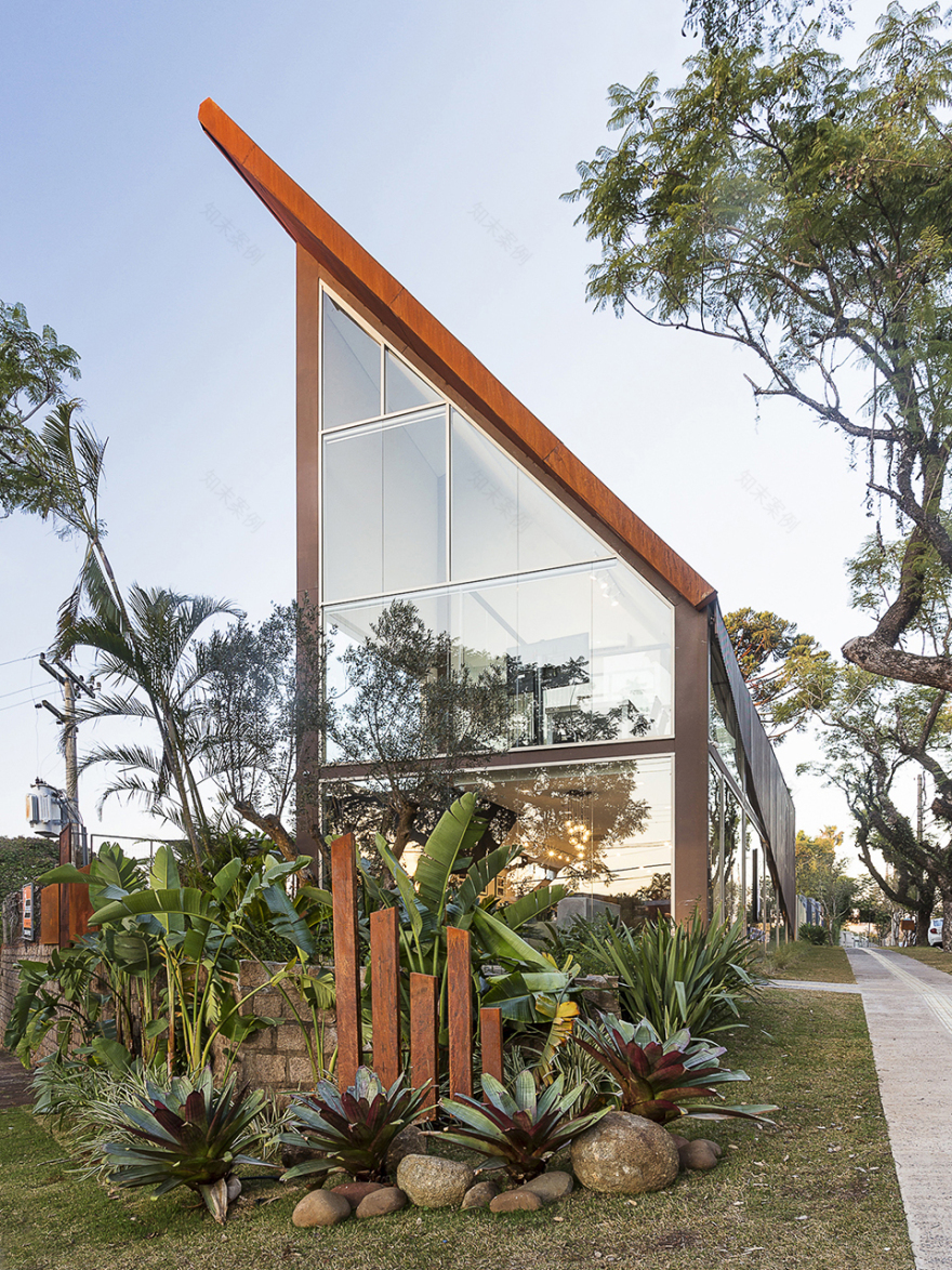
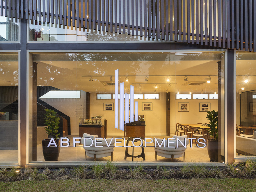
为了满足这些需求,设计团队打造出醒目的建筑外观,它由六个形状略有不同的金属框架构成,支撑起两层空间,包括产品展示区、会议室、客户服务区、咖啡吧台及其他行政支持在内的展示区。陡峭的耐候钢屋顶弯折地覆盖在钢架上,包裹着整栋建筑。在建筑正面,巨大的玻璃表面如同橱窗一样,使公共区域内外相连,金属覆盖物则在不影响光线渗透的前提下保证了室内的私密性。
▼结构分析,structure diagram ©MAENA design conecta
In order to meet all these needs, we created an iconic shape, structured through six metallic frames of slightly different shapes, supporting two floors where the spaces are laid out. There’s the exhibition area, with product demonstrations, meeting rooms, customer service, cafè and bar area and other administrative support. Folding over the steel frames is a metallic corten steel roof, with edgy angled slopes, encloses the building. In the front façade, a big glass surface acts like a stores’ window, allowing continuity between inside and out, for the public area, and a metal covering provides privacy without compromising light or permeability.
▼侧立面 – 陡峭的耐候钢屋顶 ©Alcindo Dedavid lateral facade – steep corten steel roof
▼正立面局部 – 橱窗般的玻璃表面,front facade – glass surface like a stores’ window ©Alcindo Dedavid
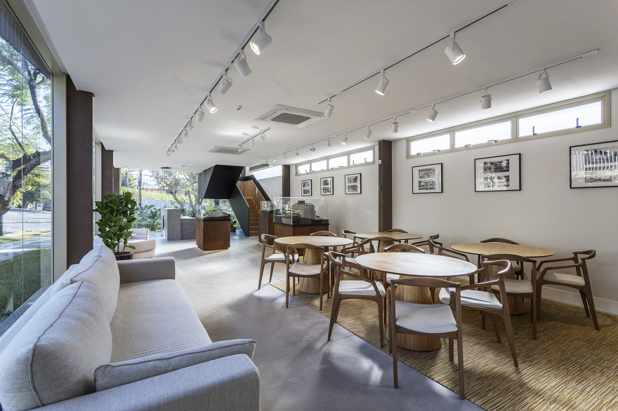
室内设计旨在强化材料的美,使纹理和饰面更具吸引力。混凝土地面和耐候钢形成鲜明对比,营造出和谐而现代的空间。通过添置整洁精致的家具,该区域变得宽敞并且可以满足各种需求。
The interior design is made to enhance the beauty of the raw materials, complementing their textures and finishes. O flooring in concrete in contrast to the corten steel creates a balanced and contemporary space. Adding clean and sophisticated furniture, the area is made wide and spacious, ready to attend every need.
▼入口区域,entrance area ©Alcindo Dedavid
▼接待处,reception ©Alcindo Dedavid
▼服务区/展示区,service area/exhibition area ©Alcindo Dedavid
▼通透的公共区域,bright common area ©Alcindo Dedavid
▼室内外的垂直线条元素,vertical line elements indoor and outdoor ©Alcindo Dedavid
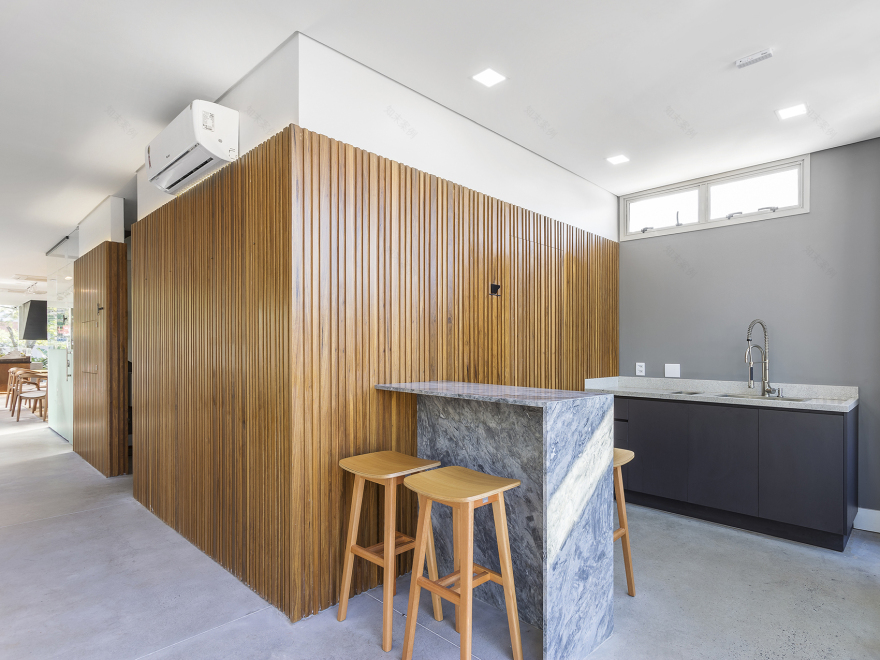
▼吧台/咖啡区域,bar/cafe area ©Alcindo Dedavid
▼楼梯,staircase ©Alcindo Dedavid
▼楼梯内部,inside view ©Alcindo Dedavid
▼由楼梯望向会议室,meeting room from staircase ©Alcindo Dedavid
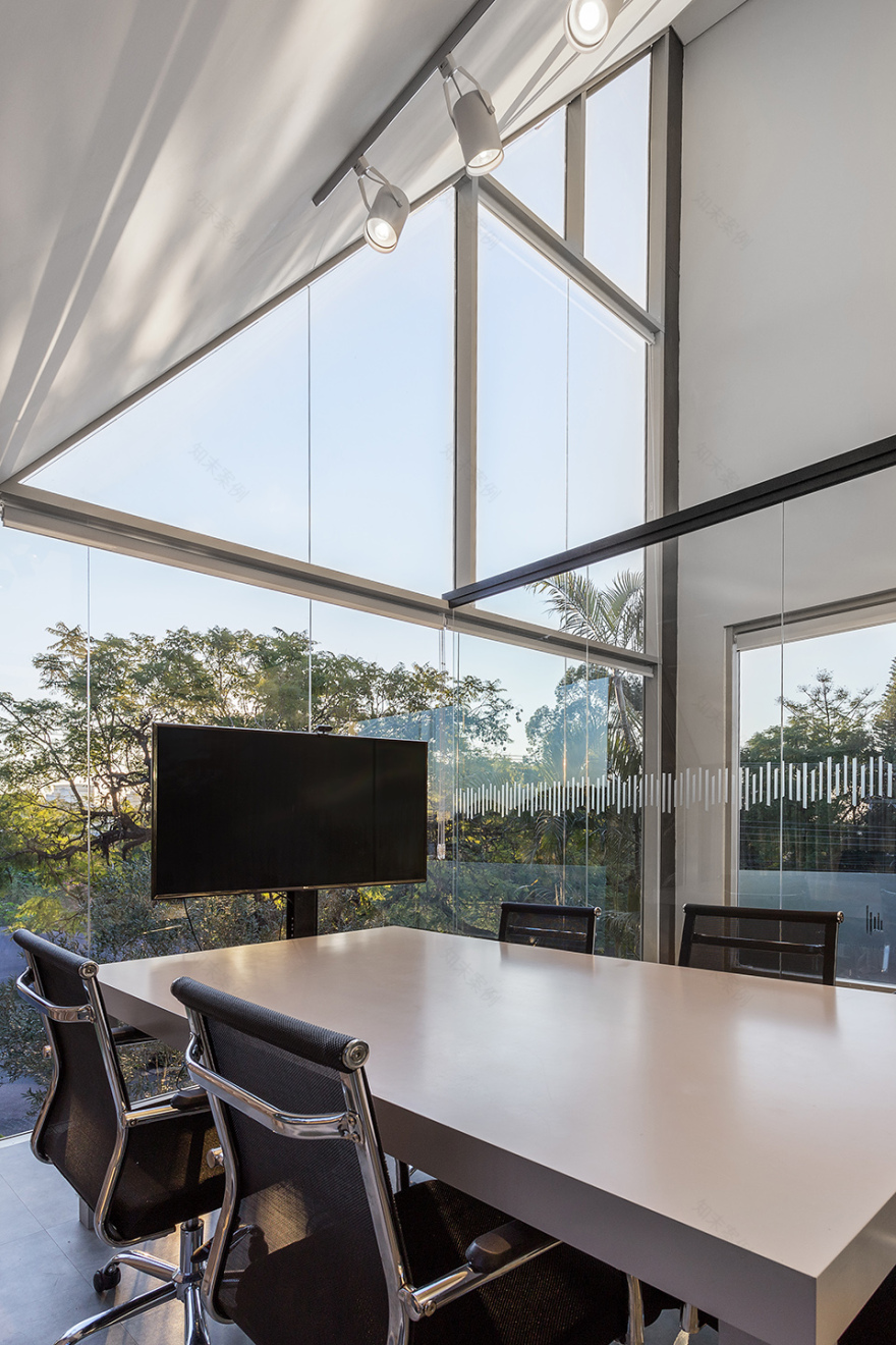
▼会议室,meeting room ©Alcindo Dedavid
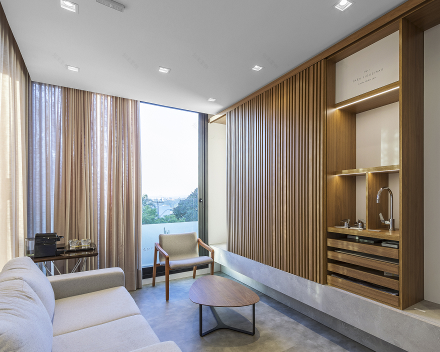
▼定制室,tailormade room ©Alcindo Dedavid
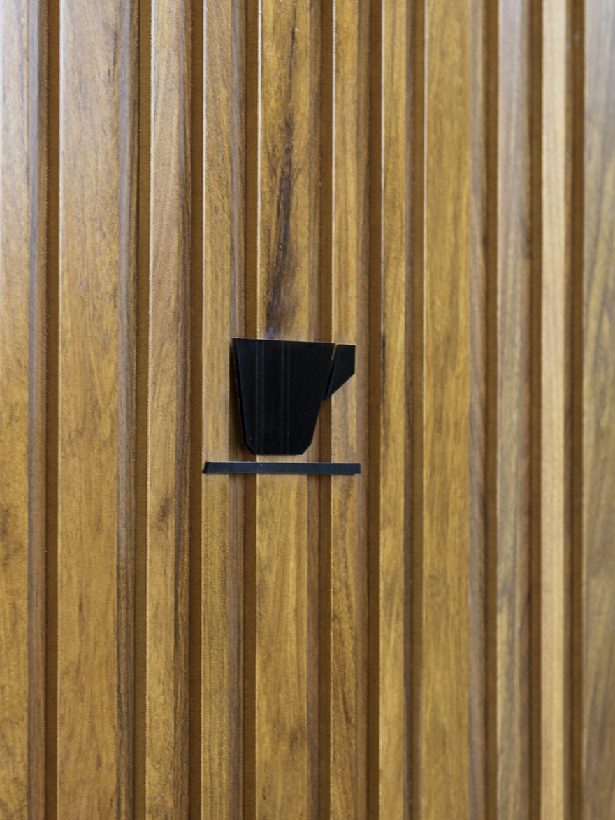
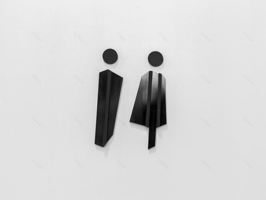
室内的图形和标识均经过完整设计,强化了品牌的标志。设计团队还借鉴了ABF Developments的标志和总部建筑,利用垂直线条营造氛围并丰富空间。就此,空间在各个尺度上与使用者建立联系,形成丰富的空间体验,彰显出品牌的创新性和先进水平。
Reinforcing the brand’s logo even the pictograms and wayfinding signaling was thoroughly designed. Inspired directly by the ABF Developments’ logo and the headquarters architecture, vertical lines are used as guidelines for setting the atmosphere and complementing the space. For this, the space communicates with the users in every scale of the project, creating a full experience that brings out the brand’s innovative and sophisticated standards.
▼楼梯细部,details of stairs ©Alcindo Dedavid
▼标识细部,details of signs ©Alcindo Dedavid
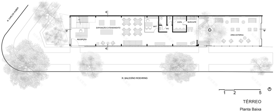
▼一层平面图,ground floor plan ©MAENA design conecta
▼二层平面图,first floor plan ©MAENA design conecta
▼立面图,elevations ©MAENA design conecta
▼剖面图,sections ©MAENA design conecta
客服
消息
收藏
下载
最近


