查看完整案例

收藏

下载
岱朴景观:美,是相对的。所以,世界的模样,取决于你凝视它的目光。日益精装化,装置化,形式化的景观如美学罂粟一般,弱化着我们的感觉器官越来越多的景观,看起来很美,但美的不轻松。视觉会欺骗人,如屏幕一样,但感觉不会。我们只希望让景观成为她本来该有的样子。
Adapt Studio: The appearance of the world, depending on your vision, so beauty is relative. Landscape design is more and more decorative, so that we feel more and more dull. There are too many landscape design works, which are beautiful to look at but cannot make people feel relaxed. Our eyes will be deceived by the photos, but the feeling will not be deceived. The landscape we want, just like nature, can make people in it feel relaxed and comfortable.
▼项目区位 Project location
项目位于南宁邕江之南,江南老区。借助大区东北角的幼儿园场地,作为销售的展示区域。老工业区的底色并不能为示范区提供足够优质的外部环境,四至道路未完全施工也使场地可达性大大减分,但相当长的看房通道,使空间能够足够的与城市分离,反而使场地有了一种“云开别有天”的神秘感。
This project is located in Jiangnan District, Nanning, Guangxi, on the south side of Yongjiang. Use the future kindergarten site on the northeast side of the plot as a display area. The outside of the project is the former industrial zone of Nanning, so the external environment is not good. The surrounding roads are also under construction, which reduces the accessibility of the project. However, the longer passage isolates the space from the outside and makes the site more mysterious.
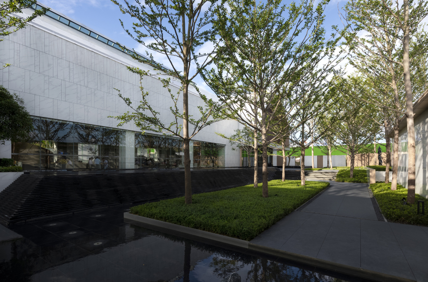
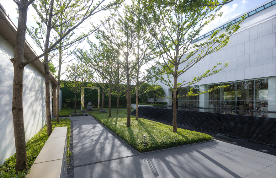
感谢项目优秀且开明的建筑设计,不单单这座纯净优雅的建筑。更为难能可贵的是,能够允许一排小叶榄仁对建筑的遮挡而如艺术馆,或者如教堂一般的售楼处,透过枝杈的掩映下显得更加素雅。
Thanks to the excellent architectural designers of this project, not only because they designed this pure and elegant building, but also for their enlightened attitude to allow a row of trees to block the building. Like an art gallery in the middle of a forest, the building is more simple and elegant, set off by plants.
放松,这是我们在项目初始就决定的调性。美,可以相对,但感受是主观的。我们希望人们走过示范区,是在一种放松的心境下,感受自然的氛围下建筑与乔木的交织重叠。
Making people feel more relaxed is our initial goal. Beauty is relative, but people feel similar to beauty. We hope that people walk into this project and feel the water, wind, sunshine and trees in a relaxed atmosphere.
场地虽格局方正,动线清晰,但留给景观的空间却相当吝啬。在这方寸之地中,我们藉以光、水、林,尝试与场地对话,而形式化的设计线条,如奥姆剃刀犁过一般,不曾出现,简单的,纯粹的,就是最自然的。
Our site is long and rectangular, the flow lines are also very clear, but the space left for the landscape is very small. In such a small site, we tried to make simple, pure design using natural elements such as sunlight, running water, woods, etc.
入口处的内敛与克制,与纯粹的建筑相得益彰,将更多的笔墨留给自然去书写。
The design of the entrance is very clean, echoing the pure architecture, leaving more space to nature.
入口 The entrance
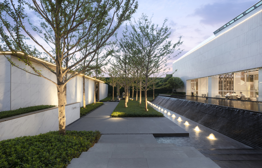
通过入口后,我们希望将人的视线感受收束在自然之间环抱式的水景,如山间的溪流般叠瀑而下,溯流而上,确是生物趋向美好境界的自然本能。
After entering the site, we are surrounding by the water and tall trees above the head, people are like entering the nature.
▼林下 Under forest
▼溪间 Stream side
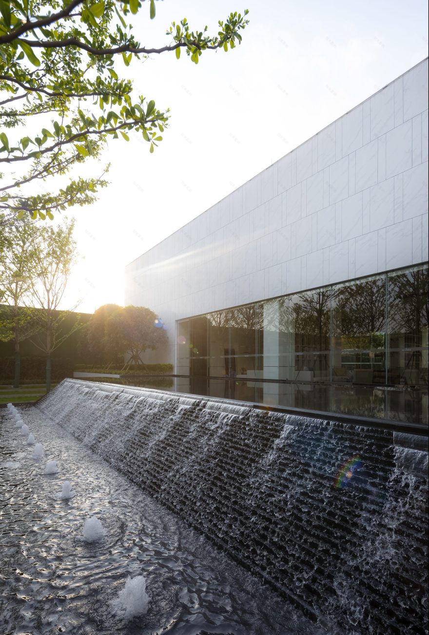
建筑与场地外部 1 米的高差,我们利用跌水与台阶的形式进行自然的消化。建筑外水景的抬升,使建筑内外两侧的视线均有着丰富的多变性,由外向内,不仅是单纯的倒映,而是一种视线的抬升,和宜动宜静的空间感受。
There is a one-meter height difference between the building and the external road. We use steps and running water to handle the height difference.
▼溪间 Stream side
水面是室内洽谈区向外观看的第一视点,抬升后水景只倒映小叶榄仁最美的树冠部分,同时能够无限弱化室内与室外的空间界限。
Look from indoor to outdoor, one eye can see the surface of the water, the water after lifting, trees can reflection in the water, outdoor and indoor, like the same space.
▼倒影 Inverted image
藉以建筑的墙体以及通透的幕墙,设计所给予的画面同样希望是放松的。框景内只存在天空中树冠以及水中的树冠,连人们的行色匆匆的脚步也被抬高的水景掩盖。
We want people to sit in the building and look at the images and be relaxed. The glass facade will form a picture frame, from the frame people can only see the plants and their reflections in the water.
▼堂前 Front of the court
▼屋后 Behind the house
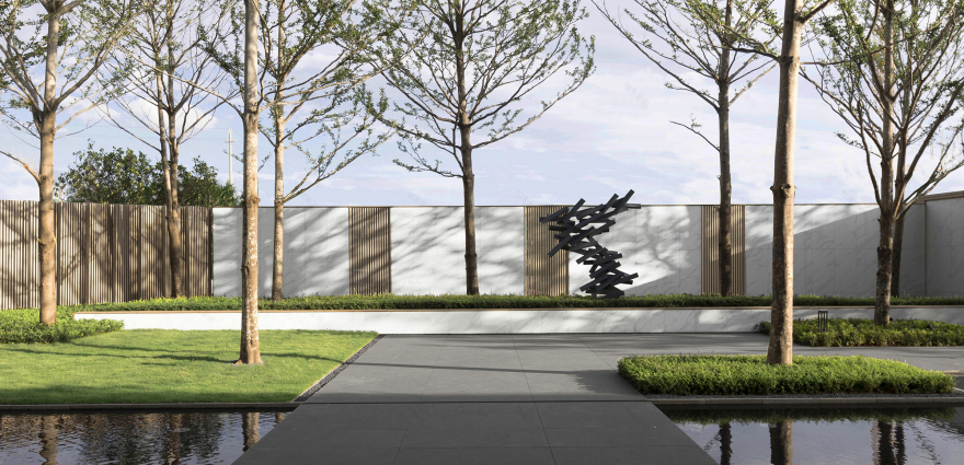
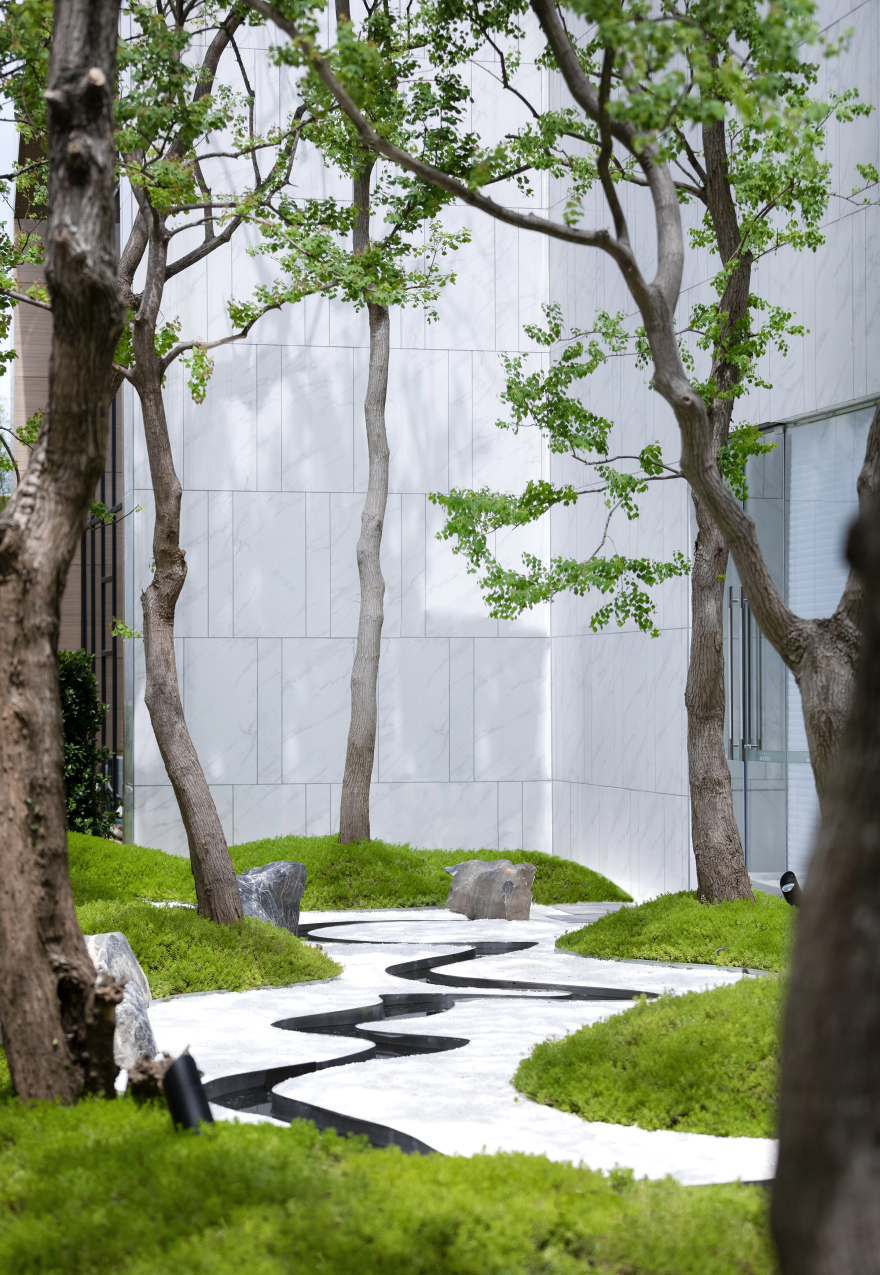
与前场在小叶榄仁树林下穿梭有所不同,后场作为通往样板房的通道,我们以景墙进行空间上的划分。白色的墙体做底,妖娆的乌桕作为点缀,曲水流觞的意境自然应该在茂林修竹与清流激湍中实现。
Different from the plants on the south side of the building, we made different landscape Spaces on the north side of the building. The space was divided by the wall. The white wall was like white paper, the plants were like ink paintings on the white paper, and the water scape flowing like a river was at the bottom.
▼微观邕江 Microscopic Yong Jiang river
邕江添雨涨,绿绕万家春。四野重烟晓,两堤叠浪新。
曲水形态的设计,我们取自南宁的母亲河——邕江,邕江也让南宁不负绿城之名
Our inspiration for the water scape comes from Nanning’s mother river – Yongjiang river.
Floating wine cups along winding water
从林间进入,穿过售楼处,再入林间,前场是挺拔与干练,后场是妖娆与意境。真正的自然不是多重绿化带来的层次,一枝一叶,却总关情。
Through the tall trees, into the building, and then into the woods, this is the real nature.
景观应该是什么样子?每一个设计师都有自己的见解。但是显然,不应或不仅是现在这个样子,我们在设计中,越来越多的尝试,让她不仅仅停留在空间或视觉上。也可喜的看到,更多的设计师希望有所改变,越是光鲜的材料越容易破败,质朴的材料和纯粹的植物,历久弥新。景观,从自然中来,希望她能回到本来该有的样子。
What is landscape? Every designer has their own answer, but many people don’t like the current landscape design. In our design, we keep trying to make the landscape more than a visual experience. The more glamorous the material, the more likely it is to decay. Simple materials and plants will work better over time. We want the landscape to be as relaxing as nature.
▼平面图 Floor plan
▼细节 Details
项目位置:南宁市江南区
项目面积:3500 平方米
建成时间:2020 年 5 月
开发商:金成集团&广西建工
管理团队:梁博、吉运、石豪
景观设计:岱朴景观
雕塑设计:Adapt Studio
摄影:日野摄影
Project location: Jiangnan District, Nanning
Project area: 3500 ㎡Completion time: 2020.05
Owner: JINCHENG HOLDINGS& Guangxi Construction Engineering Group
Management team: Liang Bo, Ji Yun, Shi Hao
Landscape design: Adapt Studio
Sculpture Design: Adapt Studio
Photography: RIYE
项目中使用的植物和材料 Application of materials and plants in this project:
客服
消息
收藏
下载
最近


