查看完整案例


收藏

下载
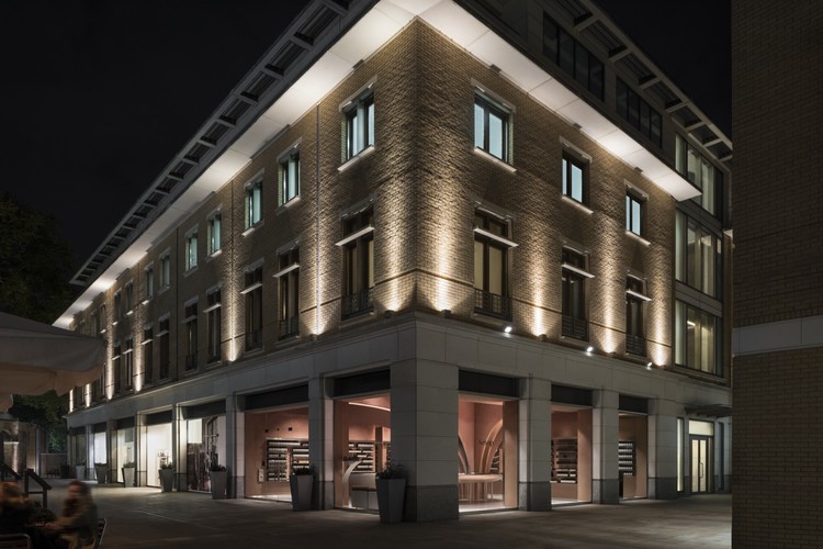
架构师提供的文本描述。位于伦敦切尔西,商店的设计灵感来自地点的上下文相关性,结合未来派元素的影响。其结果是一个典型的设计,淡红色调色板和不锈钢元素的内部特征。
Text description provided by the architects. Situated in Chelsea, London, the store’s design is inspired by the contextual relevance of the location combined with an influence of futuristic elements. The result is an interior characterized by classic architypes, a pale red color palette, and stainless-steel elements.
© Paola Pansini
保拉·潘西尼
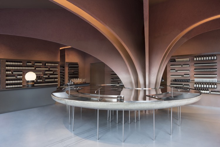
现有列用作存储布局的起点。从这个集中的柱,12个拱门延伸到周围的墙壁。本系列拱门作为创建组织层次感的关键元素,在空间中建立可视分隔符。拱门是包在粘土基石膏与微妙的渐变颜色,从一个较轻的基础到一个更深的阴影。拱门之间的光照进一步强调了梯度效应。
An existing column is used as the starting point for the store’s layout. From this centralized column, 12 arches stretch towards the perimeter walls. This series of arches function as a key element in creating a sense of organizational hierarchy, establishing visual separators within the space. The arches are clad in a clay based plaster with a subtle gradient color, ranging from a lighter base to a darker shade. Illumination from between the arches further emphasizes the gradient effect.
© Paola Pansini
保拉·潘西尼
从集中式立柱展开,圆形水槽就成为商店的自然交汇点。这个水槽是伊索所有商店的一个组成部分,它看起来像一面悬停的水镜,反射着天花板的光和颜色。由抛光不锈钢和玻璃纤维制成,水槽成为焦点元素,同时允许空间内人员的优化流动。
Expanding out from the centralized column, a sink in a circular shape establishes itself as the natural meeting point of the store. The sink, which is an integral part of all Aesop’s stores, appears as a hovering water mirror reflecting the light and colors of the ceiling. Made from polished stainless steel and glass fiber, the sink becomes a focal element, while simultaneously allowing for an optimized flow of people within the space.
© Paola Pansini
保拉·潘西尼
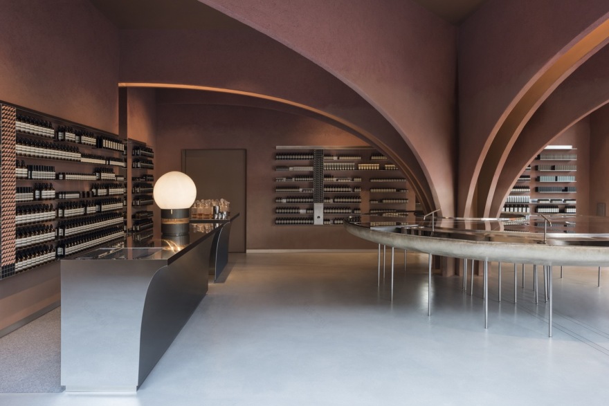
墙壁、天花板和拱门都被涂上了粉红色的粘土灰泥,这给了这个空间一种皇家玫瑰色。粘土灰泥由Clayworks公司提供,并来源于英格兰西南各县。这个简单而清晰的调色板与钢材在商店其他定制元素中的广泛使用形成了鲜明的对比。
The walls, ceiling, and arches are clad in a pink-pigmented clay based plaster, giving the space a royal rose-color. The clay plaster is delivered by Clayworks, and sourced from South West counties of England. This simple and clear color palette is contrasted by extensive use of steel in the other custom elements of the store.
© Paola Pansini
保拉·潘西尼
粗糙的墙壁表面与清晰的不锈钢形状的柔软、抛光的表现、颜色梯度的游戏以及整个空间中光线的变化形成了对比,所有这些都强调了设计的深度感。结合传统的拱门和水槽等未来主义元素,设计的目的是激发顾客的好奇心。
The contrasts created by the rough surfaces of the walls against the soft, polished expression of the clear stainless-steel shapes, the play with color gradients, as well as the changes in light throughout the space, all underline a sense of depth to the design. Combined with the traditional arches and futuristic elements such as the sink, the design aims to trigger customer’s sense of curiosity.
© Paola Pansini
保拉·潘西尼
约克广场公爵伊索是Sn hetta设计的第七家伊索书店。其他商店包括伊索·普林森门(奥斯陆)、伊索·霍曼斯比恩(奥斯陆)、伊索·格拉本斯特拉·e(杜塞尔多夫)、伊索·法萨嫩斯特拉·伊索(柏林)、伊索·伊索·离子(新加坡)和伊索·莱佛尔斯城(新加坡)。
Aesop Duke of York Square is the seventh Aesop store designed by Snøhetta. Other stores include Aesop Prinsens Gate (Oslo), Aesop Homansbyen (Oslo), Aesop Grabenstraße (Düsseldorf), Aesop Fasanenstraße (Berlin), Aesop ION (Singapore), and Aesop Raffles City (Singapore).
© Paola Pansini
保拉·潘西尼
Architects Snøhetta
Location Chelsea, London, United Kingdom
Area 108.0 m2
Project Year 2017
Photographs Paola Pansini
Category Showroom
客服
消息
收藏
下载
最近


