查看完整案例


收藏

下载

翻译
Phoenix Wharf, the Bristol-based interior design and branding agency specialising in hospitality and retail, has announced the completion of a new scheme for innovative bakery business The Bristol Loaf, who, together with other local artisanal partners, has launched a new community foodie hub in Bedminster, in the south of the city.
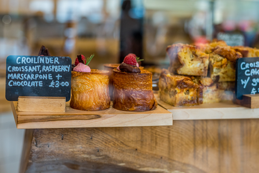
The Bristol Loaf was initially set up in 2017 by entrepreneur Gary Derham, whose background includes working for local hospitality operator The Assemblies. The Bristol Loaf ‘s first outlet was a single-unit bakery and café in the Redfield area, before expanding into a second unit and becoming a successful, high-end, artisanal bakery products supplier to many other local businesses, with a retail and wholesale product range that includes sourdough bread and great-looking pastries. ‘The first bite is with the eyes’ remains a founding credo of the business. The retail arm of The Bristol Loaf also built a reputation for serving outstanding coffee.
The ongoing success of the Redfield site led to the expansion into additional premises, taking the opportunity to re-locate the business’s baking operations at the same time, with the original Redfield site remaining open as a café. The new venue will also host an expanded food and drink offer, sourced not only from The Bristol Loaf, but from a number of other specialist operators, effectively creating a mini foodie hub for Bristol. Located on Bedminster Parade, the café-store sits within Engine House Developments, a boutique, mixed-use development, taking up the entirety of the site’s ground floor, with 240 sq m front-of-house space and 90 sq m back-of-house.
‘The vision for the new undertaking’ Phoenix Wharf Associate Creative Director Emma Carter commented, ‘is an ethical supermarket that is accessible to all, where customers feel very welcome to spend time and relax.’
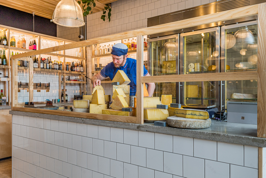
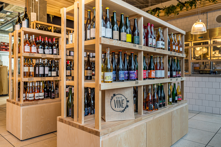
The Bristol Loaf will be retailing its own takeaway bakery produce in the space, as well as offering café customers a menu that includes coffee and pastries and a deli offer encompassing soups and sandwiches, quiches and salads, plus drinks such as smoothies and kombucha. All the produce will be locally-sourced and all dishes made from scratch on-site. Local operator Hugo’s Greengrocer is taking a 25 sq m space within the offer and there will be two other specialist producers present: The Bristol Loaf’s new sister brand, wine specialist The Bristol Vine, and local cheesemonger Two Belly.
Design Brief
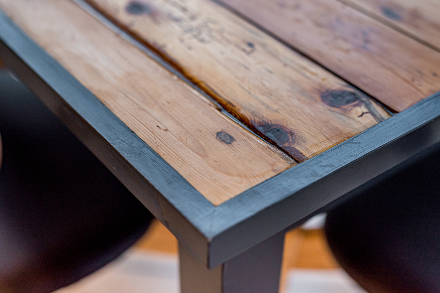
The brief for the new site was to create a community foodie hub that widened The Bristol Loaf’s offer but was still visibly linked to the original venue. The business’s commitment to sustainability meant initiatives such as using heat generated by the kitchen ovens to heat the whole space, with the smell of freshly-baked bread also filling the air. A fully-digitised order system will prevent any paper wastage, whilst the timber from former baker’s tables from The Bristol Loaf’s first premises has also been sanded back to minimise signs of wear and tear before being re-constructed as tables for the new venue’s café.
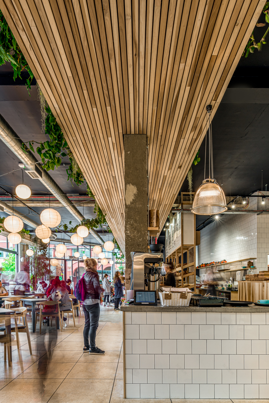
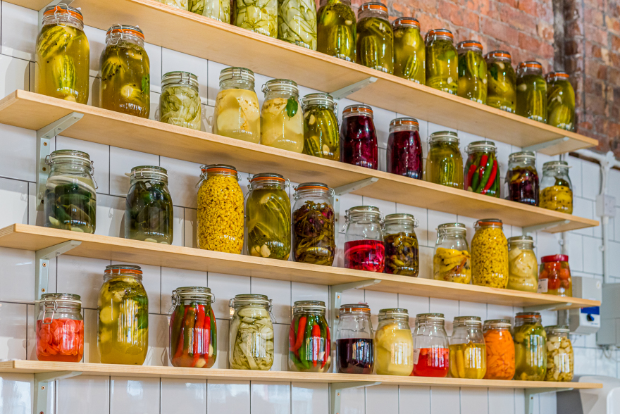
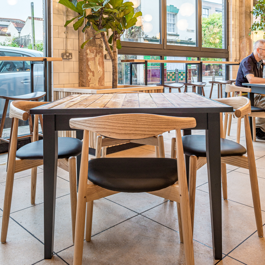
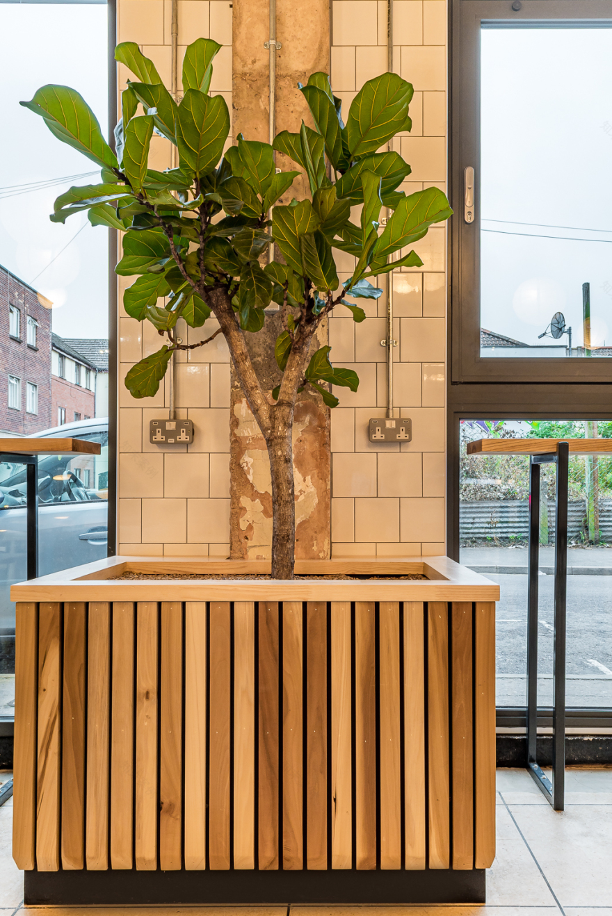
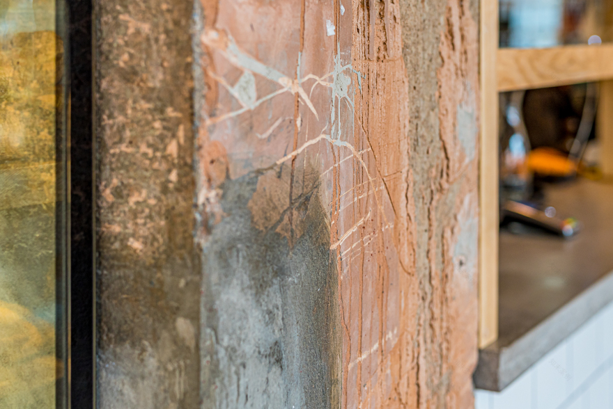
‘For the interior look and feel, the client asked for planting to be a really stand-out, nature-inspired element, building on the presence of plants in the original Redfield site’, Emma Carter commented. ‘The materials palette is both rustic and tactile and includes white tiling and the extensive use of solid ash timber for shelving, corridors and even ceiling panels, alongside brick and raw, exposed concrete, ensuring the overall aesthetic is the antithesis of a slick, super-polished look.’
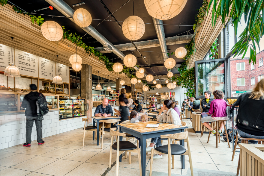
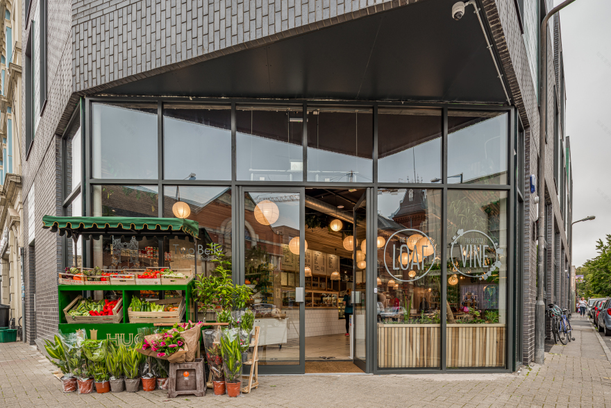
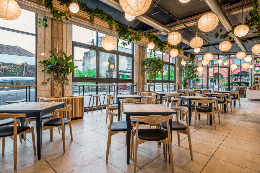
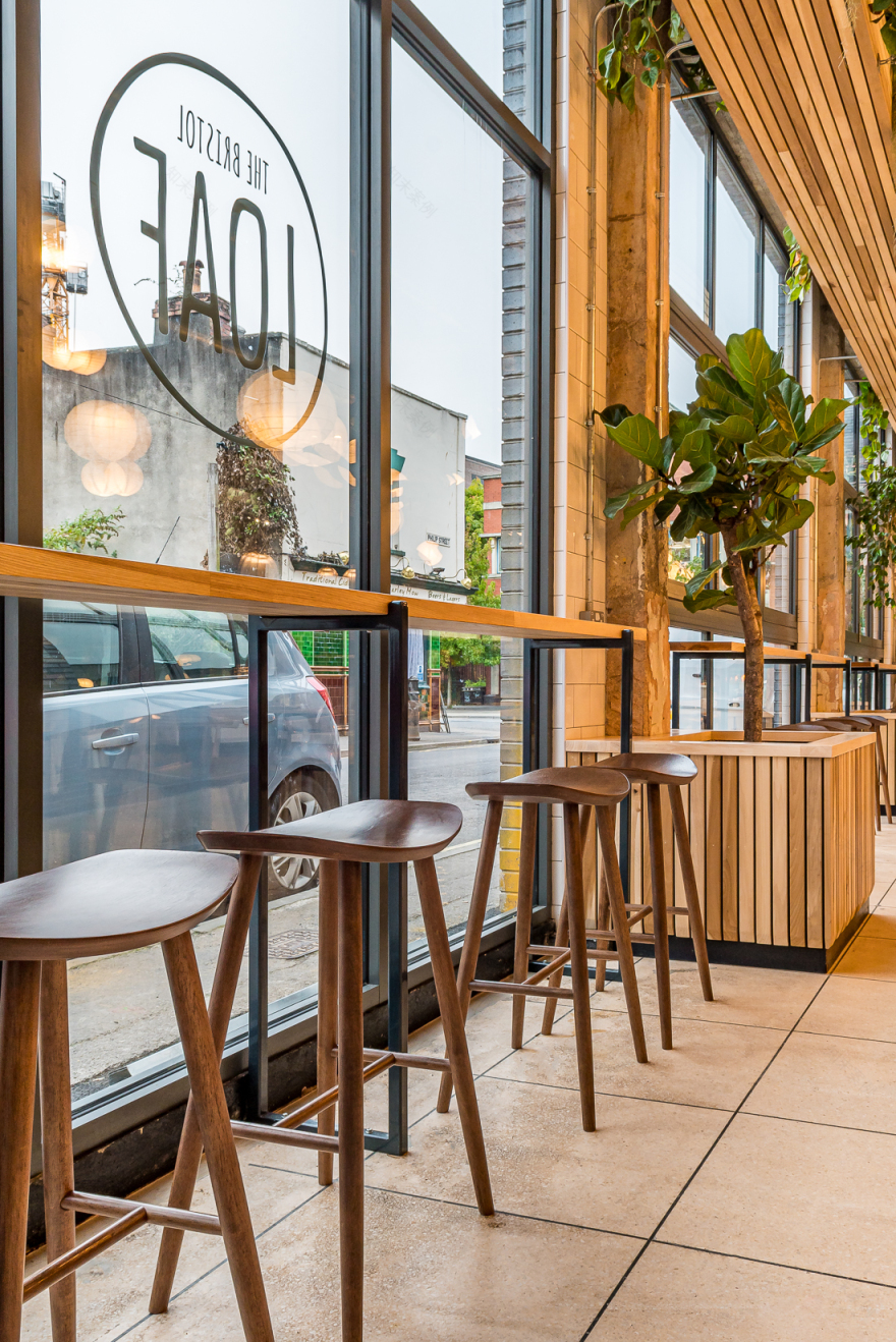
The café area includes 58 covers in total: 44 at the tables and 14 at perch/bar seating along the scheme’s full-height storefront glazing, with a wooden ledge counter and upcycled stools. The tables are in a variety of 2- and 4-seater arrangements, coming together easily to cater for larger groups. Bi-folding windows along the glazed wall enable the site to have evening opening presence onto the street front, whilst signage and branding is mostly hand-scripted and low key, allowing the company’s products to do the talking.
Visitor Journey
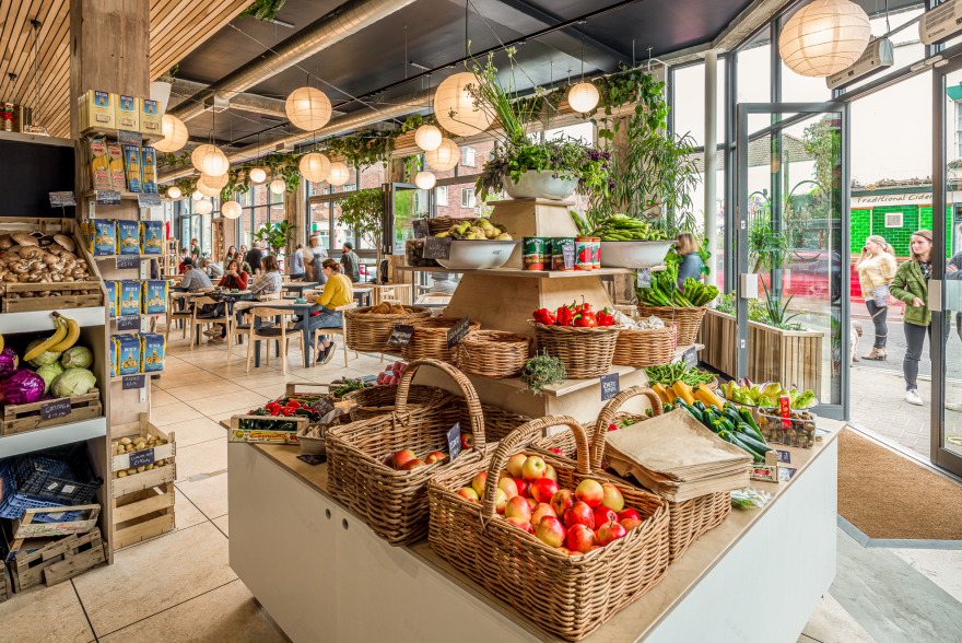
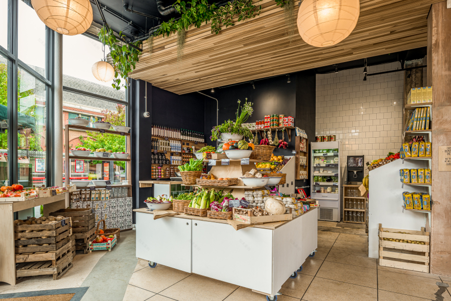
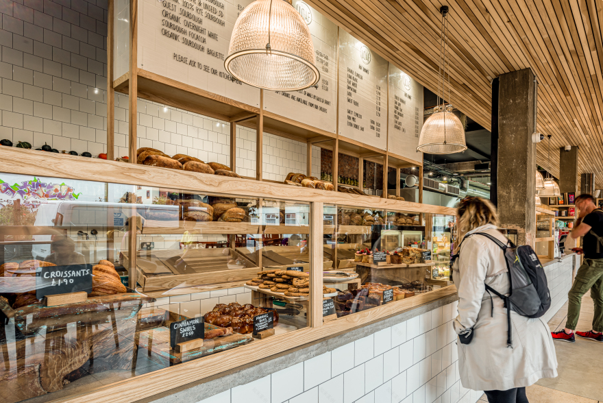
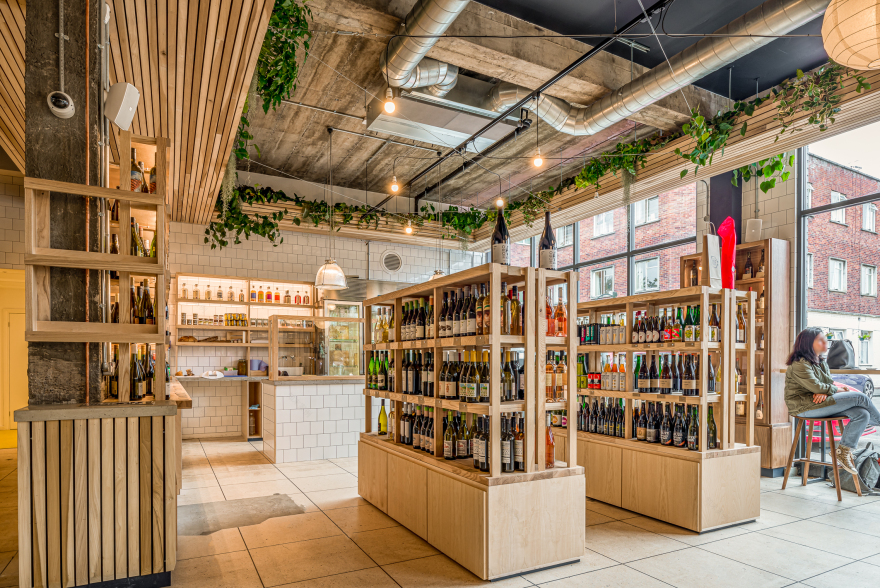
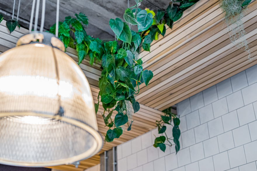
As visitors enter, they’re greeted by a floor-to-ceiling bread display, so that the bakery offer is clearly communicated. The entrance area is glazed and open with plenty of room for buggy-parking. The planting is visually-dominant from the get-go. ‘We blacked out the 4.1m high ceiling’, Emma Carter explained, ‘and created troughs almost a metre down, clad in ash timber slats and travelling the whole ceiling perimeter, housing a number of large, trailing plants. The troughs also conceal the electrical cabling, whilst criss-cross wiring creates structural support for the irrigation system.’
Immediately to the left is the Hugo’s Greengrocer store, followed by the main café counter service area, with the café itself taking up the rest of the open space. The two additional offers are The Bristol Vine, which includes a wine-tasting station, featuring all colours of wine, along with expert reviews and guidance and cheesemonger Two Belly, offering a curated selection of cheeses and suggested beers to accompany them, both of which are located against the rear wall.
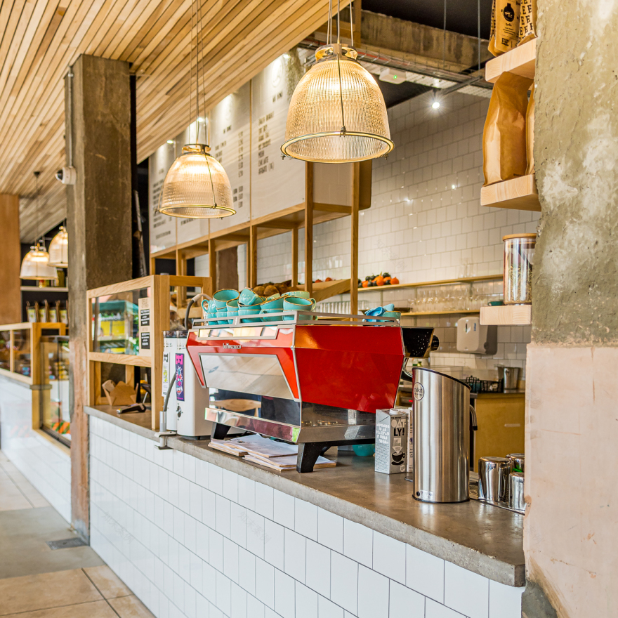
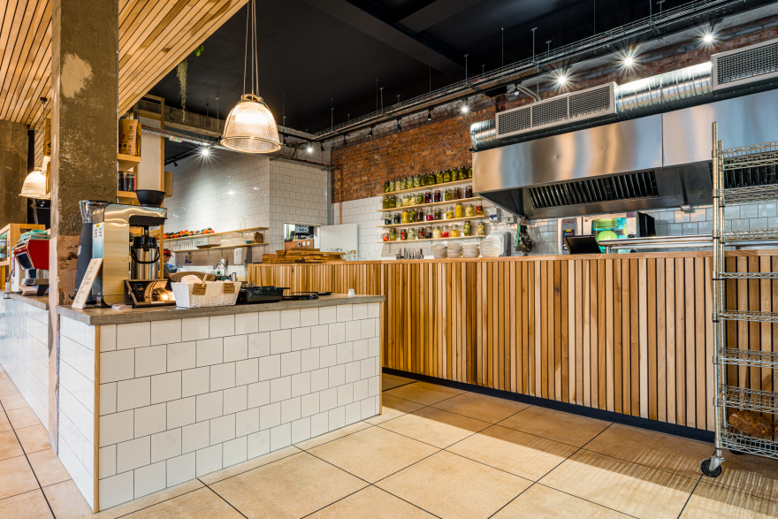
The bakery area includes a takeaway sales area; a central freestanding bread display behind the counter; a pastries area for customers to help themselves en route to the till; a chiller for the display of the deli café food offer; a hot-food area under heat lamps; a 3.5m coffee station with ample space around it for collecting drinks and the till area. Care has been taken to avoid pinch points for kitchen staff, waiting staff and customers collecting coffee, whilst at the same time separately zoning out the kitchen, counter and bakers’ spaces.
Lighting over the café seating area features clustered paper lanterns to create a soft and homely feel, whilst feature lighting over the counters is in the form of reconditioned factory pendants, offering a soft, lower level glow above the service and coffee counter areas. Flooring is an existing concrete-look tiling, which, where damaged, has been additionally concrete-screeded to ensure a safe overall level. All the counters are clad in white tiling apart from the rear counter, which is made up of wooden slats.
The back of house area includes large-scale fridges, loaders, ovens, mixing areas and shaping tables and is out of sight of customers, although some areas of prep are visible front of house to provide an element of theatre, for bread shaping, for example and lunch prep.
‘The whole design process has been a joy’, Gary Derham commented. ‘Emma from Phoenix Wharf really understood our company’s ethos and has been able to turn our ideas and vision for the space into something practical and very beautiful.’
客服
消息
收藏
下载
最近


